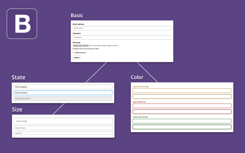
基本的な記述方法
Email address
Password
File input
Check me out
Submit
- 大枠をformタグで囲む
- フォームひとつひとつを"form-group"で囲む
- 入力エリアにはinputタグに"form-control"のクラスを設定
qiita.rb
<form>
  <!-- Eメール入力エリア -->
  <div class="form-group">
    <label>Email address</label>
    <input type="email" class="form-control" placeholder="Email">
  </div>
  <!-- パスワード入力エリア -->
  <div class="form-group">
    <label>Password</label>
    <input type="password" class="form-control" placeholder="Password">
  </div>
  <!-- ファイルアップロード -->
  <div class="form-group">
    <label>File input</label>
    <input type="file">
  </div>
 <!-- チェックボックス -->
  <div class="checkbox">
      <input type="checkbox"> Check me out
  </div>
  <!-- 送信ボタン -->
  <button type="submit" class="btn btn-default">Submit</button>
</form>
オプション
様々なクラスを付与する事で見た目の装飾・機能追加が可能
インライン

- インラインで表示したい場合は、formに"form-inline"を追加
qiita.rb
<form class="form-inline">
  <div class="form-group">
    <label>Name</label>
    <input type="text" class="form-control" placeholder="Jane Doe">
  </div>
  <div class="form-group">
    <label>Email</label>
    <input type="email" class="form-control" placeholder="jane.doe@example.com">
  </div>
  <button type="submit" class="btn btn-default">Send invitation</button>
</form>
入力エリアを隙間なく横並び(インライン)表示する記述方法
$
.00
- 横並びしたい入力エリアを"input-group"で囲む
qiita.rb
<form class="form-inline">
  <div class="form-group">
    <div class="input-group">
      <div>$</div>
      <input type="text" class="form-control" placeholder="Amount">
      <div>.00</div>
    </div>
  </div>
</form>
コントロールタイプ
テキスト
- 基本的なテキストを入力
qiita.rb
<input type="text" class="form-control">
テキストエリア
- テキストよりも縦幅が広くなった入力エリア
qiita.rb
<textarea class="form-control" rows="3"></textarea>
チェックボタン・ラジオボタン
通常チェックボタン
チェック禁止チェックボタン
初期選択状態ラジオボタン
通常ラジオボタン
チェック禁止ラジオボタン
qiita.rb
<div class="checkbox">
  <label>
    <input type="checkbox" value="">
    通常チェックボタン
  </label>
 <label>
    <input type="checkbox" value="" disabled>
    チェック禁止チェックボタン
  </label>
</div>
<div class="radio">
  <label>
    <input type="radio" name="optionsRadios" value="option1" checked>
    初期選択状態ラジオボタン
  </label>
 <label>
    <input type="radio" name="optionsRadios"value="option2">
    通常ラジオボタン
  </label>
  <label>
    <input type="radio" name="optionsRadios" value="option3" disabled>
    チェック禁止ラジオボタン
  </label>
</div>
セレクト
通常パターン

qiita.rb
<select class="form-control">
  <option>1</option>
  <option>2</option>
  <option>3</option>
  <option>4</option>
  <option>5</option>
</select>
複数選択
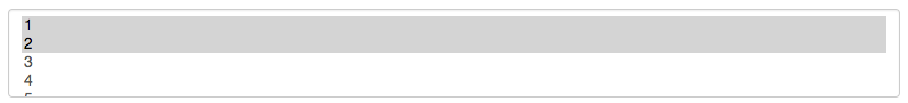
- selectタグの"multiple"を追記
qiita.rb
<select multiple class="form-control">
  <option>1</option>
  <option>2</option>
  <option>3</option>
  <option>4</option>
  <option>5</option>
</select>
状態
フォーカス

- inputタグにid="focusedInput"を指定
qiita.rb
<input class="form-control" type="text" id="focusedInput">
使用禁止
- inputタグにdisabledを指定
qiita.rb
<input class="form-control" type="text" disabled>
読み専用

- inputタグにreadonlyを指定
qiita.rb
<input class="form-control" type="text" readonly>
ヘルプテキスト
入力エリア
ここにヘルプテキストを記載
- 入力エリアの補足文を付ける場合はヘルプテキストを利用
- ヘルプテキストにしたい文章に"help-block"のクラスを付与
qiita.rb
<span class="help-block">ここにヘルプテキストを記載</span>
カラー
- 色を変更したいinputタグに下記のクラスで囲む
| 色 | 使用クラス |
|---|---|
| 緑 | has-success |
| 黄色 | has-warning |
| 赤 | has-error |
qiita.rb
<div class="form-group has-success">
  <input type="text" class="form-control">
</div>
<div class="form-group has-warning">
  <input type="text" class="form-control">
</div>
<div class="form-group has-error">
  <input type="text" class="form-control">
</div>
アイコンをつけることも可能
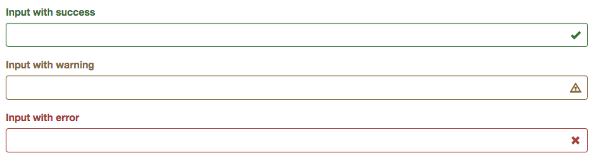
- アイコンをつけたいinputタグを囲んでいるタグに"has-feedback"を指定
- 利用したいアイコンにクラス"form-control-feedback"を指定
qiita.rb
<div class="form-group has-success has-feedback">
  <input type="text" class="form-control">
  <span class="glyphicon glyphicon-ok form-control-feedback"></span>
</div>
<div class="form-group has-warning has-feedback">
  <input type="text" class="form-control">
  <span class="glyphicon glyphicon-warning-sign form-control-feedback"></span>
</div>
<div class="form-group has-error has-feedback">
  <input type="text" class="form-control">
  <span class="glyphicon glyphicon-remove form-control-feedback"></span>
</div>
サイズ
- サイズを変更したいinputタグに下記のクラスを付与
| サイズ | 使用クラス |
|---|---|
| 大 | input-lg |
| 中 | 何も付与しない |
| 小 | input-sm |
qiita.rb
<input class="form-control input-lg" type="text">
<input class="form-control" type="text">
<input class="form-control input-sm" type="text">