2次元のデータを、pythonのmatplotlibを用いて一瞬で図に起こす
に続く、「pythonのmatplotlibを用いて一瞬で図示する」シリーズ第二弾。
とにかく手軽に下図のような1次元時系列データで卓越している周期を求めたいと思っている人へ。
pythonを用いて、
- スペクトル解析の計算の実行
- 計算結果の図示
を一括で行う。
1. コード
予め、以下のようなクラスを設定しておく。
spectra.py
# coding:utf-8

from scipy import fftpack
import numpy as np
import matplotlib.pyplot as plt


class Spectra(object):
    def __init__(self, t, f, time_unit):
        """
         - t : 時間軸の値
         - f : データの値
         - time_unit : 時間軸の単位
         - Po : パワースペクトル密度
        """
        assert t.size == f.size  # 時間軸の長さとデータの長さが同じであることを確認する
        assert np.unique(np.diff(t)).size == 1  # 時間間隔が全て一定であることを確認する
        self.time_unit = time_unit   # 時間の単位
        T = (t[1] - t[0]) * t.size
        self.period = 1.0 / (np.arange(t.size / 2)[1:] / T)

        # パワースペクトル密度を計算
        f = f - np.average(f)         # 平均をゼロに。
        F = fftpack.fft(f)                          # 高速フーリエ変換
        self.Po = np.abs(F[1:(t.size // 2)]) ** 2 / T

    def draw_with_time(self, fsizex=8, fsizey=6, print_flg=True, threshold=1.0):
        # 横軸に時間をとってパワースペクトル密度をプロット
        fig, ax = plt.subplots(figsize=(fsizex, fsizey))   # 図のサイズの指定
        ax.set_yscale('log')
        ax.set_xscale('log')
        ax.set_xlabel(self.time_unit)
        ax.set_ylabel("Power Spectrum Density")
        ax.plot(self.period, self.Po)
        if print_flg:   # パワースペクトル密度の値がthresholdより大きい部分に線を引き、周期の値を記述する
            dominant_periods = self.period[self.Po > threshold]
            print(dominant_periods, self.time_unit +
                  ' components are dominant!')
            for dominant_period in dominant_periods:
                plt.axvline(x=dominant_period, linewidth=0.5, color='k')
                ax.text(dominant_period, threshold,
                        str(round(dominant_period, 3)))

        return plt
見ての通り、scipyのfft関数を用いて時系列にFFT(離散フーリエ変換)を行い、パワースペクトル密度を計算している。
このパワースペクトル密度が周囲に比べて大きな値を示している箇所の周期が、その時系列の中で卓越している周期である。
2. 検証
時系列データを自作して上記コードの検証に用いる。
# coding:utf-8
import numpy as np
import matplotlib.pyplot as plt
from spectra import Spectra
# 時系列データの作成
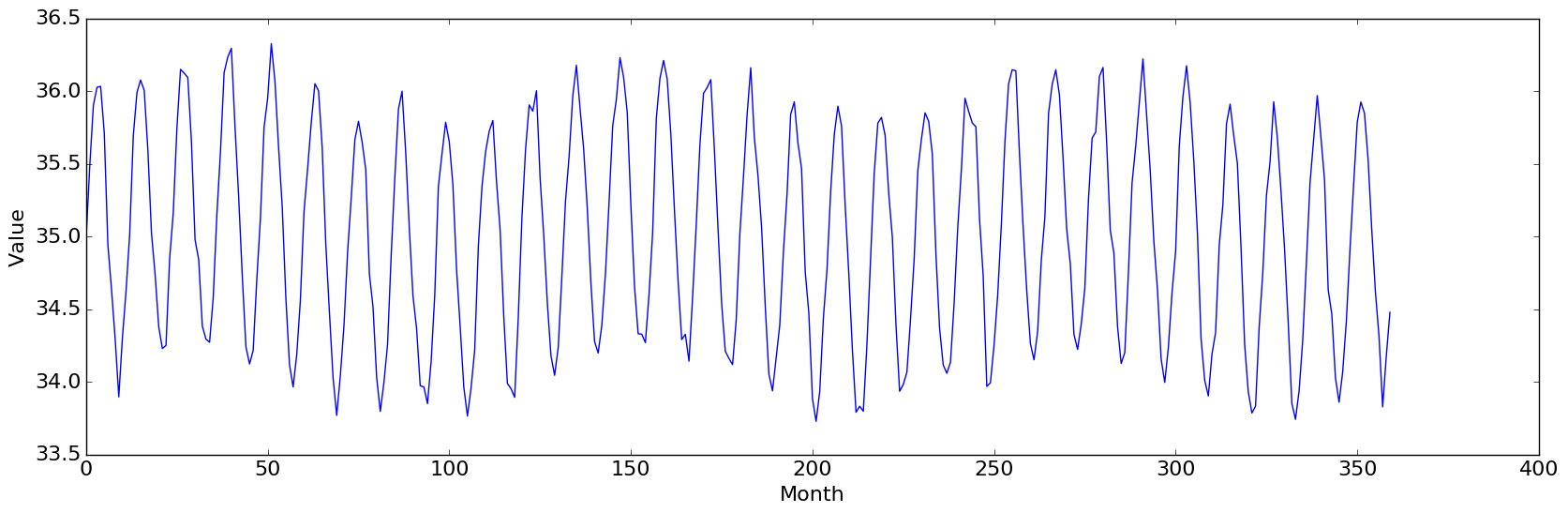
# Monthlyデータ30年分(すなわちデータ数は360個)
# 大きな1年(=12ヶ月)周期に加えて緩やかな10年(=120ヶ月)周期、更に各時刻に微小なノイズ
N = 360
t = np.arange(0, N)
td = t * np.pi / 6.0
f = np.sin(td) + 35.0 + 0.2 * np.sin(td * 0.1) + np.random.randn(N) * 0.1
# 元の時系列の描画
plt.figure(figsize=(20, 6))
plt.plot(t, f)
plt.xlim(0, N)
plt.xlabel('Month')
plt.show()
# 卓越している周期の描画
spectra = Spectra(t, f, 'Month')
plt = spectra.draw_with_time()
plt.show()
3. 結果
元の時系列データの図は、この投稿の一番上の図のようになった。
そして、卓越する周期に関する図は、以下の通りに。
[ 120. 12.] Month components are dominant!
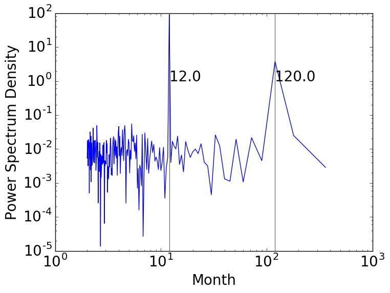
この通り、卓越する周期である
- 12ヶ月
- 120ヶ月
を見事抽出してくれた。
なお、もし元の時系列データの両端の値が大きく異なる場合には、予め窓関数を施すなどしてスペクトル解析をするにふさわしい形にデータを加工しておく。
参考文献