背景
- 2軸のggplotを使って2値分類器の説明変数の分布を可視化する(カテゴリ変数) の続編
- モデルを作成する際、説明変数の分布を確認するかと思う。
- 分布の確認の方法ついて、あまり記事を見かけないので私の実施している方法をまとめる。
確認対象
| 目的変数 | 説明変数 |
|---|---|
| 2値 | 連続変数 |
サンプルデータ
MASSからデータ取得取得「低体重出生とそのリスク因子の関連」
library(MASS)
df <- birthwt
df <- within(df, {
  low <- factor(low, labels=c("No", "Yes"))
  lwt <- lwt * 0.454
  race <- factor(race, labels=c("White","Black","Other"))
  smoke <- factor(smoke, labels=c("No","Yes"))
  ptl <- factor(ptl)
  ht <- factor(ht, labels=c("No","Yes"))
  ui <- factor(ui, labels=c("No","Yes"))
  ftv <- factor(ftv)
})
確認内容
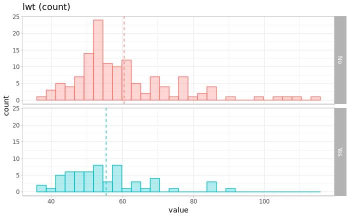
- 目的変数ごとにヒストグラムを描く
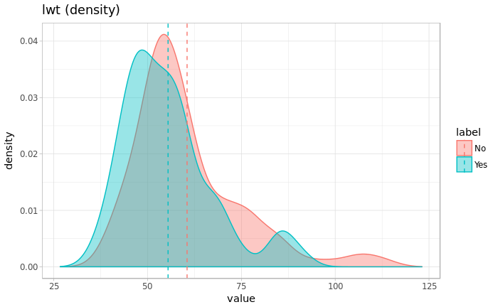
- 目的変数ごとに確率密度曲線を描く
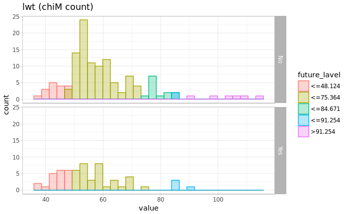
- 連続変数を離散化した結果()を目的変数ごとにヒストグラムを描く
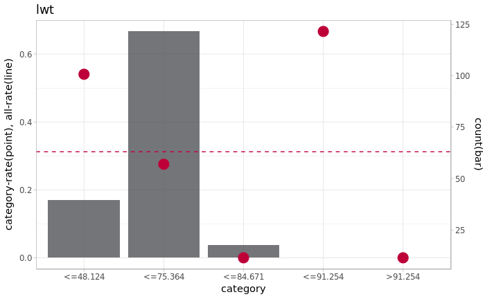
- 手法:カイマージ(Chi-merge) - 離散化した結果を用いて、カテゴリ変数を可視化する(前回の方法)
- 離散化した結果を戻り値として取得
library(ggplot2)
library(dplyr)
library(discretization)

binary_classification_plot_integer <- function(label, future, name){
  # make df
  df_marge <- data.frame(future=future,label=factor(label))
  df_marge_mean <-
    df_marge %>%
    group_by(label) %>%
    summarise(mean=mean(future)) %>%
    as.data.frame

  # plot
  p <- ggplot(data=df_marge, aes(x=future, fill=label))
  p <- p + geom_histogram(aes(colour=label),position="identity", alpha=0.3, bins=30)
  p <- p + theme_light() + xlab("value") + ylab("count") + labs(title=paste0(name," (count)"))
  p <- p + theme(legend.position="none")
  p <- p + geom_vline(data=df_marge_mean, aes(xintercept=mean, color=label),linetype="dashed")
  p <- p + facet_grid(label~.)
  plot(p)

  dens <- density(df_marge$future)
  p <- ggplot(data=df_marge, aes(x=future, y=..density.., fill=label))
  p <- p + geom_density(aes(colour=label), alpha =0.4)
  p <- p + theme_light() + xlab("value") + ylab("density") + labs(title=paste0(name," (density)"))
  p <- p + geom_vline(data=df_marge_mean, aes(xintercept=mean, color=label),linetype="dashed")
  p <- p + xlim(range(dens$x))
  plot(p)

  # カイマージ
  chiM <- chiM(df_marge, alpha=0.05)
  df_chiM <- cbind(df_marge, future_class=chiM$Disc.data[,"future"])

  # カイマージデータ
  chiM_max <- max(df_chiM$future_class)
  chiM_label <- c(paste0("<=",chiM$cutp[[1]]),paste0(">",chiM$cutp[[1]][chiM_max-1]))
  chiM_master <- data.frame(future_class=c(1:chiM_max),future_lavel=chiM_label)
  df_chiM_join <- inner_join(df_chiM, chiM_master ,by="future_class")

  # カイマージの閾値を可視化
  p <- ggplot(data=df_chiM_join, aes(x=future, fill=future_lavel))
  p <- p + geom_histogram(aes(colour=future_lavel),position="identity", alpha=0.3, bins=30)
  p <- p + theme_light() + xlab("value") + ylab("count") + labs(title=paste0(name," (chiM count)"))
  p <- p + facet_grid(label~.)
  plot(p)

  # カイマージのカテゴリの分布を可視化
  binary_classification_plot_factor(df_chiM_join[,"label"], df_chiM_join[,"future_lavel"], name)

  return(df_chiM_join)
  }
出力サンプル
グラフ
df_int_to_cate <- binary_classification_plot_integer(df[,"low"], df[,"lwt"], "lwt")
出力データ
head(df_int_to_cate)
| future | label | future_class | future_lavel |
|---|---|---|---|
| 82.628 | No | 3 | <=84.671 |
| 70.37 | No | 2 | <=75.364 |
| 47.67 | No | 1 | <=48.124 |
| 49.032 | No | 2 | <=75.364 |
| 48.578 | No | 2 | <=75.364 |
| 56.296 | No | 2 | <=75.364 |