emotionがアツいとのことで、触ってみたい感はすごくあるのですが
ここではStyled Components v4が結構便利なので紹介させていただきたいと思います。
すごく早くて軽くなった
- 16.1kBから15kB未満に
- マウント時に約25%の高速化
- 再レンダリング時に約7.5%の高速化
createGlobalStyle
injectGlobalに代わってcreateGlobalStyleというAPIができました。
通常、styled componentsは自動的にローカルスコープになるため、他のコンポーネントから分離されます。
そこがいいところなのですが、bodyの値とかを一括で変えたいときに困ります。
bodyとかのスタイリングをしたいときにとても便利です。
もともとinjectGlobalというものがありましたが、動的なアップデートやホットリロードが出来なかったり、コンポーネントとして利用できなかったりでした。
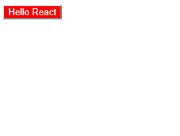
import React from 'react';
import styled , { createGlobalStyle } from 'styled-components';

const GlobalStyle = createGlobalStyle`
  body {
    color: ${props => (props.whiteColor ? 'white' : 'black')};
    background: #333;
  }
`
export default () => <React.Fragment>
  <GlobalStyle whiteColor/>
  Hello React
</React.Fragment>

"as" prop
styleがあてられたコンポーネントを別のタグで利用したい場合に使います。
.withComponentの代わりとなる機能です。
import React from 'react';
import styled from 'styled-components';

const GrayArea = styled.div`
  background: #333;
  color:white;
`
export default () => <React.Fragment>
  <GrayArea as='button' onClick={() => alert('It works!')}>
    Hello React
  </GrayArea>
</React.Fragment>
GrayAreaはdivとして作られているが、as='button'を使うことでbuttonとして利用できます。

.extendの廃止
コンポーネントを拡張する場合には、Comp.extendに代わりstyled(Comp)と記述するように統一されました。
import React from 'react';
import styled from 'styled-components';

const Button = styled.button`
  background: #333;
  color: white;
`

const RedButton = styled(Button)`
  background: red;
`

export default () => <React.Fragment>
  <RedButton  onClick={() => alert('It works!')}>
    Hello React
  </RedButton>
</React.Fragment>
Strict Modeへの完全対応
Strict Modeに準拠する形になっています。
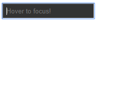
refのネイティブサポート
innerRefが廃止されたことによる対応です。
import React from 'react';
import styled from 'styled-components';

const Input = styled.input`
  padding: 0.5em;
  background: #333;
  color: white;
`

export default class Form extends React.Component {
  constructor(props) {
    super(props);
    this.inputRef = React.createRef();
  }

  render() {
    return (
      <Input
        ref={this.inputRef}
        placeholder="Hover to focus!"
        onMouseEnter={() => {
          this.inputRef.current.focus()
        }}
      />
    );
  }
}
css prop
いちいちコンポーネントを作るのが面倒な場合に、以下のように書けるようになりました。
babel pluginが必要で、実際には下のように変換されます。
<div
  css={`
    background: papayawhip;
    color: ${props => props.theme.colors.text};
  `}
/>
<Button
  css="padding: 0.5em 1em;"
/>
const StyledDiv = styled.div`
  background: papayawhip;
  color: ${props => props.theme.colors.text};
`

const StyledButton = styled(Button)`
  padding: 0.5em 1em;
`

<StyledDiv />
<StyledButton />
Theme Consumer
Context APIのConsumerコンポーネント。
ThemeProviderにて注入された状態を利用したConsumerが作成できるようになりました。
import React from 'react';
import styled, { ThemeProvider , ThemeConsumer} from 'styled-components';

const Child = () => <div>
  <ThemeConsumer>
    {theme => <div>The theme color is {theme.color}.</div>}
  </ThemeConsumer>
</div>

export default () => <ThemeProvider theme={{ color: 'black' }}>
  <Child/>
</ThemeProvider>

移行について
以前のバージョンを利用している場合、codemodsを利用して変換を行うことができます。
グローバルインストールして
npm install -g styled-components-codemods
コマンドを叩く
styled-components-codemods v4 src/**/*.js
Comp.extendとinjectGlobalが状況に応じて置換されます。