どうも7noteです。疑似要素を巧みに操り、様々なアイコン等を作るアイデア集です。
疑似要素を使えば画像やsvgを使わなくても綺麗なアイコンが作れる!
いろいろな場面で使える疑似要素のbeforeとafterの組み合わせ方をいくつか紹介します。
共通部分
index.html
<!-- サンプル基本形 -->
<a href="###" class="icon00">ボタン</a>
style.css
a {
  /* aタグの装飾を無効化 */
  color: #000;
  text-decoration: none;

  /* 装飾 + position指定 */
  border: 1px solid #000;
  padding: 5px 50px 5px 10px;
  position: relative;
}
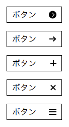
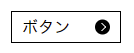
アイコン①: 「●」 + 「>」 =
.icon01::before {
  content: "";
  width: 15px;
  height: 15px;
  background: #000;
  display: inline-block;
  border-radius: 50%;
  position: absolute;
  top: 50%;
  right: 10px;
  transform: translateY(-50%);
}

.icon01::after {
  content: '';
  width: 5px;
  height: 5px;
  border-left: solid 1px #fff;
  border-top: solid 1px #fff;
  position: absolute;
  top: 50%;
  right: 15px;
  transform: translateY(-50%) rotate(135deg);
}
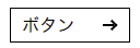
アイコン②:「-」 + 「>」 =
.icon02::before {
  content: "";
  width: 10px;
  height: 2px;
  background: #000;
  display: inline-block;
  position: absolute;
  top: 50%;
  right: 14px;
  transform: translateY(-50%);
}

.icon02::after {
  content: '';
  width: 5px;
  height: 5px;
  border-left: solid 2px #000;
  border-top: solid 2px #000;
  position: absolute;
  top: 50%;
  right: 12px;
  transform: translateY(-50%) rotate(135deg);
}
アイコン③:「-」 + 「|」 =

.icon03::before {
  content: "";
  width: 12px;
  height: 2px;
  background: #000;
  display: inline-block;
  position: absolute;
  top: 50%;
  right: 10px;
  transform: translateY(-50%);
}

.icon03::after {
  content: '';
  width: 2px;
  height: 12px;
  background: #000;
  display: inline-block;
  position: absolute;
  top: 50%;
  right: 15px;
  transform: translateY(-50%);
}
アイコン④:「/」 + 「\」 =

.icon04::before {
  content: "";
  width: 13px;
  height: 2px;
  background: #000;
  display: inline-block;
  position: absolute;
  top: 50%;
  right: 10px;
  transform: translateY(-50%) rotate(45deg);
}

.icon04::after {
  content: '';
  width: 13px;
  height: 2px;
  background: #000;
  display: inline-block;
  position: absolute;
  top: 50%;
  right: 10px;
  z-index: 2;
  transform: translateY(-50%) rotate(-45deg);
}
アイコン⑤:「-」 + 「-」 + 「-」 =
※spanも使い、「span自身」、「before」、「after」で3つです。

index.html
<a href="###" class="icon05">ボタン<span></span></a>
.icon05 span {
  width: 15px;
  height: 2px;
  background: #000;
  display: inline-block;
  position: absolute;
  top: 50%;
  right: 10px;
  transform: translateY(-50%);
}

.icon05 span::before {
  content: "";
  width: 15px;
  height: 2px;
  background: #000;
  display: inline-block;
  position: absolute;
  top: -5px;
  left: 0;
}

.icon05 span::after {
  content: '';
  width: 15px;
  height: 2px;
  background: #000;
  display: inline-block;
  position: absolute;
  bottom: -5px;
  left: 0;
}
まとめ
あくまで疑似要素なので、このアイコン自身をクリックした時にリンクで飛ばすとかはできないので、リンクさせたいなら必ず別でaタグを用意してコーディングをする必要があります。
またbeforeとafterならafterの方が前面にくるので、疑似要素を重ねるようなアイコンを作る時は前面に来る方をafterに指定します。
アイデア次第ではほかにもいろいろなアイコンの作成ができますので好きなアイコン作ってみてください。
このページに記述しているソースはわかりやすくするため、beforeとafterを完全に分けていますが・・・↓
.icon::before,
.icon::after {
  content: "";
  /* ~~ 以下略 ~~ */
}
こんな感じに同じプロパティであれば、まとめて書いてもOKです。
おそまつ!
~ Qiitaで毎日投稿中!! ~
【初心者向け】WEB制作のちょいテク詰め合わせ