.container の幅を width:100% にして、background:url(bg.jpg) top center no-repeat のように背景画像を指定します。
<!doctype html>
<html>
<head>
<meta charset="utf-8">
<meta name="viewport" content="width=device-width">
<title>CSS</title>
<style type="text/css">
body { margin:0; padding:0; }
.container {
	width:100%;
	height:1278px;
	background:url(bg.jpg) top center no-repeat;
}
.inner {
	width:960px;
	background:yellow;
	margin:0 auto;
}
</style>
</head>
<body>
<div class="container">
	<div class="inner">ここは、inner エリアです。</div>
</div>
</body>
</html>
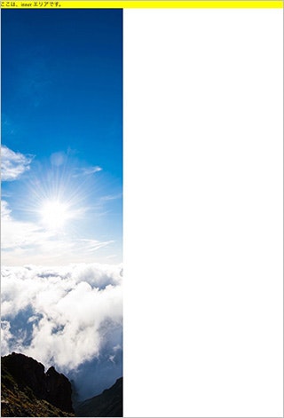
PCでは問題なく、背景画像が表示されます。

スマホだと背景が途中で切れて(ずれて)表示されます。
min-width を指定すれば解決します。
<!doctype html>
<html>
<head>
<meta charset="utf-8">
<meta name="viewport" content="width=device-width">
<title>CSS</title>
<style type="text/css">
body { margin:0; padding:0; }
.container {
	width:100%;
+	min-width:960px;
	height:1278px;
	background:url(bg.jpg) top center no-repeat;
}
.inner {
	width:960px;
	background:yellow;
	margin:0 auto;
}
</style>
</head>
<body>
<div class="container">
	<div class="inner">ここは、inner エリアです。</div>
</div>
</body>
</html>