2
0

Delete article

Deleted articles cannot be recovered.

Draft of this article would be also deleted.

Are you sure you want to delete this article?

More than 1 year has passed since last update.

散布図/散布図行列を表示する(SPSS Modeler データ加工逆引き10-7)

Last updated at Posted at 2022-11-24

散布図/散布図行列を表示する(新グラフ)

スクリーンショット 2022-11-15 11.20.15.png

1.想定される利用目的

・データの分布の確認
・ばらつきのあるグループの比較

2.サンプルストリームのダウンロード

3.サンプルストリームの説明

スクリーンショット 2022-11-15 11.22.34.png

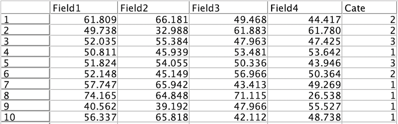
入力するデータを確認するため[テーブル]を実行します。
スクリーンショット 2022-11-15 11.23.35.png

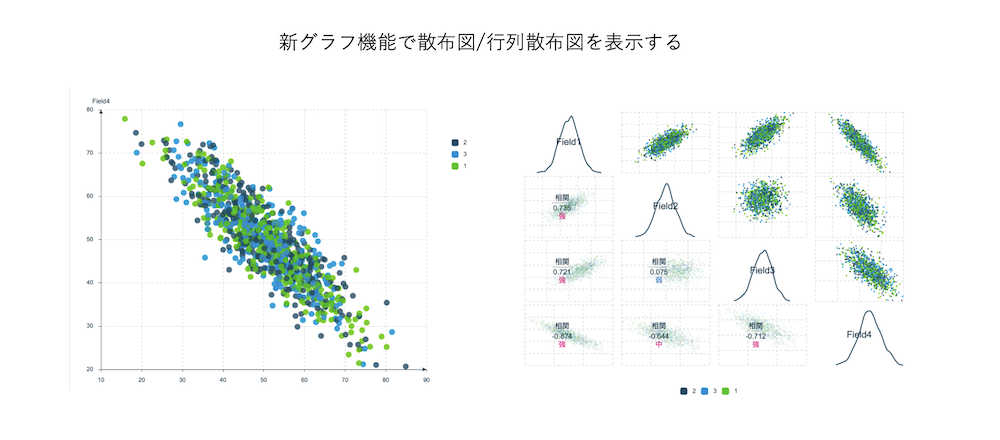
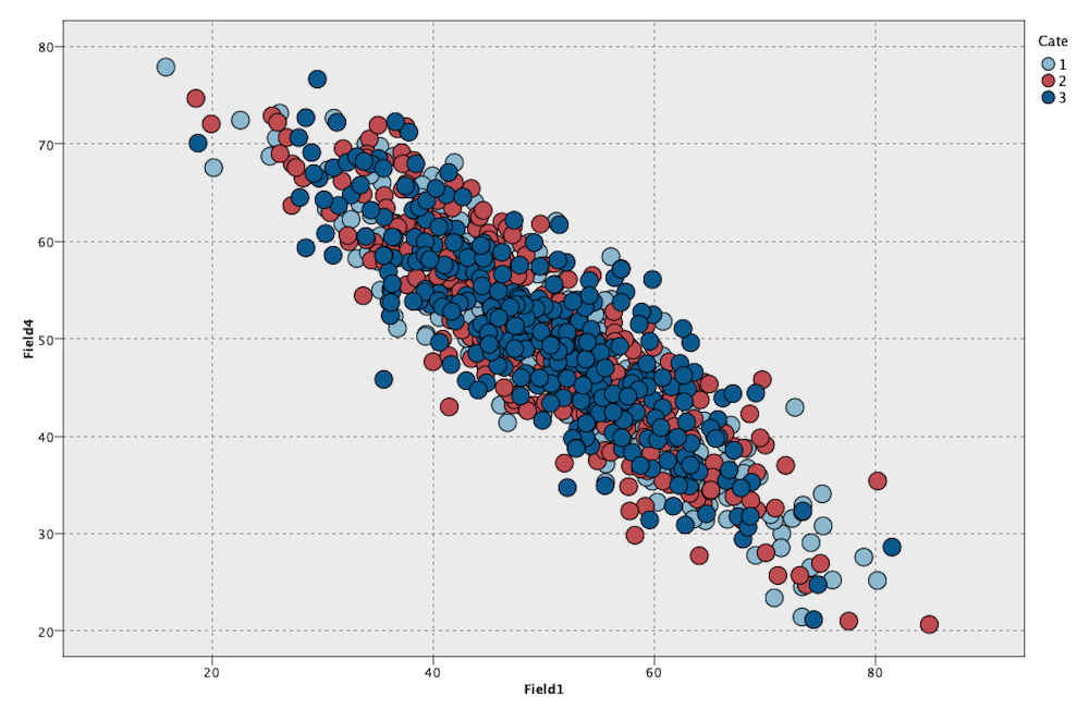
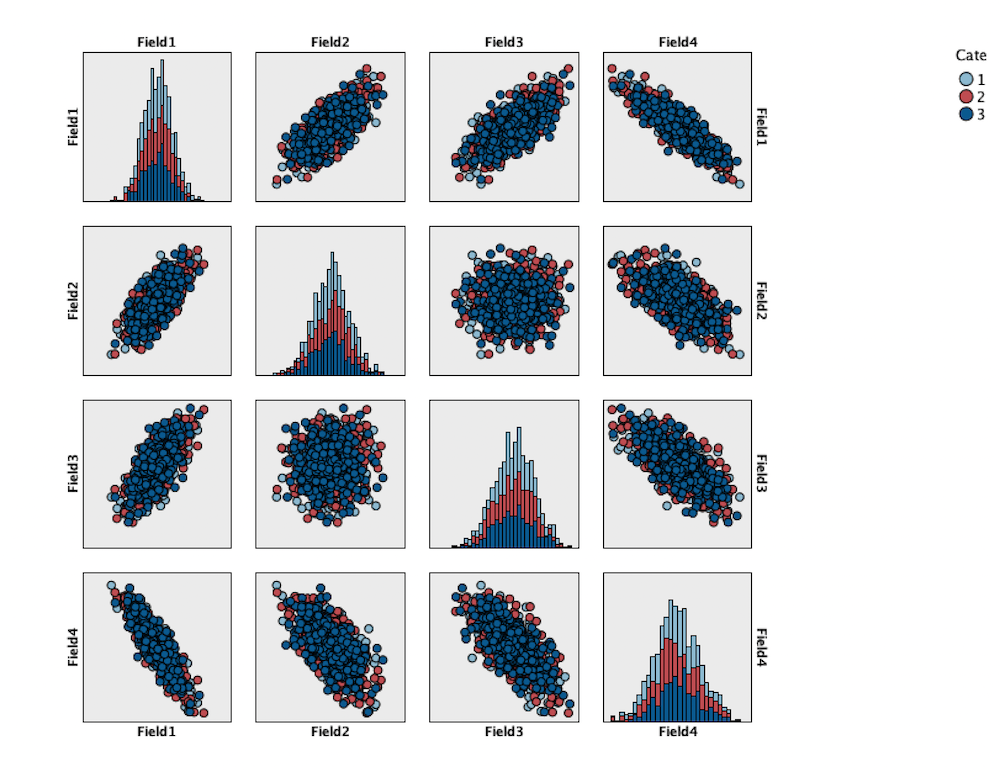
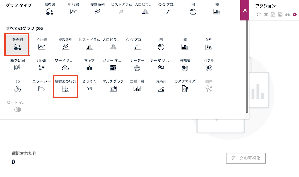
[散布図]ノードで従来の散布図を[グラフボード]ノードで従来の散布図行列を表示します。

スクリーンショット 2022-11-15 11.24.06.png

スクリーンショット 2022-11-15 11.24.47.png

[シミュレーション生成]ノードを右クリックして[データの表示]を選択します。
スクリーンショット 2022-11-11 14.15.57.png

散布図と散布図行列をそれぞれ選択します。
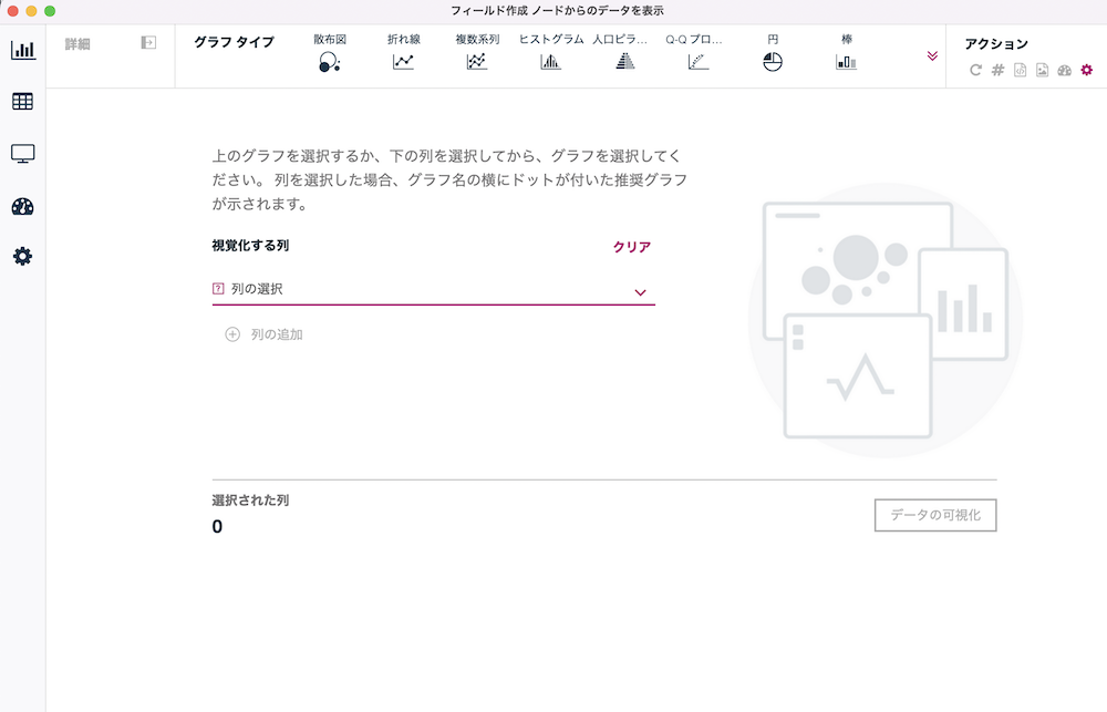
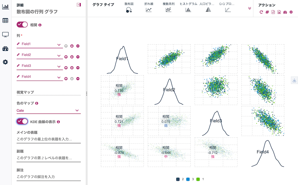
スクリーンショット 2022-11-15 11.12.01.png

以下の画面左の設定に従いセットします。

スクリーンショット 2022-11-15 11.17.14.png

*画面下のスライダーで表示領域を、画面右の判例のオン・オフで表示を切り替えられます。

スクリーンショット 2022-11-15 11.18.45.png

注意事項

新グラフ機能はバージョン18.1以降で装備されました。

4.参考情報

散布図を説明した記事

新グラフを解説した記事

SPSS Modeler ノードリファレンス目次

SPSS Modeler 逆引きストリーム集(データ加工)

2
0
0

Register as a new user and use Qiita more conveniently

  1. You get articles that match your needs
  2. You can efficiently read back useful information
  3. You can use dark theme
What you can do with signing up
2
0

Delete article

Deleted articles cannot be recovered.

Draft of this article would be also deleted.

Are you sure you want to delete this article?