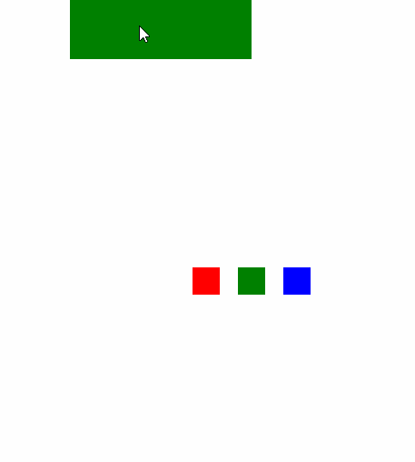
cssのアニメーションを使ったことがなかったので,使ってみました.
(シンプルなものだと意外と簡単だった!!凝りだすとはまりそうだけど...)
上の緑の四角にマウスオーバー⇒赤緑青の四角が動くようにしてあります.
(他の要素をcssのみで動かすっていうがと意外に難しかった)
sample.html
<!DOCTYPE html>
<html>

<head>
    <link rel="stylesheet" href="./sample.css">
</head>

<body>
    <div class="test1"></div>
    <div class="test"></div>
</body>

</html>
sample.css
.test {
    width: 30px;
    height: 30px;
    margin: 0 auto;
    margin-top: 400px;
    box-shadow: 50px 0px red, 100px 0px green, 150px 0px blue;
}

.test1 {
    width: 200px;
    height: 76px;
    margin: 0 auto;
    background-color: green;
}

.test1:hover+.test {
    animation: ue 1s forwards, shita 1s 1s forwards;
    animation-timing-function: ease-out;
}

@keyframes ue {
    from {
        margin-top: 400px;
    }
    to {
        margin-top: 100px;
    }
}

@keyframes shita {
    from {
        margin-top: 100px;
    }
    to {
        margin-top: 400px;
    }
}