はじめに
n番煎じです。
オシャレなTabBarを作るために調べたのが始まりです。
コード全文
サンプルコード
import SwiftUI

struct HomeView: View {
    var body: some View {
        Text("HomeView")
    }
}
struct FavoriteView: View {
    var body: some View {
        Text("FavoriteView")
    }
}
struct NewsView: View {
    var body: some View {
        Text("NewsView")
    }
}
struct ProfileView: View {
    var body: some View {
        Text("ProfileView")
    }
}

struct ContentView: View {
    @State var selectedIndex = 0

    var body: some View {
        ZStack(alignment: .bottom) {
            TabView(selection: $selectedIndex) {
                HomeView()
                    .tag(TabbarItem.home.rawValue)
                FavoriteView()
                    .tag(TabbarItem.favorite.rawValue)
                NewsView()
                    .tag(TabbarItem.news.rawValue)
                ProfileView()
                    .tag(TabbarItem.profile.rawValue)
            }
            .frame(width: CGFloat((80 * (TabbarItem.allCases.count - 1)) + 120))
            .padding(.vertical, 26)

            ZStack {
                HStack {
                    ForEach(TabbarItem.allCases, id: \.self) { item in
                        Button {
                            selectedIndex = item.rawValue
                        } label: {
                            tabItemView(
                                tabbarItem: item,
                                isActive: selectedIndex == item.rawValue
                            )
                        }
                    }
                }
                .padding(6)
            }
            .frame(height: 70)
            .background(.blue.opacity(0.2))
            .cornerRadius(15)
            .padding(.vertical, 26)
        }
    }
}

extension ContentView {
    func tabItemView(tabbarItem: TabbarItem, isActive: Bool) -> some View {
        VStack {
            Spacer()
            Image(systemName: tabbarItem.iconName)
                .resizable()
                .renderingMode(.template)
                .foregroundColor(isActive ? .black : .gray)
                .frame(width: 20, height: 20)

            if let title = tabbarItem.title {
                Text(title)
                    .lineLimit(1)
                    .font(.system(size: 14))
                    .foregroundColor(isActive ? .black : .gray)
            }

            Spacer()
        }
        .frame(width: isActive ? 120 : 80, height: 60)
        .background(isActive ? .blue.opacity(0.4) : .clear)
        .cornerRadius(10)
    }
}

enum TabbarItem: Int, CaseIterable {
    case home
    case favorite
    case news
    case profile

    var title: String? {
        switch self {
        case .home:
            return "Home"
        case .favorite:
            return "Favorite"
        case .news:
            return "News"
        case .profile:
            return "Profile"
        }
    }

    var iconName: String {
        switch self {
        case .home:
            return "house"
        case .favorite:
            return "heart"
        case .news:
            return "newspaper"
        case .profile:
            return "person.crop.circle"
        }
    }
}
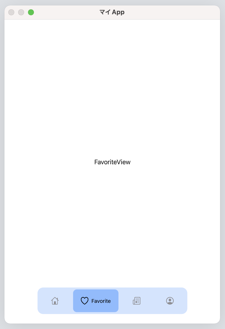
スクリーンショット
Playgroundで確認

ざっくり解説
タブバーで選択させるViewを用意します。
struct HomeView: View {
    var body: some View {
        Text("HomeView")
    }
}
struct FavoriteView: View {
    var body: some View {
        Text("FavoriteView")
    }
}
struct NewsView: View {
    var body: some View {
        Text("NewsView")
    }
}
struct ProfileView: View {
    var body: some View {
        Text("ProfileView")
    }
}
TabBarに表示させたい項目をまとめたenumです。
項目数を増減させたいときにここをを変更するだけで済ませたいのでenumにしてCaseIterableを継承させます。
caseに対応するViewを返すようにしても良いかもしれないです。
enum TabbarItem: Int, CaseIterable {
    case home
    case favorite
    case news
    case profile

    var title: String? {
        switch self {
        case .home:
            return "Home"
        case .favorite:
            return "Favorite"
        case .news:
            return "News"
        case .profile:
            return "Profile"
        }
    }

    var iconName: String {
        switch self {
        case .home:
            return "house"
        case .favorite:
            return "heart"
        case .news:
            return "newspaper"
        case .profile:
            return "person.crop.circle"
        }
    }
}
今回のメイン部分です。
TabViewを用意、HStack内でForEachを使用してButtonを並べます。
そしてそれらをZStackに入れるようにします。
今回はButtonを使用していますが、独自Viewに.onTapGestureで同様のことができます。
個人的には長押しでハイライトされた方が分かりやすいと思うのでButtonのlabel:で独自Viewを渡す方が好きです。
.frame(width: CGFloat((80 * (TabbarItem.allCases.count - 1)) + 120))はTabViewの幅を調整しています。
今回みたいに画面端に余白がある場合TabViewの幅を調整しないと余白部分にTabViewが存在しており、TabItemをタップした判定になってしまうからです。
この辺りはやりたいUIによって変えるのが良いです。
        ZStack(alignment: .bottom) {
            TabView(selection: $selectedIndex) {
                HomeView()
                    .tag(TabbarItem.home.rawValue)
                FavoriteView()
                    .tag(TabbarItem.favorite.rawValue)
                NewsView()
                    .tag(TabbarItem.news.rawValue)
                ProfileView()
                    .tag(TabbarItem.profile.rawValue)
            }
            .frame(width: CGFloat((80 * (TabbarItem.allCases.count - 1)) + 120))
            .padding(.vertical, 26)

            ZStack {
                HStack {
                    ForEach(TabbarItem.allCases, id: \.self) { item in
                        Button {
                            selectedIndex = item.rawValue
                        } label: {
                            tabItemView(
                                tabbarItem: item,
                                isActive: selectedIndex == item.rawValue
                            )
                        }
                    }
                }
                .padding(6)
            }
            .frame(height: 70)
            .background(.blue.opacity(0.2))
            .cornerRadius(15)
            .padding(.vertical, 26)
        }
Buttonに渡してるViewです。
ここは各々好きなViewにしていいと思います。
自分はアイコン画像のみにしたり、アイコンと文字列を縦並びと横並びを変えやすいようにVStack(HStack)にImageとTextを入れてます。
Spacer()は入れないと上下(左右)がギチギチになってしまって見た目が悪くなるので入れてます。
.frame(width: isActive ? 120 : 80, height: 60)はTabItem単体のサイズを指定しています。
今回はアクティブなアイテムと非アクティブなアイテムでサイズを変えるようにしています。
    func tabItemView(tabbarItem: TabbarItem, isActive: Bool) -> some View {
        VStack {
            Spacer()
            Image(systemName: tabbarItem.iconName)
                .resizable()
                .renderingMode(.template)
                .foregroundColor(isActive ? .black : .gray)
                .frame(width: 20, height: 20)

            if let title = tabbarItem.title {
                Text(title)
                    .lineLimit(1)
                    .font(.system(size: 14))
                    .foregroundColor(isActive ? .black : .gray)
            }

            Spacer()
        }
        .frame(width: isActive ? 120 : 80, height: 60)
        .background(isActive ? .blue.opacity(0.4) : .clear)
        .cornerRadius(10)
    }
VStackをHStackに変えたり、isActiveがtrueの時だけTextを表示させる、みたいなこともできたりします。
まとめ
TabBarのUIを変える方法でした。ちょっと印象変えたい時などに使ってみると良いかもしれないです。
割と面倒かと思ってたら、比較的簡単にいじれて仕組みも単純でした。
次は長押しとかのアクションを入れてみたいです。
参考
https://medium.com/geekculture/custom-tabbar-in-swiftui-4d239410ee73
https://qiita.com/hoshi005/items/6e4b9e9ce2a77e6283d6