これからPlotlyやDashを触る初心者の方にとって、参考になれば幸いです。
自己紹介
- 20代
- ビジネスPythonを学ぶ会に参加しています
分かったこと・できたこと
- 気象庁からダウンロードしたcsv、扱いにくかった
- PlotlyとDashで簡単にデータ可視化アプリが作れた
データ
気象庁のページからcsvをダウンロードしてきました。
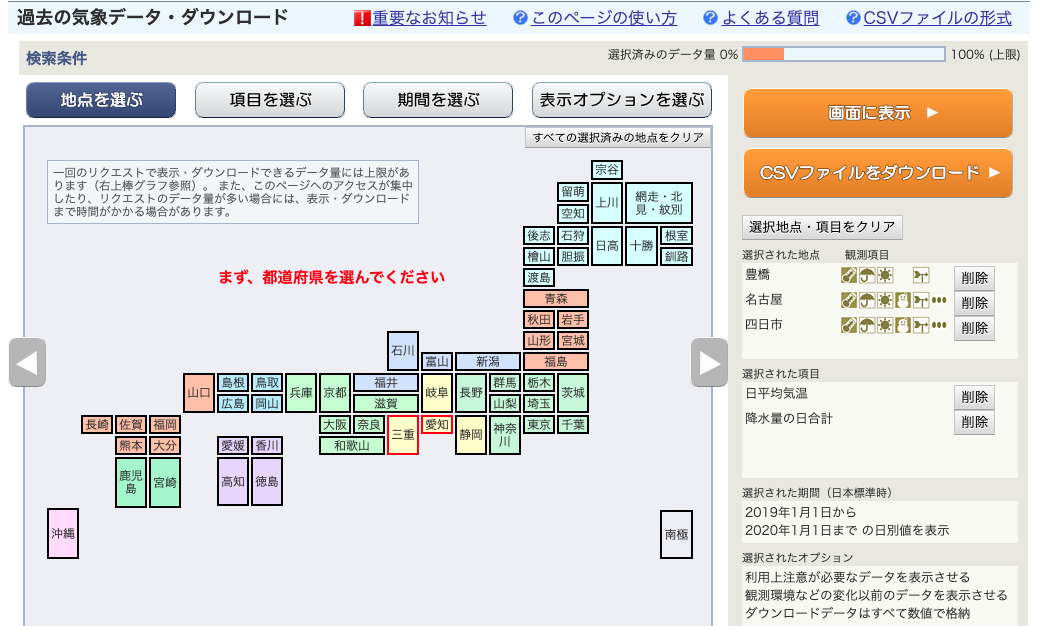
ポチポチ操作してcsvを取得
取得したcsvを手とpandasで加工しました。
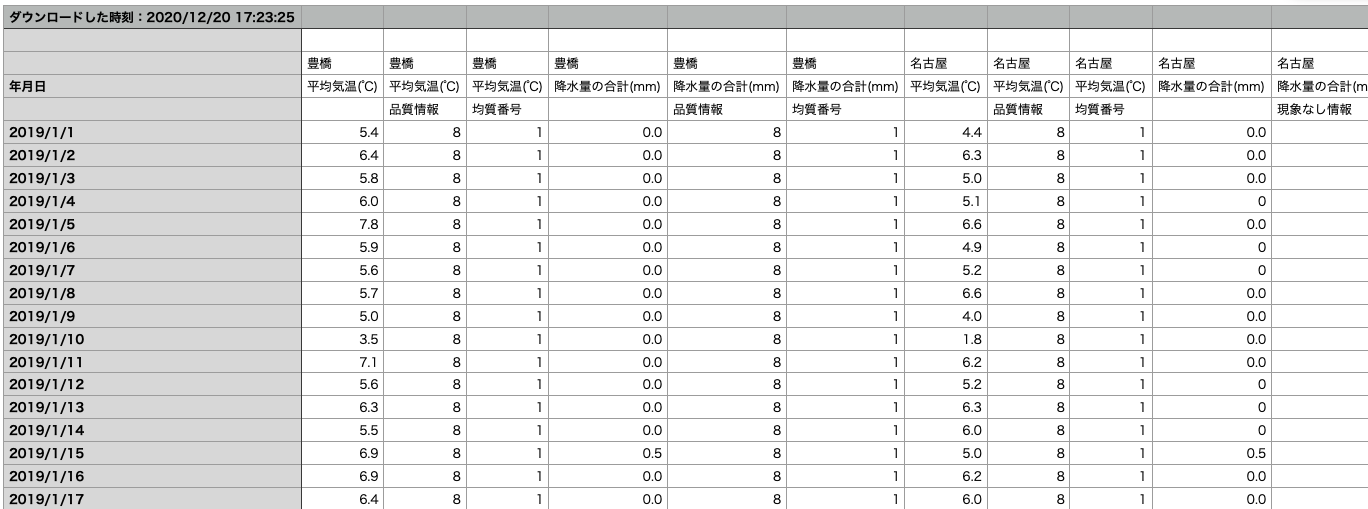
これを
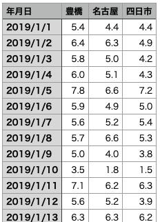
こんなかんじに
ソースコード
例の本を参考に書きました。
import dash
import dash_core_components as dcc
import dash_html_components as html
import plotly.express as px
import pandas as pd
df = pd.read_csv("./data_processed.csv", engine="python", )
df.set_index("年月日", inplace=True)
app = dash.Dash(__name__)
app.layout = html.Div(
[
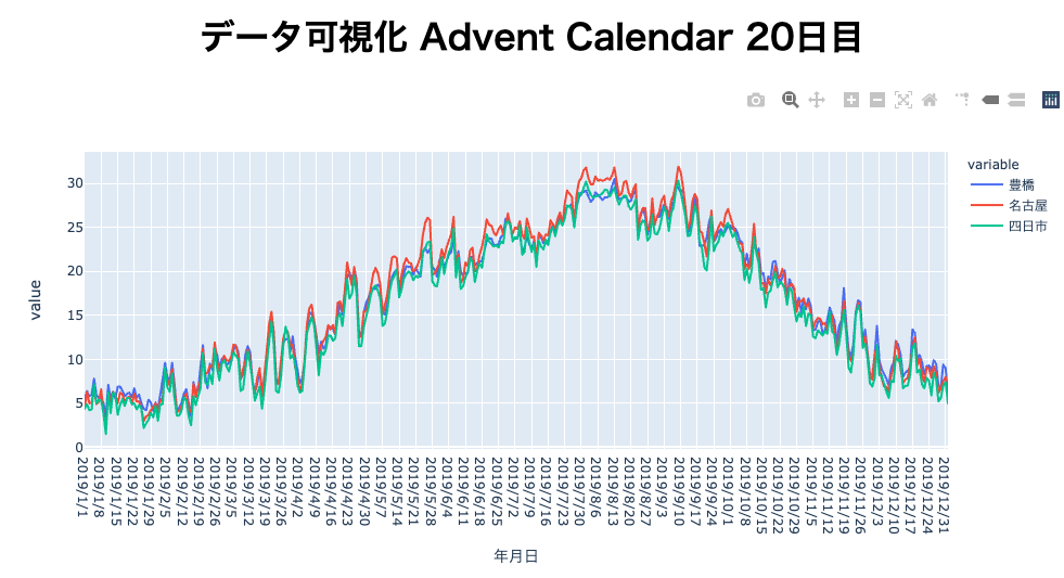
html.H1("データ可視化 Advent Calendar 20日目", style={"textAlign":"center"}),
dcc.Graph(
figure = px.line(df)
),
]
)
if __name__ == "__main__":
app.run_server(debug=True)
実行画面
まとめと反省
- 名古屋は(自分のこれまで住んだことのある土地と比較して)暑いなーという感覚は実際あってるみたい。
- 気象庁のデータもPlotlyとDashの機能もまだまだ持て余してるので今後も勉強を続けて行きたい。
- 納期ドリブン、失敗しました。すみませんでした...。