住んだことがある市町村、
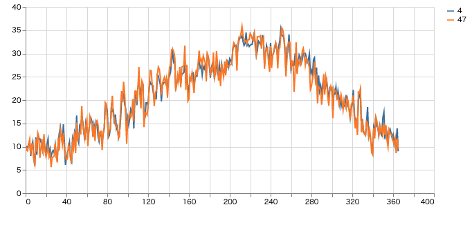
どこの気候が過ごしやすいのか知りたくて可視化してみました。
作ったもの
データ取得
https://www.data.jma.go.jp/gmd/risk/obsdl/
※取得後、数行削ってから読み込んでます。
コード
import streamlit as st
import pandas as pd

df = pd.read_csv("./data_edit.csv", encoding="utf-8", header=None)

df_T = df.T
# df.columns=df.iloc[0]

# df_T.reindex(df_T.index.drop("Unnamed: 0"))
df_T.iloc[0,0] ="市"
df_T.columns = df_T.iloc[0]
df_T = df_T.iloc[1:]

df_T = df_T.drop_duplicates(subset=["市","年月日"])

df_T = df_T[df_T["年月日"].str.startswith("最高気温")]

df_TT = df_T.T
df_TT
df_line = df_TT.iloc[2:].reset_index(drop=True).drop(columns=[25]).astype(float)
st.write(df_line)

st.line_chart(df_line))