(その3)
コイン投げ1セット=3回投げる
これは本にはなかったんだけど、単純に「1セット2回投げ」を「1セット3回投げ」にして、合計を「4枚投げ」から「6枚投げ」にしてみた。
コード
from random import randint
from decimal import Decimal
from prettytable import PrettyTable
import numpy as np

def tossBiasedCoin():
    """ Returns 0 or 1 with 0 having 2/3 chance """
    return randint(0,2) % 2

# Make a 4x4 array
counts = [[0 for j in range(4)] for i in range(4)]

# Toss a coin many times to get counts
sampleCount = 500000
for num in range(sampleCount):
    firstSet = [tossBiasedCoin(),tossBiasedCoin(),tossBiasedCoin()] # 0, 1, 2, 3
    secondSet = [tossBiasedCoin(),tossBiasedCoin(),tossBiasedCoin()]
    counts[sum(secondSet)][sum(firstSet)] += 1

# Conert all counts to perentage
TWOPLACES = Decimal(10) ** -2
for i in range(4):
    for j in range(4):
        value = counts[i][j]
        counts[i][j] = (100 * Decimal(counts[i][j])/Decimal(sampleCount)).quantize(TWOPLACES)
        print("Converted the value {} to percentage {}".format(value, counts[i][j]))

# Make summaries of number of heads.
keys = np.arange(7)
values = [counts[0][0], # 0
          counts[0][1]+counts[1][0], # 1
          counts[0][2]+counts[2][0]+counts[1][1],
          counts[0][3]+counts[1][2]+counts[2][1]+counts[3][0],
          counts[1][3]+counts[2][2]+counts[3][1],
          counts[2][3]+counts[3][2],
          counts[3][3]]

# Add row descriptions
counts[0].insert(0, '2nd set 0 head')
counts[1].insert(0, '2nd set 1 head')
counts[2].insert(0, '2nd set 2 heads')
counts[3].insert(0, '2nd set 3 heads')

# Create table with column descriptions, add rows, then show it.
table = PrettyTable(["", "1st set 0 head", "1st set 1 head", "1st set 2 heads", "1st set 3 heads"])
table.padding_width = 1
table.add_row(counts[0])
table.add_row(counts[1])
table.add_row(counts[2])
table.add_row(counts[3])
print table

# Draw a bar chart
import matplotlib.pyplot as plt
fig, ax = plt.subplots()
rects = plt.bar(keys,
                 values,
                 0.5,
                 alpha=0.4,
                 align="center",
                 color='b')

plt.xlabel('Number of heads')
plt.ylabel('Probability (%)')
plt.title('Probabilities heads with a biased coin')
plt.xticks(keys, np.arange(7))

plt.tight_layout()
plt.show()
結果
またさらに標準偏差みたいになってきた。
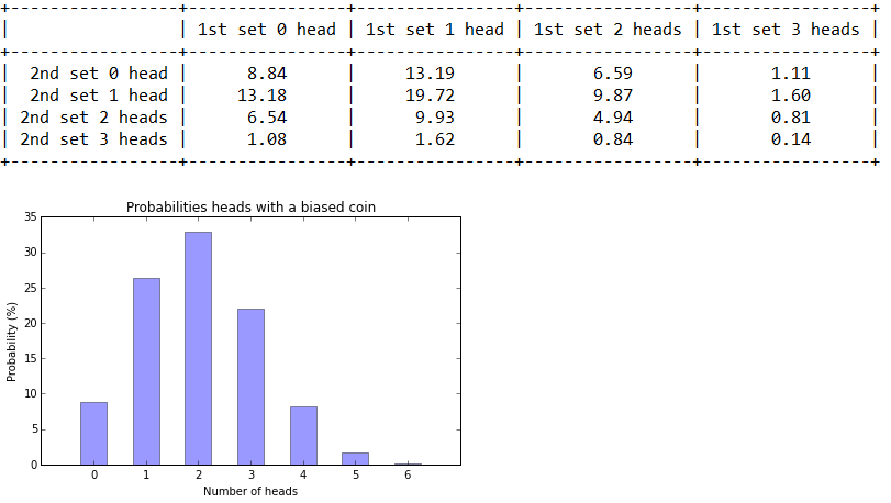
6枚投げて何枚表になるかは、「6 x 1/3」で、2になるから「2枚表になりやすい」ということ。
(その4)につづく。