(その4)
(文中に出てくるページ参照は 統計学が最強の学問である[実践編]データ分析のための思想と方法 - 西内啓 著 という本のページです。)
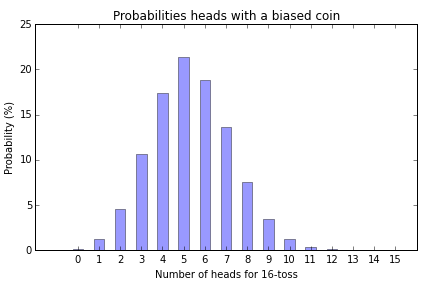
16枚のコインを投げた場合
P63で「参考までに」とある、16回コインを投げた場合の結果。
表が出る確率が1/3という、非対称なコインを投げるという場合でも「データの合計が正規分布に収束する」と著者は強調している。
なぜ「山」の形になるかだけど、一番理解しやすかったのが、2x2や3x3や8x8の表としてデータが表されている場合、右上から左下に向かって「同じ結果を出す別のパターン」がいくつも存在し、それらを足し合わせることで、対角線に近いほど合計の値が大きくなる=山の一番高いところになる、というもの。
コード
今回は棒グラフのみ作るので、表にするためのデータは準備しない。
from random import randint
from decimal import Decimal
import numpy as np

def tossBiasedCoin():
    """ Returns 0 or 1 with 0 having 2/3 chance """
    return randint(0,2) % 2

# Prepare counters
tossCount = 16
counts = [0]*tossCount

# Toss a coin many times to get counts
sampleCount = 50000
for num in range(sampleCount):
    headCount = 0
    for i in range(tossCount): # Toss the coin 16 times
        headCount += tossBiasedCoin()
    counts[headCount] += 1

# Conert all counts to perentage
TWOPLACES = Decimal(10) ** -2
for i in range(tossCount):
    value = counts[i]
    counts[i] = (100 * Decimal(counts[i])/Decimal(sampleCount)).quantize(TWOPLACES)
    print("Converted the value {} to percentage {}".format(value, counts[i]))

# Draw a bar chart
import matplotlib.pyplot as plt
fig, ax = plt.subplots()
rects = plt.bar(np.arange(tossCount),
                 counts,
                 0.5,
                 alpha=0.4,
                 align="center",
                 color='b')

plt.xlabel('Number of heads for 16-toss')
plt.ylabel('Probability (%)')
plt.title('Probabilities heads with a biased coin')
plt.xticks(np.arange(tossCount))

plt.tight_layout()
plt.show()
カウンター変数を作る
素直に、要素が16個の list を作る。
# Prepare counters
tossCount = 16
counts = [0]*tossCount
コインを投げる
16回投げて何枚表になるかを50万回実行する(こんなに回さなくてもいいんだけど)
## Toss a coin many times to get counts
sampleCount = 50000
for num in range(sampleCount):
    headCount = 0
    for i in range(tossCount): # Toss the coin 16 times
        headCount += tossBiasedCoin()
    counts[headCount] += 1
パーセントに変換する
# Conert all counts to perentage
TWOPLACES = Decimal(10) ** -2
for i in range(tossCount):
    value = counts[i]
    counts[i] = (100 * Decimal(counts[i])/Decimal(sampleCount)).quantize(TWOPLACES)
    print("Converted the value {} to percentage {}".format(value, counts[i]))
棒グラフを作る
特に特別なことはしていない。
# Draw a bar chart
import matplotlib.pyplot as plt
fig, ax = plt.subplots()
rects = plt.bar(np.arange(tossCount),
                 counts,
                 0.5,
                 alpha=0.4,
                 align="center",
                 color='b')

plt.xlabel('Number of heads for 16-toss')
plt.ylabel('Probability (%)')
plt.title('Probabilities heads with a biased coin')
plt.xticks(np.arange(tossCount))

plt.tight_layout()
plt.show()
結果
P64の図表1-21にそっくりのグラフが出来た。
まとめ
Pythonでデータの分析が出来るようになるためのコツというか、今後やらなくてはいけないなと感じること。
- Pythonとは関係ないけれど、統計・確率の根本的な復習と勉強
- Pythonのキモのひとつは シーケンス型と見た
- matplotlib をはじめとするプロットやグラフ用のライブラリに馴れる