昨日に引き続き matplotlib の機能を説明していきます。
色、マーカー、線種
import numpy as np
from pandas import *
from pylab import *
import matplotlib.pyplot as plt
from matplotlib import font_manager
from numpy.random import randn

prop = matplotlib.font_manager.FontProperties(fname="/usr/share/fonts/truetype/fonts-japanese-gothic.ttf")

r = randn(30).cumsum()

# 色、線種、マーカーを指定する
# 黒、破線、マーカーは o
plt.plot(r, color='k', linestyle='dashed', marker='o')

plt.show()
plt.savefig("image.png")
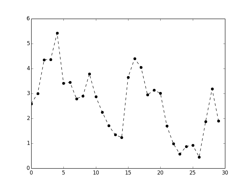
折れ線はデフォルトでは直線で結ばれます。 drawstyle オプションでこれを変更できます。
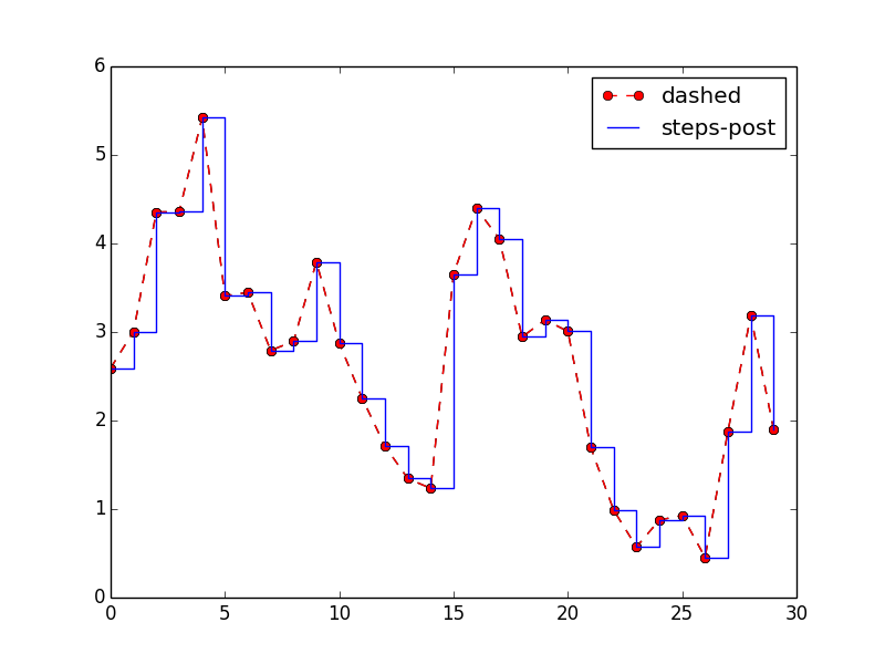
# RGB 値を明示
plt.plot(r, color='#ff0000', linestyle='dashed', marker='o', label='dashed')
# drawstyle を変更
plt.plot(r, color='#0000ff', drawstyle='steps-post', label='steps-post')
# 凡例を付ける
plt.legend(loc='best')

plt.show()
plt.savefig("image2.png")
目盛り、ラベル
plt.xlim() や plt.xticks() は引数を与えずに呼ぶと現在の値を返します。
これに値を引数で指定することでパラメーターを設定できます。
# 引数を与えずに現在値を確認する
print( plt.xlim() )
# => (0.0, 30.0)
print( plt.xticks() )
# => (array([  0.,   5.,  10.,  15.,  20.,  25.,  30.]), <a list of 7 Text xticklabel objects>)

# 新しい値を設定する
plt.xlim([0, 40])
plt.xticks([0,4,8,12,16,20,24,28,32,36,40])

print( plt.ylim() )
# => (-7.0, 3.0)
print( plt.yticks() )
# => (array([-8., -6., -4., -2.,  0.,  2.,  4.]), <a list of 7 Text yticklabel objects>)

plt.ylim([-10, 10])
plt.yticks([-10,-8,-6,-4,-2,0,2,4,6,8,10])

plt.show()
plt.savefig("image3.png")

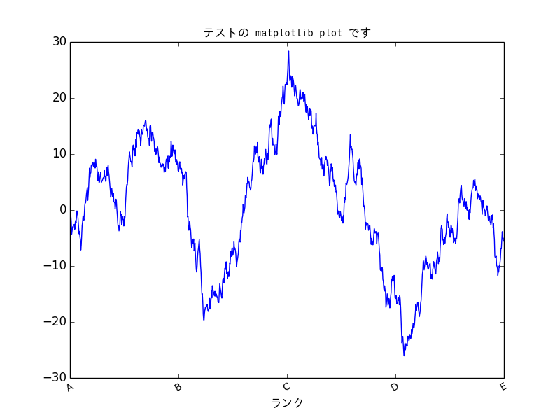
軸のカスタマイズ
次のようなランダムウォークのプロットを考えてみます。
fig = plt.figure()
ax = fig.add_subplot(1,1,1)

r = randn(1000).cumsum()
ax.plot(r)

plt.show()
plt.savefig("image4.png")

これの目盛り、ラベルをカスタマイズしてみます。
たとえば X 軸については 250 ごとにランクを分け、文字は 30 度傾け、日本語で表示するといったところです。
ax.set_xticks([0, 250, 500, 750, 1000])
ax.set_xticklabels(['A', 'B', 'C', 'D', 'E'], rotation=30, fontsize='small')
ax.set_title('テストの matplotlib plot です', fontproperties=prop)
ax.set_xlabel('ランク', fontproperties=prop)

plt.show()
plt.savefig("image5.png")
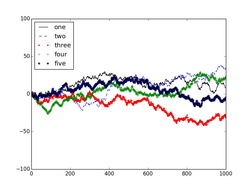
凡例の追加
プロットされたデータの識別において簡単な方法はラベルを指定し凡例で表示することです。データごとに色や線種を分けるとわかりやすいでしょう。
fig = plt.figure()
ax = fig.add_subplot(1,1,1)

def randn1000():
    return randn(1000).cumsum()

ax.plot(randn1000(), 'k', label='one')
ax.plot(randn1000(), 'b--', label='two')
ax.plot(randn1000(), 'r.', label='three')
ax.plot(randn1000(), 'g+', label='four')
ax.plot(randn1000(), 'b*', label='five')

plt.ylim([-100, 100])

ax.legend(loc='best')

plt.show()
plt.savefig("image6.png")
ファイル保存時のオプション
plt.savefig() のときに画像ファイルのオプションを指定することができます。
| 引数 | 説明 |
|---|---|
| fname | ファイルのパスを含む文字列か Python のファイルオブジェクト、形式は拡張子から自動判定される。 |
| dpi | 1 インチあたりのドット数であり図の解像度。デフォルトは 100 。 |
| facecolor,edgecolor | サブプロット外側の背景色。デフォルトは w (白) 。 |
| format | ファイル形式を明示的に指定したいときに。 png, pdf など。 |
| bbox_inches | 図中の保存する部分の指定。 tight を指定すると図の周りの空白領域を除去する。 |
今回はまだ pandas は登場していませんので、ここまでは純粋に matplotlib の話となります。次回以降、 pandas と組み合わせてプロットをしていきます。
参考
Matplotlib 利用ノート
http://www.geocities.jp/showa_yojyo/note/python-matplotlib.html
Pythonによるデータ分析入門――NumPy、pandasを使ったデータ処理
http://www.oreilly.co.jp/books/9784873116556/