はじめに
2020年7月、Plotly 4.8.2 時点の情報で全面的に書き直しました。
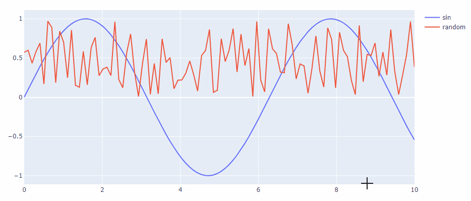
Pythonから利用できるライブラリ、Plotlyの初歩的な使い方、とりわけ特に頻繁に用いる折れ線グラフ(散布図)の作り方を記述します。Plotlyを用いると、下図に示すようにぐりぐり動かせるグラフを作ることができます。
この記事では扱っていませんが、Plotlyは、折れ線グラフ以外にも様々な種類のグラフを描くことができます。また、Plotly ExpressというPlotlyの高レベルのAPIや、DashというPlotlyを用いたWebアプリケーションフレームワークもあります(例)。
インストール
pip install plotlyでPlotlyをインストールします。
データの用意
てきとうに、サインカーブとランダムな系列を用意します。
import numpy as np
xs = np.linspace(0, 10, 100)
sins = np.sin(xs)
randoms = np.random.rand(100)
折れ線グラフの作成
go.Figure()の引数のdataに、散布図(go.Scatter())の系列の配列を入れて、fig.show()するだけです。簡単ですね!
import plotly.graph_objects as go
fig = go.Figure(data=[
    go.Scatter(x=xs, y=sins, name="sin"),
    go.Scatter(x=xs, y=randoms, name="random"),
])
fig.show()
系列の指定は、上のようにgo.Figure(data=[])で指定してもいいですし、ひとまずgo.Figure()を作っておいて、fig.add_trace()してもOKです。
import plotly.graph_objects as go
fig = go.Figure()
fig.add_trace(go.Scatter(x=xs, y=sins, name="sin"))
fig.add_trace(go.Scatter(x=xs, y=randoms, name="random"))
fig.show() # 上と同じ結果
グラフ上での簡単な操作方法はこちら
- グラフ内でドラッグすると、X軸方向、Y軸方向、矩形に拡大
- X軸、Y軸上でドラッグすると、軸方向に移動
- X軸、Y軸の端でドラッグすると、軸方向に拡大縮小
- ダブルクリックすると、初期表示に戻る
グラフのカスタマイズ
グラフ全体、各軸の設定
グラフ全体の描画オプションはfig.update_layout()を、各軸はfig.update_xaxes(), fig.update_yaxes()を呼んで変更しましょう。オプション名を忘れた場合は都度ググってもいいですが、fig.update_layout(foo=0)などとわざとエラーを出すと有効なオプション一覧を示してくれます。
fig.update_xaxes(title="x") # X軸タイトルを指定
fig.update_yaxes(title="y") # Y軸タイトルを指定

fig.update_xaxes(range=(1,3)) # X軸の最大最小値を指定
fig.update_xaxes(rangeslider={"visible":True}) # X軸に range slider を表示(下図参照)

fig.update_yaxes(scaleanchor="x", scaleratio=1) # Y軸のスケールをX軸と同じに(plt.axis("equal"))

fig.update_layout(title="Title") # グラフタイトルを設定
fig.update_layout(font={"family":"Meiryo", "size":20}) # フォントファミリとフォントサイズを指定
fig.update_layout(showlegend=True) # 凡例を強制的に表示(デフォルトでは複数系列あると表示)
fig.update_layout(xaxis_type="linear", yaxis_type="log") # X軸はリニアスケール、Y軸はログスケールに
fig.update_layout(width=800, height=600) # 図の高さを幅を指定
fig.update_layout(template="plotly_white") # 白背景のテーマに変更
テーマは下記から選択することができます。テーマの一覧はこちら
['ggplot2', 'seaborn', 'simple_white', 'plotly',
 'plotly_white', 'plotly_dark', 'presentation', 'xgridoff',
 'ygridoff', 'gridon', 'none']

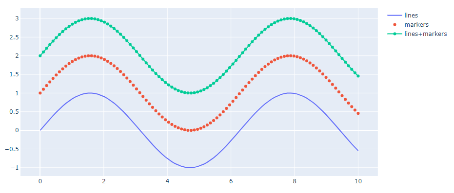
系列の設定
系列のオプションmodeに、"lines", "markers", "lines+markers"を指定すると、線だけ、マーカだけ、線とマーカに描画することができます。
import plotly.graph_objects as go
fig = go.Figure()
fig.add_trace(go.Scatter(x=xs, y=sins, name="lines", mode="lines")) # 線だけ
fig.add_trace(go.Scatter(x=xs, y=sins + 1, name="markers", mode="markers")) # マーカだけ
fig.add_trace(go.Scatter(x=xs, y=sins + 2, name="lines+markers", mode="lines+markers")) # 線とマーカ
fig.show()
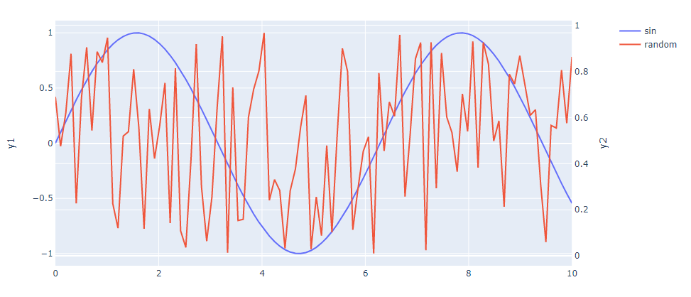
第2Y軸
secondary_yを有効にしたmake_subplotsでfigを作り、fig.add_trace()やfig.update_yaxes()にsecondary_yを設定すればOKです。
import plotly.graph_objects as go
from plotly.subplots import make_subplots

fig = make_subplots(specs=[[{"secondary_y": True}]])
fig.add_trace(go.Scatter(x=xs, y=sins, name="sin"), secondary_y=False)
fig.add_trace(go.Scatter(x=xs, y=randoms, name="random"), secondary_y=True)
fig.update_yaxes(title_text="y1", secondary_y=False)
fig.update_yaxes(title_text="y2", secondary_y=True)
fig.show()
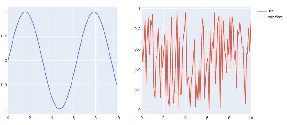
複数プロット
こちらもrowsとcolsを指定したmake_subplotsでfigを作り、fig.add_trace()やfig.update_layout()などにrow,colを設定すればOKです。
import plotly.graph_objects as go
from plotly.subplots import make_subplots

fig = make_subplots(rows=1, cols=2)
fig.add_trace(go.Scatter(x=xs, y=sins, name="sin"), row=1, col=1)
fig.add_trace(go.Scatter(x=xs, y=randoms, name="random"), row=1, col=2)
fig.show()
そのほか
fig.write_html("a.html") # 単独HTMLファイルにぐりぐりできる状態で出力
fig.write_image("a.png") # 画像に出力(グラフ上のアイコンの"download as a png"でもOK)