
cssnextとは策定中のCSS仕様を先立って使えるようにするツールのことです。
ひとことで言うとCSS版Babelです。
CSSを変換する仕組みはPostCSSのプラグインとして有志によって作成されています。
cssnextはそのプラグインをまとめたプラグインパックと呼ばれるものです。
※古いブラウザに対応させるためのフォールバック機能を提供するプラグインも含んでいます。
本記事は策定中のCSSの知識をつけることが目的です
参考リンクなど
cssnext(PostCSS)の背景や使い方は先日記事を書いたので是非見てみてください
Step by Stepで始めるCSSモダン化(PostCSS)
playgroundでcssnextが実際にどのように変換するのかを試せます。
機能一覧
本記事で紹介する機能一覧を出すのに使ったcssnextのページです。
postcss-cssnext features
※2016/09/07時点の機能一覧です。今後増減があると思います。
※Can I useが空なのは見つけれなかった。
automatic vendor prefixes
ベンダープレフィックスを自動でつけてくれる機能です。
div {
  display:flex;
}
div {
  display:-webkit-box;
  display:-ms-flexbox;
  display:flex;
}
custom properties & var()
CSSに変数を導入します。
:root{}で定義して、var()で使います。
:root {
  --myColor: red;
}

div {
  background-color: var(--myColor)
}
div {
  background-color: red
}
custom properties set & @apply
プロパティごと定義を共通化するものです。
:root{}で定義して、@applyで使います。
:root {
  --myBackGroundColor: {
    background-color: red
  }
}

div {
  @apply --myBackGroundColor
}
div {
  background-color: red}
reduced calc()
数値計算を行います。
calc()の中に式を書きます。
式に単位が付いていてもOKです。
reduced。。。?一般的な「減らす」の意味じゃないですよね。
「整理して簡単な形に変える、まとめる」というしっくり来る説明を@nyoro_712さんから貰いました。ありがとうございます。
div {
  width: calc(10px + 20);
  min-width: calc(10 * 2px);
  height: calc(100px / 2);
  min-height: calc(10 + 20)px;
}
div {
  width: 30px;
  min-width: 20px;
  height: 50px;
  min-height: 30px;
}
custom media queries
メディアクエリの定義に名前をつけることができます。
@custom-media --変数名 〜で定義して@media (--変数名)で使用します。
iPadとかデバイス名指定できるの嬉しいですね。
@custom-media --iPad only screen (min-device-width: 768px) and (max-device-width: 1024px);

@media (--iPad) {
  /** css for ipad */
}
@media only screen (min-device-width: 768px) and (max-device-width: 1024px) {
  /** css for ipad */
}
media queries ranges
不等号を使ってメディアクエリを定義できます。
min, maxに変換してくれます。地味に嬉しい機能。
@media (width >= 500px) and (width < 1201px) {
  /* your styles */
}
@media (min-width: 500px) and (max-width: 1200px) {
  /* your styles */
}
custom selectors
セレクタを定義することができます。
@custom-selector :--変数名で定義しておいて:--変数名で使用
つなげる事もできます。
大量のセレクタが作れますね。
@custom-selector :--header h1, h2, h3, h4;
@custom-selector :--hover :hover;
@custom-selector :--hoge .hoge, .piyo, .fuga;

:--header:--hover:--hoge {
  /* styles */
}
h1:hover.hoge,
h2:hover.hoge,
h3:hover.hoge,
h4:hover.hoge,
h1:hover.piyo,
h2:hover.piyo,
h3:hover.piyo,
h4:hover.piyo,
h1:hover.fuga,
h2:hover.fuga,
h3:hover.fuga,
h4:hover.fuga {
  /* styles */
}
nesting
Sassでもおなじみのネスト記法が使えます。
a {
  color:red;

  & span {
    color: white;
  }
}
a {
  color:red
}
a span {
  color:white
}
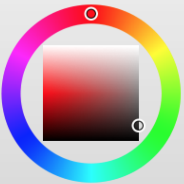
color() function
color()関数で色を指定できます。
a {
  color: color(red blackness(50%));
}
a:hover {
  color: color(red blackness(50%) whiteness(25%));
}
a {
  color: rgb(128, 0, 0);
}
a:hover {
  color: rgb(128, 64, 64);
}
hwb() function
HWB形式で色指定が可能です。
body {
  color: hwb(90, 0%, 0%, 0.5);
}
body {
  color: rgba(128, 255, 0, 0.5);
}
HSLと似ているので比較
HSL
HSLは色相・彩度・明度(Hue, Saturation, Lightness)
HWB
HWBは色相・白味・黒味(Hue, Whiteness, Blackness)
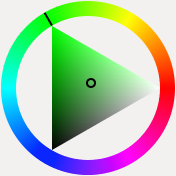
HWBのが直感的にイメージしやすいと思います。
gray() function
灰色をあらわすための関数が追加。
rgb(),rgba()に変換します。
.foo {
  color: gray(85);
}

.bar {
  color: gray(10%, 50%);
}
.foo {
  color: rgb(85, 85, 85);
}

.bar {
  color: rgba(26, 26, 26, 0.5);
}
#rrggbbaa colors
透明度が追加され、#rrggbbaaの形式で定義できます。
#rgbaでもOK。
body {
  background: #9d9c;
  color: #001020ff;
}
body {
  background: rgba(153, 221, 153, 0.8);
  color: rgba(0, 16, 32, 1);
}
rgba function (rgb fallback)
rgba()に対応していないIE8のために#rgbに変換します。
これはplaygroundでは有効になっていないみたいです。
rgbaに対応してないのはもうIE8のみみたいなので外したのかも。
body {
  background: rgba(153, 221, 153, 0.8);
  border: solid 1px rgba(100,102,103,.3);
}
body {
  background: #99dd99;
  background: rgba(153, 221, 153, 0.8);
  border: solid 1px #646667;
  border: solid 1px rgba(100,102,103,.3);
}
rebeccapurple color
レベッカパープルという紫色をあらわす指定が追加されます。
rebeccapurpleがCSS 4 colorに提案された経緯に経緯がまとまっているので見てみてください
body {
  color: rebeccapurple;
}
body {
  color: rgb(102, 51, 153);
}
font-variant property
font-variant-xxxをfont-feature-settingsの形に変換するらしい。
font-variantはなくなるってことなのかな。ちょっとだけ調べてみましたが良くわからなかった。。
h2 {
  font-variant-caps: small-caps;
}

table {
  font-variant-numeric: lining-nums;
}
h2 {
  -webkit-font-feature-settings: "c2sc";
          font-feature-settings: "c2sc";
  font-variant-caps: small-caps;
}

table {
  -webkit-font-feature-settings: "lnum";
          font-feature-settings: "lnum";
  font-variant-numeric: lining-nums;
}
filter property
filterに対応していないFirefox35未満でfilterを使えるようにする機能です。
オプションでoldIE:trueを指定すると古いIEでも使えそうな記述あり。
フィルタ自体は以下記事を参照
CSSフィルタことはじめ
.blur {
    filter:sepia(100%);
}
.blur {
    filter:url('data:image/svg+xml;charset=utf-8,<svg xmlns="http://www.w3.org/2000/svg"><filter id="filter"><feColorMatrix type="matrix" color-interpolation-filters="sRGB" values="0.393 0.769 0.189 0 0 0.349 0.686 0.168 0 0 0.272 0.534 0.131 0 0 0 0 0 1 0" /></filter></svg>#filter');
    -webkit-filter:sepia(100%);
            filter:sepia(100%);
}
initial value
スタイルをリセットする事が可能。
このall: initialは目玉機能だそうな。
どうもCSSに詳しい人には嬉しい機能らしい。
div {
  all: initial; /* use initial for ALL PROPERTIES in one shot */
}
div {
  -webkit-animation: none 0s ease 0s 1 normal none running;
          animation: none 0s ease 0s 1 normal none running;
  -webkit-backface-visibility: visible;
          backface-visibility: visible;
  background: transparent none repeat 0 0 / auto auto padding-box border-box scroll;
  border: medium none currentColor;
  border-collapse: separate;
  -o-border-image: none;
     border-image: none;
  border-radius: 0;
  border-spacing: 0;
  bottom: auto;
  box-shadow: none;
  box-sizing: content-box;
  caption-side: top;
  clear: none;
  clip: auto;
  color: #000;
  -webkit-columns: auto;
     -moz-columns: auto;
          columns: auto;
  -webkit-column-count: auto;
     -moz-column-count: auto;
          column-count: auto;
  -webkit-column-fill: balance;
     -moz-column-fill: balance;
          column-fill: balance;
  -webkit-column-gap: normal;
     -moz-column-gap: normal;
          column-gap: normal;
  -webkit-column-rule: medium none currentColor;
     -moz-column-rule: medium none currentColor;
          column-rule: medium none currentColor;
  -webkit-column-span: 1;
     -moz-column-span: 1;
          column-span: 1;
  -webkit-column-width: auto;
     -moz-column-width: auto;
          column-width: auto;
  content: normal;
  counter-increment: none;
  counter-reset: none;
  cursor: auto;
  direction: ltr;
  display: inline;
  empty-cells: show;
  float: none;
  font-family: serif;
  font-size: medium;
  font-style: normal;
  font-variant: normal;
  font-weight: normal;
  font-stretch: normal;
  line-height: normal;
  height: auto;
  -webkit-hyphens: none;
      -ms-hyphens: none;
          hyphens: none;
  left: auto;
  letter-spacing: normal;
  list-style: disc outside none;
  margin: 0;
  max-height: none;
  max-width: none;
  min-height: 0;
  min-width: 0;
  opacity: 1;
  orphans: 2;
  outline: medium none invert;
  overflow: visible;
  overflow-x: visible;
  overflow-y: visible;
  padding: 0;
  page-break-after: auto;
  page-break-before: auto;
  page-break-inside: auto;
  -webkit-perspective: none;
          perspective: none;
  -webkit-perspective-origin: 50% 50%;
          perspective-origin: 50% 50%;
  position: static;
  right: auto;
  -moz-tab-size: 8;
    -o-tab-size: 8;
       tab-size: 8;
  table-layout: auto;
  text-align: left;
  -moz-text-align-last: auto;
       text-align-last: auto;
  text-decoration: none;
  text-indent: 0;
  text-shadow: none;
  text-transform: none;
  top: auto;
  -webkit-transform: none;
          transform: none;
  -webkit-transform-origin: 50% 50% 0;
          transform-origin: 50% 50% 0;
  -webkit-transform-style: flat;
          transform-style: flat;
  -webkit-transition: none 0s ease 0s;
  transition: none 0s ease 0s;
  unicode-bidi: normal;
  vertical-align: baseline;
  visibility: visible;
  white-space: normal;
  widows: 2;
  width: auto;
  word-spacing: normal;
  z-index: auto;
  all: initial; /* use initial for ALL PROPERTIES in one shot */
}
rem unit (px fallback)
remに対応していないIE8のためにpxを追加してくれます。
rem自体は以下記事を参照
remってなに?
h1 {
  font-size: 1.5rem;
}
h1 {
  font-size: 24px;
  font-size: 1.5rem;
}
:any-link pseudo-class
:link, :visitedを1つの定義で可能にします。
nav :any-link {
  background-color: yellow;
}
nav :link,nav :visited {
  background-color: yellow;
}
:matches pseudo-class
セレクタをグルーピングできます。
p:matches(:first-child, .special) {
  color: red;
}
p:first-child, p.special {
  color: red;
}
:not pseudo-class
matchesの:not版です。
p:not(:first-child, .special) {
  color: red;
}
p:not(:first-child):not(.special) {
  color: red;
}
:: pseudo syntax (: fallback)
IE8のために::を:に変換します。
IE8はもう死んだんだ。
a::before {
}
a:before {
}
overflow-wrap property (word-wrap fallback)
overflow-wrapをword-wrapに変換します。
body {
  overflow-wrap: break-word;
}
body {
  word-wrap: break-word;
}
attribute case insensitive
大文字小文字を無視する属性セレクタのオプションiが追加。
[attr=abc i] {
  border-style: solid none;
}
[attr=abc],[attr=Abc],[attr=aBc],[attr=ABc],[attr=abC],[attr=AbC],[attr=aBC],[attr=ABC] {
  border-style: solid none;
}
あとがき
Sassだ、LESSだ、Stylusだ、Compassだ、cssnextだ、とCSS界隈もかなり混沌としている気がします
いつかCSSだけで済む日が来るといいですね