この記事は、Android その3 Advent Calendar 2016 - Qiitaの12日目の記事です!
注意!!
この記事は、appcompat-v7のバージョン25.0.1で試した内容です。最新バージョン25.1.0では、android.support.v7.app.AlertControllerの実装が変更されており、使用できない箇所があります。
#AlertDialogのスタイルをカスタマイズ
Support Library v7 appcompat ライブラリを使用するると、Android 2.3(API レベル 9)以上のデバイスで、アプリでマテリアルデザインを使用することができ、ダイアログもマテリアルデザインになります。
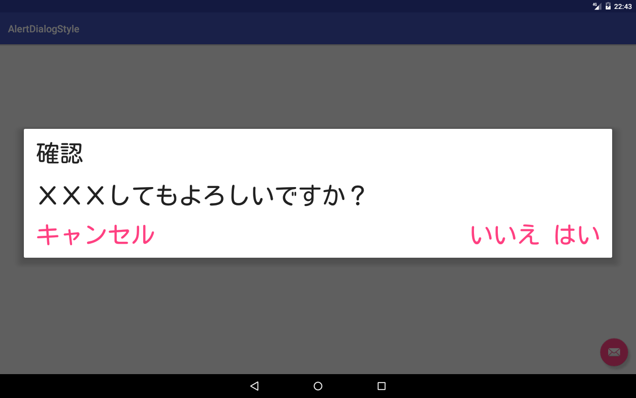
import android.support.v7.app.AlertDialog;

// 省略

	AlertDialog.Builder builder = new AlertDialog.Builder(MainActivity.this);
	builder.setTitle("確認");
	builder.setMessage("XXXしてもよろしいですか?");
	builder.setPositiveButton("はい", null);
	builder.setNegativeButton("いいえ", null);
	builder.setNeutralButton("キャンセル", null);
	builder.create().show();
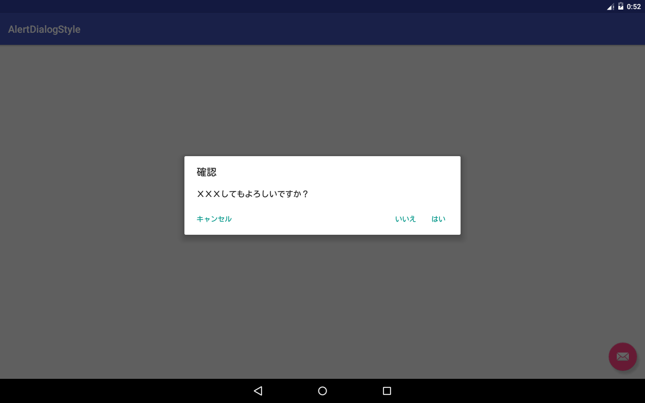
NeutralButtonが左端にあり、PositiveButtonとNegativeButtonが右に寄ったデザインですね。
通常のユーザーが使用するアプリであればこのデザインでよいとは思いますが、幼児/高年齢向けアプリを考えたとき、もっと大きな文字で、押しやすいボタンのデザインにしたいと思ったので、ダイアログをカスタマイズしてみます。
styles.xml
まず、スタイルを定義します。
<style name="MyAlertDialogStyle" parent="Theme.AppCompat.Light.Dialog">

</style>
AlertDialog.Builderの、第二引数 int themeResIdにテーマを指定することでカスタムのスタイルの適用することができます。[AlertDialog.Builder | Android Developers](https://developer.android.com/reference/android/support/v7/app/AlertDialog.Builder.html#AlertDialog.Builder(android.content.Context, int))
AlertDialog.Builder builder = new AlertDialog.Builder(MainActivity.this, R.style.MyAlertDialogStyle);
アプリすべてのダイアログにスタイルを適用する場合は、AppThemeのandroid:alertDialogThemeに指定します。
<style name="AppTheme" parent="Theme.AppCompat.Light.DarkActionBar">
    <item name="colorPrimary">@color/primary</item>
    <item name="colorPrimaryDark">@color/primary_dark</item>
    <item name="colorAccent">@color/accent</item>
    <item name="android:alertDialogTheme">@style/MyAlertDialogStyle</item>
</style>
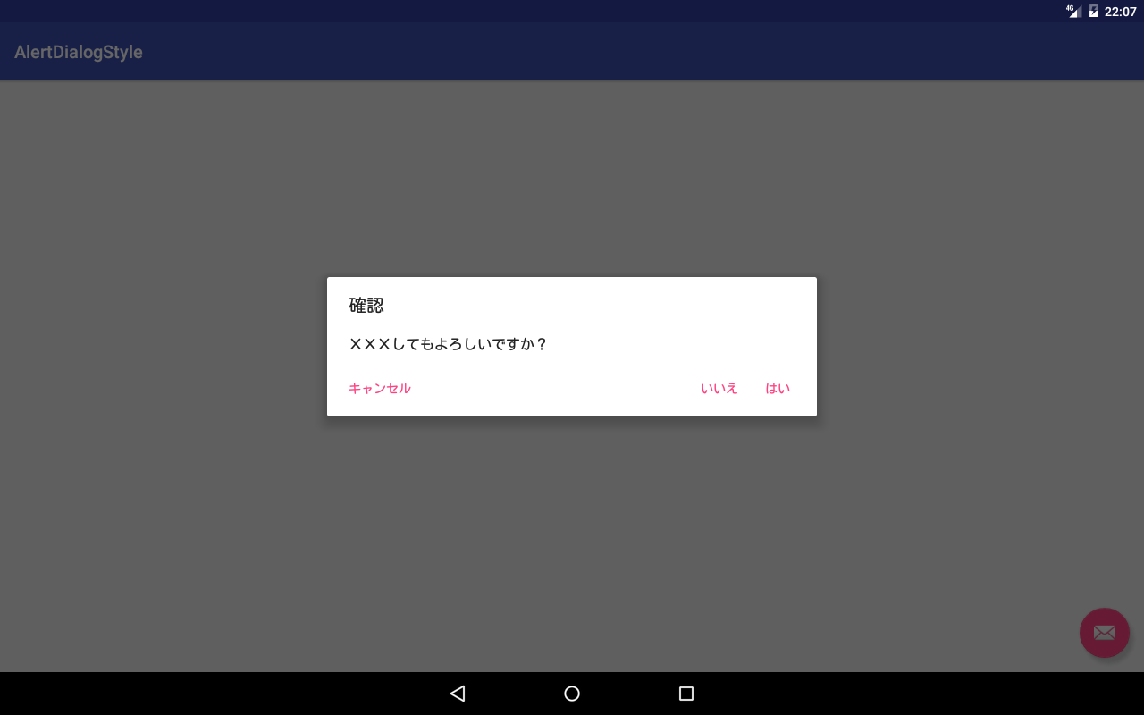
ボタンのテキストカラー
colorAccentを指定します。
<style name="MyAlertDialogStyle" parent="Theme.AppCompat.Light.Dialog">
    <item name="colorAccent">@color/primary</item>
</style>
タイトルとボタンのテキストの大きさ
android:textSizeを指定します。
<style name="MyAlertDialogStyle" parent="Theme.AppCompat.Light.Dialog">
    <item name="colorAccent">@color/primary</item>
    <item name="android:textSize">@dimen/dialog_text_size</item>
</style>
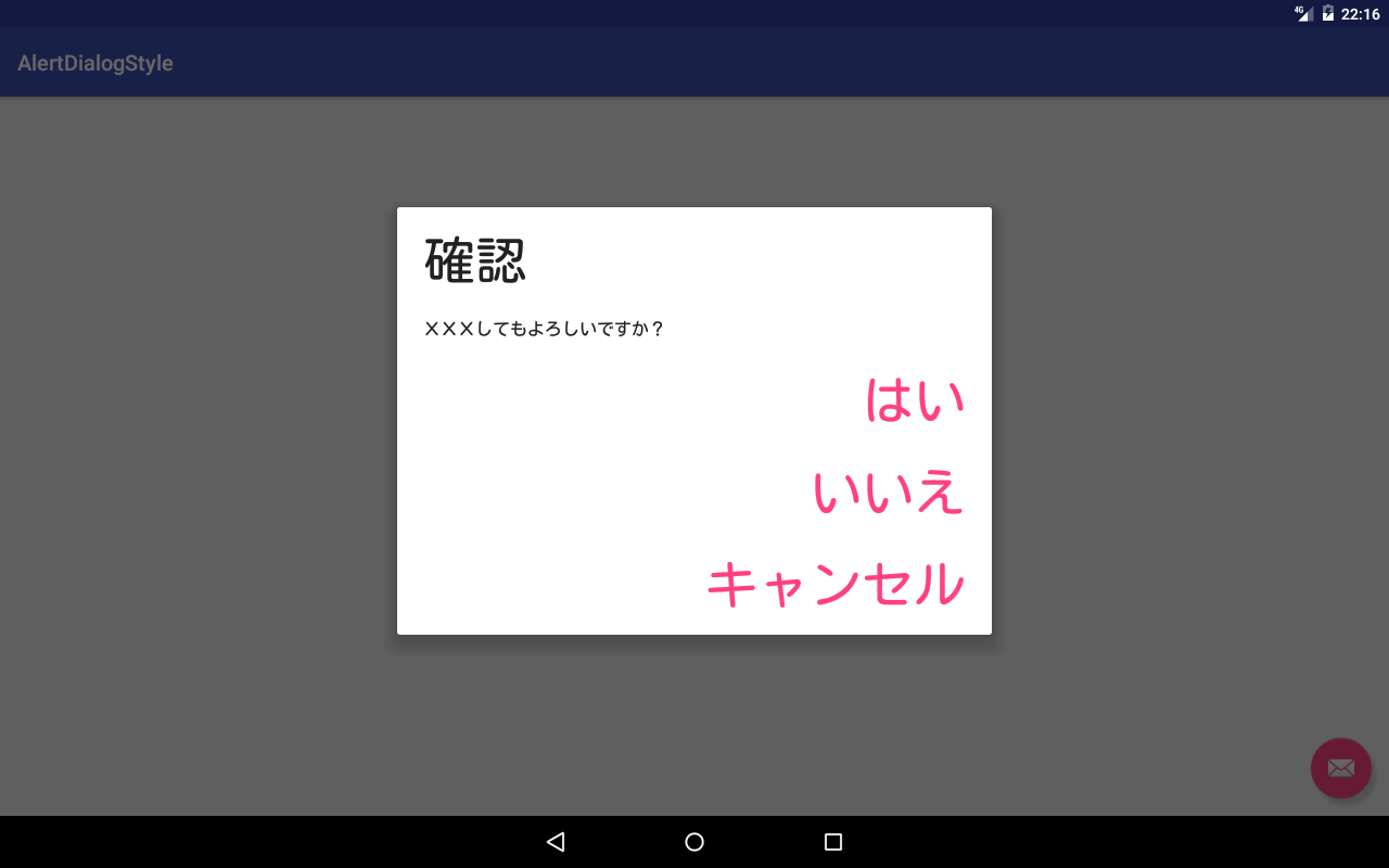
ボタンが縦に並んでしまいました...
メッセージのサイズは変更されませんね...
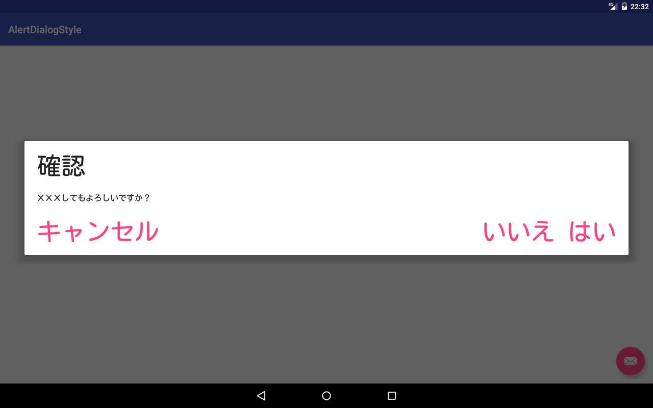
ダイアログの大きさを変更
android:windowMinWidthMajor, android:windowMinWidthMinorを指定します。
<style name="MyAlertDialogStyle" parent="Theme.AppCompat.Light.Dialog">
    <item name="colorAccent">@color/primary</item>
    <item name="android:textSize">@dimen/dialog_text_size</item>
    <item name="android:windowMinWidthMajor">@dimen/dialog_min_width_major</item>
    <item name="android:windowMinWidthMinor">@dimen/dialog_min_width_minor</item>
</style>
- android:windowMinWidthMajor ... 端末が横向きの場合のダイアログの幅の最小サイズ
- android:windowMinWidthMinor ... 端末が縦向きの場合のダイアログの幅の最小サイズ
dimenは画面全体の比率(%)で指定することができます。
<resources>
    <item type="dimen" name="dialog_min_width_major">95%</item>
    <item type="dimen" name="dialog_min_width_minor">95%</item>
</resources>
テキストスタイル
android:textColorPrimaryを指定するとテキストカラーを変更できます。
<style name="MyAlertDialogStyle" parent="Theme.AppCompat.Light.Dialog">
    <item name="colorAccent">@color/primary</item>
    <item name="android:textColorPrimary">@color/colorPrimary</item>
</style>
android:windowTitleStyleを定義するとタイトルのスタイルを変更できます。
<style name="MyAlertDialogStyle" parent="Theme.AppCompat.Light.Dialog">
    <item name="colorAccent">@color/primary</item>
    <item name="android:windowTitleStyle">@style/windowTitleStyle</item>
</style>

<style name="windowTitleStyle" parent="TextAppearance.AppCompat.Large">
    <item name="android:textSize">@dimen/dialog_text_size</item>
</style>
メッセージのテキストサイズ
メッセージのテキストサイズを指定きる属性が見当たりませんでしたのでコードでハックします。
AlertDialog.Builder builder = new AlertDialog.Builder(MainActivity.this, R.style.MyAlertDialogStyle);
builder.setTitle("確認");
builder.setMessage("XXXしてもよろしいですか?");
builder.setPositiveButton("はい", null);
builder.setNegativeButton("いいえ", null);
builder.setNeutralButton("キャンセル", null);

AlertDialog dialog = builder.show();

// メッセージテキストを変更する。
TextView textView = (TextView) dialog.findViewById(android.R.id.message);
textView.setTextSize(48.0f);
ボタンのスタイル
buttonBarNeutralButtonStyle, buttonBarNegativeButtonStyle, buttonBarPositiveButtonStyle で指定することが出来ます。
<style name="MyAlertDialogStyle" parent="Theme.AppCompat.Light.Dialog">
    <item name="colorAccent">@color/primary</item>
    <item name="android:textSize">@dimen/dialog_text_size</item>
    <item name="android:windowMinWidthMajor">@dimen/dialog_min_width_major</item>
    <item name="android:windowMinWidthMinor">@dimen/dialog_min_width_minor</item>

    <item name="buttonBarNeutralButtonStyle">@style/buttonBarButtonStyle.Neutral</item>
    <item name="buttonBarNegativeButtonStyle">@style/buttonBarButtonStyle.Negative</item>
    <item name="buttonBarPositiveButtonStyle">@style/buttonBarButtonStyle.Positive</item>

</style>
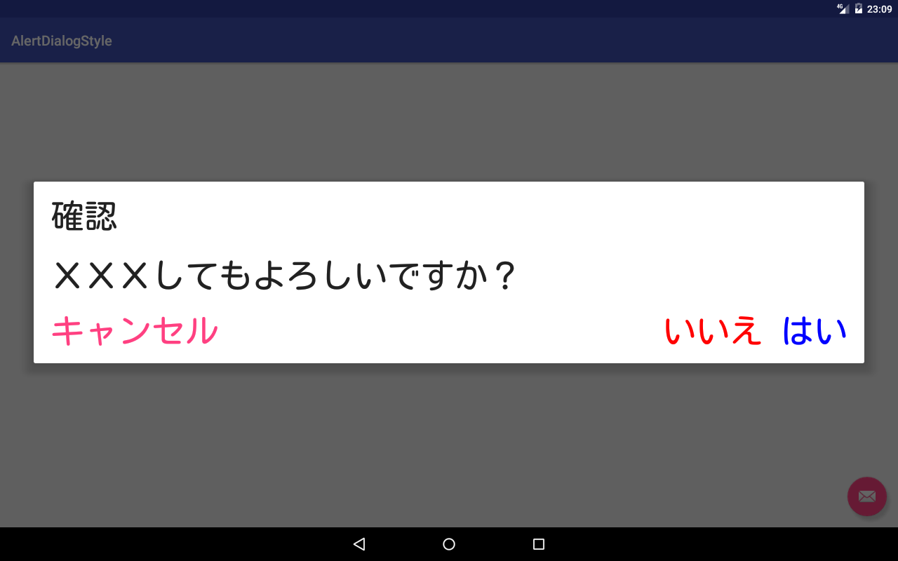
テキストカラー
<style name="buttonBarButtonStyle" parent="Widget.AppCompat.Button.Borderless.Colored">
</style>

<style name="buttonBarButtonStyle.Neutral">
</style>

<style name="buttonBarButtonStyle.Negative">
    <item name="android:textColor">@color/red</item>
</style>

<style name="buttonBarButtonStyle.Positive">
    <item name="android:textColor">@color/blue</item>
</style>
親(parent)に Widget.AppCompat.Button.Borderless.Colored を指定すると、テキストカラーのデフォルトがcolorAccentになります。
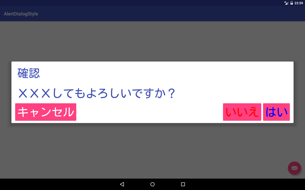
カラーボタン
親(parent)に Widget.AppCompat.Button.Coloredを指定すると、colorAccentを背景にしたボタンを配置されます。
<style name="buttonBarButtonStyle" parent="Widget.AppCompat.Button.Colored">
</style>

<style name="buttonBarButtonStyle.Neutral">
</style>

<style name="buttonBarButtonStyle.Negative">
    <item name="android:textColor">@color/red</item>
</style>

<style name="buttonBarButtonStyle.Positive">
    <item name="android:textColor">@color/blue</item>
</style>
背景
背景はのサイズを大きくしたり、カラーを変更したり場合には、android:backgroundを変更します。
リップル効果が着いた背景にしたい場合は、appcompatのソースを参考にするとよいでしょう。
背景カラーを変更したり場合には、app:backgroundTint を指定します。
<style name="buttonBarButtonStyle.Positive">
    <item name="backgroundTint">@color/colorAccent</item>
</style>
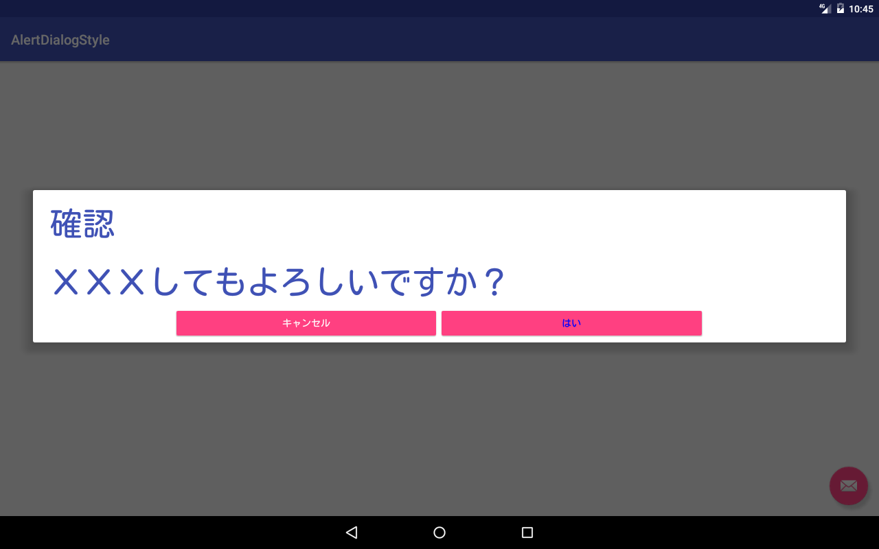
ボタンの配置
マテリアルデザイン以前のダイアログように、ボタンが中央に3つ並べたスタイルにしたい場合は、コードでハックします。
AlertDialog.Builder builder = new AlertDialog.Builder(MainActivity.this, R.style.MyAlertDialogStyle);
builder.setTitle("確認");
builder.setMessage("XXXしてもよろしいですか?");
builder.setPositiveButton("はい", null);
// builder.setNegativeButton("いいえ", null);
builder.setNeutralButton("キャンセル", null);

AlertDialog dialog = builder.show();

// メッセージテキストを変更する。
TextView textView = (TextView) dialog.findViewById(android.R.id.message);
textView.setTextSize(48.0f);


// ボタンパネルのコンテナを取得する。
LinearLayout containerButtons = (LinearLayout) dialog.findViewById(R.id.buttonPanel);

// Space Viewを削除する。
containerButtons.removeView(containerButtons.getChildAt(1));

// ボタンパネルの子ViewのボタンのGravityをCENTERに設定する
containerButtons.setGravity(Gravity.CENTER);

// LinearLayoutの比率の合計を3に設定する。
containerButtons.setWeightSum(3.0f);

// 各ボタンを取得する。
Button button3 = (Button) containerButtons.findViewById(android.R.id.button3);
Button button2 = (Button) containerButtons.findViewById(android.R.id.button2);
Button button1 = (Button) containerButtons.findViewById(android.R.id.button1);

// 各ボタンの比率を指定する。
((LinearLayout.LayoutParams)button3.getLayoutParams()).weight = 1.0f;
((LinearLayout.LayoutParams)button2.getLayoutParams()).weight = 1.0f;
((LinearLayout.LayoutParams)button1.getLayoutParams()).weight = 1.0f;

// 各ボタンの幅を0にする。
((LinearLayout.LayoutParams)button3.getLayoutParams()).width = 0;
((LinearLayout.LayoutParams)button2.getLayoutParams()).width = 0;
((LinearLayout.LayoutParams)button1.getLayoutParams()).width = 0;
Layoutでハック
appcompat ライブラリで使用されているリソースを上書きすることで、ダイアログのデザインを変更することも可能です。
<?xml version="1.0" encoding="utf-8"?>
<LinearLayout xmlns:android="http://schemas.android.com/apk/res/android"
        android:id="@+id/parentPanel"
        android:layout_width="match_parent"
        android:layout_height="wrap_content"
        android:orientation="vertical">
    <LinearLayout
            android:id="@+id/topPanel"
            android:layout_width="match_parent"
            android:layout_height="wrap_content"
            android:orientation="vertical">
        <LinearLayout
                android:id="@+id/title_template"
                android:layout_width="match_parent"
                android:layout_height="wrap_content"
                android:orientation="horizontal"
                android:gravity="center_vertical"
                android:paddingLeft="?attr/dialogPreferredPadding"
                android:paddingRight="?attr/dialogPreferredPadding"
                android:paddingTop="@dimen/abc_dialog_padding_top_material">
            <ImageView
                    android:id="@android:id/icon"
                    android:layout_width="32dip"
                    android:layout_height="32dip"
                    android:scaleType="fitCenter"
                    android:src="@null"
                    style="@style/RtlOverlay.Widget.AppCompat.DialogTitle.Icon"/>
            <android.support.v7.widget.DialogTitle
                    android:id="@+id/alertTitle"
                    style="?attr/android:windowTitleStyle"
                    android:singleLine="true"
                    android:ellipsize="end"
                    android:layout_width="match_parent"
                    android:layout_height="wrap_content"
                    android:textAlignment="viewStart" />
        </LinearLayout>
        <!-- If the client uses a customTitle, it will be added here. -->
    </LinearLayout>
    <FrameLayout
            android:id="@+id/contentPanel"
            android:layout_width="match_parent"
            android:layout_height="wrap_content"
            android:layout_weight="1"
            android:minHeight="48dp">
        <View android:id="@+id/scrollIndicatorUp"
              android:visibility="gone"
              android:layout_width="match_parent"
              android:layout_height="1dp"
              android:layout_gravity="top"
              android:background="?attr/colorControlHighlight"/>
        <android.support.v4.widget.NestedScrollView
                android:id="@+id/scrollView"
                android:layout_width="match_parent"
                android:layout_height="wrap_content"
                android:clipToPadding="false">
            <LinearLayout
                    android:layout_width="match_parent"
                    android:layout_height="wrap_content"
                    android:orientation="vertical">
                <TextView
                        android:id="@android:id/message"
                        style="@style/TextAppearance.AppCompat.Subhead"
                        android:layout_width="match_parent"
                        android:layout_height="wrap_content"
                        android:paddingLeft="?attr/dialogPreferredPadding"
                        android:paddingTop="@dimen/abc_dialog_padding_top_material"
                        android:paddingRight="?attr/dialogPreferredPadding"/>
                <View
                        android:id="@+id/textSpacerNoButtons"
                        android:visibility="gone"
                        android:layout_width="0dp"
                        android:layout_height="@dimen/abc_dialog_padding_top_material"/>
            </LinearLayout>
        </android.support.v4.widget.NestedScrollView>
        <View android:id="@+id/scrollIndicatorDown"
              android:visibility="gone"
              android:layout_width="match_parent"
              android:layout_height="1dp"
              android:layout_gravity="bottom"
              android:background="?attr/colorControlHighlight"/>
    </FrameLayout>
    <FrameLayout
            android:id="@+id/customPanel"
            android:layout_width="match_parent"
            android:layout_height="wrap_content"
            android:layout_weight="1"
            android:minHeight="48dp">
        <FrameLayout
                android:id="@+id/custom"
                android:layout_width="match_parent"
                android:layout_height="wrap_content"/>
    </FrameLayout>
    <include layout="@layout/abc_alert_dialog_button_bar_material" />
</LinearLayout>
<?xml version="1.0" encoding="utf-8"?>
<android.support.v7.widget.ButtonBarLayout
    xmlns:android="http://schemas.android.com/apk/res/android"
    xmlns:app="http://schemas.android.com/apk/res-auto"
    android:id="@+id/buttonPanel"
    android:layout_width="match_parent"
    android:layout_height="wrap_content"
    android:layoutDirection="locale"
    android:orientation="horizontal"
    android:paddingLeft="12dp"
    android:paddingRight="12dp"
    android:paddingTop="4dp"
    android:paddingBottom="4dp"
    android:gravity="bottom"
    app:allowStacking="@bool/abc_allow_stacked_button_bar"
    style="?attr/buttonBarStyle">
    <Button
        android:id="@android:id/button3"
        style="?attr/buttonBarNeutralButtonStyle"
        android:layout_width="wrap_content"
        android:layout_height="wrap_content" />
    <android.support.v4.widget.Space
        android:id="@+id/spacer"
        android:layout_width="0dp"
        android:layout_height="0dp"
        android:layout_weight="1"
        android:visibility="invisible" />
    <Button
        android:id="@android:id/button2"
        style="?attr/buttonBarNegativeButtonStyle"
        android:layout_width="wrap_content"
        android:layout_height="wrap_content" />
    <Button
        android:id="@android:id/button1"
        style="?attr/buttonBarPositiveButtonStyle"
        android:layout_width="wrap_content"
        android:layout_height="wrap_content" />
</android.support.v7.widget.ButtonBarLayout>
※ <android.support.v4.widget.Space android:id="@+id/spacer"/> は必須です。削除するとエラーが発生します。
appcompat ライブラリで使用されているリソースを追うことで、何処でどのstyleや属性が使用しているか確認できますので、
ターゲットユーザーにとって使いやすいデザインにハックしてみたいと思います。