NumPyのndarrayから2次元グラフ
準備するデータはこれ
Notebook
import numpy as np

x = np.linspace(0, 10)
y1 = np.sin(x)
y2 = np.cos(x) * 2
Matplotlib
Notebook
import matplotlib.pyplot as plt
# Notebook出力には次の1行が必要
%matplotlib inline

plt.figure(figsize=(8, 6))    # グラフのサイズ指定(この行は省略可)
plt.plot(x, y1)
plt.plot(x, y2)

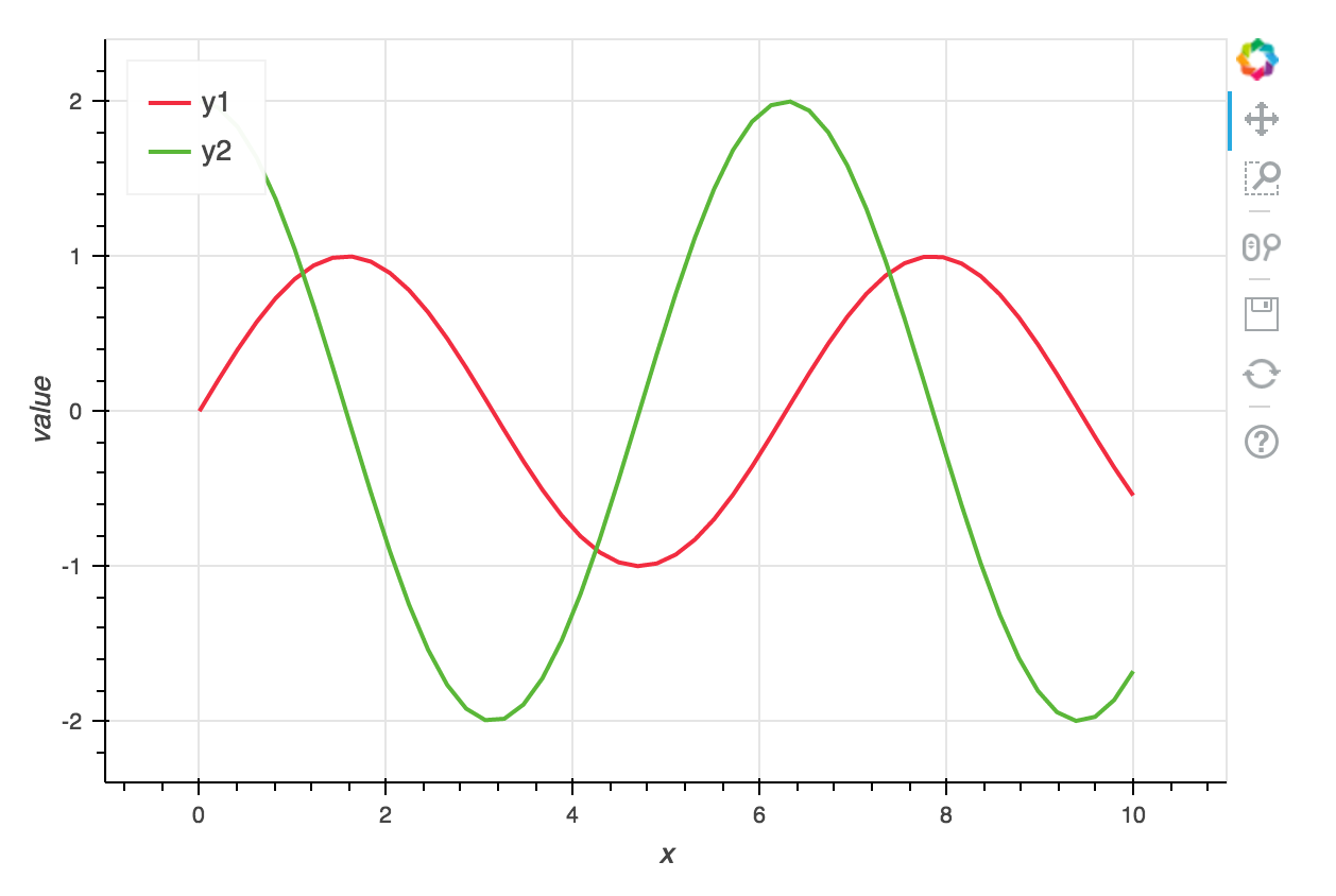
Bokeh
bokeh.plottingモジュールの場合
Notebook
from bokeh.plotting import output_notebook, figure, show
output_notebook()    # <- Notebook出力にはこの1行が必要

fig = figure(width = 600, height=400)    # width, heightは省略可
fig.line(x, y1)
fig.line(x, y2)
show(fig)

Matplotlibに近い感じで覚えやすいけど、色を個別に指定する必要があるのが面倒。
公式ドキュメント:Plotting with Basic Glyphs
bokeh.chartsモジュールの場合
Notebook
from bokeh.charts import output_notebook, Line, show
output_notebook()    # <- Notebook出力にはこの1行が必要

chart = Line(data={'x': x, 'y1': y1, 'y2': y2}, x='x',
             width=600, height=400)    # width, heightは省略可
show(chart)
単純なデータを素早くプロットするには向いていないけど、自動的に軸ラベルやレジェンドが入ったりと気が利いている。
公式ドキュメント:Making High-level Charts
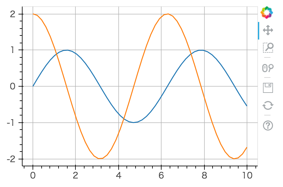
MatplotlibからにBokehに変換
notebook
import matplotlib.pyplot as plt
from bokeh.plotting import output_notebook, show
from bokeh.mpl import to_bokeh
output_notebook()    # <- Notebook出力にはこの1行が必要

plt.plot(x, y1)
plt.plot(x, y2)
show(to_bokeh())
公式ドキュメント:Leveraging Other Libraries
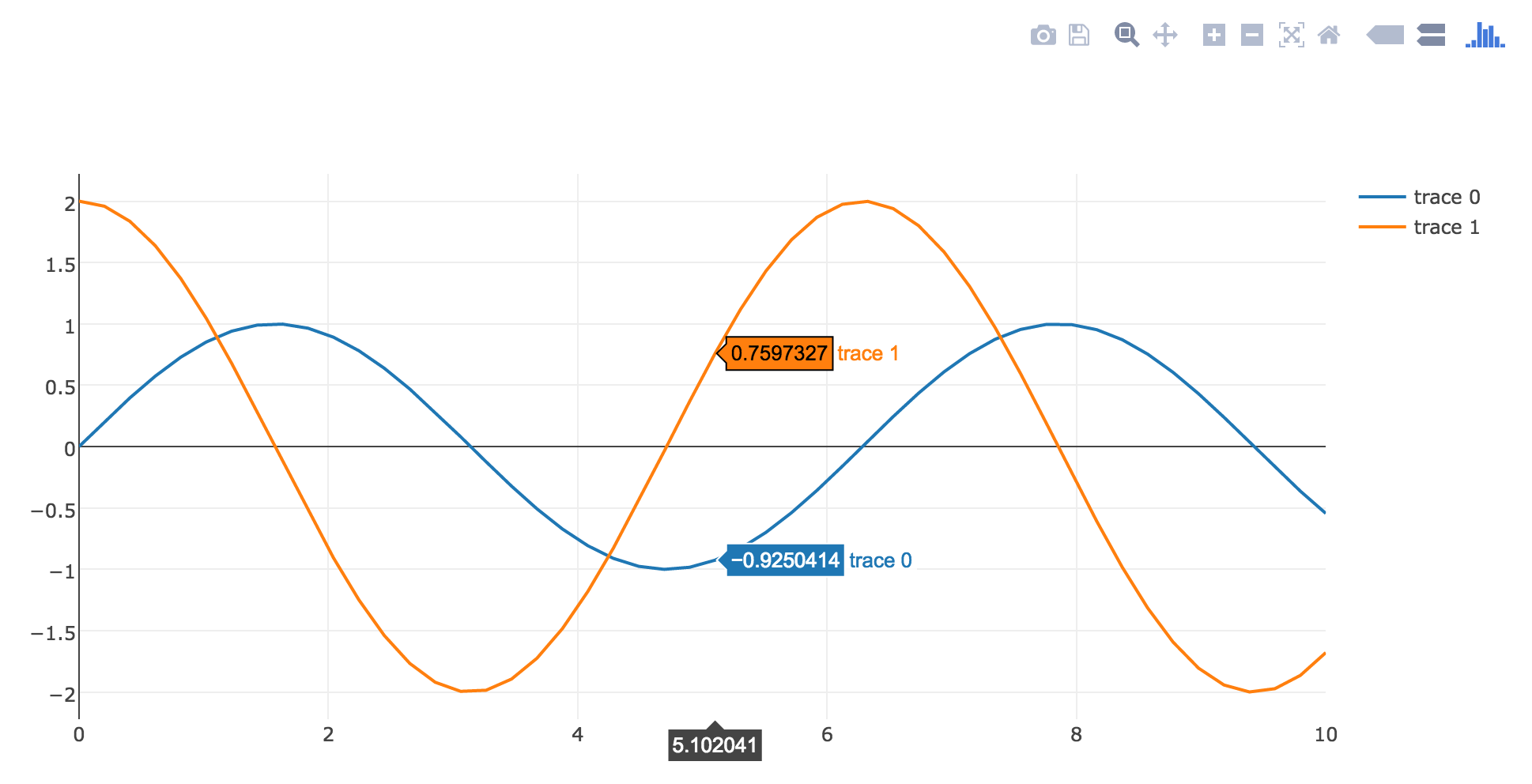
Plotly
グラフのサイズを指定しない場合
Notebook
from plotly.graph_objs import Scatter
from plotly.offline import init_notebook_mode, iplot
init_notebook_mode()    # <- Notebook出力にはこの1行が必要

scatter1 = Scatter(x=x, y=y1)
scatter2 = Scatter(x=x, y=y2)
iplot([scatter1, scatter2])    # <- Notebookに出力するにはiplot関数を使う
公式ドキュメント:Plotly Offline for IPython Notebooks
グラフのサイズを指定する場合
Notebook
from plotly.graph_objs import Scatter, Figure, Layout
from plotly.offline import init_notebook_mode, iplot
init_notebook_mode()    # <- Notebook出力にはこの1行が必要

scatter1 = Scatter(x=x, y=y1)
scatter2 = Scatter(x=x, y=y2)
fig = Figure(data=[scatter1, scatter2], layout=Layout(width=600, height=400))
iplot(fig)    # <- Notebookに出力するにはiplot関数を使う

公式ドキュメント:Python Setting Graph Size
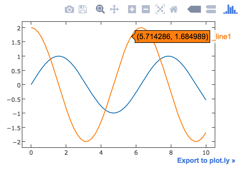
MatplotlibからPlotlyに変換
Notebook
import matplotlib.pyplot as plt
from plotly.offline import init_notebook_mode, iplot_mpl
init_notebook_mode()    # <- Notebook出力にはこの1行が必要

plt.plot(x, y1)
plt.plot(x, y2)
iplot_mpl(plt.gcf())    # <- MatplotlibのグラフをNotebookに出力するにはiplot_mpl関数を使う
pandasのDataFrameから散布図
Bokehのライブラリに最初からDataFrameになっているサンプルデータが含まれているのでそれを使ってプロットする。
Notebook
from bokeh.sampledata import iris
df = iris.flowers
df.head()

Matplotlib
Notebook
import matplotlib.pyplot as plt
# Notebook出力には次の1行が必要
%matplotlib inline

plt.scatter(df['sepal_length'], df['sepal_width'])

Bokeh
Notebook
from bokeh.charts import output_notebook, Scatter, show
output_notebook()    # <- Notebook出力にはこの1行が必要

chart = Scatter(data=df, x='sepal_length', y='sepal_width',
                width=600, height=400)      # width, heightは省略可
show(chart)
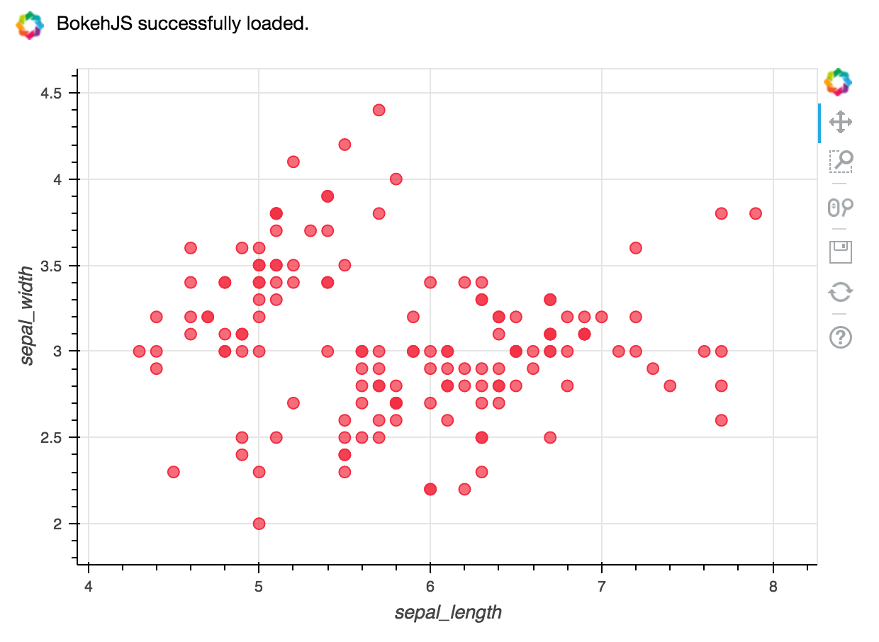
公式ドキュメント:Making High-level Charts - Scatter Plots
pandas
Notebook
import matplotlib.pyplot as plt
# Notebook出力には次の1行が必要
%matplotlib inline

df.plot.scatter(x='sepal_length', y='sepal_width')

seaborn
Notebook
import seaborn
# Notebook出力には次の1行が必要
%matplotlib inline

seaborn.jointplot(x='sepal_length', y='sepal_width', data=df)

参考リンク:
Pythonの可視化パッケージの使い分け - Qiita
なんでもかんでもJupyter Notebookに表示するためのチートシート 3次元プロット編 - Qiita