1. はじめに
グラフによって得意とする表現は異なり,扱えるデータの型も異なる.
したがってデータと目的によって利用するグラフをある程度絞ることができる.
例えばグラフをつくる前に読む本では以下のように整理されており,またWeb上でも多くのチートシートが公開されている1.
| 得意な表現方法 | 個別 | 全体 | |
|---|---|---|---|
| 実数 | 割合 | ||
| データ項目の比較 | 棒グラフ | レーダーチャート | 円グラフ |
| 積み上げ棒グラフ | |||
| 時間の経過による推移 | 折れ線グラフ | 面グラフ | |
| データの偏り | ヒートマップ | ||
| データ項目同士の関係 | 散布図 | ||
本記事ではデータの性質毎にグラフおよびそれが伝える内容を整理し,Pythonによるそれらの実装を示す.
ここでは From Data to Viz に従って整理する.
ただし,一部のグラフ2とMapsとNetworkは扱わない.
また,各グラフが得意とする表現は5 Quick and Easy Data Visualizations in Python with Codeで用いられている以下の図に従い,比較,分布,構成,関係,の4種類で分類する.
他の分類基準に興味がある方は他に記事があるのでそちらを参照されたい3.

本章の残りの部分ではグラフ作成時の注意点や実装方針を述べ,実行環境を明記する.
第2章ではデータの性質・目的毎にグラフを整理し,第3章でそれらの実装を示す.
最後に,第4章で参考資料を記す.
方針
グラフ作成時の注意点
- ある変数についてプロットする際,凡例が複数になる場合は各要素毎にプロットする.
- サブプロット間で対応関係のあるものは共通の色を使用する.
- $x$軸の目盛りが潰れてしまう場合は$y$軸の利用を検討する.
実装について
実装は Top 50 matplotlib Visualizations と The Python Graph Gallery を参考にする.
実行環境
- Python 3.6.8
- numpy 1.14.0
- scipy 1.0.0
- matplotlib 3.0.3
- seaborn 0.9.0
- pandas 0.24.2
- calmap 0.0.7
- joypy 0.1.10
- pywaffle 0.2.1
- squarify 0.4.2
2. チートシート
本章では対象のデータの性質と目的毎にグラフを整理し,チートシートを作成する.
表で使われる - はその列の見出しで記される観点の考慮が必要ないことを表す.
数値型の場合
| 変数の数 | 順序関係 | データの多さ | 確認観点 | 推奨されるグラフ |
|---|---|---|---|---|
| 1 | - | - | 分布 | ヒストグラム(Histogram) |
| 分布 | 密度プロット(Density Plot) | |||
| 2 | なし | 少ない | 分布 | 箱ひげ図(Box Plot) |
| 分布 | ヒストグラム(Histogram) | |||
| 関係 | 散布図(Scatter Plot) | |||
| 多い | 分布 | バイオリンプロット(Violin Plot) | ||
| 分布 | 密度プロット(Density Plot) | |||
| 分布,関係 | 散布図+分布(Scatter with Marginal Point) | |||
| 分布 | 2D密度プロット(2D Density Plot) | |||
| あり | - | 関係 | 線付き散布図(Connected Scatter Plot) | |
| 比較 | 面グラフ(Area Plot) | |||
| 比較 | 折れ線グラフ(Line Plot) | |||
| 3 | なし | - | 分布 | 箱ひげ図(Box Plot) |
| 分布 | バイオリンプロット(Violin Plot) | |||
| 関係 | バブルプロット(Bubble Plot) | |||
| あり | - | 構成 | 累積面グラフ(Stacked Area Plot) | |
| 比較 | 折れ線グラフ(Line Plot) | |||
| 比較 | 面グラフ(Area Plot) | |||
| 4~ | なし | - | 分布 | 箱ひげ図(Box Plot) |
| 分布 | バイオリンプロット(Violin Plot) | |||
| 比較 | リッジライン(Ridgeline) | |||
| 関係 | 散布図行列(Scatter Matrix, Pairwise Plot, Correlogram) | |||
| 関係 | ヒートマップ(Heatmap) | |||
| 構成 | 樹形図(Dendrogram) | |||
| あり | - | 構成 | 累積面グラフ(Stacked Area Plot) | |
| 比較 | 折れ線グラフ(Line Plot) | |||
| 比較 | 面グラフ(Area Plot) |
カテゴリ型の場合
| 変数の数 | 変数間の関係 | 確認観点 | 推奨されるグラフ |
|---|---|---|---|
| 1 | - | 比較 | 棒グラフ(Bar Plot) |
| 比較 | ロリポップチャート(Lollipop) | ||
| 構成 | ワッフルチャート(Waffle) | ||
| 構成 | ツリーマップ(Treemap) | ||
| 2~ | 独立 | 構成 | ベン図(Venn Diagram) |
| ネスト | 構成 | ツリーマップ(Treemap) | |
| 構成 | 樹形図(Dendrogram) | ||
| 比較 | 棒グラフ(Bar Plot) | ||
| サブグループ | 関係 | グループ化された散布図(Grouped Scatter Plot) | |
| 関係 | ヒートマップ(Heatmap) | ||
| 構成 | 累積棒グラフ(Stacked Bar Plot) | ||
| 比較 | ロリポップチャート(Lollipop) | ||
| 比較 | グループ化された棒グラフ(Grouped Bar Plot) | ||
| 比較 | 平行座標プロット(Parallel Plot) | ||
| 比較 | レーダーチャート(Spider Plot) | ||
| グラフ上で隣接 | 関係 | ヒートマップ(Heatmap) |
数値型とカテゴリ型が混在している場合
時系列の場合
| 変数の数 | 確認観点 | 推奨されるグラフ |
|---|---|---|
| 1 | 分布 | 箱ひげ図(Box Plot) |
| 分布 | バイオリンプロット(Violin Plot) | |
| 比較 | リッジライン(Ridgeline) | |
| 比較 | 面グラフ(Area Plot) | |
| 比較 | 折れ線グラフ(Line Plot) | |
| 比較 | 棒グラフ(Bar Plot) | |
| 比較 | ロリポップチャート(Lollipop) | |
| 2~ | 分布 | 箱ひげ図(Box Plot) |
| 分布 | バイオリンプロット(Violin Plot) | |
| 比較 | リッジライン(Ridgeline) | |
| 比較 | 折れ線グラフ(Line Plot) | |
| 関係 | ヒートマップ(Heatmap) | |
| 構成 | 累積面グラフ(Stacked Area Plot) |
3. グラフとその実装
ヒストグラム(Histogram)
特徴
単一の変数についての分布がわかる.
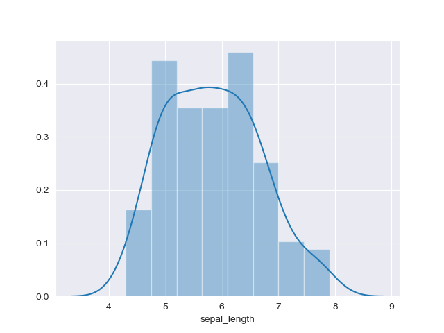
実装はこちら
import matplotlib.pyplot as plt
import pandas as pd
import seaborn as sns

sns.set_style('darkgrid')

df = sns.load_dataset('iris')

sns.distplot(df["sepal_length"])
plt.show()
注意点
- 基本指針にもある通り,一つのグラフに複数のヒストグラムをプロットすると理解しづらくなるため,サブプロットの使用を推奨.
- ヒストグラムをプロットする際はbinを指定する必要がある.
binの区切り方によってはだいぶ印象が変わるため,binを色々と変更してみると良い.
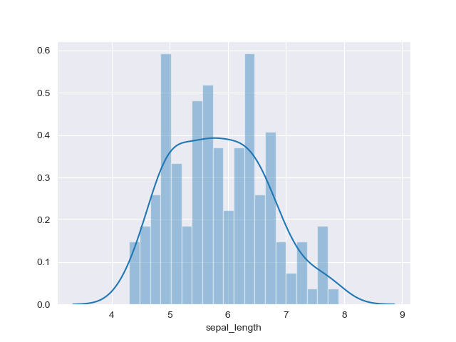
実装はこちら
import matplotlib.pyplot as plt
import pandas as pd
import seaborn as sns

sns.set_style('darkgrid')

df = sns.load_dataset('iris')

sns.distplot(df["sepal_length"], bins=20)
plt.show()
関連するグラフ
累積ヒストグラム(Stacked Histogram)
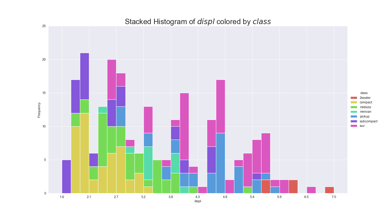
実装はこちら
import matplotlib.pyplot as plt
import numpy as np
import pandas as pd
import seaborn as sns

sns.set_style('darkgrid')

df = pd.read_csv("https://github.com/selva86/datasets/raw/master/mpg_ggplot2.csv")

x_var, groupby_var = 'displ', 'class'
df_agg = df.loc[:, [x_var, groupby_var]].groupby(groupby_var)
vals = [df[x_var].values.tolist() for i, df in df_agg]

plt.figure(figsize=(16,9), dpi=80)
colors = sns.color_palette("hls", len(vals))
n, bins, patches = plt.hist(vals, 30, stacked=True, density=False, color=colors[:len(vals)])

plt.legend(
    {group:col for group, col in zip(np.unique(df[groupby_var]).tolist(), colors[:len(vals)])},
    title=groupby_var,
    loc='center left',
    bbox_to_anchor=(1, .5),
    facecolor='white',
    frameon=False)
plt.title(f"Stacked Histogram of ${x_var}$ colored by ${groupby_var}$", fontsize=22)
plt.xlabel(x_var)
plt.ylabel("Frequency")
plt.ylim(0, 25)
plt.xticks(ticks=bins[::3], labels=[round(b,1) for b in bins[::3]])
plt.show()
実装はこちら
import matplotlib.pyplot as plt
import numpy as np
import pandas as pd
import seaborn as sns

sns.set_style('darkgrid')

df = pd.read_csv("https://github.com/selva86/datasets/raw/master/mpg_ggplot2.csv")

x_var, groupby_var = 'manufacturer', 'class'
df_agg = df.loc[:, [x_var, groupby_var]].groupby(groupby_var)
vals = [df[x_var].values.tolist() for i, df in df_agg]

plt.figure(figsize=(16,9), dpi=80)
colors = sns.color_palette("hls", len(vals))
n, bins, patches = plt.hist(
    vals, df[x_var].unique().__len__(),
    stacked=True,
    density=False,
    orientation='horizontal',
    color=colors[:len(vals)])

plt.legend(
    {group:col for group, col in zip(np.unique(df[groupby_var]).tolist(), colors[:len(vals)])},
    loc='center left',
    title=groupby_var,
    bbox_to_anchor=(1, .5),
    facecolor='white',
    frameon=False)
plt.title(f"Stacked Histogram of ${x_var}$ colored by ${groupby_var}$", fontsize=22)
plt.xlabel("Frequency")
plt.ylabel(x_var)
plt.xlim(0, 40)
plt.xticks(
    ticks=np.arange(0, 41, 5),
    labels=[str(n) for n in np.arange(0, 41, 5)])
plt.yticks(
    ticks=bins+0.5,
    labels=np.unique(df[x_var]).tolist())
plt.show()
注意点
- 累積したヒストグラムよりも,基本指針に従って各ラベルごとにプロットしたほうが見やすい.
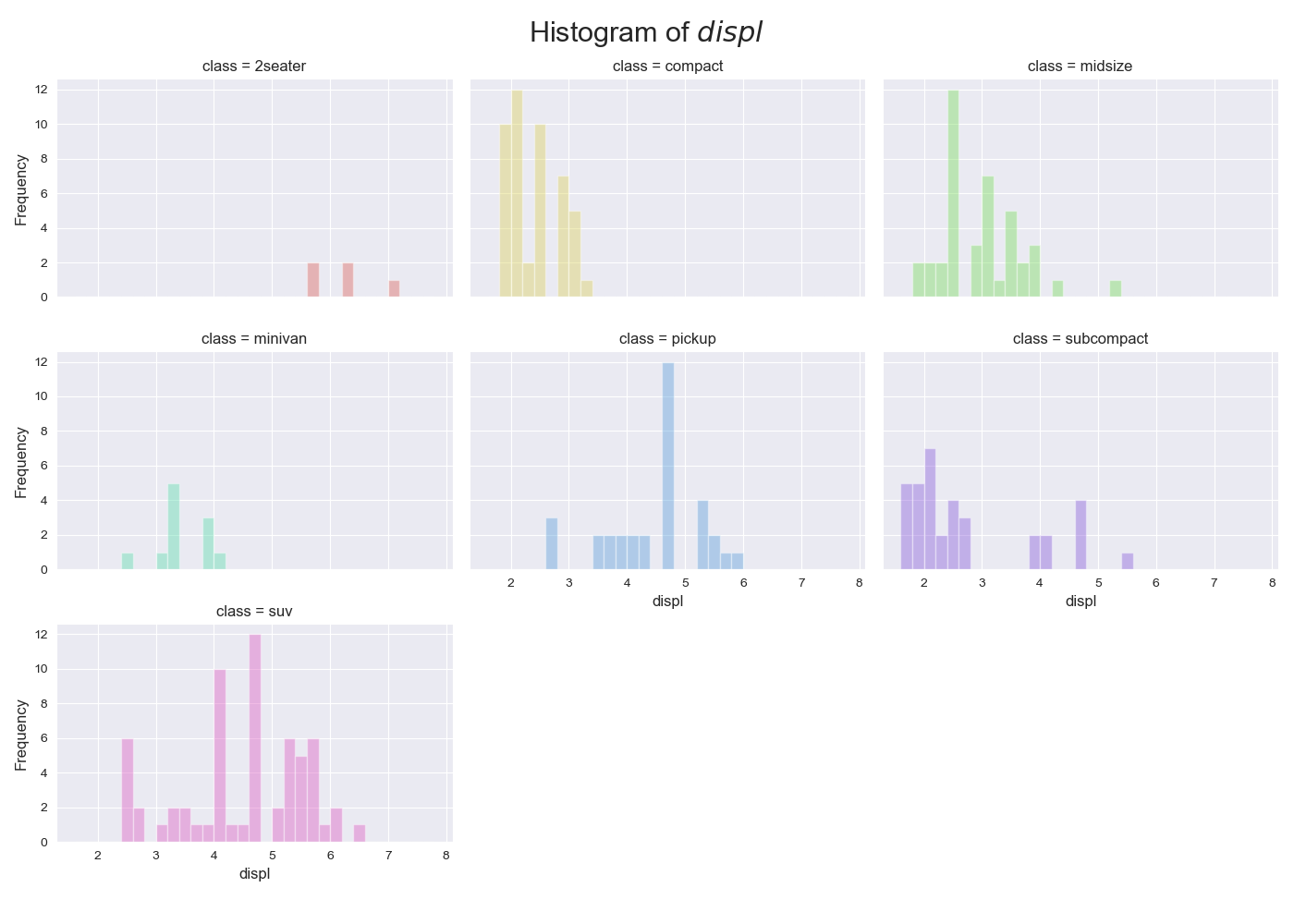
実装はこちら
import matplotlib.pyplot as plt
import numpy as np
import pandas as pd
import seaborn as sns

sns.set_style('darkgrid')

df = pd.read_csv("https://github.com/selva86/datasets/raw/master/mpg_ggplot2.csv")

x_var, groupby_var = 'displ', 'class'
df_agg = df.loc[:, [x_var, groupby_var]].groupby(groupby_var)

classes = np.unique(df[groupby_var]).tolist()
global_min, global_max = df[x_var].min(), df[x_var].max()

nr, nc = 3, 3
x, y = 0, 0
fig, ax = plt.subplots(nrows=nr, ncols=nc, sharex=True, sharey=True, figsize=(14, 10))
for i, c in enumerate(classes):
    x = x + 1 if i > 0 and i % nc == 0 else x
    y = i % nc

    vals = df_agg.get_group(c)[x_var].values
    sns.distplot(
        vals,
        bins=np.arange(global_min, global_max+1, 0.2),
        color=sns.color_palette("hls", len(classes))[i],
        kde=False,
        rug=False,
        ax=ax[x, y])

    if i >= len(classes) - nr:
        ax[x, y].tick_params(labelbottom=True)
        ax[x, y].set_xlabel(x_var, fontsize=12)
    if y==0:
        ax[x, y].set_ylabel('Frequency', fontsize=12)

    ax[x, y].tick_params(labelsize=10)
    ax[x, y].set_title(groupby_var + ' = ' + c, fontsize=12)

if i < nr * nc:
    for i in range(i+1, nr*nc):
        x = x + 1 if i > 0 and i % nc == 0 else x
        y = i % nc

        fig.delaxes(ax[x, y])

fig.suptitle(f"Histogram of ${x_var}$", fontsize=22)
fig.tight_layout(
    rect=[
        0, # left
        0.03, # bottom
        1, # right
        0.95 # top
    ]
)
fig.show()
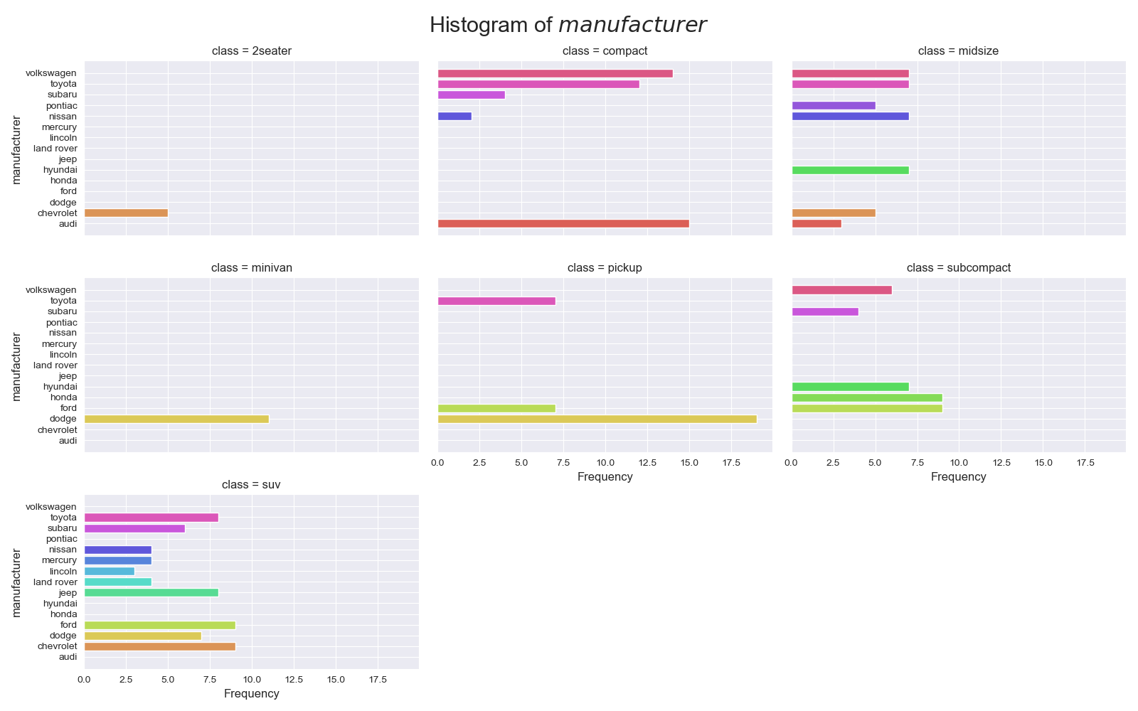
実装はこちら
import matplotlib.pyplot as plt
import numpy as np
import pandas as pd
import seaborn as sns

sns.set_style('darkgrid')

df = pd.read_csv("https://github.com/selva86/datasets/raw/master/mpg_ggplot2.csv")

x_var, groupby_var = 'manufacturer', 'class'
df_agg = df.loc[:, [x_var, groupby_var]].groupby(groupby_var)

# 足りない分を埋める
df_count = df_agg[x_var].value_counts().reset_index(name='Frequency')
all_m = set(np.unique(df_count.manufacturer))
for c in classes:
    current_m = set(df_count[df_count[groupby_var]==c][x_var].values)
    diff = all_m.difference(current_m)
    for d in diff:
        s = pd.Series([c, d, 0], index=[groupby_var, x_var, 'Frequency'])
        df_count = df_count.append(s, ignore_index=True)
df_count = df_count.sort_values(by=[groupby_var, x_var])

u_x_var = np.unique(df_count.manufacturer)
n_u_x_var = len(u_x_var)
r = np.arange(1, n_u_x_var+1)

classes = np.unique(df_count[groupby_var])
nr, nc = 3, 3
x, y = 0, 0
fig, ax = plt.subplots(nrows=nr, ncols=nc, sharex=True, sharey=True, figsize=(16, 10))
for i, c in enumerate(classes):
    x = x + 1 if i > 0 and i % nc == 0 else x
    y = i % nc

    ax[x, y].barh(
        y=r,
        width=df_count[df_count[groupby_var]==c]['Frequency'],
        color=sns.color_palette("hls", n_u_x_var))

    if i >= len(classes) - nr:
        ax[x, y].tick_params(labelbottom=True)
        ax[x, y].set_yticks(np.arange(1, n_u_x_var+1), minor=False)
        ax[x, y].set_yticklabels(u_x_var)
        ax[x, y].set_ylabel(x_var, fontsize=12)
        ax[x, y].set_xlabel('Frequency', fontsize=12)
    else:
        ax[x, y].set_xlabel('')
    if y==0:
        ax[x, y].set_ylabel(x_var, fontsize=12)
    if y != 0:
        ax[x, y].set_ylabel('')

    ax[x, y].tick_params(labelsize=10)
    ax[x, y].set_title(groupby_var + ' = ' + c, fontsize=12)

if i < nr * nc:
    for i in range(i+1, nr*nc):
        x = x + 1 if i > 0 and i % nc == 0 else x
        y = i % nc

        fig.delaxes(ax[x, y])


fig.suptitle(f"Histogram of ${x_var}$", fontsize=22)
fig.tight_layout(
    rect=[
        0, # left
        0, # bottom
        1, # right
        0.95 # top
    ]
)
fig.show()
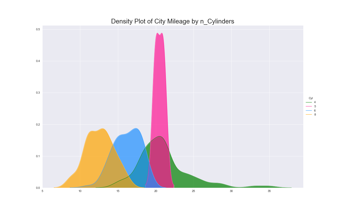
密度プロット(Density Plot)
特徴
このグラフもヒストグラムと同様に単変量の分布を表現できる.
実装はこちら
import matplotlib.pyplot as plt
import pandas as pd
import seaborn as sns

sns.set_style('darkgrid')

df = pd.read_csv("https://github.com/selva86/datasets/raw/master/mpg_ggplot2.csv")

colors = ['g', 'deeppink', 'dodgerblue', 'orange']
plt.figure(figsize=(16,10), dpi=80)
sns.kdeplot(df.loc[df['cyl'] == 4, "cty"], shade=True, color=colors[0], label="4", alpha=.7)
sns.kdeplot(df.loc[df['cyl'] == 5, "cty"], shade=True, color=colors[1], label="5", alpha=.7)
sns.kdeplot(df.loc[df['cyl'] == 6, "cty"], shade=True, color=colors[2], label="6", alpha=.7)
sns.kdeplot(df.loc[df['cyl'] == 8, "cty"], shade=True, color=colors[3], label="8", alpha=.7)

plt.title('Density Plot of City Mileage by n_Cylinders', fontsize=22)
plt.legend(
    title='Cyl',
    loc='center left',
    bbox_to_anchor=(1, .5),
    facecolor='white',
    frameon=False)
plt.show()
注意点
- ヒストグラムと同様にバンド幅を色々と変更すると,印象が変わる4.
- 1つのプロットに複数の密度プロットを示すと理解しづらくなるので,サブプロットを使用するべき.
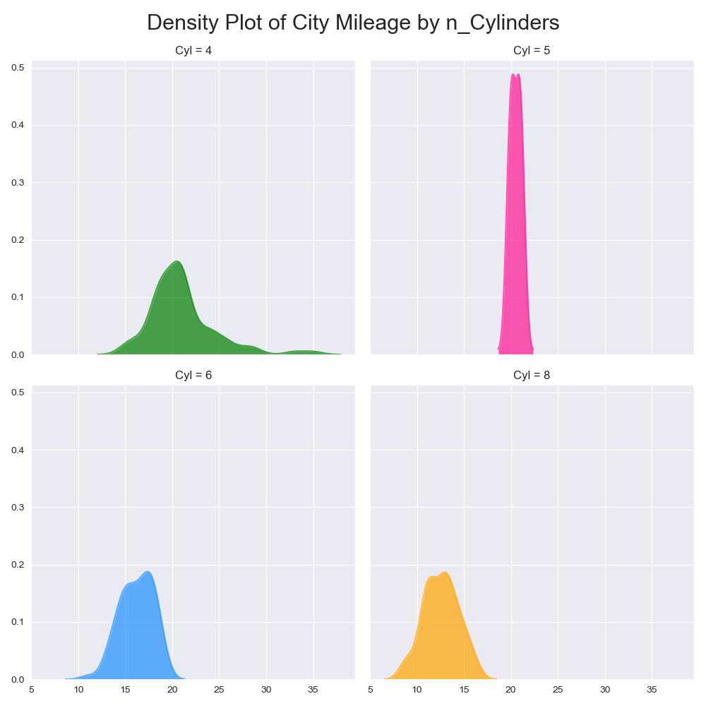
実装はこちら
import matplotlib.pyplot as plt
import pandas as pd
import seaborn as sns

sns.set_style('darkgrid')

df = pd.read_csv("https://github.com/selva86/datasets/raw/master/mpg_ggplot2.csv")

nr, nc = 2, 2
colors = ['dodgerblue', 'g', 'orange']
fig, ax = plt.subplots(nrows=nr, ncols=nc, sharex=True, sharey=True, figsize=(10, 10))
x, y = 0, 0
for i, cyl in enumerate([4, 5, 6, 8]):
    x = x + 1 if i > 0 and i % nc == 0 else x
    y = i % nc

    sns.kdeplot(df.loc[df['cyl'] == cyl, "cty"], shade=True, alpha=.7, color=colors[i], ax=ax[x, y])

    ax[x, y].set_title("Cyl = "+str(cyl), fontsize=12)
    ax[x, y].legend('', frameon=False)

fig.suptitle('Density Plot of City Mileage by n_Cylinders', fontsize=22)
fig.tight_layout(
    rect=[
        0, # left
        0, # bottom
        1, # right
        0.95 # top
    ]
)
fig.show()
関連するグラフ
密度プロット+ヒストグラム
実装はこちら
import matplotlib.pyplot as plt
import pandas as pd
import seaborn as sns
sns.set_style('white')
df = pd.read_csv("https://github.com/selva86/datasets/raw/master/mpg_ggplot2.csv")
# Draw Plot
plt.figure(figsize=(13,10), dpi=80)
sns.distplot(df.loc[df['class'] == 'compact', "cty"], color="dodgerblue", label="Compact", hist_kws={'alpha':.7}, kde_kws={'linewidth':3})
sns.distplot(df.loc[df['class'] == 'suv', "cty"], color="orange", label="SUV", hist_kws={'alpha':.7}, kde_kws={'linewidth':3})
sns.distplot(df.loc[df['class'] == 'minivan', "cty"], color="g", label="minivan", hist_kws={'alpha':.7}, kde_kws={'linewidth':3})
plt.ylim(0, 0.35)
# Decoration
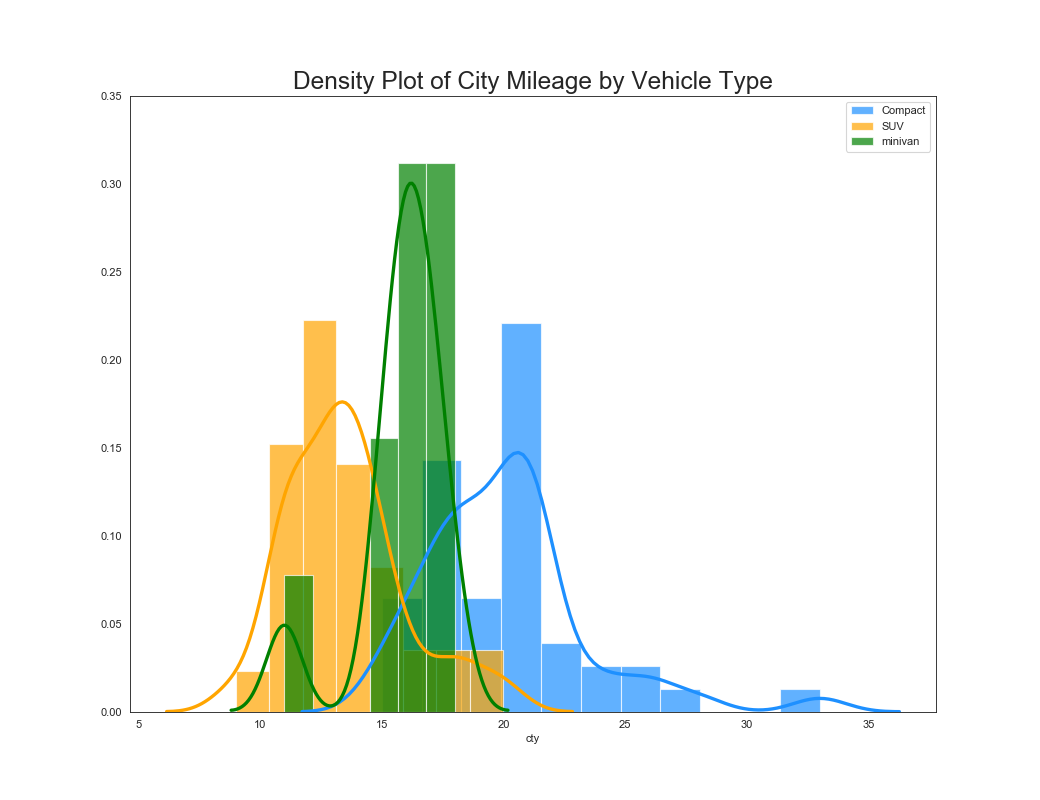
plt.title('Density Plot of City Mileage by Vehicle Type', fontsize=22)
plt.legend()
plt.show()
実装はこちら
import matplotlib.pyplot as plt
import pandas as pd
import seaborn as sns

sns.set_style('white')

df = pd.read_csv("https://github.com/selva86/datasets/raw/master/mpg_ggplot2.csv")

colors = ['dodgerblue', 'g', 'orange']

nr, nc = 2, 2
fig, ax = plt.subplots(nrows=nr, ncols=nc, sharex=True, sharey=True, figsize=(10, 10))
x, y = 0, 0
classes = ['compact', 'suv', 'minivan']
for i, c in enumerate(classes):
    x = x + 1 if i > 0 and i % nc == 0 else x
    y = i % nc

    sns.distplot(df.loc[df['class'] == c, "cty"], label=c, hist_kws={'alpha':.7}, kde_kws={'linewidth':3}, ax=ax[x, y], color=colors[i])

    if i >= len(classes) - nr:
        ax[x, y].tick_params(labelbottom=True)
        ax[x, y].set_xlabel('cty', fontsize=12)
    else:
        ax[x, y].set_xlabel('')

    ax[x, y].tick_params(labelsize=10)
    ax[x, y].set_title('class = ' + c, fontsize=12)

if i < nr * nc:
    for i in range(i+1, nr*nc):
        x = x + 1 if i > 0 and i % nc == 0 else x
        y = i % nc

        fig.delaxes(ax[x, y])

fig.suptitle('Density Plot of City Mileage by Vehicle Type', fontsize=22)
fig.tight_layout(
    rect=[
        0, # left
        0, # bottom
        1, # right
        0.95 # top
    ]
)
fig.show()
2D密度プロット(2D Density Plot)
特徴
データ数が大きい場合に散布図よりも有効.
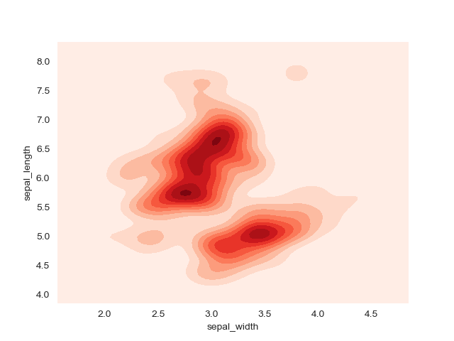
実装はこちら
import matplotlib.pyplot as plt
import pandas as pd
import seaborn as sns
from matplotlib_venn import venn3

sns.set_style('darkgrid')

df = sns.load_dataset('iris')

sns.kdeplot(df.sepal_width, df.sepal_length, cmap="Reds", shade=True, bw=.15)

plt.show()
箱ひげ図(Box Plot)
特徴
箱ひげ図はある変数の分布を表すのに向いている.
ヒストグラムや密度プロットと違い,箱ひげ図は複数の変数を扱うことができる.
箱ひげ図の中央の線はその変数の中央値を表している.
箱の上部と下部はそれぞれ75%tile,25%tileの数値を表している.
箱から伸びている線に収まっていない点は外れ値としてみなす.
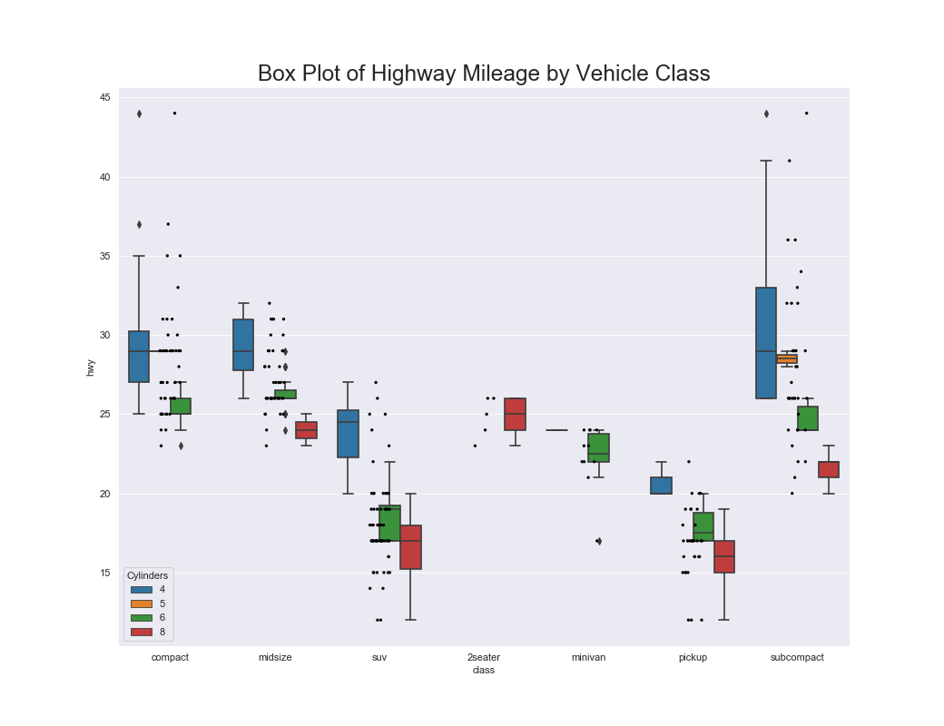
実装はこちら
import matplotlib.pyplot as plt
import pandas as pd
import seaborn as sns

sns.set_style('darkgrid')

df = pd.read_csv("https://github.com/selva86/datasets/raw/master/mpg_ggplot2.csv")

plt.figure(figsize=(13,10), dpi=80)
sns.boxplot(x='class', y='hwy', data=df, hue='cyl')
sns.stripplot(x='class', y='hwy', data=df, color='black', size=3, jitter=1)

plt.title('Box Plot of Highway Mileage by Vehicle Class', fontsize=22)
plt.legend(title='Cylinders')
plt.show()
注意点
- 箱ひげ図では分布がわからないので,サンプル数が少なければジッター or スウォームプロット,多ければバイオリンプロットを使うと良い.
- 中央値順に並べるとインサイトを生みやすい.
- 箱ひげ図はサンプル数がわからなくなってしまうため,プロットに示しておくのが親切.
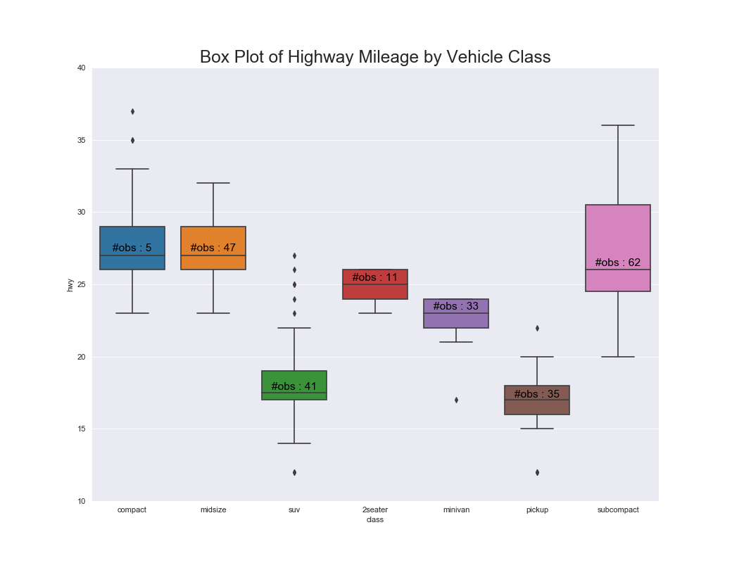
実装はこちら
import matplotlib.pyplot as plt
import pandas as pd
import seaborn as sns

sns.set_style('darkgrid')

df = pd.read_csv("https://github.com/selva86/datasets/raw/master/mpg_ggplot2.csv")

plt.figure(figsize=(13,10), dpi=80)
sns.boxplot(x='class', y='hwy', data=df, notch=False)

def add_n_obs(df,group_col,y):
    medians_dict = {grp[0]:grp[1][y].median() for grp in df.groupby(group_col)}
    xticklabels = [x.get_text() for x in plt.gca().get_xticklabels()]
    n_obs = df.groupby(group_col)[y].size().values
    for (x, xticklabel), n_ob in zip(enumerate(xticklabels), n_obs):
        plt.text(x, medians_dict[xticklabel]*1.01, "#obs : "+str(n_ob), horizontalalignment='center', fontdict={'size':14}, color='black')

add_n_obs(df, group_col='class', y='hwy')

plt.title('Box Plot of Highway Mileage by Vehicle Class', fontsize=22)
plt.ylim(10, 40)
plt.show()
バイオリンプロット(Violin Plot)
特徴
バイオリンプロットは箱ひげ図とよく似ているが,箱ひげ図と違い分布がわかる.
バイオリンプロットはデータ数が多く個々のデータ点を観測できないときによく使用される.
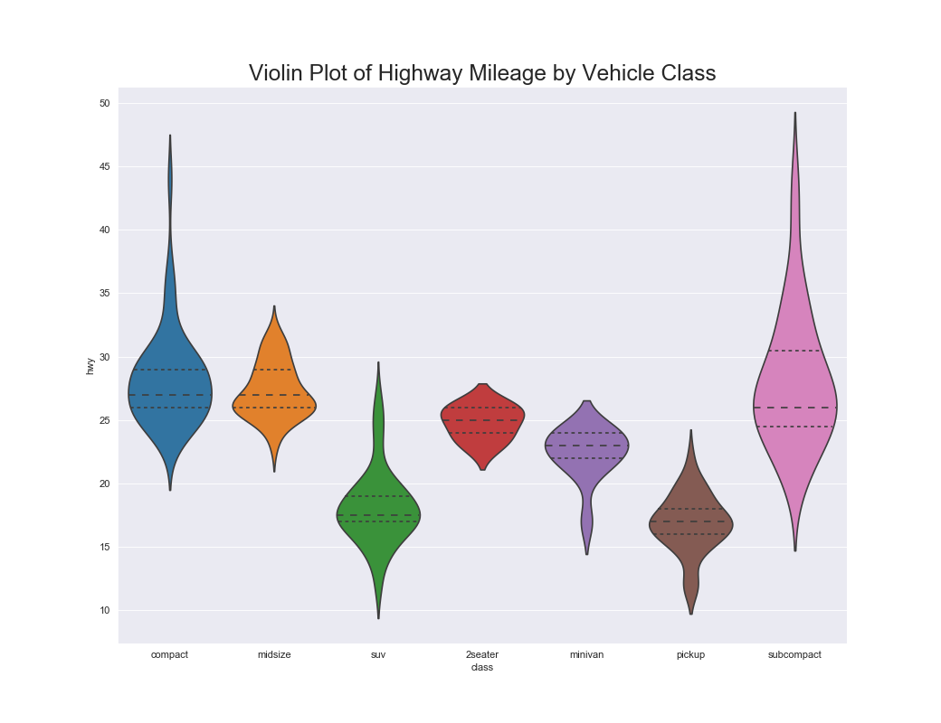
実装はこちら
import matplotlib.pyplot as plt
import pandas as pd
import seaborn as sns

sns.set_style('darkgrid')

df = pd.read_csv("https://github.com/selva86/datasets/raw/master/mpg_ggplot2.csv")

plt.figure(figsize=(13,10), dpi=80)
sns.violinplot(x='class', y='hwy', data=df, scale='width', inner='quartile')

plt.title('Violin Plot of Highway Mileage by Vehicle Class', fontsize=22)
plt.show()
注意点
- グループ数が少ないのであればリッジラインも良い.
- グループ毎にサンプル数が異なる場合は,サンプル数をそれぞれプロットするべき.
- 中央値順に並べるとインサイトを生みやすい.
関連するグラフ
バイオリンプロットによるカウントプロット
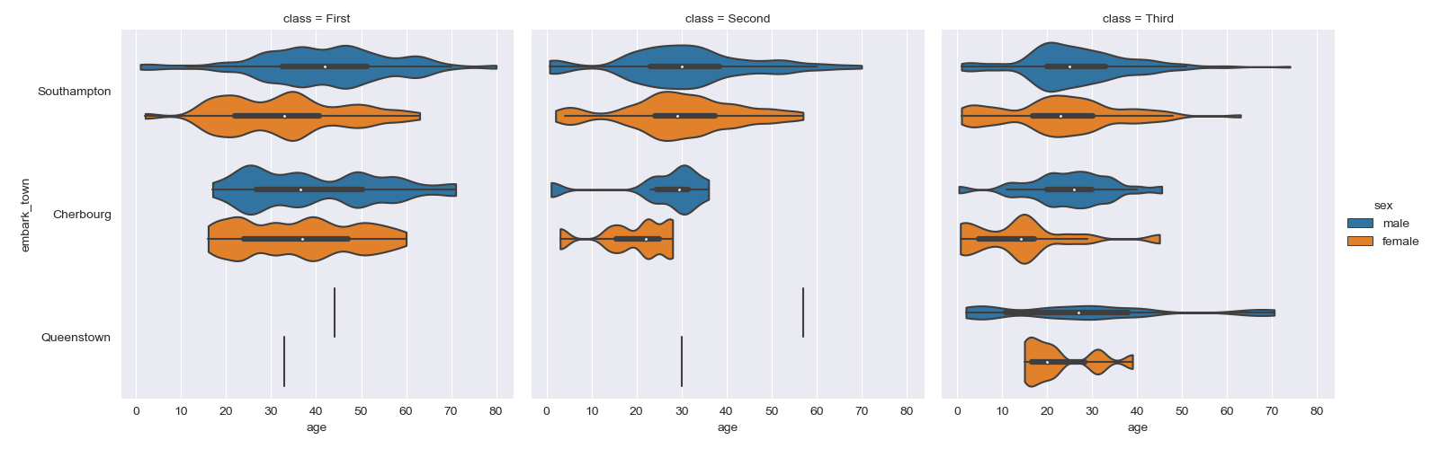
実装はこちら
import matplotlib.pyplot as plt
import pandas as pd
import seaborn as sns

sns.set_style('darkgrid')

titanic = sns.load_dataset("titanic")

sns.catplot(x="age", y="embark_town",
            hue="sex", col="class",
            data=titanic[titanic.embark_town.notnull()],
            orient="h", height=5, aspect=1, palette="tab10",
            kind="violin", dodge=True, cut=0, bw=.2)
plt.show()
散布図(Scatter Plot)
特徴
2変数間の関係がわかる.
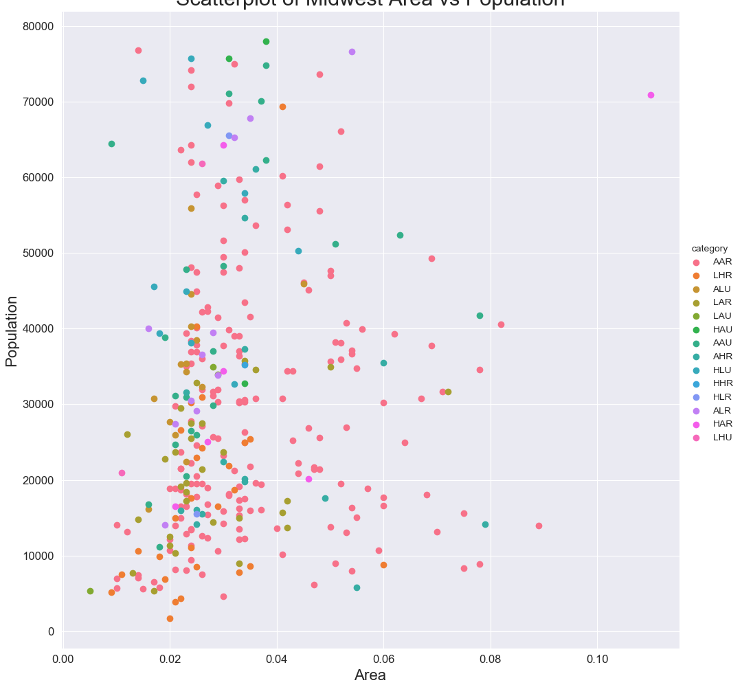
実装はこちら
import matplotlib.pyplot as plt
import pandas as pd
import seaborn as sns

sns.set_style('darkgrid')

df = pd.read_csv('https://raw.githubusercontent.com/selva86/datasets/master/midwest_filter.csv')

grid = sns.FacetGrid(df, hue='category', size=10)
grid.map(plt.scatter, 'area', 'poptotal')

grid.add_legend()
plt.xticks(fontsize=12)
plt.yticks(fontsize=12)
plt.xlabel('Area', fontsize=16)
plt.ylabel('Population', fontsize=16)
plt.title('Scatterplot of Midwest Area vs Population', fontsize=22)
plt.show()
注意点
- データ点があまりにも多いとよくわからないことになる.
- サブグループがあればサブプロットとして切り出してプロットするべき.
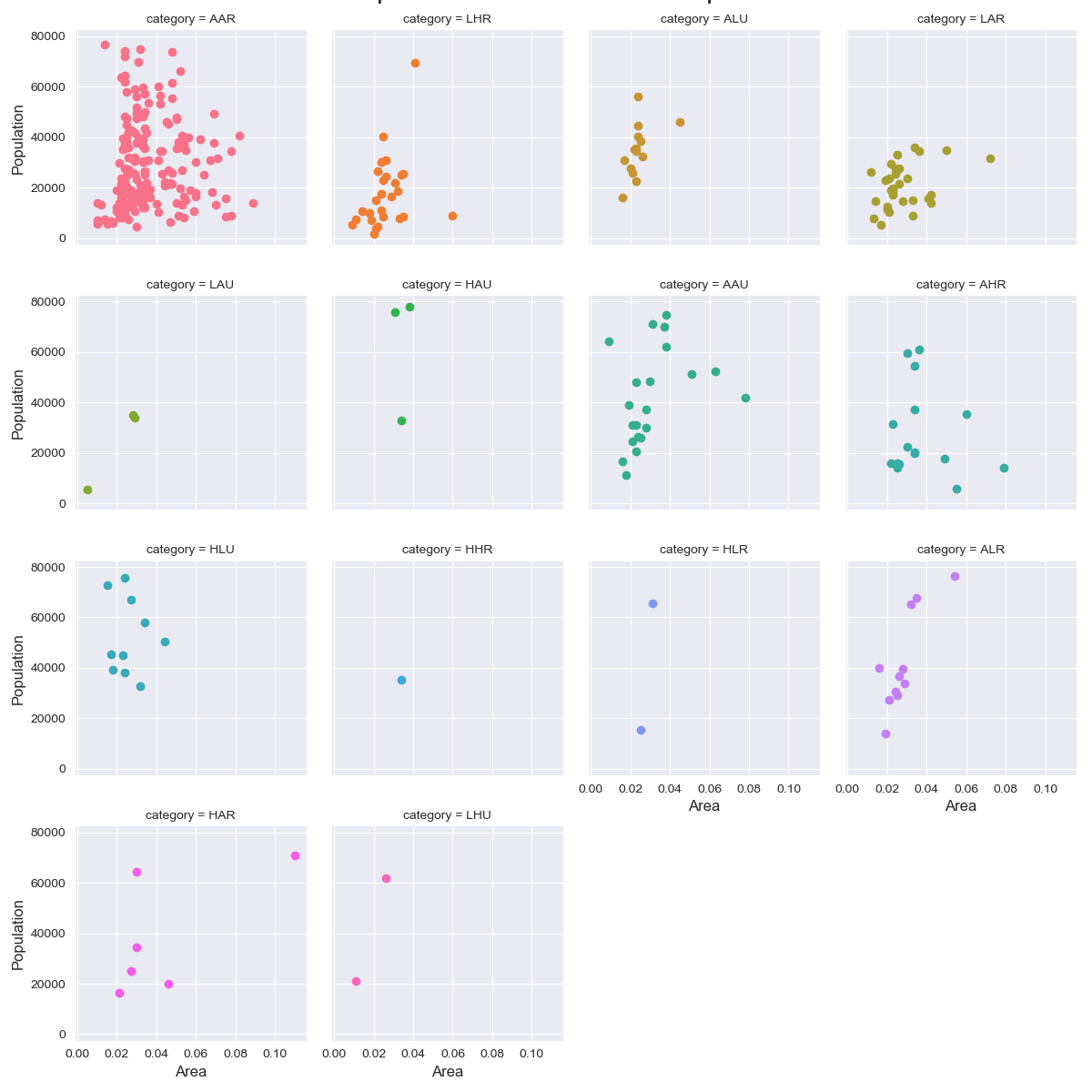
実装はこちら
import matplotlib.pyplot as plt
import pandas as pd
import seaborn as sns

sns.set_style('darkgrid')

df = pd.read_csv('https://raw.githubusercontent.com/selva86/datasets/master/midwest_filter.csv')

grid = sns.FacetGrid(df, col='category', hue='category', col_wrap=4, size=3)
grid.map(plt.scatter, 'area', 'poptotal')

grid.fig.suptitle('Scatterplot of Midwest Area vs Population', y=1.02, fontsize=22)
for ax in grid._bottom_axes:
    ax.set_xlabel('Area', fontsize=12)
for ax in grid._left_axes:
    ax.set_ylabel('Population', fontsize=12)
plt.show()
関連するグラフ
クラスタ付き散布図(Scatter with Clusters)
特徴
凡例の色を変えるだけでなく,注目させたい部分を囲うとだいぶわかりやすくなる.
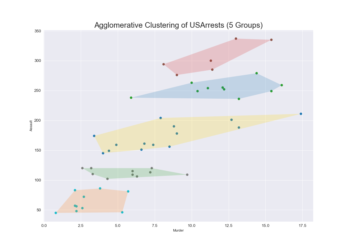
実装はこちら
import matplotlib.pyplot as plt
import numpy as np
import pandas as pd
import seaborn as sns
from sklearn.cluster import AgglomerativeClustering
from scipy.spatial import ConvexHull

sns.set_style('darkgrid')

df = pd.read_csv('https://raw.githubusercontent.com/selva86/datasets/master/USArrests.csv')

cluster = AgglomerativeClustering(n_clusters=5, affinity='euclidean', linkage='ward')
cluster.fit_predict(df[['Murder', 'Assault', 'UrbanPop', 'Rape']])

plt.figure(figsize=(14, 10), dpi= 80)
plt.scatter(df.iloc[:,0], df.iloc[:,1], c=cluster.labels_, cmap='tab10')

def encircle(x,y, ax=None, **kw):
    if not ax: ax=plt.gca()
    p = np.c_[x,y]
    hull = ConvexHull(p)
    poly = plt.Polygon(p[hull.vertices,:], **kw)
    ax.add_patch(poly)

encircle(df.loc[cluster.labels_ == 0, 'Murder'], df.loc[cluster.labels_ == 0, 'Assault'], ec="k", fc="gold", alpha=0.2, linewidth=0)
encircle(df.loc[cluster.labels_ == 1, 'Murder'], df.loc[cluster.labels_ == 1, 'Assault'], ec="k", fc="tab:blue", alpha=0.2, linewidth=0)
encircle(df.loc[cluster.labels_ == 2, 'Murder'], df.loc[cluster.labels_ == 2, 'Assault'], ec="k", fc="tab:red", alpha=0.2, linewidth=0)
encircle(df.loc[cluster.labels_ == 3, 'Murder'], df.loc[cluster.labels_ == 3, 'Assault'], ec="k", fc="tab:green", alpha=0.2, linewidth=0)
encircle(df.loc[cluster.labels_ == 4, 'Murder'], df.loc[cluster.labels_ == 4, 'Assault'], ec="k", fc="tab:orange", alpha=0.2, linewidth=0)

plt.xlabel('Murder'); plt.xticks(fontsize=12)
plt.ylabel('Assault'); plt.yticks(fontsize=12)
plt.title('Agglomerative Clustering of USArrests (5 Groups)', fontsize=22)
plt.show()
散布図+回帰(Scatter with Regression)
特徴
回帰直線を引くことで,単なる散布図以上にデータの傾向の違いを示すことができる..
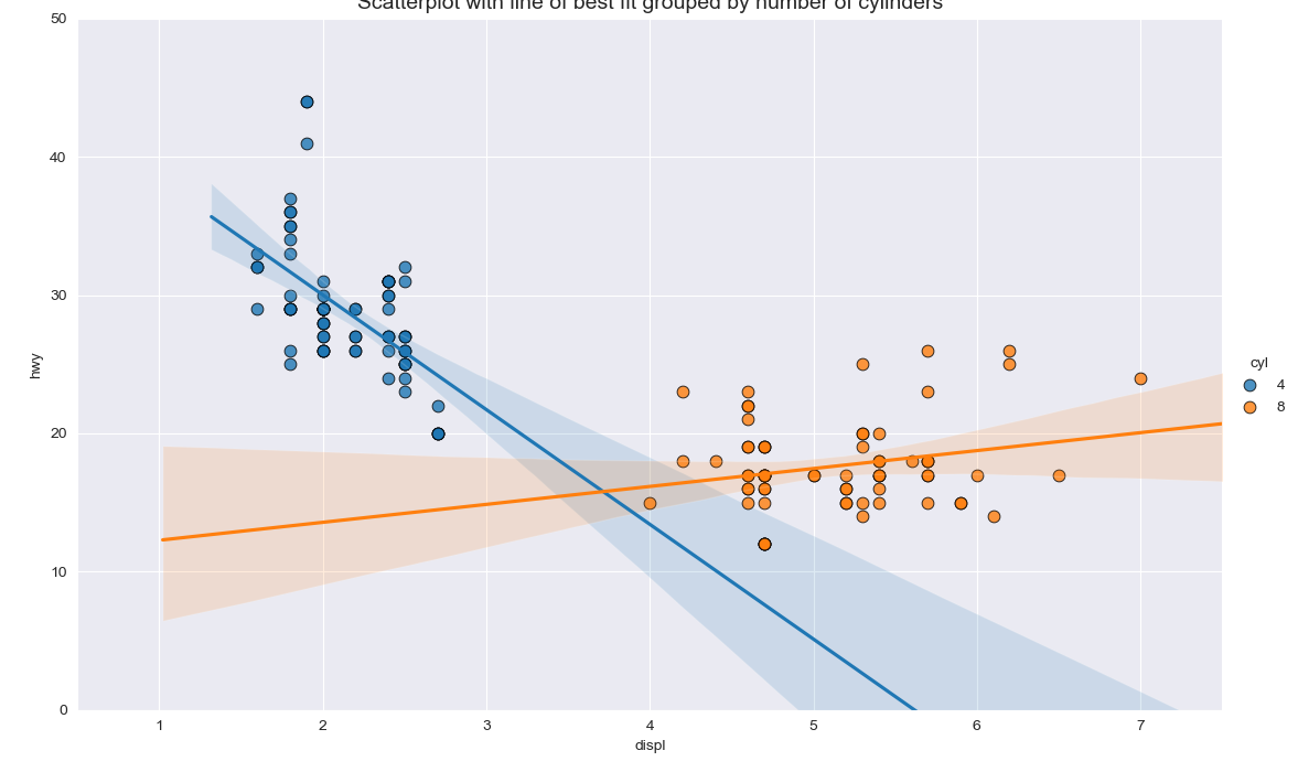
実装はこちら
import matplotlib.pyplot as plt
import pandas as pd
import seaborn as sns

sns.set_style('darkgrid')

df = pd.read_csv("https://raw.githubusercontent.com/selva86/datasets/master/mpg_ggplot2.csv")
df_select = df.loc[df.cyl.isin([4,8]), :]

grid = sns.lmplot(
    x='displ', y='hwy', data=df_select, hue='cyl',
    height=7,
    aspect=1.6,
    palette='tab10',
    scatter_kws=dict(s=60, linewidth=.7, edgecolors='black'))
grid.set(xlim=(0.5, 7.5), ylim=(0, 50))
plt.title("Scatterplot with line of best fit grouped by number of cylinders", fontsize=14)
plt.show()
実装はこちら
import matplotlib.pyplot as plt
import pandas as pd
import seaborn as sns

sns.set_style('darkgrid')

df = pd.read_csv("https://raw.githubusercontent.com/selva86/datasets/master/mpg_ggplot2.csv")
df_select = df.loc[df.cyl.isin([4,8]), :]

grid = sns.lmplot(
    x='displ', y='hwy', data=df_select,
    height=7,
    aspect=1.6,
    palette='tab10',
    col='cyl',
    scatter_kws=dict(s=60, linewidth=.7, edgecolors='black')
)
grid.set(xlim=(0.5, 7.5), ylim=(0, 50))
plt.show()
散布図+分布(Scatter with Marginal Point)
特徴
データ点が多い場合には単なる散布図よりも有効.
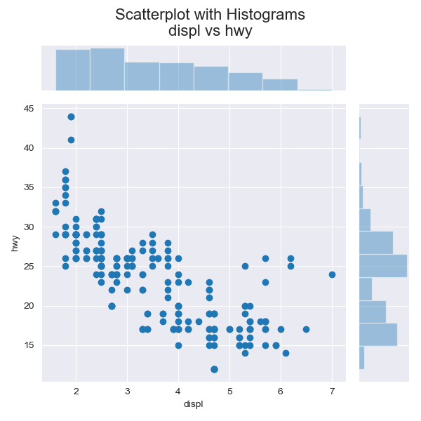
実装はこちら
import matplotlib.pyplot as plt
import pandas as pd
import seaborn as sns

sns.set_style('darkgrid')

df = pd.read_csv("https://raw.githubusercontent.com/selva86/datasets/master/mpg_ggplot2.csv")

sns.jointplot(x='displ', y='hwy', data=df)

plt.suptitle('Scatterplot with Histograms\ndispl vs hwy', fontsize=16)
plt.tight_layout(
    rect=[
        0, # left
        0, # bottom
        1, # right
        0.92 # top
    ]
)
plt.show()

実装はこちら
import matplotlib.pyplot as plt
import numpy as np
import pandas as pd
import seaborn as sns

sns.set_style('darkgrid')

df = pd.read_csv("https://raw.githubusercontent.com/selva86/datasets/master/mpg_ggplot2.csv")

x_var, y_var, hue = 'displ', 'hwy', 'manufacturer'
displ_min, displ_max = 1, 8
hwy_min, hwy_max = 10, 46

nr, nc = 3, 5
fig = plt.figure(figsize=(16, 10), dpi=80)
grid = plt.GridSpec(4*nr, 4*nc, hspace=0.1, wspace=0.1)

index = 0
categories = np.unique(df[hue])
x, y = 0, 0
for i in range(nc):
    for j in range(nr):
        x_start, y_start = i*4, j*4
        x_end, y_end = x_start+3, y_start+3

        if i==0 and j==nr-1:
            ax_main = fig.add_subplot(grid[y_start+1:y_end, x_start:x_end-1])
            ax_main.set(xlabel=x_var, ylabel=y_var)
        elif i==0:
            ax_main = fig.add_subplot(grid[y_start+1:y_end, x_start:x_end-1], xticklabels=[])
            ax_main.set(ylabel=y_var)
        elif j==nr-1:
            ax_main = fig.add_subplot(grid[y_start+1:y_end, x_start:x_end-1], yticklabels=[])
            ax_main.set(xlabel=x_var)
        else:
            ax_main = fig.add_subplot(grid[y_start+1:y_end, x_start:x_end-1], xticklabels=[], yticklabels=[])
        ax_top = fig.add_subplot(grid[y_start, x_start:x_end-1], xticklabels=[], yticklabels=[])
        ax_right = fig.add_subplot(grid[y_start+1:y_end, x_end-1], xticklabels=[], yticklabels=[])

        ax_main.set_xlim([displ_min, displ_max])
        ax_main.set_ylim([hwy_min, hwy_max])
        ax_top.set_xlim([displ_min, displ_max])
        ax_right.set_ylim([hwy_min, hwy_max])

        ax_main.scatter(
            x_var, y_var, data=df[df[hue]==categories[index]],
            s=df[df[hue]==categories[index]].cty*4,
            alpha=.9,
            edgecolors='gray',
            linewidths=.5)
        sns.violinplot(
            x=x_var, data=df[df[hue]==categories[index]],
            ax=ax_top)
        sns.violinplot(
            y=y_var, data=df[df[hue]==categories[index]],
            ax=ax_right)
        ax_top.set(xlabel='')
        ax_right.set(ylabel='')

        for item in ([ax_main.xaxis.label, ax_main.yaxis.label] + ax_main.get_xticklabels() + ax_main.get_yticklabels()):
            item.set_fontsize(10)
        ax_top.set(title='category = ' + categories[index])
        ax_top.title.set_fontsize(10)

        index += 1

fig.suptitle('Scatterplot with violinplots \n ' + x_var + 'vs' + y_var, fontsize=22)
fig.show()
線付き散布図(Connected Scatter Plot)
特徴
散布図と折れ線グラフの中間.時系列でよく使われる.
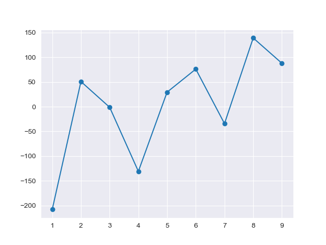
実装はこちら
import matplotlib.pyplot as plt
import numpy as np
import pandas as pd
import seaborn as sns
from matplotlib_venn import venn3

sns.set_style('darkgrid')

df=pd.DataFrame({'x': range(1,10), 'y': np.random.randn(9)*80+range(1,10) })

plt.plot( 'x', 'y', data=df, linestyle='-', marker='o')
plt.show()
注意点
- $x$軸もしくは$y$軸のどちらかは順序通りに並べておくとインサイトを得やすい.
スロープチャート(Slope Chart)
特徴
線付き散布図の亜種.
前後での差を伝えるときに向いている.

実装はこちら
import matplotlib.pyplot as plt
import matplotlib.lines as mlines
import numpy as np
import pandas as pd
import seaborn as sns

sns.set_style('white')

df = pd.read_csv("https://raw.githubusercontent.com/selva86/datasets/master/gdppercap.csv")

def newline(p1, p2, color='black'):
    ax = plt.gca()
    l = mlines.Line2D([p1[0],p2[0]], [p1[1],p2[1]], color='red' if p1[1]-p2[1] > 0 else 'green', marker='o', markersize=6)
    ax.add_line(l)
    return l

fig, ax = plt.subplots(nrows=1, ncols=1, sharex=True, sharey=True, figsize=(14,14), dpi=80)

ax.vlines(x=1, ymin=500, ymax=13000, color='black', alpha=0.7, linewidth=1, linestyles='dotted')
ax.vlines(x=3, ymin=500, ymax=13000, color='black', alpha=0.7, linewidth=1, linestyles='dotted')

ax.scatter(y=df['1952'], x=np.repeat(1, df.shape[0]), s=10, color='black', alpha=0.7)
ax.scatter(y=df['1957'], x=np.repeat(3, df.shape[0]), s=10, color='black', alpha=0.7)

for p1, p2, c in zip(df['1952'], df['1957'], df['continent']):
    newline([1,p1], [3,p2])
    ax.text(1-0.05, p1, c + ', ' + str(round(p1)), horizontalalignment='right', verticalalignment='center', fontdict={'size':14})
    ax.text(3+0.05, p2, c + ', ' + str(round(p2)), horizontalalignment='left', verticalalignment='center', fontdict={'size':14})

ax.text(1-0.05, 13000, 'BEFORE', horizontalalignment='right', verticalalignment='center', fontdict={'size':18, 'weight':700})
ax.text(3+0.05, 13000, 'AFTER', horizontalalignment='left', verticalalignment='center', fontdict={'size':18, 'weight':700})

ax.set_title("Slopechart: Comparing GDP Per Capita between 1952 vs 1957", fontdict={'size':22})
ax.set(xlim=(0,4), ylim=(0,14000), ylabel='Mean GDP Per Capita')
ax.set_xticks([1,3])
ax.set_xticklabels(["1952", "1957"])
plt.yticks(np.arange(500, 13000, 2000), fontsize=12)

plt.gca().spines["top"].set_alpha(.0)
plt.gca().spines["bottom"].set_alpha(.0)
plt.gca().spines["right"].set_alpha(.0)
plt.gca().spines["left"].set_alpha(.0)
plt.show()
ダンベルチャート(Dumbbell Chart)
特徴
前後でどのくらいの差が存在するのかを伝えるのが得意.
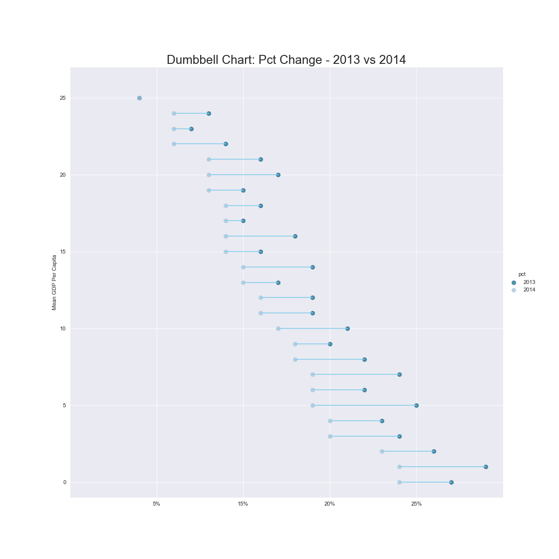
実装はこちら
import matplotlib.pyplot as plt
import matplotlib.lines as mlines
import pandas as pd
import seaborn as sns

sns.set_style('darkgrid')

# Import Data
df = pd.read_csv("https://raw.githubusercontent.com/selva86/datasets/master/health.csv")
df.sort_values('pct_2014', inplace=True)
df.reset_index(inplace=True)

# Func to draw line segment
def newline(p1, p2, color='black'):
    ax = plt.gca()
    l = mlines.Line2D([p1[0],p2[0]], [p1[1],p2[1]], color='skyblue')
    ax.add_line(l)
    return l

# Figure and Axes
fig, ax = plt.subplots(nrows=1, ncols=1, sharex=True, sharey=True, figsize=(14,14), dpi=80)

# Points
ax.scatter(y=df['index'], x=df['pct_2013'], s=50, color='#0e668b', alpha=0.7, label='2013')
ax.scatter(y=df['index'], x=df['pct_2014'], s=50, color='#a3c4dc', alpha=0.7, label='2014')

# Line Segments
for i, p1, p2 in zip(df['index'], df['pct_2013'], df['pct_2014']):
    newline([p1, i], [p2, i])

# Decoration
ax.set_title("Dumbbell Chart: Pct Change - 2013 vs 2014", fontdict={'size':22})
ax.set(xlim=(0,.25), ylim=(-1, 27), ylabel='Mean GDP Per Capita')
ax.set_xticks([.05, .1, .15, .20])
ax.set_xticklabels(['5%', '15%', '20%', '25%'])
ax.legend(title='pct', loc='center left', bbox_to_anchor=(1, .5), facecolor='white', frameon=False)
plt.show()
バブルプロット(Bubble Plot)
特徴
散布図と同様で2変数間の関係を扱える.
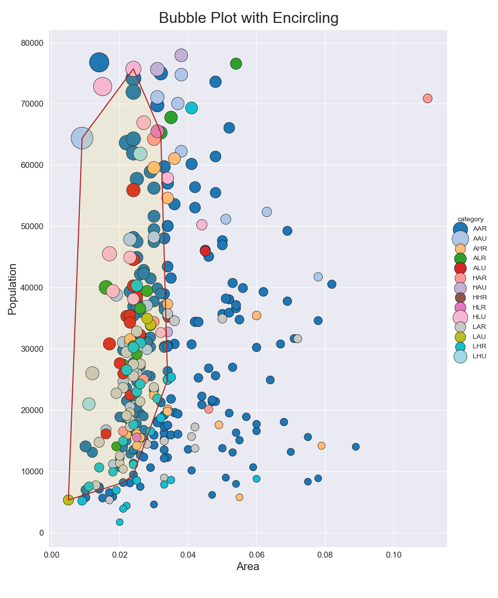
実装はこちら
import matplotlib.pyplot as plt
import numpy as np
import pandas as pd
import seaborn as sns
from scipy.spatial import ConvexHull

sns.set_style('darkgrid')

df = pd.read_csv('https://raw.githubusercontent.com/selva86/datasets/master/midwest_filter.csv')

def encircle(x, y, ax=None, **kw):
    if not ax:
        ax = plt.gca()
    p = np.c_[x, y] # 行方向に連結
    hull = ConvexHull(p)
    poly = plt.Polygon(p[hull.vertices, :], **kw)
    ax.add_patch(poly)

categories = np.unique(df['category'])
colors = [plt.cm.tab20(i/float(len(categories)-1)) for i in range(len(categories))]
encircle_data = df.loc[df.state=='IN', :]

fig, ax = plt.subplots(nrows=1, ncols=1, sharex=True, sharey=True, figsize=(10, 12))
for i, category in enumerate(categories):
    ax.scatter(
        'area', 'poptotal', data=df[df.category==category],
        s='dot_size',
        c=colors[i],
        label=str(category),
        edgecolors='black',
        linewidth=.5
    )

encircle(encircle_data.area, encircle_data.poptotal, ec='k', fc='gold', alpha=.1)
encircle(encircle_data.area, encircle_data.poptotal, ec='firebrick', fc='none', linewidth=1.5)

ax.legend(
    title='category',
    loc='center left',
    bbox_to_anchor=(1, .5),
    facecolor='white',
    frameon=False)
ax.set_xlabel('Area', fontsize=16)
ax.set_ylabel('Population', fontsize=16)
ax.tick_params(labelsize=12)
fig.suptitle('Bubble Plot with Encircling', fontsize=22)
fig.tight_layout(
    rect=[
        0, # left
        0.03, # bottom
        1, # right
        0.965 # top
    ]
)
fig.show()
注意点
- バブルプロットの場合は各バブルがどのくらいの大きさを表しているのかを示すべき5.
- 散布図同様に要素が多い場合は別にプロットすべき.

実装はこちら
import matplotlib.pyplot as plt
import numpy as np
import pandas as pd
import seaborn as sns
from scipy.spatial import ConvexHull

sns.set_style('darkgrid')

df = pd.read_csv('https://raw.githubusercontent.com/selva86/datasets/master/midwest_filter.csv')

categories = np.unique(df['category'])
colors = [plt.cm.tab20(i/float(len(categories)-1)) for i in range(len(categories))]
encircle_data = df.loc[df.state=='IN', :]

def ceil_float(src, range):
    return ((src / range) + 1) * range

def ceil_int(src, range):
    return ((int)(src / range) + 1) * range

def encircle(x, y, ax=None, **kw):
    if not ax:
        ax = plt.gca()
    p = np.c_[x, y] # 行方向に連結
    hull = ConvexHull(p)
    poly = plt.Polygon(p[hull.vertices, :], **kw)
    ax.add_patch(poly)

area_min, area_max = 0, ceil_float(df['area'].max(), 0.001)
poptotal_min, poptotal_max = 0, ceil_int(df['poptotal'].max(), 10000)
xticks = np.arange(0, area_max+0.01, area_max/4)
yticks = np.arange(0, poptotal_max+1, poptotal_max/4)

nr, nc = 4, 4
fig, ax = plt.subplots(nrows=nr, ncols=nc, sharex=True, sharey=True, figsize=(10, 10))
x, y = 0, 0
for i, category in enumerate(categories):
    x = x + 1 if i > 0 and i % nc == 0 else x
    y = i % nc

    ax[x, y].set_xticks(xticks, minor=True)
    ax[x, y].set_yticks(yticks, minor=True)
    ax[x, y].tick_params(labelsize=8)
    ax[x, y].set_title('category = ' + category)

    if i >= len(categories) - nc:
        ax[x, y].tick_params(labelbottom=True)
        ax[x, y].set_xlabel('Area', fontsize=10)
    if y==0:
        ax[x, y].set_ylabel('Population', fontsize=10)

    ax[x, y].scatter(
        'area', 'poptotal', data=df[df.category==category],
        s='dot_size',
        c=colors[i],
        label=str(category),
        edgecolors='black',
        linewidth=.5
    )
    encircle(encircle_data.area, encircle_data.poptotal, ax=ax[x, y], ec='k', fc='gold', alpha=.1)
    encircle(encircle_data.area, encircle_data.poptotal, ax=ax[x, y], ec='firebrick', fc='none', linewidth=1.5)

if i < nr * nc:
    for i in range(i+1, nr*nc):
        x = x + 1 if i > 0 and i % nc == 0 else x
        y = i % nc

        fig.delaxes(ax[x, y])

fig.suptitle('Bubble Plot with Encircling', fontsize=22)
fig.tight_layout(
    rect=[
        0, # left
        0.03, # bottom
        1, # right
        0.96 # top
    ]
)
fig.show()
ジッタープロット(Jitter Plot)
特徴
散布図と同様に2変数間の関係を扱える.
ただ,同じ座標の点が重ならないように微妙にずらしてプロットする.
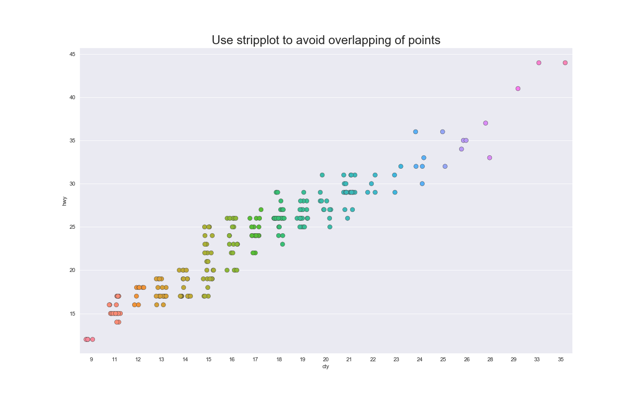
実装はこちら
import matplotlib.pyplot as plt
import pandas as pd
import seaborn as sns

sns.set_style('darkgrid')

df = pd.read_csv("https://raw.githubusercontent.com/selva86/datasets/master/mpg_ggplot2.csv")

fig, ax = plt.subplots(figsize=(16, 10), dpi=80)
sns.stripplot(x=df.cty, y=df.hwy, jitter=0.25, size=8, ax=ax, linewidth=.5)

plt.title('Use stripplot to avoid overlapping of points', fontsize=22)
plt.show()
スウォームプロット(Swarm Plot)
特徴
散布図と同様に2変数間の関係を扱える.
同じ座標の点が重ならないようにジッター以上にずらしてプロットする.
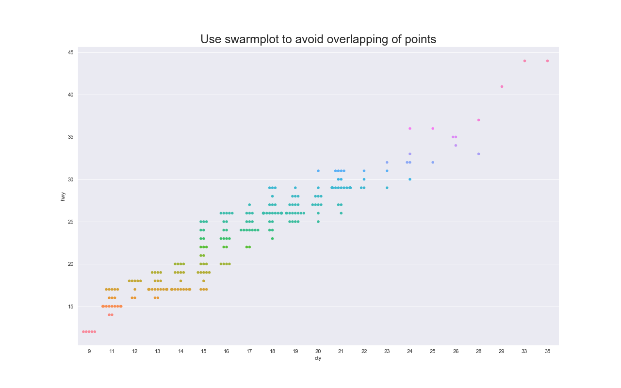
実装はこちら
import matplotlib.pyplot as plt
import pandas as pd
import seaborn as sns

sns.set_style('darkgrid')

df = pd.read_csv("https://raw.githubusercontent.com/selva86/datasets/master/mpg_ggplot2.csv")

fig, ax = plt.subplots(figsize=(16, 10), dpi=80)
sns.swarmplot(x='cty', y='hwy', data=df, hue='hwy')

plt.legend().set_visible(False)
plt.title('Use swarmplot to avoid overlapping of points', fontsize=22)
plt.show()
カウントプロット(Count Plot)
特徴
散布図と同様で2変数間の関係を扱える.
同じ点が複数存在する場合は円が大きくなる.

実装はこちら
import matplotlib.pyplot as plt
import pandas as pd
import seaborn as sns

sns.set_style('darkgrid')

df = pd.read_csv("https://raw.githubusercontent.com/selva86/datasets/master/mpg_ggplot2.csv")
df_counts = df.groupby(['hwy', 'cty']).size().reset_index(name='counts')

fig, ax = plt.subplots(figsize=(16, 10), dpi=80)
sns.stripplot(df_counts.cty, df_counts.hwy, size=df_counts.counts*2, ax=ax)

plt.title('Counts Plot - Size of circle is bigger as more points overlap', fontsize=22)
plt.show()
注意点
- 一瞥しただけでは同一の点がいくつ存在するかわからない.
散布図行列(Scatter Matrix, Pairwise Plot, Correlogram)
特徴
全ての変数の組み合わせについて散布図を作るため,変数間の傾向を把握しやすい.

実装はこちら
import matplotlib.pyplot as plt
import seaborn as sns

sns.set_style('darkgrid')

df = sns.load_dataset('iris')

sns.pairplot(df, kind='reg', diag_kind='kde', hue='species')

plt.show()
ドットプロット(Dot Plot)
特徴
対象データの順序を表現する.
また,各点がどのくらい離れているのかも伝えられる.
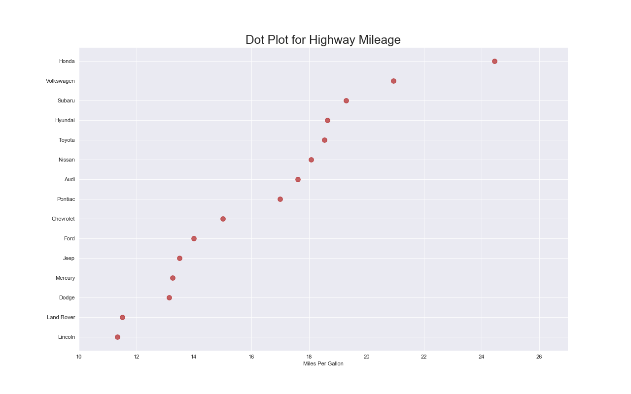
実装はこちら
import matplotlib.pyplot as plt
import pandas as pd
import seaborn as sns

sns.set_style('darkgrid')

df_raw = pd.read_csv("https://github.com/selva86/datasets/raw/master/mpg_ggplot2.csv")
df = df_raw[['cty', 'manufacturer']].groupby('manufacturer').apply(lambda x: x.mean())
df.sort_values('cty', inplace=True)
df.reset_index(inplace=True)

fig, ax = plt.subplots(figsize=(16,10), dpi=80)
ax.scatter(y=df.index, x=df.cty, s=75, color='firebrick', alpha=0.7)

ax.set_title('Dot Plot for Highway Mileage', fontdict={'size':22})
ax.set_xlabel('Miles Per Gallon')
ax.set_yticks(df.index)
ax.set_yticklabels(df.manufacturer.str.title(), fontdict={'horizontalalignment': 'right'})
ax.set_xlim(10, 27)
plt.show()
分散ドットプロット(Distributed Dot Plot)
特徴
グループ毎の分布を表現できる.
色がついている箇所は中央値であり,それ以外は同じ点が多ければ多いほど色が濃くなる.
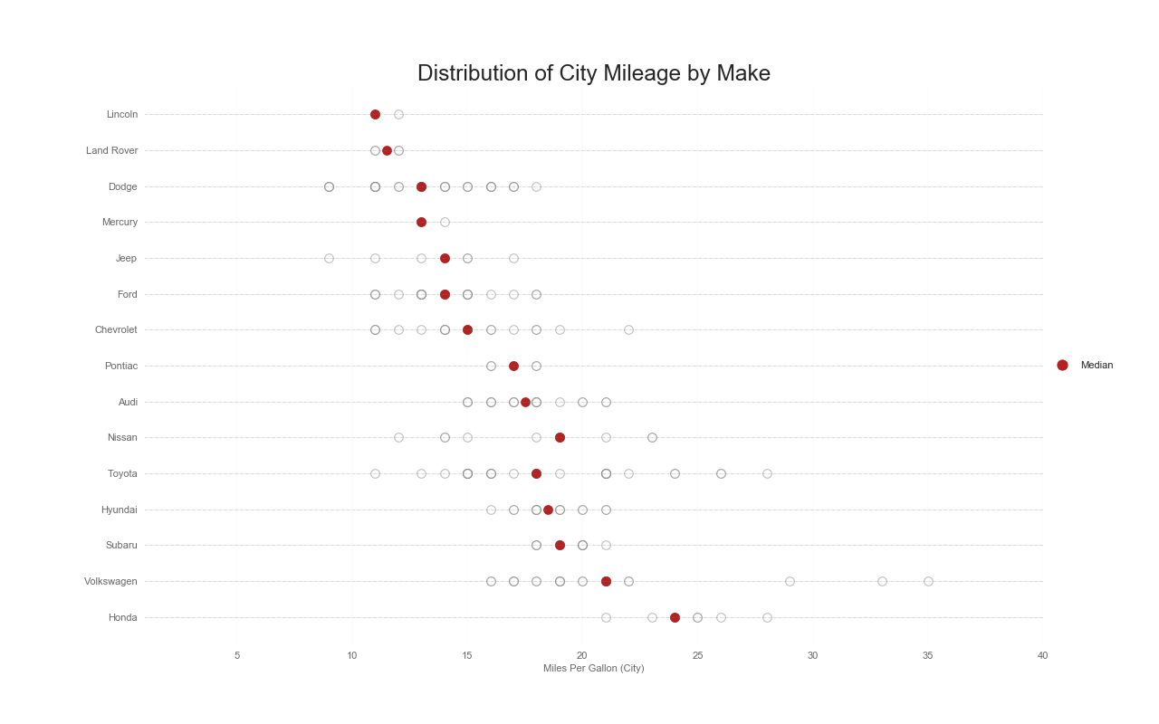
実装はこちら
import matplotlib.pyplot as plt
import matplotlib.patches as mpatches
import numpy as np
import pandas as pd
import seaborn as sns

sns.set_style('white')

df_raw = pd.read_csv("https://github.com/selva86/datasets/raw/master/mpg_ggplot2.csv")
cyl_colors = {4:'tab:red', 5:'tab:green', 6:'tab:blue', 8:'tab:orange'}
df_raw['cyl_color'] = df_raw.cyl.map(cyl_colors)

df = df_raw[['cty', 'manufacturer']].groupby('manufacturer').apply(lambda x: x.mean())
df.sort_values('cty', ascending=False, inplace=True)
df.reset_index(inplace=True)
df_median = df_raw[['cty', 'manufacturer']].groupby('manufacturer').apply(lambda x: x.median())

fig, ax = plt.subplots(figsize=(16,10), dpi=80)
ax.hlines(y=df.index, xmin=0, xmax=40, color='gray', alpha=0.5, linewidth=.5, linestyles='dashdot')

for i, make in enumerate(df.manufacturer):
    df_make = df_raw.loc[df_raw.manufacturer==make, :]
    ax.scatter(y=np.repeat(i, df_make.shape[0]), x='cty', data=df_make, s=75, edgecolors='gray', c='w', alpha=0.5)
    ax.scatter(y=i, x='cty', data=df_median.loc[df_median.index==make, :], s=75, c='firebrick')

red_patch = plt.plot([],[], marker="o", ms=10, ls="", mec=None, color='firebrick', label="Median")
plt.legend(
    handles=red_patch,
    loc='center left',
    bbox_to_anchor=(1, .5),
    facecolor='white',
    frameon=False)
ax.set_title('Distribution of City Mileage by Make', fontdict={'size':22})
ax.set_xlabel('Miles Per Gallon (City)', alpha=0.7)
ax.set_yticks(df.index)
ax.set_yticklabels(df.manufacturer.str.title(), fontdict={'horizontalalignment': 'right'}, alpha=0.7)
ax.set_xlim(1, 40)
plt.xticks(alpha=0.7)
plt.gca().spines["top"].set_visible(False)
plt.gca().spines["bottom"].set_visible(False)
plt.gca().spines["right"].set_visible(False)
plt.gca().spines["left"].set_visible(False)
plt.grid(axis='both', alpha=.4, linewidth=.1)
plt.show()
Diverging Dot Plot
特徴
Diverging Barと似ているが,Diverging Barと比較して棒がない分,各グループ毎の違いが際立つ

実装はこちら
import matplotlib.pyplot as plt
import pandas as pd
import seaborn as sns

sns.set_style('darkgrid')

df = pd.read_csv("https://github.com/selva86/datasets/raw/master/mtcars.csv")
x = df.loc[:, ['mpg']]
df['mpg_z'] = (x - x.mean())/x.std()
df['colors'] = ['red' if x < 0 else 'darkgreen' for x in df['mpg_z']]
df.sort_values('mpg_z', inplace=True)
df.reset_index(inplace=True)

plt.figure(figsize=(14,16), dpi=80)
plt.scatter(df.mpg_z, df.index, s=450, alpha=.6, color=df.colors)
for x, y, tex in zip(df.mpg_z, df.index, df.mpg_z):
    t = plt.text(
        x, y, round(tex, 1),
        horizontalalignment='center',
        verticalalignment='center',
        fontdict={'color':'white'})

plt.gca().spines["top"].set_alpha(.3)
plt.gca().spines["bottom"].set_alpha(.3)
plt.gca().spines["right"].set_alpha(.3)
plt.gca().spines["left"].set_alpha(.3)

plt.yticks(df.index, df.cars)
plt.title('Diverging Dotplot of Car Mileage', fontdict={'size':20})
plt.xlabel('$Mileage$')
plt.xlim(-2.5, 2.5)
plt.show()
棒グラフ(Bar Plot)
特徴
カテゴリ変数同士の数値を比較する場合に有効.

実装はこちら
import matplotlib.pyplot as plt
import pandas as pd
import seaborn as sns
import random

sns.set_style('darkgrid')

df_raw = pd.read_csv("https://github.com/selva86/datasets/raw/master/mpg_ggplot2.csv")

df = df_raw.groupby('manufacturer').size().reset_index(name='counts')
n = df['manufacturer'].unique().__len__()+1
all_colors = list(plt.cm.colors.cnames.keys())
random.seed(100)
c = random.choices(all_colors, k=n)

plt.figure(figsize=(16,10), dpi=80)
sns.barplot(x='manufacturer', y='counts', data=df)
for i, val in enumerate(df['counts'].values):
    plt.text(i, val, float(val), horizontalalignment='center', verticalalignment='bottom', fontdict={'fontweight':500, 'size':12})

plt.title("Number of Vehicles by Manaufacturers", fontsize=22)
plt.ylabel('# Vehicles')
plt.ylim(0, 45)
plt.show()
実装はこちら
import matplotlib.pyplot as plt
import numpy as np
import pandas as pd
import seaborn as sns
sns.set_style('darkgrid')
df_raw = pd.read_csv("https://github.com/selva86/datasets/raw/master/mpg_ggplot2.csv")
df = df_raw[['cty', 'manufacturer']].groupby('manufacturer').apply(lambda x: x.mean())
df.sort_values('cty', inplace=True)
df.reset_index(inplace=True)
fig, ax = plt.subplots(figsize=(16,10), facecolor='white', dpi=80)
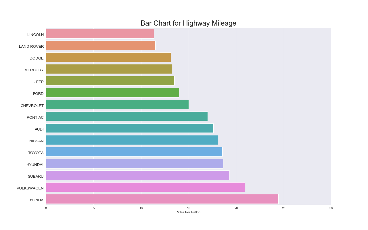
sns.barplot(x=df.cty, y=df.index, data=df, orient='h')
ax.set_title('Bar Chart for Highway Mileage', fontdict={'size':22})
ax.set(xlabel='Miles Per Gallon', xlim=(0, 30))
plt.yticks(
df.index+0.1, df.manufacturer.str.upper(),
horizontalalignment='right', fontsize=12)
plt.show()
注意点
- 棒グラフとヒストグラムを混同せず,異なるものだと理解すること.
- ラベルが長い場合は横方向の棒グラフを検討すること.
- 値順にソートしてプロットするとインサイトを得やすい.
- 不必要に色を増やさないこと.基本的に一色のほうが見やすい.
関連するグラフ
グループ化された棒グラフ(Grouped Bar Plot)
特徴
各グループ毎の棒グラフを一度に把握できる.

実装はこちら
import matplotlib.pyplot as plt
import numpy as np
import pandas as pd
import seaborn as sns

sns.set_style('darkgrid')

df = pd.read_csv("https://github.com/selva86/datasets/raw/master/mpg_ggplot2.csv")

x_var, groupby_var = 'manufacturer', 'class'
df_agg = df.loc[:, [x_var, groupby_var]].groupby(groupby_var)
df_count = df_agg[x_var].value_counts().reset_index(name='Frequency').sort_values(by=[x_var])

plt.figure(figsize=(16, 10))
sns.barplot(
    x=x_var, y='Frequency', data=df_count, hue=groupby_var,
    palette=sns.color_palette("hls", len(np.unique(df[groupby_var]).tolist())))

plt.legend(
    title=groupby_var,
    loc='center left',
    bbox_to_anchor=(1, .5),
    facecolor='white',
    frameon=False)
plt.xticks(rotation=0)
plt.yticks(ticks=range(0, 20, 5))
plt.title(f"Histogram of ${x_var}$ colored by ${groupby_var}$", fontsize=22)
plt.show()
注意点
- あまりにも棒グラフが多すぎると一瞥して理解できないので,サブプロットにするべき.
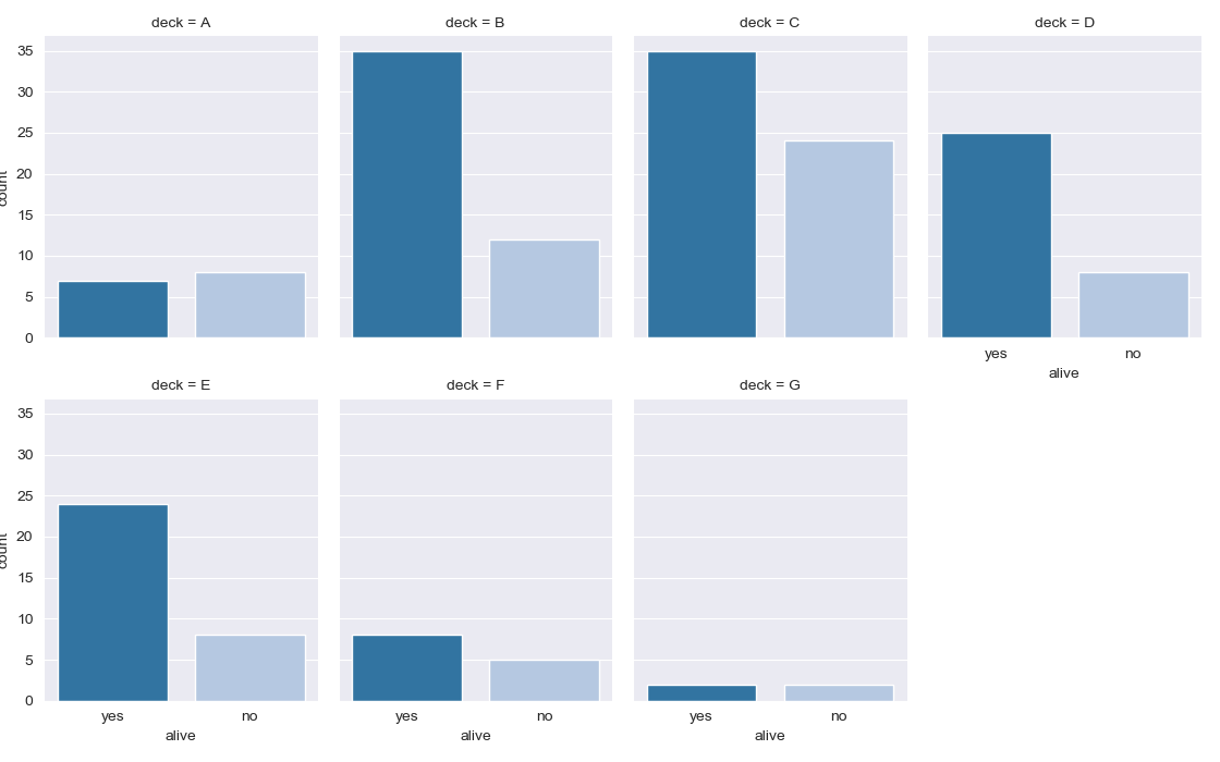
実装はこちら
import matplotlib.pyplot as plt
import pandas as pd
import seaborn as sns

sns.set_style('darkgrid')

titanic = sns.load_dataset("titanic")

g = sns.catplot("alive", col="deck", col_wrap=4,
                data=titanic[titanic.deck.notnull()],
                kind="count", height=3.5, aspect=.8,
                palette='tab20')
plt.show()
実装はこちら
import matplotlib.pyplot as plt
import numpy as np
import pandas as pd
import seaborn as sns

sns.set_style('darkgrid')

df = pd.read_csv("https://github.com/selva86/datasets/raw/master/mpg_ggplot2.csv")

x_var, groupby_var = 'manufacturer', 'class'
df_agg = df.loc[:, [x_var, groupby_var]].groupby(groupby_var)

# 足りない分を埋める
df_count = df_agg[x_var].value_counts().reset_index(name='Frequency')
all_m = set(np.unique(df_count.manufacturer))
for c in classes:
    current_m = set(df_count[df_count[groupby_var]==c][x_var].values)
    diff = all_m.difference(current_m)
    for d in diff:
        s = pd.Series([c, d, 0], index=[groupby_var, x_var, 'Frequency'])
        df_count = df_count.append(s, ignore_index=True)
df_count = df_count.sort_values(by=[groupby_var, x_var])

u_x_var = np.unique(df_count.manufacturer)
n_u_x_var = len(u_x_var)
r = np.arange(1, n_u_x_var+1)

classes = np.unique(df_count[groupby_var])
nr, nc = 3, 3
x, y = 0, 0
fig, ax = plt.subplots(nrows=nr, ncols=nc, sharex=True, sharey=True, figsize=(16, 10))
for i, c in enumerate(classes):
    x = x + 1 if i > 0 and i % nc == 0 else x
    y = i % nc

    ax[x, y].barh(
        y=r,
        width=df_count[df_count[groupby_var]==c]['Frequency'],
        color=sns.color_palette("hls", n_u_x_var))

    if i >= len(classes) - nr:
        ax[x, y].tick_params(labelbottom=True)
        ax[x, y].set_yticks(np.arange(1, n_u_x_var+1), minor=False)
        ax[x, y].set_yticklabels(u_x_var)
        ax[x, y].set_ylabel(x_var, fontsize=12)
        ax[x, y].set_xlabel('Frequency', fontsize=12)
    else:
        ax[x, y].set_xlabel('')
    if y==0:
        ax[x, y].set_ylabel(x_var, fontsize=12)
    if y != 0:
        ax[x, y].set_ylabel('')

    ax[x, y].tick_params(labelsize=10)
    ax[x, y].set_title(groupby_var + ' = ' + c, fontsize=12)

if i < nr * nc:
    for i in range(i+1, nr*nc):
        x = x + 1 if i > 0 and i % nc == 0 else x
        y = i % nc

        fig.delaxes(ax[x, y])


fig.suptitle(f"Histogram of ${x_var}$", fontsize=22)
fig.tight_layout(
    rect=[
        0, # left
        0, # bottom
        1, # right
        0.95 # top
    ]
)
fig.show()
Diverging Bars
特徴
ある基準からどの程度離れているかを表現できる.
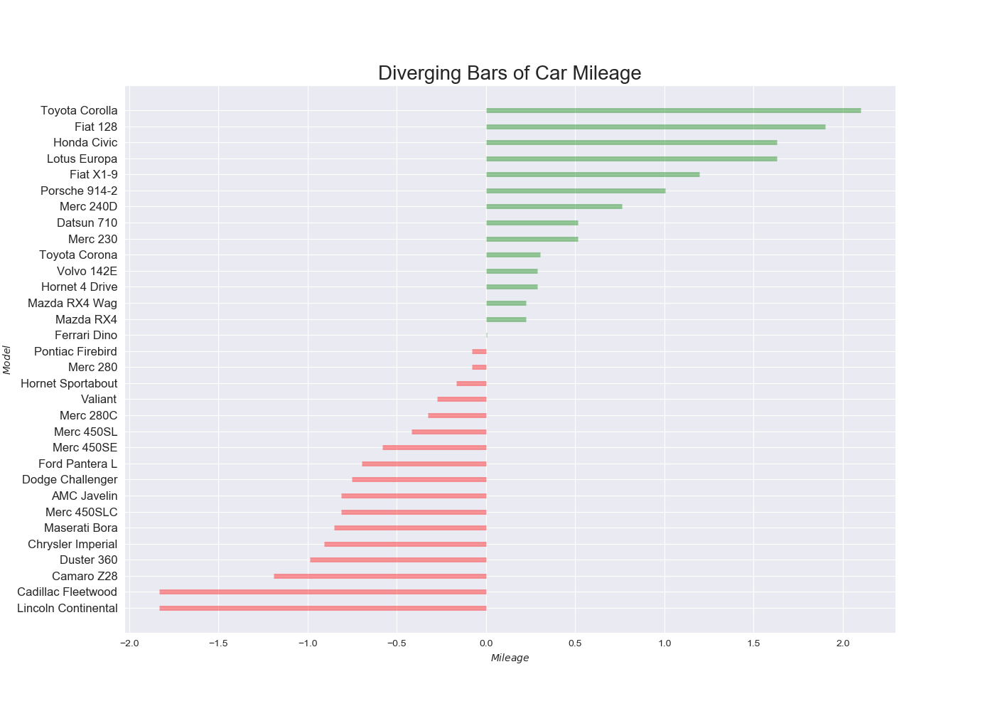
実装はこちら
import matplotlib.pyplot as plt
import pandas as pd
import seaborn as sns

sns.set_style('darkgrid')

df = pd.read_csv("https://github.com/selva86/datasets/raw/master/mtcars.csv")
x = df.loc[:, ['mpg']]
df['mpg_z'] = (x - x.mean())/x.std()
df['colors'] = ['red' if x < 0 else 'green' for x in df['mpg_z']]
df.sort_values('mpg_z', inplace=True)
df.reset_index(inplace=True)

plt.figure(figsize=(14, 10))
plt.hlines(
    y=df.index, xmin=0, xmax=df.mpg_z,
    color=df.colors,
    alpha=.4,
    linewidth=5)

plt.gca().set(xlabel='$Mileage$', ylabel='$Model$')
plt.yticks(df.index, df.cars, fontsize=12)
plt.title('Diverging Bars of Car Mileage', fontdict={'size':20})
plt.show()
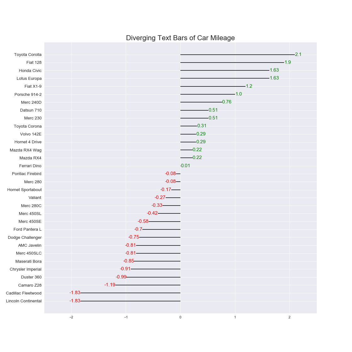
実装はこちら
import matplotlib.pyplot as plt
import pandas as pd
import seaborn as sns

sns.set_style('darkgrid')

df = pd.read_csv("https://github.com/selva86/datasets/raw/master/mtcars.csv")
x = df.loc[:, ['mpg']]
df['mpg_z'] = (x - x.mean())/x.std()
df['colors'] = ['red' if x < 0 else 'green' for x in df['mpg_z']]
df.sort_values('mpg_z', inplace=True)
df.reset_index(inplace=True)

plt.figure(figsize=(14,14), dpi=80)
plt.hlines(y=df.index, xmin=0, xmax=df.mpg_z)
for x, y, tex in zip(df.mpg_z, df.index, df.mpg_z):
    t = plt.text(
        x, y, round(tex, 2),
        horizontalalignment='right' if x < 0 else 'left',
        verticalalignment='center',
        fontdict={'color':'red' if x < 0 else 'green', 'size':14})

plt.yticks(df.index, df.cars, fontsize=12)
plt.title('Diverging Text Bars of Car Mileage', fontdict={'size':20})
plt.xlim(-2.5, 2.5)
plt.show()
注意点
- ソートした上でプロットすると効果的.
ロリポップチャート(Lollipop)
特徴
基本的には棒グラフと同じ.
ただ例えば同じような値がたくさん並ぶ場合は,棒グラフよりもこちらのほうが適切.
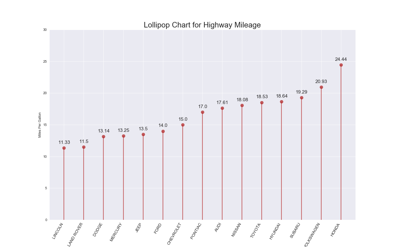
実装はこちら
import matplotlib.pyplot as plt
import pandas as pd
import seaborn as sns

sns.set_style('darkgrid')

df_raw = pd.read_csv("https://github.com/selva86/datasets/raw/master/mpg_ggplot2.csv")
df = df_raw[['cty', 'manufacturer']].groupby('manufacturer').apply(lambda x: x.mean())
df.sort_values('cty', inplace=True)
df.reset_index(inplace=True)

fig, ax = plt.subplots(figsize=(16,10), dpi=80)
ax.vlines(x=df.index, ymin=0, ymax=df.cty, color='firebrick', alpha=0.7, linewidth=2)
ax.scatter(x=df.index, y=df.cty, s=75, color='firebrick', alpha=0.7)

ax.set_title('Lollipop Chart for Highway Mileage', fontdict={'size':22})
ax.set_ylabel('Miles Per Gallon')
ax.set_xticks(df.index)
ax.set_xticklabels(df.manufacturer.str.upper(), rotation=60, fontdict={'horizontalalignment': 'right', 'size':12})
ax.set_ylim(0, 30)

for row in df.itertuples():
    ax.text(row.Index, row.cty+.5, s=round(row.cty, 2), horizontalalignment= 'center', verticalalignment='bottom', fontsize=14)

plt.show()
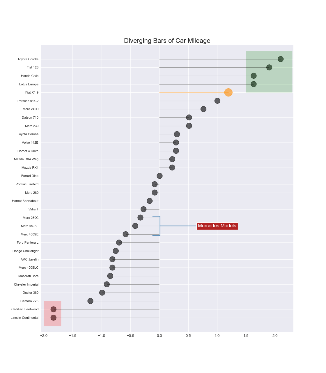
実装はこちら
import matplotlib.pyplot as plt
import matplotlib.patches as patches
import pandas as pd
import seaborn as sns

sns.set_style('darkgrid')

df = pd.read_csv("https://github.com/selva86/datasets/raw/master/mtcars.csv")
x = df.loc[:, ['mpg']]
df['mpg_z'] = (x - x.mean())/x.std()
df['colors'] = 'black'

df.loc[df.cars == 'Fiat X1-9', 'colors'] = 'darkorange'
df.sort_values('mpg_z', inplace=True)
df.reset_index(inplace=True)

plt.figure(figsize=(14,16), dpi=80)
plt.hlines(y=df.index, xmin=0, xmax=df.mpg_z, color=df.colors, alpha=0.4, linewidth=1)
plt.scatter(df.mpg_z, df.index, color=df.colors, s=[600 if x == 'Fiat X1-9' else 300 for x in df.cars], alpha=0.6)
plt.yticks(df.index, df.cars)
plt.xticks(fontsize=12)

plt.annotate(
    'Mercedes Models', xy=(0.0, 11.0), xytext=(1.0, 11), xycoords='data',
    fontsize=15, ha='center', va='center',
    bbox=dict(boxstyle='square', fc='firebrick'),
    arrowprops=dict(
        arrowstyle='-[, widthB=2.0, lengthB=1.5',
        lw=2.0,
        color='steelblue'),
    color='white')

p1 = patches.Rectangle((-2.0, -1), width=.3, height=3, alpha=.2, facecolor='red')
p2 = patches.Rectangle((1.5, 27), width=.8, height=5, alpha=.2, facecolor='green')
plt.gca().add_patch(p1)
plt.gca().add_patch(p2)

plt.title('Diverging Bars of Car Mileage', fontdict={'size':20})
plt.show()
注意点
- ソートして並べること.
- ソートしない場合は棒グラフのほうがよい.
- ラベルが読みづらかったら横向きにすること.
人口ピラミッド(Population Pyramid)
特徴
グループ毎の分布を表現できる.

実装はこちら
import matplotlib.pyplot as plt
import matplotlib.patches as mpatches
import numpy as np
import pandas as pd
import seaborn as sns

sns.set_style('white')

df_raw = pd.read_csv("https://github.com/selva86/datasets/raw/master/mpg_ggplot2.csv")
cyl_colors = {4:'tab:red', 5:'tab:green', 6:'tab:blue', 8:'tab:orange'}
df_raw['cyl_color'] = df_raw.cyl.map(cyl_colors)

df = df_raw[['cty', 'manufacturer']].groupby('manufacturer').apply(lambda x: x.mean())
df.sort_values('cty', ascending=False, inplace=True)
df.reset_index(inplace=True)
df_median = df_raw[['cty', 'manufacturer']].groupby('manufacturer').apply(lambda x: x.median())

fig, ax = plt.subplots(figsize=(16,10), dpi=80)
ax.hlines(y=df.index, xmin=0, xmax=40, color='gray', alpha=0.5, linewidth=.5, linestyles='dashdot')

for i, make in enumerate(df.manufacturer):
    df_make = df_raw.loc[df_raw.manufacturer==make, :]
    ax.scatter(y=np.repeat(i, df_make.shape[0]), x='cty', data=df_make, s=75, edgecolors='gray', c='w', alpha=0.5)
    ax.scatter(y=i, x='cty', data=df_median.loc[df_median.index==make, :], s=75, c='firebrick')

red_patch = plt.plot([],[], marker="o", ms=10, ls="", mec=None, color='firebrick', label="Median")
plt.legend(
    handles=red_patch,
    loc='center left',
    bbox_to_anchor=(1, .5),
    facecolor='white',
    frameon=False)
ax.set_title('Distribution of City Mileage by Make', fontdict={'size':22})
ax.set_xlabel('Miles Per Gallon (City)', alpha=0.7)
ax.set_yticks(df.index)
ax.set_yticklabels(df.manufacturer.str.title(), fontdict={'horizontalalignment': 'right'}, alpha=0.7)
ax.set_xlim(1, 40)
plt.xticks(alpha=0.7)
plt.gca().spines["top"].set_visible(False)
plt.gca().spines["bottom"].set_visible(False)
plt.gca().spines["right"].set_visible(False)
plt.gca().spines["left"].set_visible(False)
plt.grid(axis='both', alpha=.4, linewidth=.1)
plt.show()
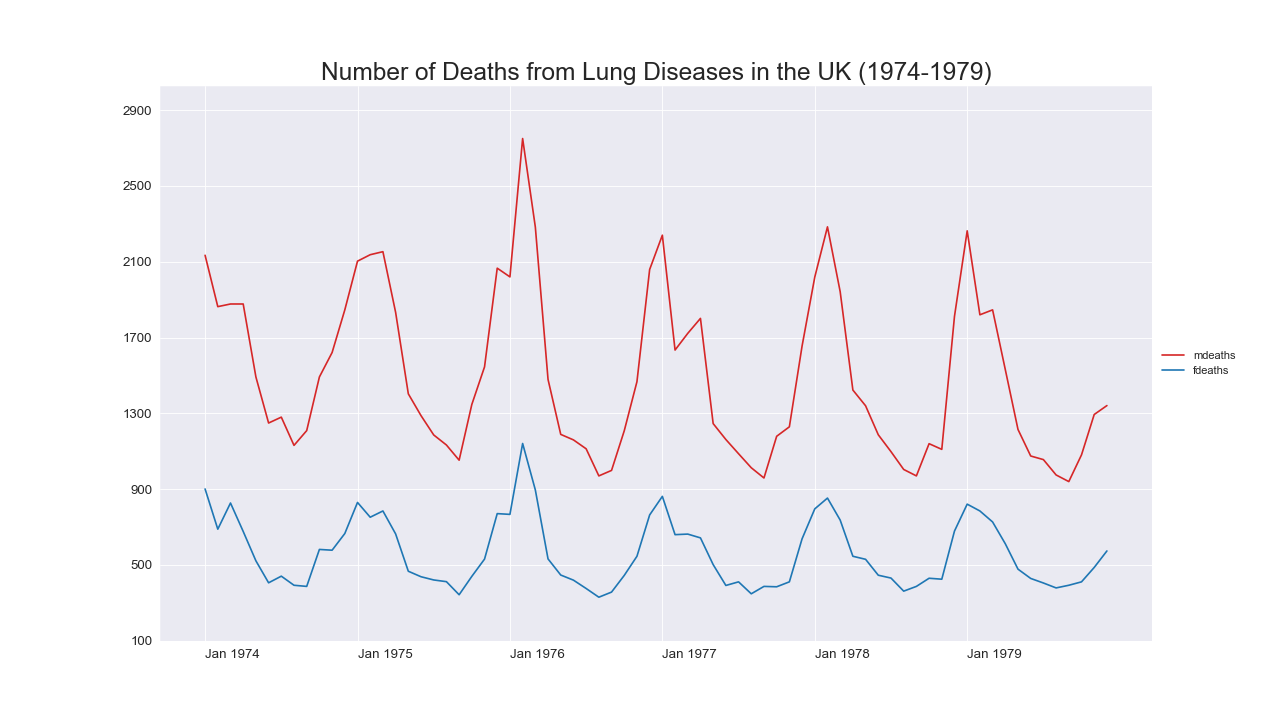
折れ線グラフ(Line Plot)
特徴
数値の変化を表現できる.
大抵の場合,$x$軸でソートされている.
時系列でよく使用される.
同一の時刻で複数の点を観測できる場合はエラー幅をプロットすることもできる.
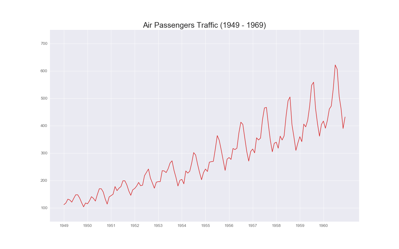
実装はこちら
import matplotlib.pyplot as plt
import pandas as pd
import seaborn as sns

sns.set_style('darkgrid')

df = pd.read_csv('https://github.com/selva86/datasets/raw/master/AirPassengers.csv')

plt.figure(figsize=(16,10), dpi=80)
plt.plot('date', 'value', data=df, color='tab:red')

plt.ylim(50, 750)
xtick_location = df.index.tolist()[::12]
xtick_labels = [x[:4] for x in df.date.tolist()[::12]]
plt.xticks(ticks=xtick_location, labels=xtick_labels, rotation=0, fontsize=12, horizontalalignment='center', alpha=.7)
plt.yticks(fontsize=12, alpha=.7)
plt.title("Air Passengers Traffic (1949 - 1969)", fontsize=22)

plt.gca().spines["top"].set_alpha(0.0)
plt.gca().spines["bottom"].set_alpha(0.3)
plt.gca().spines["right"].set_alpha(0.0)
plt.gca().spines["left"].set_alpha(0.3)
plt.show()
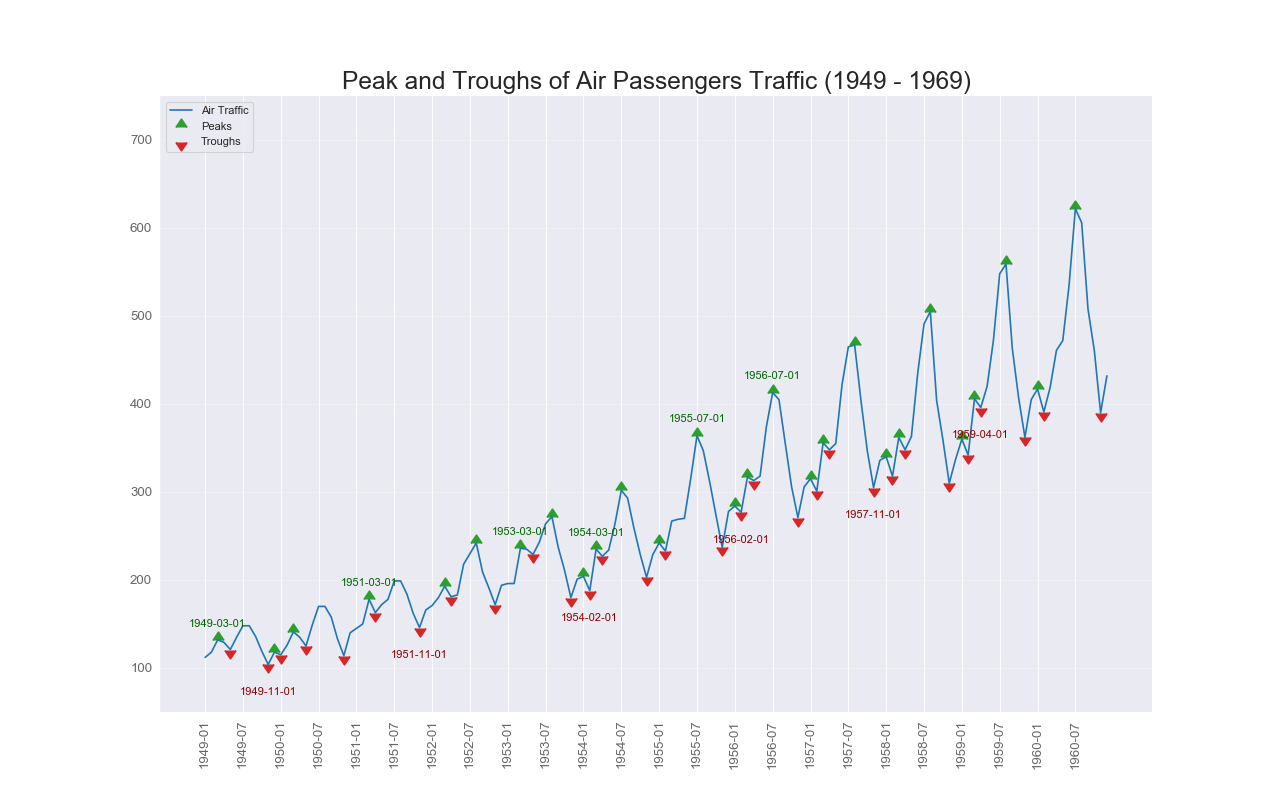
実装はこちら
import matplotlib.pyplot as plt
import numpy as np
import pandas as pd
import seaborn as sns

sns.set_style('darkgrid')

df = pd.read_csv('https://github.com/selva86/datasets/raw/master/AirPassengers.csv')

data = df['value'].values
doublediff = np.diff(np.sign(np.diff(data)))
peak_locations = np.where(doublediff == -2)[0] + 1

doublediff2 = np.diff(np.sign(np.diff(-1*data)))
trough_locations = np.where(doublediff2 == -2)[0] + 1

plt.figure(figsize=(16,10), dpi=80)
plt.plot('date', 'value', data=df, color='tab:blue', label='Air Traffic')
plt.scatter(df.date[peak_locations], df.value[peak_locations], marker=10, color='tab:green', s=100, label='Peaks')
plt.scatter(df.date[trough_locations], df.value[trough_locations], marker=11, color='tab:red', s=100, label='Troughs')

for t, p in zip(trough_locations[1::5], peak_locations[::3]):
    plt.text(df.date[p], df.value[p]+15, df.date[p], horizontalalignment='center', color='darkgreen')
    plt.text(df.date[t], df.value[t]-35, df.date[t], horizontalalignment='center', color='darkred')

plt.ylim(50,750)
xtick_location = df.index.tolist()[::6]
xtick_labels = [x[:7] for x in df.date.tolist()[::6]]
plt.xticks(ticks=xtick_location, labels=xtick_labels, rotation=90, fontsize=12, alpha=.7)
plt.title("Peak and Troughs of Air Passengers Traffic (1949 - 1969)", fontsize=22)
plt.yticks(fontsize=12, alpha=.7)

plt.gca().spines["top"].set_alpha(.0)
plt.gca().spines["bottom"].set_alpha(.3)
plt.gca().spines["right"].set_alpha(.0)
plt.gca().spines["left"].set_alpha(.3)

plt.legend(loc='upper left')
plt.grid(axis='y', alpha=.3)
plt.show()
実装はこちら
import matplotlib.pyplot as plt
import numpy as np
import pandas as pd
import seaborn as sns

sns.set_style('darkgrid')

df = pd.read_csv('https://github.com/selva86/datasets/raw/master/mortality.csv')

y_LL = 100
y_UL = int(df.iloc[:, 1:].max().max()*1.1)
y_interval = 400
mycolors = ['tab:red', 'tab:blue', 'tab:green', 'tab:orange']

fig, ax = plt.subplots(1,1,figsize=(16, 9), dpi=80)

columns = df.columns[1:]
for i, column in enumerate(columns):
    plt.plot('date', column, data=df, lw=1.5, color=mycolors[i], label=column)

plt.tick_params(axis="both", which="both", bottom=False, top=False,
                labelbottom=True, left=False, right=False, labelleft=True)

plt.gca().spines["top"].set_alpha(.3)
plt.gca().spines["bottom"].set_alpha(.3)
plt.gca().spines["right"].set_alpha(.3)
plt.gca().spines["left"].set_alpha(.3)

plt.legend(
    loc='center left',
    bbox_to_anchor=(1, .5),
    facecolor='white',
    frameon=False)
plt.title('Number of Deaths from Lung Diseases in the UK (1974-1979)', fontsize=22)
plt.yticks(range(y_LL, y_UL, y_interval), [str(y) for y in range(y_LL, y_UL, y_interval)], fontsize=12)
plt.xticks(range(0, df.shape[0], 12), df.date.values[::12], horizontalalignment='left', fontsize=12)
plt.ylim(y_LL, y_UL)
plt.show()
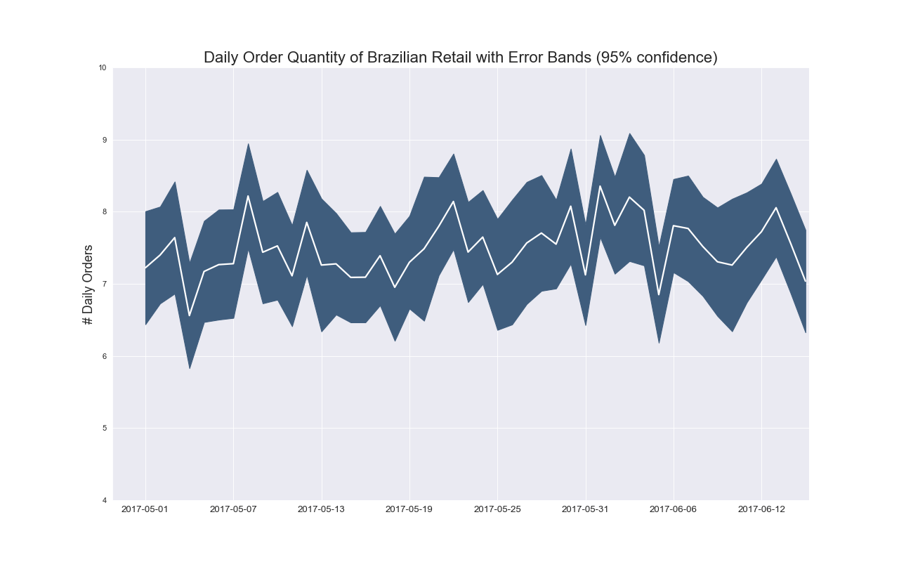
実装はこちら
import matplotlib.pyplot as plt
import numpy as np
import pandas as pd
import seaborn as sns
from dateutil.parser import parse
from scipy.stats import sem

sns.set_style('darkgrid')

df_raw = pd.read_csv(
    'https://raw.githubusercontent.com/selva86/datasets/master/orders_45d.csv',
    parse_dates=['purchase_time', 'purchase_date'])

df_mean = df_raw.groupby('purchase_date').quantity.mean()
df_se = df_raw.groupby('purchase_date').quantity.apply(sem).mul(1.96)

plt.figure(figsize=(16,10), dpi=80)
plt.ylabel("# Daily Orders", fontsize=16)
x = [d.date().strftime('%Y-%m-%d') for d in df_mean.index]
plt.plot(x, df_mean, color="white", lw=2)
plt.fill_between(x, df_mean - df_se, df_mean + df_se, color="#3F5D7D")

plt.gca().spines["top"].set_alpha(0)
plt.gca().spines["bottom"].set_alpha(1)
plt.gca().spines["right"].set_alpha(0)
plt.gca().spines["left"].set_alpha(1)
plt.xticks(x[::6], [str(d) for d in x[::6]] , fontsize=12)
plt.title("Daily Order Quantity of Brazilian Retail with Error Bands (95% confidence)", fontsize=20)

s, e = plt.gca().get_xlim()
plt.xlim(s, e-2)
plt.ylim(4, 10)
plt.show()
注意点
- $y$軸は0から始めること.
- 複数の線をプロットする場合,多いと見づらいので気をつけること.
- 線の数が多いと見づらいので気をつけること.
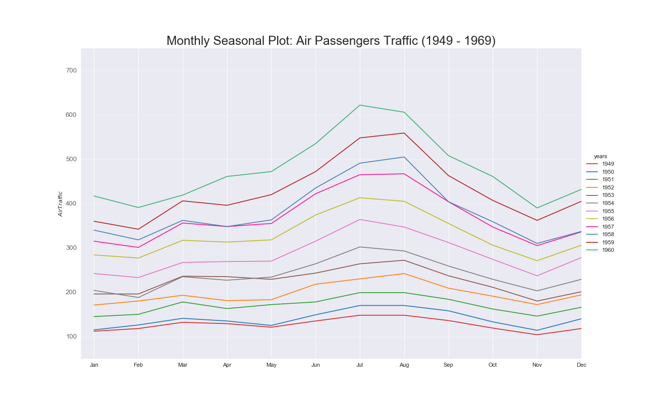
実装はこちら
import matplotlib.pyplot as plt
import numpy as np
import pandas as pd
import seaborn as sns
from dateutil.parser import parse

sns.set_style('darkgrid')

df = pd.read_csv('https://github.com/selva86/datasets/raw/master/AirPassengers.csv')

df['year'] = [parse(d).year for d in df.date]
df['month'] = [parse(d).strftime('%b') for d in df.date]
years = df['year'].unique()

mycolors = ['tab:red', 'tab:blue', 'tab:green', 'tab:orange', 'tab:brown', 'tab:grey', 'tab:pink', 'tab:olive', 'deeppink', 'steelblue', 'firebrick', 'mediumseagreen']
plt.figure(figsize=(16,10), dpi= 80)

for i, y in enumerate(years):
    plt.plot('month', 'value', data=df.loc[df.year==y, :], color=mycolors[i], label=y)

plt.ylim(50,750)
plt.xlim(-0.3, 11)
plt.ylabel('$Air Traffic$')
plt.yticks(fontsize=12, alpha=.7)
plt.title("Monthly Seasonal Plot: Air Passengers Traffic (1949 - 1969)", fontsize=22)
plt.grid(axis='y', alpha=.3)

plt.gca().spines["top"].set_alpha(0.0)
plt.gca().spines["bottom"].set_alpha(0.5)
plt.gca().spines["right"].set_alpha(0.0)
plt.gca().spines["left"].set_alpha(0.5)
plt.legend(
    title='years',
    loc='center left',
    bbox_to_anchor=(1, .5),
    facecolor='white',
    frameon=False)
plt.show()
面グラフ(Area Plot)
特徴
折れ線グラフのようなもの.
ただ折れ線グラフよりももっと見やすい.
線の色の透明度を高めた色で塗りつぶすといい感じに見える.
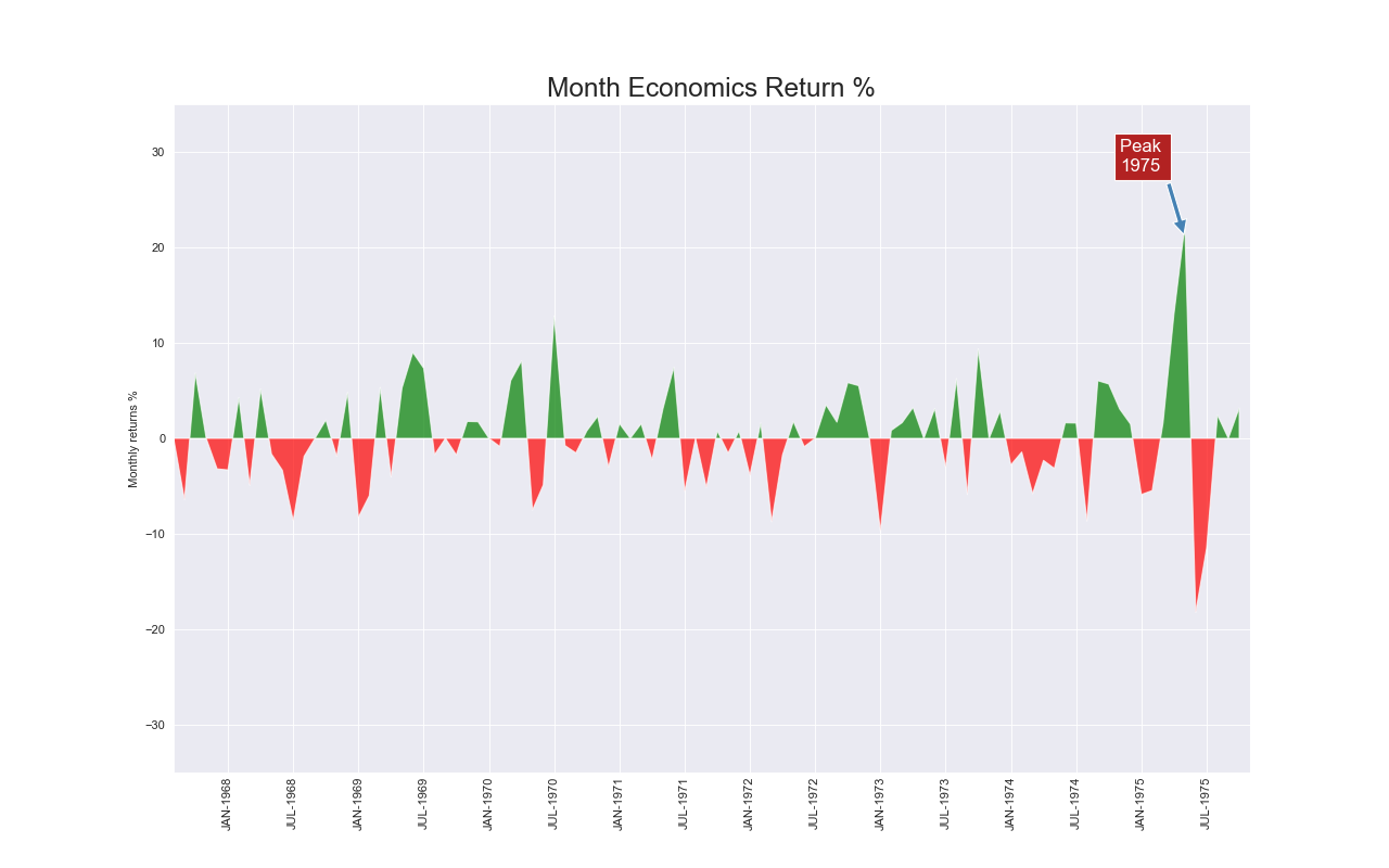
実装はこちら
import matplotlib.pyplot as plt
import numpy as np
import pandas as pd
import seaborn as sns

sns.set_style('darkgrid')

df = pd.read_csv("https://github.com/selva86/datasets/raw/master/economics.csv", parse_dates=['date']).head(100)
x = np.arange(df.shape[0])
y_returns = (df.psavert.diff().fillna(0)/df.psavert.shift(1)).fillna(0) * 100

plt.figure(figsize=(16,10), dpi=80)
plt.fill_between(x[1:], y_returns[1:], 0, where=y_returns[1:] >= 0, facecolor='green', interpolate=True, alpha=0.7)
plt.fill_between(x[1:], y_returns[1:], 0, where=y_returns[1:] <= 0, facecolor='red', interpolate=True, alpha=0.7)

plt.annotate('Peak \n1975', xy=(94.0, 21.0), xytext=(88.0, 28),
             bbox=dict(boxstyle='square', fc='firebrick'),
             arrowprops=dict(facecolor='steelblue', shrink=0.05), fontsize=15, color='white')

xtickvals = [str(m)[:3].upper()+"-"+str(y) for y,m in zip(df.date.dt.year, df.date.dt.month_name())]
plt.gca().set_xticks(x[::6])
plt.gca().set_xticklabels(xtickvals[::6], rotation=90, fontdict={'horizontalalignment': 'center', 'verticalalignment': 'center_baseline'})
plt.ylim(-35,35)
plt.xlim(1,100)
plt.title("Month Economics Return %", fontsize=22)
plt.ylabel('Monthly returns %')
plt.show()
注意点
- $y$軸は0から始めること.
実装はこちら
import matplotlib.pyplot as plt
import numpy as np
import pandas as pd
import seaborn as sns

sns.set_style('darkgrid')

df = pd.read_csv('https://raw.githubusercontent.com/selva86/datasets/master/nightvisitors.csv')

mycolors = ['tab:red', 'tab:blue', 'tab:green', 'tab:orange', 'tab:brown', 'tab:grey', 'tab:pink', 'tab:olive']

fig, ax = plt.subplots(1,1,figsize=(16, 9), dpi=80)
columns = df.columns[1:]
labs = columns.values.tolist()

x  = df['yearmon'].values.tolist()
y0 = df[columns[0]].values.tolist()
y1 = df[columns[1]].values.tolist()
y2 = df[columns[2]].values.tolist()
y3 = df[columns[3]].values.tolist()
y4 = df[columns[4]].values.tolist()
y5 = df[columns[5]].values.tolist()
y6 = df[columns[6]].values.tolist()
y7 = df[columns[7]].values.tolist()
y = np.vstack([y0, y2, y4, y6, y7, y5, y1, y3])

labs = columns.values.tolist()
ax = plt.gca()
ax.stackplot(x, y, labels=labs, colors=mycolors, alpha=0.8)

ax.set_title('Night Visitors in Australian Regions', fontsize=18)
ax.set(ylim=[0, 100000])
ax.legend(fontsize=10, ncol=4)
plt.legend(
    title='regions',
    loc='center left',
    bbox_to_anchor=(1, .5),
    facecolor='white',
    frameon=False)
plt.xticks(x[::5], fontsize=10, horizontalalignment='center')
plt.yticks(np.arange(10000, 100000, 20000), fontsize=10)
plt.xlim(x[0], x[-1])

plt.gca().spines["top"].set_alpha(0)
plt.gca().spines["bottom"].set_alpha(.3)
plt.gca().spines["right"].set_alpha(0)
plt.gca().spines["left"].set_alpha(.3)
plt.show()
関連するグラフ
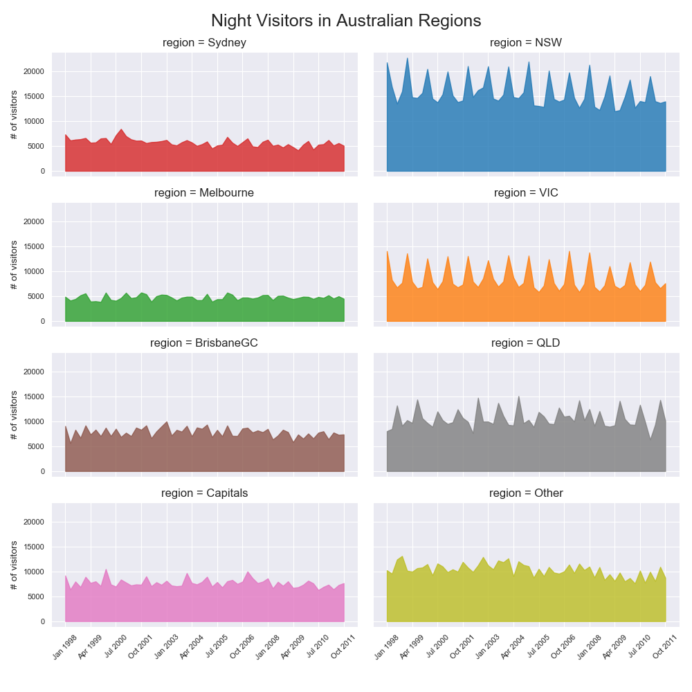
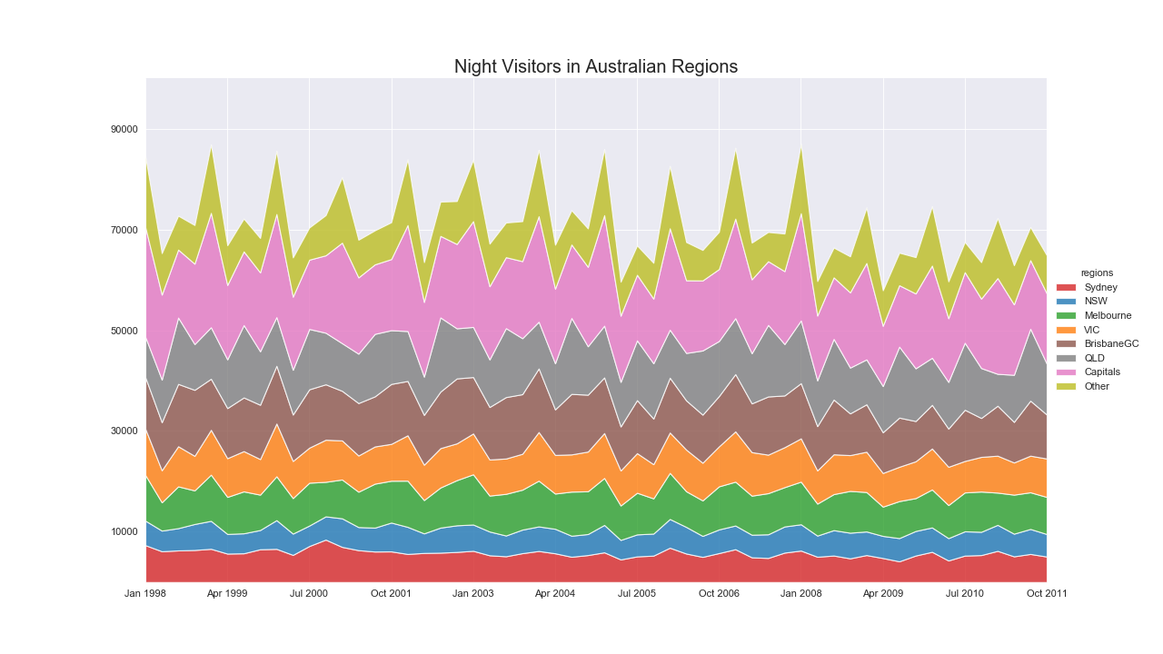
累積面グラフ(Stacked Area Plot)
特徴
1つのグラフで複数のグループの値の変化を確認できる.
もし各グループの相対的な重要度にのみ興味があるのであればパーセンテージについて累積面グラフを書くと良い.
実装はこちら
import matplotlib.pyplot as plt
import numpy as np
import pandas as pd
import seaborn as sns

sns.set_style('darkgrid')

df = pd.read_csv('https://raw.githubusercontent.com/selva86/datasets/master/nightvisitors.csv')
columns = df.columns[1:]

mycolors = ['tab:red', 'tab:blue', 'tab:green', 'tab:orange', 'tab:brown', 'tab:grey', 'tab:pink', 'tab:olive']
yearmon = df['yearmon'].values.tolist()
xticks = np.arange(0, len(yearmon), 5)

nr, nc = 4, 2
fig, ax = plt.subplots(nrows=nr, ncols=nc, sharex=True, sharey=True, figsize=(10, 10))
x, y = 0, 0
for i, column in enumerate(columns):
    x = x + 1 if i > 0 and i % nc == 0 else x
    y = i % nc

    ax[x, y].tick_params(labelsize=8)
    ax[x, y].set_title('region = ' + column)

    if i >= len(columns) - nc:
        ax[x, y].tick_params(labelbottom=True)
        ax[x, y].set_xticks(xticks)
        ax[x, y].set_xticklabels([ym for i, ym in enumerate(yearmon) if i%5==0], rotation=45)
    if y==0:
        ax[x, y].set_ylabel('# of visitors', fontsize=10)

    ax[x, y].fill_between(
        x=df['yearmon'].values.tolist(),
        y1=df[column].values.tolist(),
        y2=0,
        label=columns[i],
        alpha=0.8,
        color=mycolors[i]
    )

if i < nr * nc:
    for i in range(i+1, nr*nc):
        x = x + 1 if i > 0 and i % nc == 0 else x
        y = i % nc

        fig.delaxes(ax[x, y])

fig.legend(
    title='regions',
    loc='center left',
    bbox_to_anchor=(1, .5),
    facecolor='white',
    frameon=False)
fig.suptitle('Night Visitors in Australian Regions', fontsize=18)
fig.tight_layout(
    rect=[
        0, # left
        0.03, # bottom
        1, # right
        0.96 # top
    ]
)
fig.show()
注意点
- 各グループの個別の変化を読み取るのが難しいので,別でプロットしたほうが良い.
- もしくは,折れ線グラフを使ったほうがよい.
レーダーチャート(Spider Plot)
特徴
特定の項目に偏りがあるかどうかを表現できる.

実装はこちら
import matplotlib.pyplot as plt
import pandas as pd
from math import pi

sns.set_style('darkgrid')

df = pd.DataFrame({
'group': ['A','B','C','D','E'],
'var1': [38, 1.5, 30, 4, 31],
'var2': [29, 10, 9, 34, 2],
'var3': [8, 39, 23, 24, 5],
'var4': [7, 31, 33, 14, 21],
'var5': [28, 15, 32, 14, 6]
})

def make_spider(nrows, ncols, index, color, label=None, title=None, ax=None):
    categories=list(df)[1:]
    N = len(categories)

    angles = [n / float(N) * 2 * pi for n in range(N)]
    angles += angles[:1]

    if ax == None:
        ax = plt.subplot(nrows, ncols, index+1, polar=True)

    ax.set_theta_offset(pi / 2)
    ax.set_theta_direction(-1)

    plt.xticks(angles[:-1], categories, color='grey', size=8)

    ax.set_rlabel_position(0)
    plt.yticks([10,20,30], ["10","20","30"], color="grey", size=7)
    plt.ylim(0,40)

    values=df.loc[row].drop('group').values.flatten().tolist()
    values += values[:1]
    ax.plot(angles, values, color=color, linewidth=2, linestyle='solid', label=label)
    ax.fill(angles, values, color=color, alpha=0.4)

    if title:
        plt.title(title, size=11, color=color, y=1.1)

my_dpi=96
plt.figure(figsize=(1000/my_dpi, 1000/my_dpi), dpi=my_dpi)

my_palette = plt.cm.get_cmap("Set2", len(df.index))

nr, nc = 3, 2
for row in range(0, len(df.index)):
    make_spider(nr, nc, row, title='group '+df['group'][row], color=my_palette(row))
plt.show()
注意点
- 複数のグループをプロットする場合はサブプロットを使用するべき.
- スケールが違う項目を利用する場合は,最低でもスケールの数字を示すこと.
- 円形の図は見づらいので棒グラフにしたほうが良い.
- 項目の並びによってだいぶ印象が変わる.
- 数値の変化の割にプロットが大きく変化するため変化を過大評価しがち.
ヒートマップ(Heatmap)
特徴
項目ごとに数の大小関係がわかる.
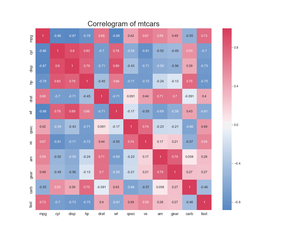
実装はこちら
import matplotlib.pyplot as plt
import pandas as pd
import seaborn as sns

sns.set_style('darkgrid')

df = pd.read_csv("https://github.com/selva86/datasets/raw/master/mtcars.csv")

plt.figure(figsize=(12,10), dpi=80)
sns.heatmap(
    df.corr(),
    xticklabels=df.corr().columns,
    yticklabels=df.corr().columns,
    cmap=sns.diverging_palette(250, 5, as_cmap=True),
    center=0,
    annot=True,
    linecolor='white')

plt.title('Correlogram of mtcars', fontsize=22)
plt.xticks(fontsize=12)
plt.yticks(fontsize=12)
plt.show()
注意点
- 大抵の場合,正規化する必要あり
- クラスタ分析で似たクラスタを固めて並べるとインサイトを得やすい.
- 配色が大事.
関連するグラフ
カレンダーマップ
特徴
視覚的にいつイベントが発生しているか把握しやすい.
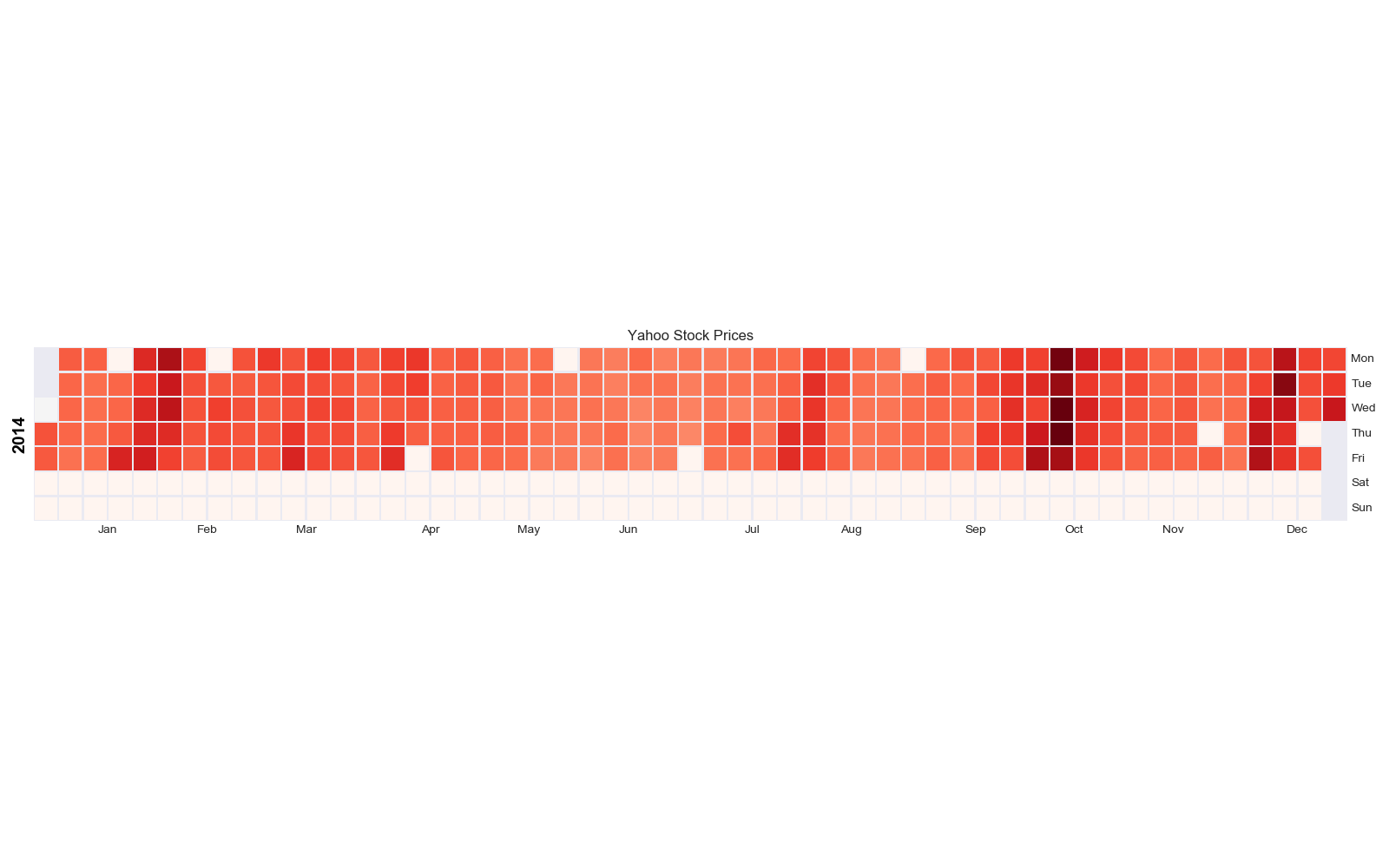
実装はこちら
import calmap
import matplotlib.pyplot as plt
import pandas as pd
import seaborn as sns
from dateutil.parser import parse

sns.set_style('darkgrid')

df = pd.read_csv("https://raw.githubusercontent.com/selva86/datasets/master/yahoo.csv", parse_dates=['date'])
df.set_index('date', inplace=True)

plt.figure(figsize=(16,10), dpi= 80)
calmap.calendarplot(df['2014']['VIX.Close'], fig_kws={'figsize': (16,10)}, yearlabel_kws={'color':'black', 'fontsize':14}, subplot_kws={'title':'Yahoo Stock Prices'})
plt.show()
リッジライン(Ridgeline)
特徴
基本は密度プロットだが,多くのグループについて比較するときに有用.
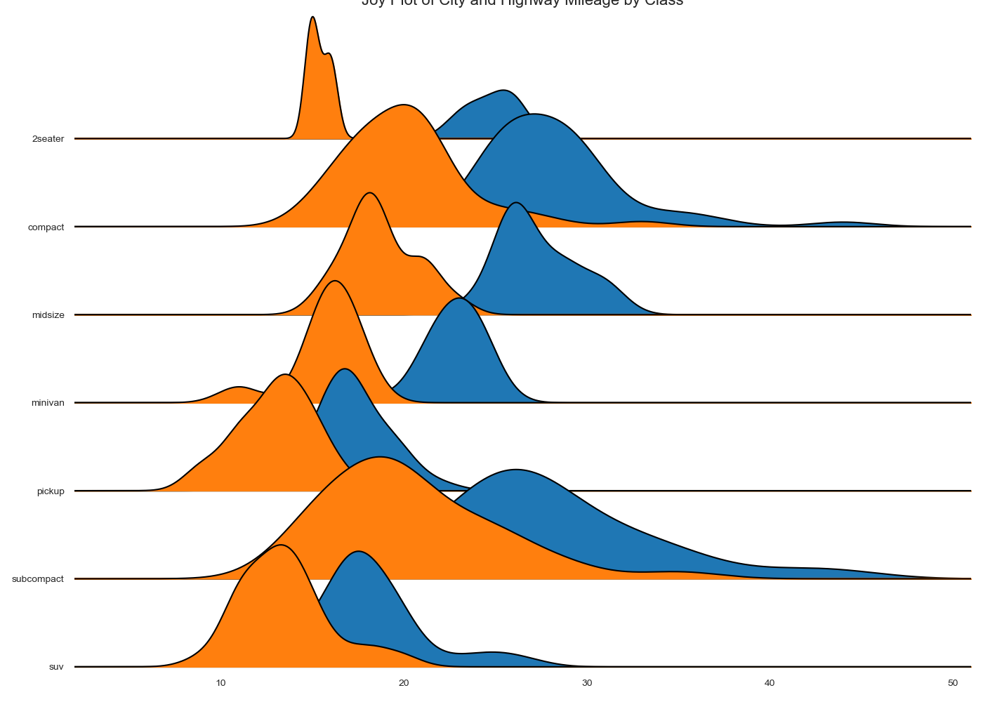
実装はこちら
import joypy
import matplotlib.pyplot as plt
import pandas as pd
import seaborn as sns

sns.set_style('white')

mpg = pd.read_csv("https://github.com/selva86/datasets/raw/master/mpg_ggplot2.csv")

plt.figure(figsize=(10, 10))
fig, axes = joypy.joyplot(mpg, column=['hwy', 'cty'], by="class", ylim='own', figsize=(14,10))

plt.title('Joy Plot of City and Highway Mileage by Class', fontsize=22)
plt.show()
ワッフルチャート(Waffle)
特徴
グループ内の構成比を表現するのが得意.
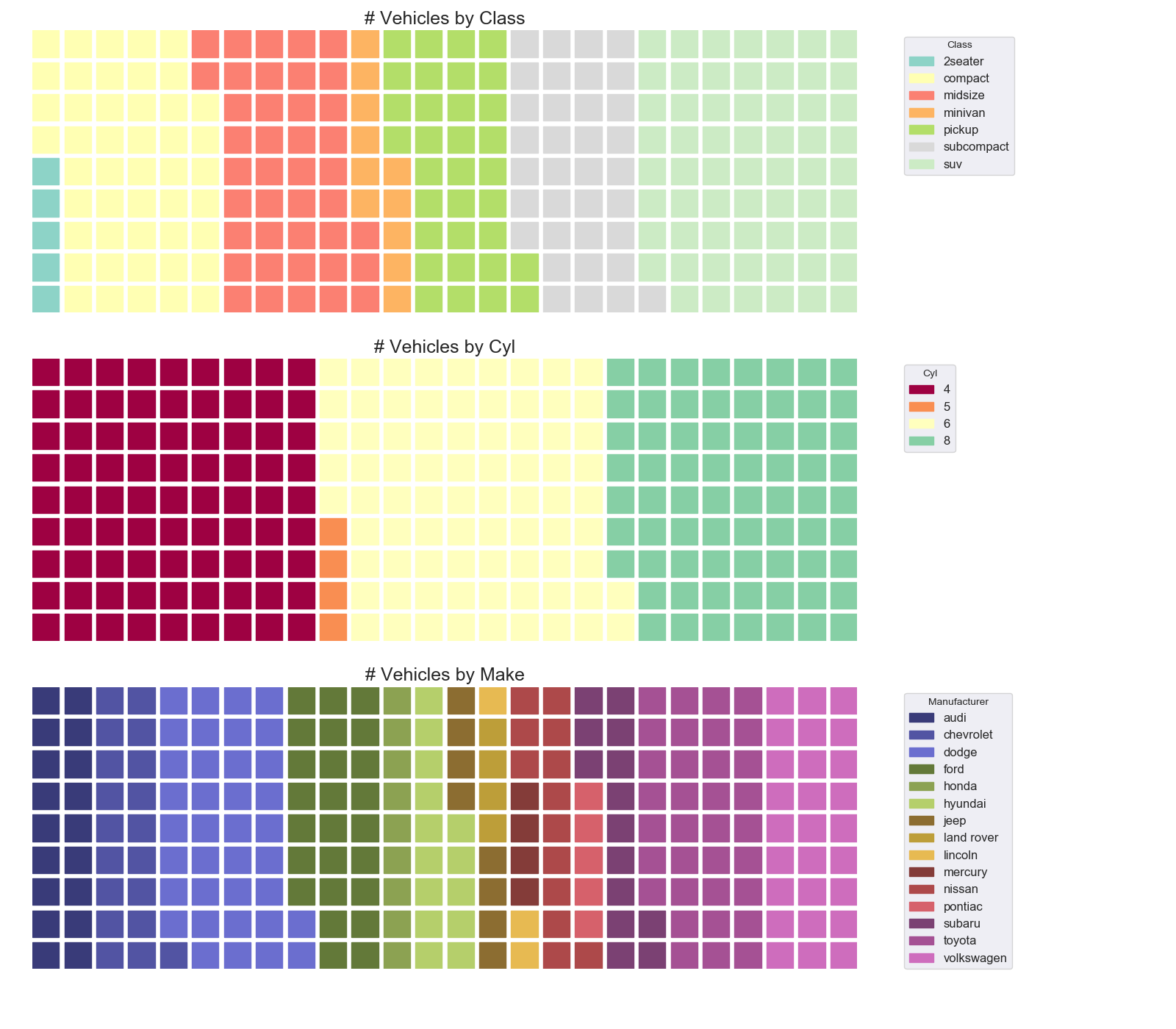
実装はこちら
import matplotlib.pyplot as plt
import pandas as pd
import seaborn as sns
from pywaffle import Waffle

sns.set_style('darkgrid')

df_raw = pd.read_csv("https://github.com/selva86/datasets/raw/master/mpg_ggplot2.csv")

df_class = df_raw.groupby('class').size().reset_index(name='counts_class')
n_categories = df_class.shape[0]
colors_class = [plt.cm.Set3(i/float(n_categories)) for i in range(n_categories)]

df_cyl = df_raw.groupby('cyl').size().reset_index(name='counts_cyl')
n_categories = df_cyl.shape[0]
colors_cyl = [plt.cm.Spectral(i/float(n_categories)) for i in range(n_categories)]

df_make = df_raw.groupby('manufacturer').size().reset_index(name='counts_make')
n_categories = df_make.shape[0]
colors_make = [plt.cm.tab20b(i/float(n_categories)) for i in range(n_categories)]

fig = plt.figure(
    FigureClass=Waffle,
    plots={
        '311': {
            'values': df_class['counts_class'],
            'labels': ["{1}".format(n[0], n[1]) for n in df_class[['class', 'counts_class']].itertuples()],
            'legend': {'loc': 'upper left', 'bbox_to_anchor': (1.05, 1), 'fontsize': 12, 'title':'Class'},
            'title': {'label': '# Vehicles by Class', 'loc': 'center', 'fontsize':18},
            'colors': colors_class
        },
        '312': {
            'values': df_cyl['counts_cyl'],
            'labels': ["{1}".format(n[0], n[1]) for n in df_cyl[['cyl', 'counts_cyl']].itertuples()],
            'legend': {'loc': 'upper left', 'bbox_to_anchor': (1.05, 1), 'fontsize': 12, 'title':'Cyl'},
            'title': {'label': '# Vehicles by Cyl', 'loc': 'center', 'fontsize':18},
            'colors': colors_cyl
        },
        '313': {
            'values': df_make['counts_make'],
            'labels': ["{1}".format(n[0], n[1]) for n in df_make[['manufacturer', 'counts_make']].itertuples()],
            'legend': {'loc': 'upper left', 'bbox_to_anchor': (1.05, 1), 'fontsize': 12, 'title':'Manufacturer'},
            'title': {'label': '# Vehicles by Make', 'loc': 'center', 'fontsize':18},
            'colors': colors_make
        }
    },
    rows=9,
    figsize=(16, 14)
)
plt.show()
ツリーマップ(Treemap)
特徴
円グラフの完全上位互換.
構成比がわかる.
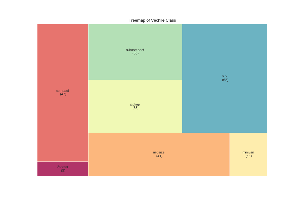
実装はこちら
import matplotlib.pyplot as plt
import pandas as pd
import seaborn as sns
import squarify

sns.set_style('darkgrid')

df_raw = pd.read_csv("https://github.com/selva86/datasets/raw/master/import squarify

df_raw = pd.read_csv("https://github.com/selva86/datasets/raw/master/mpg_ggplot2.csv")

df = df_raw.groupby('class').size().reset_index(name='counts')
labels = df.apply(lambda x: str(x[0]) + "\n (" + str(x[1]) + ")", axis=1)
sizes = df['counts'].values.tolist()
colors = [plt.cm.Spectral(i/float(len(labels))) for i in range(len(labels))]

plt.figure(figsize=(12,8), dpi=80)
squarify.plot(sizes=sizes, label=labels, color=colors, alpha=.8)

plt.title('Treemap of Vechile Class')
plt.axis('off')
plt.show()
樹形図(Dendrogram)
特徴
階層構造を表現するのが得意.
以下ではクラスタリングを行っている.
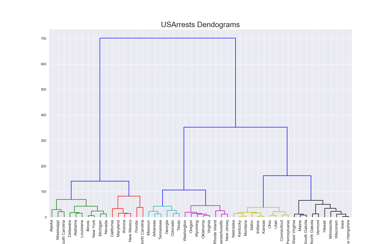
実装はこちら
import matplotlib.pyplot as plt
import pandas as pd
import seaborn as sns
import scipy.cluster.hierarchy as shc

sns.set_style('darkgrid')

df = pd.read_csv('https://raw.githubusercontent.com/selva86/datasets/master/USArrests.csv')

plt.figure(figsize=(16, 10), dpi= 80)
plt.title("USArrests Dendograms", fontsize=22)
dend = shc.dendrogram(
    shc.linkage(
        df[['Murder', 'Assault', 'UrbanPop', 'Rape']],
        # metric = 'braycurtis',
        # metric = 'canberra',
        # metric = 'chebyshev',
        # metric = 'cityblock',
        # metric = 'correlation',
        # metric = 'cosine',
        metric = 'euclidean',
        # metric = 'hamming',
        # metric = 'jaccard',
        # method= 'single')
        # method= 'complete')
        # method = 'average')
        # method='weighted')
        # method='centroid')
        # method='median')
        method='ward'),
    labels=df.State.values,
    color_threshold=100)
plt.xticks(fontsize=12)
plt.show()
注意点
- クラスタリングを行う場合はその手法をよく理解すること6.
- ラベルが長い場合は横向きも検討すること.
ベン図(Venn Diagram)
特徴
グループ同士での論理的な関係を表現できる.
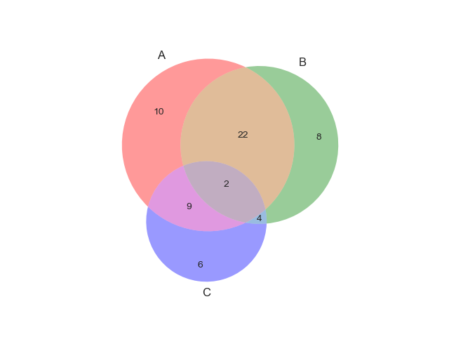
実装はこちら
import matplotlib.pyplot as plt
import pandas as pd
import seaborn as sns
from matplotlib_venn import venn3

sns.set_style('darkgrid')

venn3(subsets = (10, 8, 22, 6,9,4,2))
plt.show()

実装はこちら
import matplotlib.pyplot as plt
import numpy as np
import pandas as pd
import seaborn as sns
from matplotlib_venn import venn3, venn3_circles

sns.set_style('darkgrid')

v = venn3(subsets=(1, 1, 1, 1, 1, 1, 1), set_labels = ('A', 'B', 'C'))

v.get_patch_by_id('100').set_alpha(1.0)
v.get_patch_by_id('100').set_color('white')
v.get_label_by_id('100').set_text('Unknown')
v.get_label_by_id('A').set_text('Set "A"')
c = venn3_circles(subsets=(1, 1, 1, 1, 1, 1, 1), linestyle='dashed')
c[0].set_lw(1.0)
c[0].set_ls('dotted')

plt.title("Sample Venn diagram")
plt.annotate('Unknown set', xy=v.get_label_by_id('100').get_position() - np.array([0, 0.05]), xytext=(-70,-70),
ha='center', textcoords='offset points', bbox=dict(boxstyle='round,pad=0.5', fc='gray', alpha=0.1),
arrowprops=dict(arrowstyle='->', connectionstyle='arc3,rad=0.5',color='gray'))

plt.show()
注意点
- 3グループ以上プロットすると見づらくなる.
平行座標プロット(Parallel Plot)
特徴
複数の変数間で性質が異なるかどうかを表現できる.

実装はこちら
import matplotlib.pyplot as plt
import pandas as pd
import seaborn as sns
from pandas.plotting import parallel_coordinates

sns.set_style('darkgrid')

df_final = pd.read_csv("https://raw.githubusercontent.com/selva86/datasets/master/diamonds_filter.csv")

plt.figure(figsize=(12,9), dpi= 80)
parallel_coordinates(df_final, 'cut', colormap='Dark2')

plt.gca().spines["top"].set_alpha(0)
plt.gca().spines["bottom"].set_alpha(.3)
plt.gca().spines["right"].set_alpha(0)
plt.gca().spines["left"].set_alpha(.3)

plt.title('Parallel Coordinated of Diamonds', fontsize=22)
plt.grid(alpha=0.3)
plt.xticks(fontsize=12)
plt.yticks(fontsize=12)
plt.show()
注意点
- レーダーチャートと同じ内容を表現しているが,レーダーチャートよりも好まれる.
- 折れ線グラフと同様に,多くの線をプロットしすぎないこと.
- $x$軸がソートされるべきものである場合はソートしておいたほうが良い.
4. 参考資料
- グラフをつくる前に読む本
- 5 Quick and Easy Data Visualizations in Python with Code
- From Data to Viz
- The Python Graph Gallery
- Top 50 matplotlib Visualizations
-
Visualisation :: Choosing a chart や Visual Vocabulary を参照. ↩
-
例えば円グラフといった利用が推奨されていないグラフや,Chord DiagramやSankey Diagram,Circular Packingなどまだ使用する予定のないグラフ. ↩
-
ケース別データの可視化パターンとpythonによる実装,データ可視化チートシート や よく使うグラフをseabornで可視化する方法を調べてみたを参照. ↩
-
DENDROGRAMを参照. ↩