はじめに
本Tipsでは、空港間流通量について可視化する事例をご紹介しています。空港間流通量には、出発空港と到着空港の旅客数などの情報が含まれています。データは、国土交通省の国土数値情報で公開されています。データの仕様は、国土数値情報(空港間流通量)製品仕様書 第 1.1 版をご参照ください。グラフ化までの処理の流れは次の通りです。
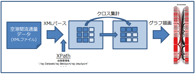
XML パース
R
# ワーキングディレクトリのセット
setwd( "ワーキングディレクトリ" )
# ライブラリの読み込み(事前にインストールしておく)
library( XML ) # XMLファイルをパースする
# XMLファイルのパース
doc <- xmlInternalTreeParse( "S10b-14.xml" )
# 取り出す要素の XPath を定義
depAportXPath <- "/ksj:Dataset/ksj:BetAport/ksj:depAport" # 出発空港名
arrAportXPath <- "/ksj:Dataset/ksj:BetAport/ksj:arrAport" # 到着空港名
numOfPassXPath <- "/ksj:Dataset/ksj:BetAport/ksj:numOfPass" # 旅客数
# xpathSApply で要素の値を取り出す
depAport <- xpathSApply( doc, depAportXPath, xmlValue ) # 出発空港名
arrAport <- xpathSApply( doc, arrAportXPath, xmlValue ) # 到着空港名
numOfPass <- xpathSApply( doc, numOfPassXPath, xmlValue ) # 旅客数
# 旅客数が全ての要素に存在しないので、存在する要素だけに絞り込む
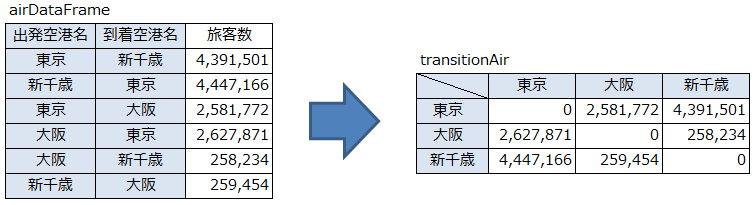
airDataFrame <- as.data.frame( cbind(depAport[1:length( numOfPass )], arrAport[1:length( numOfPass )], numOfPass[1:length( numOfPass )]))
クロス集計
R
# ライブラリの読み込み(事前にインストールしておく)
library( reshape2 )      # クロス集計する
# クロス集計の準備
meltAir <- melt( airDataFrame, id.vars = c( "V1", "V2" ), measure.vars = "V3", variable.name = "vName", value.name = "vValue" )
# 数値に変換する(引数 'type' (character) が不正です、のエラーを回避するため)
meltAir$vValue <- type.convert( meltAir$vValue )
# クロス集計する
transitionAir  <- acast( meltAir, V1~V2 , value.var="vValue", sum )
この処理によるクロス集計のイメージは次の通りです。
グラフ描画
グラフ描画の準備
R
# ライブラリの読み込み(事前にインストールしておく)
library( Gmisc ) # 状態遷移をプロットする
library( grid ) # ユニット・オブジェクトの生成
library( RColorBrewer ) # カラーパレットを使用する
# パラメータのセット
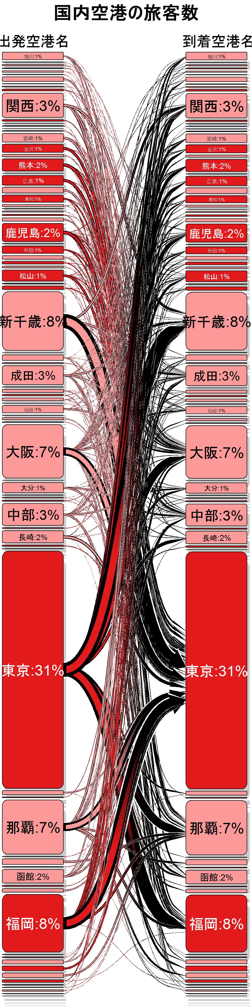
main <- c( "国内空港の旅客数" )
box_label <- c( "出発空港名", "到着空港名" )
txt_start_clr <- c( "black", "white" )
txt_end_clr <- c( "black", "white" )
output_perc <- function( txt, n ) sprintf( "%s:%.0f%%", txt, n )
box_txt <- cbind( mapply( output_perc, txt = c( rownames( transitionAir )), n = prop.table( rowSums( transitionAir ))*100 ), mapply( output_perc, txt = c( colnames( transitionAir )), n = prop.table( colSums( transitionAir ))*100 ))
fill_start_box <- brewer.pal( n = 6, name = "Paired" )[5:6]
fill_end_box <- brewer.pal( n = 6, name = "Paired" )[5:6]
overlap_add_width <- 1.2
type_of_arrow <- "gradient"
max_lwd <- unit(20, "mm")
cex <- 5
グラフを描画する
R
png( "plot1.png", width = 1000, height = 4000 )
transitionPlot( transitionAir, cex = cex, main = main, box_label = box_label, box_txt = box_txt,txt_start_clr = txt_start_clr, txt_end_clr = txt_end_clr, fill_start_box = fill_start_box, fill_end_box =fill_end_box, overlap_add_width = overlap_add_width, type_of_arrow = type_of_arrow, max_lwd = max_lwd )
dev.off()
グラフのサンプル
リファレンス
Introduction to transitionPlot by MAX GORDON
transitionPlot function by MAX GORDON