はじめに
netcdfのデータをxarrayで開いて、matplotlibで図にするのを、daskで並列化(multiprocess)してみた。
データは、NCEP/NCAR reanalysisの地表面付近の毎月の温位("pottmp.sig995.mon.mean.nc")で、NOAAのESRLで入手した。
データ
import xarray as xr
ds=xr.open_dataset("pottmp.sig995.mon.mean.nc")
print(ds)
<xarray.Dataset>
Dimensions:  (lat: 73, lon: 144, time: 852)
Coordinates:
  * lat      (lat) float32 90.0 87.5 85.0 82.5 80.0 ... -82.5 -85.0 -87.5 -90.0
  * lon      (lon) float32 0.0 2.5 5.0 7.5 10.0 ... 350.0 352.5 355.0 357.5
  * time     (time) datetime64[ns] 1948-01-01 1948-02-01 ... 2018-12-01
Data variables:
    pottmp   (time, lat, lon) float32 ...
Attributes:
    Conventions:    COARDS
    description:    Data from NCEP initialized reanalysis (4x/day).  These ar...
    platform:       Model
    NCO:            20121012
    history:        Created 2011/06/27 by ESRL/PSD Web & Data Team\nConverted...
    title:          monthly mean pottmp.sig995 from the NCEP Reanalysis
    References:     http://www.esrl.noaa.gov/psd/data/gridded/data.ncep.reana...
    dataset_title:  NCEP-NCAR Reanalysis 1
print(ds["pottmp"].max(),ds["pottmp"].min())
<xarray.DataArray 'pottmp' ()>
array(334.699951) <xarray.DataArray 'pottmp' ()>
array(214.599854)
ds.close()
1度データxarrayでデータを開いて見てみると、データは852か月分ある。最初のデータは最大約335K、最低は約215Kであり、コンターのレベルの参考にする。
plot
import matplotlib.pyplot as plt
import numpy as np
import cartopy.crs as ccrs
図化にはmatplotlibを使い、緯度経度座標で図にするためにcartopyを使用する。
test 1 (parallel)
import dask
@dask.delayed
def plot_month(n):
    ds=xr.open_dataset("pottmp.sig995.mon.mean.nc")
    pottmp=ds["pottmp"].isel(time=n)

    fig=plt.figure()
    proj=ccrs.PlateCarree()
    proj180=ccrs.PlateCarree(central_longitude=180)
    ax = fig.add_subplot(111, projection=proj180)
    ax.coastlines()
    cl=ax.contourf(pottmp.lon,pottmp.lat,pottmp,np.arange(200,350,20),transform=proj)
    ax.set_title(pottmp.time.data)
    fig.colorbar(cl,shrink=0.5)
    plt.tight_layout()
    fig.savefig("pottmp_{n}.png".format(n=n+1))
    plt.close()

    ds.close()
%%time
_ = dask.compute(*[plot_month(n) for n in range(852)],scheduler="processes")
CPU times: user 5.83 s, sys: 281 ms, total: 6.11 s
Wall time: 3min 6s
Daskで852か月分の作図をmultiprocessにしたコード。実行時間は3分6秒。実行環境は手元の4コアのノートPC (Panasonic CF-NX2)。
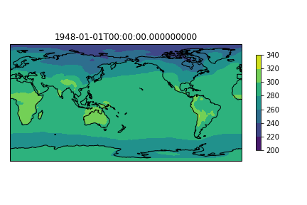
例として最初の図はこのようになる。
test 2 (serial)
def plot_month(n):
    ds=xr.open_dataset("pottmp.sig995.mon.mean.nc")
    pottmp=ds["pottmp"].isel(time=n)

    fig=plt.figure()
    proj=ccrs.PlateCarree()
    proj180=ccrs.PlateCarree(central_longitude=180)
    ax = fig.add_subplot(111, projection=proj180)
    ax.coastlines()
    cl=ax.contourf(pottmp.lon,pottmp.lat,pottmp,np.arange(200,350,20),transform=proj)
    ax.set_title(pottmp.time.data)
    fig.colorbar(cl,shrink=0.5)
    plt.tight_layout()
    fig.savefig("pottmp_{n}.png".format(n=n+1))
    plt.close()

    ds.close()
%%time
_ = [plot_month(n) for n in range(852)]
CPU times: user 4min 27s, sys: 28.4 s, total: 4min 55s
Wall time: 4min 57s
同じコードを並列化しない場合の実行時間は4分57秒。4コアを使っても4倍になるわけではないけれども、並列化した場合の方が速い。
test 3 (serial)
ds=xr.open_dataset("pottmp.sig995.mon.mean.nc")
pottmp=ds["pottmp"]
def plot_month(pottmp,n):
    pottmpn=pottmp.isel(time=n)

    fig=plt.figure()
    proj=ccrs.PlateCarree()
    proj180=ccrs.PlateCarree(central_longitude=180)
    ax = fig.add_subplot(111, projection=proj180)
    ax.coastlines()
    cl=ax.contourf(pottmpn.lon,pottmpn.lat,pottmpn,np.arange(200,350,20),transform=proj)
    ax.set_title(pottmpn.time.data)
    fig.colorbar(cl,shrink=0.5)
    plt.tight_layout()
    fig.savefig("pottmp_{n}.png".format(n=n+1))
    plt.close()
%%time
_ = [plot_month(pottmp,n) for n in range(852)]
CPU times: user 4min 19s, sys: 12.4 s, total: 4min 31s
Wall time: 4min 32s
test1とtest2ではfucntionの中でいちいちnetcdfを開いているが、多分並列化の場合はその方が問題がなさそう。並列化しない場合、Test3のようにnetcdfを1度開いてからそこからデータを読みにいってもたいして速いわけではない。
注
matplotlibを並列化すると、図にする順番によってはフォントが乱れることがある。よくわからないがフォントのキャッシュによるもの?
参考
Matplotlibをmultiprocessing.Poolで並列化する際の覚書 (Qiita)
Matplotlib multiprocessing fonts corruption using savefig (stack overflow)