Storybookとは
iframeによるサンドボックス環境にUIコンポーネントのカタログを作成することができるライブラリ。
storybookが提供するヘルパー関数を用いることで簡単にstoryを記述することができる。
メリット
- コンポーネントのUIを素早く確認したり、挙動をテストすることができる。propsに応じた異なる挙動を一度に確認することも可能。
- 静的ファイルに書き出すことで、デザイナーや非エンジニアが開発環境を立ち上げることなくUIを確認できる。
- その他Addonの追加により便利機能を追加できる。
セットアップ
まず Vueのプロジェクトを作成する。
$ npm i -g @vue/cli
$ vue init myapp (初期設定はデフォルトで)
$ cd myapp
次に、適当なコンポーネントを作成する。
<template>
  <el-button type="primary" :icon="iconType" :style="styles">{{ label }}</el-button>
</template>
<script>
import { Button } from "element-ui";
export default {
  components: {
    "el-button": Button
  },
  props: {
    label: {
      type: String,
      default: "My Button"
    },
    backGroundColor: {
      type: String,
      default: "#409eff"
    },
    height: {
      type: Number,
      default: 50
    },
    width: {
      type: Number,
      default: 150
    },
    icon: {
      type: String,
      default: ""
    }
  },
  computed: {
    styles() {
      return {
        "--color": this.backGroundColor,
        "--height": this.height,
        "--width": this.width
      };
    },
    iconType() {
      return this.icon;
    }
  }
};
</script>
<style scoped>
button {
  --color: #409eff;
  --height: 50px;
  --width: 100px;
  background-color: var(--color);
  height: var(--height);
  width: var(--width);
  border-radius: 5px;
  font-size: 18px;
  line-height: 1.5;
  padding: 0 10px;
  display: inline-block;
}
</style>
UIにはElementUIを使用。propsに応じてスタイルが変化するボタンを作成した。
次に、storybookのライブラリをインストール。
$ npm i -g @storybook/cli
$ getstorybook
getstorybookは自動でプロジェクトの種類(React, Vue,...)を検知して必要ライブラリのインストール、設定ファイルの生成を行ってくれるライブラリ。
また、今回は2種のAddonsを追加する。
$ yarn add @storybook/addon-knobs -D
$ yarn add storybook-addon-vue-info -D
以下のようなstoryを読み込むための設定ファイルと、Addonsを追加するファイルが生成された。
import { configure } from '@storybook/vue';

// automatically import all files ending in *.stories.js
// const req = require.context('../stories', true, /.stories.js$/);
function loadStories() {
  require('../stories/index.stories');
}

configure(loadStories, module);
(require.contextがエラーを吐くのでちょっと変更)
import '@storybook/addon-actions/register';
import '@storybook/addon-links/register';
もう一つ生成された stories/index.stories.js にはstoryを記述する。
import { storiesOf } from '@storybook/vue';
import { action } from '@storybook/addon-actions';
import { withKnobs, text, color, number } from '@storybook/addon-knobs'
import VueInfoAddon from 'storybook-addon-vue-info'
import 'element-ui/lib/theme-chalk/index.css';

import Button from '../src/components/Button'
import Counter from '../src/components/Counter'

storiesOf('Buttons', module)
  .addDecorator(VueInfoAddon)
  .addDecorator(withKnobs)
  .add('button', () => {
    const label = text('Label', 'My Button')
    const backgroundColor = color('Color', '#409eff')
    const height = number('height', 50)
    const width = number('width', 150)
    return {
      components: { Button },
      template: `<Button
        @click.native="action"
        label="${label}"
        backGroundColor="${backgroundColor}"
        height="${height}px"
        width="${width}px"
      />`,
      methods: { action: action('button-clicked') },
    }
  })
  .add('Search', () => {
    const label = text('Label', 'Search')
    const backgroundColor = color('Color', '#409eff')
    const height = number('height', 50)
    const width = number('width', 150)
    return {
      components: { Button },
      template: `<Button
        @click.native="action"
        label="${label}"
        backGroundColor="${backgroundColor}"
        height="${height}px"
        width="${width}px"
        icon="el-icon-search"
      />`,
      methods: { action: action('button-clicked') },
    }
  })
通常のボタンと、propsの変更により検索ボタンバージョンを追加した。
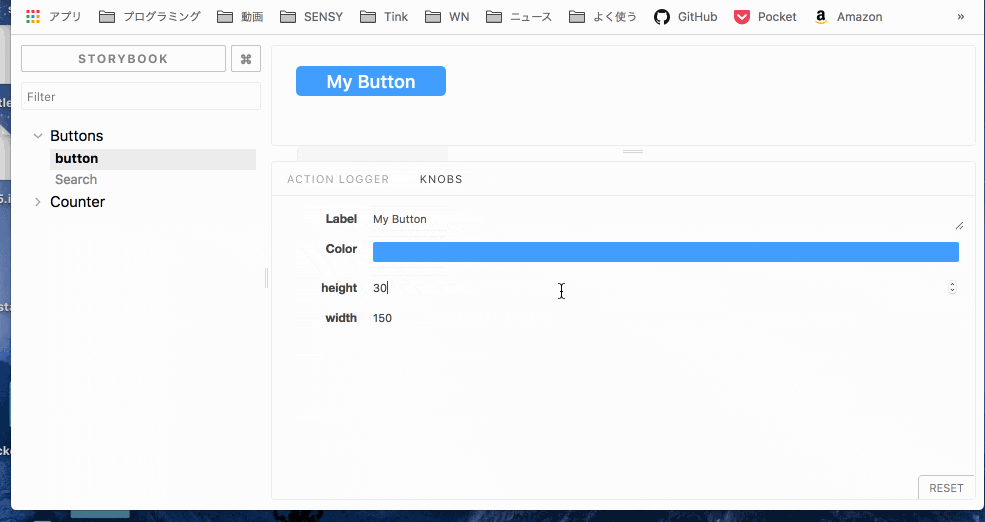
先ほどインストールした @storybook/addon-knobs により、propsなどの値をstorybookの画面でリアルタイムに変更しながら確認することができる。
また、 storybook-addon-vue-info は、propsなどのドキュメントを自動で生成してくれる。
これで準備が整ったので、storybookを起動する。
$ yarn storybook

左のツリーから、追加したstoryを選択することができる。
Knobsの挙動。
静的ファイルへの書き出し
以下のコマンドで静的ファイルに書き出してくれる。
$ yarn build-storybook -c .storybook -o .out
.out/ に出力されたhtml等をGitHub Pagesとかにホスティングすれば、非エンジニアでもUIコンポーネントを確認することが可能。
Storyshotsテストの追加 (挫折)
storyを用いたいわゆるsnap shot testingを実装することができる。
今回はbabel周りの設定がうまくいかず断念。
snap shot testingとは
ある状態におけるUIコンポーネントの表示をsnap shotとして保存し、コードの変更後のsnap shotと比較することで、想定外のUIの変化を検知することができるテスト。
UIに変化があった場合はテストがFAILし、それが正しい変化である場合は、snap shotをその状態にupdateする。
ライブラリのヘルパー関数を用いてUIの状態を宣言的に記述するだけでテストが行えるので簡単に実装できる。
storybookでは、記述したstoryをそのままsnap shotとして用いることができる。
$ @storybook/addon-storyshots
詳しい設定はこちらを参照。
https://github.com/storybooks/storybook/tree/master/addons/storyshots/storyshots-core
今回のコードはこちら
https://github.com/taichi-jp/vue-storybook-test
以下で公式のExampleを閲覧可能。
https://storybook.js.org/examples/