はじめに
CSS3まで使うとここまでできるようになってるなんて。
ちょっとフラットデザインっぽくスタイルを当ててみました。
モダンブラウザではtransitionでフェードエフェクトが効きます。
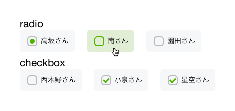
フォームなどを利用する際、アイコンではなく ラジオボタンやチェックボックスのテキスト部分 をクリックして、「あーチェックされない……」という経験をされたことがある人は多いかと。labelとinputが関連付けられていないというやつです。
関連付けされていることを明示的にするためにボタンのようなデザインでラップし、ユーザビリティを高めました。
タッチデバイスでも押しやすい(押すとチェックできるというのが分かりやすい)かと思います。
概要
ユーザに見える部分は全て label に当たっているスタイルです。
input 自体は display: none; しておき、関連付けられた label を checked のトリガーにします。
隣接セレクタを使い、 checked 状態の input の隣にある label.radio や label.checkbox にスタイルを当てます。
↓チェックされているラジオボタンの隣にある .radio のスタイル
input[type=radio]:checked + .radio {
}
label には :before と :after 擬似要素を使い、グレーの角丸とアイコンを表現しています。
ラジオボタンは角丸で円を、チェックボックスは二辺のみborderを付けた要素を45度回転させています。
- モダンブラウザ
- IE9+
- android4.0系標準ブラウザ
- iOS7 Safari
コード
index.html
<form action="">
  <section>
    <h2>radio</h2>
    <input type="radio" name="hoge" value="高坂さん" checked id="radio01" />
    <label for="radio01" class="radio">高坂さん</label>

    <input type="radio" name="hoge" value="南さん" id="radio02" />
    <label for="radio02" class="radio">南さん</label>

    <input type="radio" name="hoge" value="園田さん" id="radio03" />
    <label for="radio03" class="radio">園田さん</label>

  </section>
  <section>
    <h2>checkbox</h2>

    <input type="checkbox" name="piyo" value="西木野さん" checked id="checkbox01" />
    <label for="checkbox01" class="checkbox">西木野さん</label>

    <input type="checkbox" name="piyo" value="小泉さん" id="checkbox02" />
    <label for="checkbox02" class="checkbox">小泉さん</label>

    <input type="checkbox" name="piyo" value="星空さん" id="checkbox03" />
    <label for="checkbox03" class="checkbox">星空さん</label>
  </section>
</form>
inputDesign.css
input[type=radio], input[type=checkbox] {
  display: none;
}

.radio, .checkbox {
  box-sizing: border-box;
  -webkit-transition: background-color 0.2s linear;
  transition: background-color 0.2s linear;
  position: relative;
  display: inline-block;
  margin: 0 20px 8px 0;
  padding: 12px 12px 12px 42px;
  border-radius: 8px;
  background-color: #f6f7f8;
  vertical-align: middle;
  cursor: pointer;
}
.radio:hover, .checkbox:hover {
  background-color: #e2edd7;
}
.radio:hover:after, .checkbox:hover:after {
  border-color: #53b300;
}
.radio:after, .checkbox:after {
  -webkit-transition: border-color 0.2s linear;
  transition: border-color 0.2s linear;
  position: absolute;
  top: 50%;
  left: 15px;
  display: block;
  margin-top: -10px;
  width: 16px;
  height: 16px;
  border: 2px solid #bbb;
  border-radius: 6px;
  content: '';
}

.radio:before {
  -webkit-transition: opacity 0.2s linear;
  transition: opacity 0.2s linear;
  position: absolute;
  top: 50%;
  left: 20px;
  display: block;
  margin-top: -5px;
  width: 10px;
  height: 10px;
  border-radius: 50%;
  background-color: #53b300;
  content: '';
  opacity: 0;
}
input[type=radio]:checked + .radio:before {
  opacity: 1;
}

.checkbox:before {
  -webkit-transition: opacity 0.2s linear;
  transition: opacity 0.2s linear;
  position: absolute;
  top: 50%;
  left: 21px;
  display: block;
  margin-top: -7px;
  width: 5px;
  height: 9px;
  border-right: 3px solid #53b300;
  border-bottom: 3px solid #53b300;
  content: '';
  opacity: 0;
  -webkit-transform: rotate(45deg);
  -ms-transform: rotate(45deg);
  transform: rotate(45deg);
}
input[type=checkbox]:checked + .checkbox:before {
  opacity: 1;
}
一応Sassも
inputDesign.scss
$iconColor: #53b300;

input[type=radio], input[type=checkbox] {
  display: none;
}

.radio, .checkbox {
  box-sizing: border-box;
  -webkit-transition: background-color 0.2s linear;
  transition: background-color 0.2s linear;
  position: relative;
  display: inline-block;
  margin: 0 20px 8px 0;
  padding: 12px 12px 12px 42px;
  border-radius: 8px;
  background-color: #f6f7f8;
  vertical-align: middle;
  cursor: pointer;

  &:hover {
    background-color: #e2edd7;
    &:after {
      border-color: $iconColor;
    }
  }

  &:after {
    -webkit-transition: border-color 0.2s linear;
    transition: border-color 0.2s linear;
    position: absolute;
    top: 50%;
    left: 15px;
    display: block;
    margin-top: -10px;
    width: 16px;
    height: 16px;
    border: 2px solid #bbb;
    border-radius: 6px;
    content: '';
  }
}
.radio {
  &:before {
    -webkit-transition: opacity 0.2s linear;
    transition: opacity 0.2s linear;
    position: absolute;
    top: 50%;
    left: 20px;
    display: block;
    margin-top: -5px;
    width: 10px;
    height: 10px;
    border-radius: 50%;
    background-color: $iconColor;
    content: '';
    opacity: 0;
    input[type=radio]:checked + & {
      opacity: 1;
    }
  }
}

.checkbox {
  &:before {
    -webkit-transition: opacity 0.2s linear;
    transition: opacity 0.2s linear;
    position: absolute;
    top: 50%;
    left: 21px;
    display: block;
    margin-top: -7px;
    width: 5px;
    height: 9px;
    border-right: 3px solid $iconColor;
    border-bottom: 3px solid $iconColor;
    content: '';
    opacity: 0;
    -webkit-transform: rotate(45deg);
    -ms-transform: rotate(45deg);
    transform: rotate(45deg);
    input[type=checkbox]:checked + & {
      opacity: 1;
    }
  }
}
↑Sassコードの、validateに引っかかったみたいな赤いのは何なんでしょうか……。
追記
シンタックスハイライトをscssに変更