はじめに
pythonで数直線を描きたかったのだが,どうググっても良い方法が出てこなかったので,自分なりの方法をここにまとめる.
使用機器
- MacBook Air
- Jupyter notebook
実装
実際にやってみた.
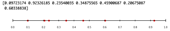
number_line.py
import numpy as np
import matplotlib.pyplot as plt
import pylab
%matplotlib inline

#テキトーな配列を生成
rand_size = 7 #配列のサイズ
rand = np.random.random_sample(rand_size) #テキトーな配列を生成
print(rand)
rand = sorted(rand) #ソート
y = [0]*rand_size #y=0

#数直線
fig,ax=plt.subplots(figsize=(10,10)) #画像サイズ
fig.set_figheight(1) #高さ調整
ax.tick_params(labelbottom=True, bottom=False) #x軸設定
ax.tick_params(labelleft=False, left=False) #y軸設定

xmin, xmax= 0,1 #数直線の最小値・最大値
plt.tight_layout() #グラフの自動調整
plt.scatter(rand,y,c='r') #散布図
plt.hlines(y=0,xmin=xmin,xmax=xmax) #横軸
plt.vlines(x=[i for i in range(xmin,xmax+1,1)],ymin=-0.04,ymax=0.04) #目盛り線(大)
plt.vlines(x=[i/10 for i in range(xmin*10,xmax*10+1,1)],ymin=-0.02,ymax=0.02) #目盛り線(小)
line_width=0.1#目盛り数値の刻み幅
plt.xticks(np.arange(xmin,xmax+line_width,line_width)) #目盛り数値
pylab.box(False) #枠を消す
↓こんな感じになる↓
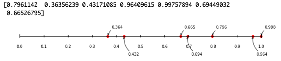
数直線の値を表示
数直線の値を表示したり....
number_line2.py
import numpy as np
import matplotlib.pyplot as plt
import pylab
%matplotlib inline

#テキトーな配列を生成
rand_size = 7 #配列のサイズ
rand = np.random.random_sample(rand_size) #テキトーな配列を生成
print(rand)
rand = sorted(rand) #ソート
y = [0]*rand_size #y=0

#数直線
fig,ax=plt.subplots(figsize=(10,10)) #画像サイズ
fig.set_figheight(1) #高さ調整
ax.tick_params(labelbottom=True, bottom=False) #x軸設定
ax.tick_params(labelleft=False, left=False) #y軸設定

#数直線上の数値を表示
for i in range(int(rand_size/2)+1):
    ax.annotate('{0:.3f}'.format(rand[2*i]),
                 xy=(rand[2*i],y[2*i]),
                 xytext=(10, 20),
                 textcoords='offset points',
                 arrowprops=dict(arrowstyle="->",connectionstyle="arc3,rad=.3")
                )

for i in range(int(rand_size/2)):
    ax.annotate('{0:.3f}'.format(rand[2*i+1]),
                 xy=(rand[2*i+1],y[2*i+1]),
                 xytext=(10, -50),
                 textcoords='offset points',
                 arrowprops=dict(arrowstyle="->",connectionstyle="arc3,rad=-.3")
                )

xmin, xmax= 0,1 #数直線の最小値・最大値
plt.tight_layout() #グラフの自動調整
plt.scatter(rand,y,c='r') #散布図
plt.hlines(y=0,xmin=xmin,xmax=xmax) #横軸
plt.vlines(x=[i for i in range(xmin,xmax+1,1)],ymin=-0.04,ymax=0.04) #目盛り線(大)
plt.vlines(x=[i/10 for i in range(xmin*10,xmax*10+1,1)],ymin=-0.02,ymax=0.02) #目盛り線(小)
line_width=0.1#目盛り数値の刻み幅
plt.xticks(np.arange(xmin,xmax+line_width,line_width)) #目盛り数値
pylab.box(False) #枠を消す
↓こんな感じになる↓
おわりに
数直線をライブラリで一発で書けないものですかね...?
他に良い方法があればご教授ください....