タイトル長くてすいません。
自分用に実装したののメモ。
フラットっぽい感じ。
ソース
html
<label>
    ファイル
    <div class="uploader">
        ファイルを選択
        <input type="file">
    </div>
</label>
<label>
    同意の確認
    <div class="custom-checkbox">
        <input type="checkbox">
        利用規約に同意します
    </div>
</label>
stylesheet
label {
    font-weight: bold;
    cursor: pointer;
    font-size: 0.9em;
    display: block;
}
.uploader {
    margin-bottom: 10px;
    background-color: #fff;
    display: inline-block;
    border-radius: 1px;
    color: #333;
    vertical-align: top;
    border: 1px solid #d9d9d9;
    padding: 8px;
    display: block;
}
.uploader:hover {
    border: 1px solid #b9b9b9;
    box-shadow: inset 0px 1px 2px rgba(0,0,0,0.1);
    border-top: 1px solid #a0a0a0;
}
.uploader:focus {
    box-shadow: none;
    border: 1px solid #4d90fe;
    outline: none;
}
.uploader:active {
    box-shadow: inset 0px 1px 5px rgba(0,0,0,0.5);
}
.uploader input {
    display: none;
}
.uploader span.value {
    display: block;
    float: right;
    background: #eee;
    padding: 8px;
    margin: -8px;
    opacity: 0.8;
    width: 70%;
    text-align: center;
    min-height: 1em;
    line-height: 1.5em;
}


.custom-checkbox {
    position: relative;
    margin-left: 1.4em;
}
.custom-checkbox input {
    display: none;
}
.custom-checkbox .check {
    position: absolute;
    width: 1em;
    height: 1em;
    left: 0;
    top: 3px;
    margin-left: -1.4em;
    vertical-align: baseline;
    display: block;
    border: 1px solid #ddd;
}
.custom-checkbox:hover .check {
    border: 1px solid #b9b9b9;
    box-shadow: inset 0px 1px 2px rgba(0,0,0,0.1);
    border-top: 1px solid #a0a0a0;
    -webkit-transition: 0.2s;
       -moz-transition: 0.2s;
        -ms-transition: 0.2s;
         -o-transition: 0.2s;
            transition: 0.2s;
}
.custom-checkbox .check.checked {
    box-shadow: none;
    border: 1px solid #4d90fe;
    border-radius: 50%;
    transition: 0.2s;
    background: rgba(77, 144, 254, 0.15);
}
javascript
$(function(){
    $('.uploader input[type=file]').change(function(){
        var file = $(this).prop('files')[0];
        $(this).parent().children('.value').remove();
        $(this).after('<span class="value"></span>');
        $(this).parent().children('.value').html(file.name);
    });

    $('.custom-checkbox').prepend('<span class="check"></span>');
    $('.custom-checkbox input').change(function(){
        $(this).parent().children('.check').toggleClass('checked');
    });
});
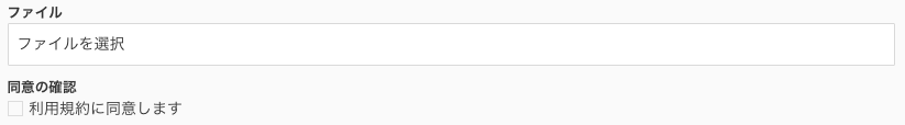
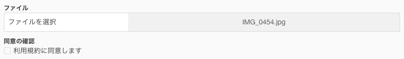
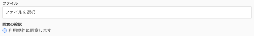
動作
ホバー時の動作とかはスクショとってません
初期状態
ファイル選択時
チェックボックス選択時
まとめ
ラジオボタンもちょっと変えればできる
追記
2016/02/15
ちょっと変えたら普通にチェックマークできた。
css
.custom-checkbox:hover .check {
    border: 1px solid #A5A5A5;
    box-shadow: inset 0px 1px 2px rgba(0,0,0,0.1);
    border-top: 1px solid #9B9B9B;
    -webkit-transition: 0.2s;
       -moz-transition: 0.2s;
        -ms-transition: 0.2s;
         -o-transition: 0.2s;
            transition: 0.2s;
}
.custom-checkbox .check.checked {
    box-shadow: none;
    border: 1px solid #4d90fe;
    transform: rotate(45deg);
    border-top-color: transparent;
    border-left-color: transparent;
    top: 0px;
    width: 8px;
}
ブラウザテストはしてない(誰か試して