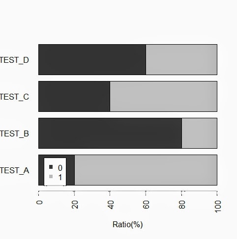
0, 1の2値データの割合を100%積み上げ棒グラフとして出力する。
コード
sample_data <- data.frame(
  TEST_A=c(1, 1, 0, 1, 1),
  TEST_B=c(1, 0, 0, 0, 0),
  TEST_C=c(0, 0, 1, 1, 1),
  TEST_D=c(1, 0, 0, 0, 1)
)

#カテゴリ変数へ
sample_data$TEST_A <- as.factor(sample_data$TEST_A)
sample_data$TEST_B <- as.factor(sample_data$TEST_B)
sample_data$TEST_C <- as.factor(sample_data$TEST_C)
sample_data$TEST_D <- as.factor(sample_data$TEST_D)

summary(sample_data)

#棒グラフ描画
barplot(
  sapply(c(
    "TEST_A",
    "TEST_B",
    "TEST_C",
    "TEST_D"
  ),
  function(s){
    (table(sample_data[s])/sum(table(sample_data[s]))) * 100
  }),
  horiz=T,
  las=2,
  col=gray(c(0.2, 0.8)),
  xlim=c(0,100),
  xlab="Ratio(%)"
)
legend(3, 1.1, c("0", "1"), pch=15, col=gray(c(0.2, 0.8)))
出力
コンソール
> summary(sample_data)
 TEST_A TEST_B TEST_C TEST_D
 0:1    0:4    0:2    0:3
 1:4    1:1    1:3    1:2
グラフ