人のソースを見て勉強しようシリーズ第2弾
CSS3でチェックボックスのアニメーションを作る - jsdo.it
今回の参考ソースはここ
今回の収穫は
CSS3のキーフレームアニメーションと、
チェックボックスのアニメーションの力技の部分。
ざっくりとしたソースの解読
上にスライドするアニメーション
section {
 animation-duration: 0.4s;  // アニメーション一回分の時間の長さ
 animation-name: slideUp;   //キーフレームアニメーション指定
 animation-timing-function: cubic-bezier(0.4, 0, 0.2, 1); //アニメーションのタイミング指定
}

@keyframes slideUp {
  0% {
    transform: translateY(6.25rem);
  }
  100% {
    transform: translateY(0);
  }
}
アニメーションのタイミング指定
タイミングの指定は
- ease(初期値)
- linear(一定)
- ease-in(ゆっくり始まる)
- ease-out(ゆっくり終わる)
- ease-in-out(ゆっくり始まってゆっくり終わる)
とだいたいこのくらいかと思ってたけど
ベジェ曲線での指定もできるっぽい。
参考サイト
数値指定どうすれば…と思ってググってみたら、
手頃に確認できるサイトがあった。
Ceaser - CSS Easing Animation Tool - Matthew Lein
横移動、縦幅・横幅変更、不透明度の動きをプレビューできる✿cubic-bezier
動きの比較ができる。Easing Function 早見表
jQuery Easingと合わせて確認できる
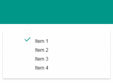
チェックボックスのアニメーション
ここのチェックボックスとチェックの入れ替えどうやってるんだろうと思ってたら、単にボックスの上と右の線を消して45度回転させてるだけだった。
/* チェックボックス */
.checkbox {
  position: relative;
  top: -0.375rem;
  margin: 0 1rem 0 0;
  cursor: pointer;
}
.checkbox:before,.checkbox:after {
  content: "";
  position: absolute;
     left: 0;
}
//チェック前
.checkbox:before {
  transition: all 0.3s ease-in-out;
  z-index: 1;
  width: 1rem;
  height: 1rem;
  border: 2px solid #f2f2f2;
}
//チェック後
.checkbox:checked:before {
  transform: rotate(-45deg);
  border-color: #009688;
  height: .5rem;   //↓このあたりで無理矢理チェック実装してる
  border-top-style: none;
  border-right-style: none;
}
.checkbox:after {
  top: -0.125rem;
  width: 1.1rem;
  height: 1.1rem;
  cursor: pointer;
  background: #fff; //デフォルトのチェックボックスを塗りつぶし
}
他、デザイン周りとか...
角丸とシャドウの設定が0.125remとか細かいなーと思った。
 border-radius: 0.125rem;
 box-shadow: 0 0.125rem 0.3125rem 0 rgba(0, 0, 0, 0.25);
あとmargin/padding含め基本rem指定だったのが印象的。