flex-shrinkは、flexアイテムの縮み率を指定するプロパティ
下記のサンプルでは、spanがflexアイテムとなります。
sample code
<div class="flex-container">
  <span>1</span>
  <span>2</span>
  <span>3</span>
</div>
.flex-container{
  display: flex;
  flex-flow: row nowrap;

  width: 300px;
  height: 120px;

  border: 5px dotted black;
  box-sizing: border-box;
  margin-bottom: 20px;
}

span{
  /* flex-grow , flex-shrink , flex-basisをまとめて記述 */
  flex: 0 0 200px;
}

span:nth-child(1){ background-color: #FF99AA; }
span:nth-child(2){ background-color: #AAFF99; }
span:nth-child(3){ background-color: #99AAFF; }
はみ出る
.flex-container{
  flex-flow: row nowrap;
  width: 300px;
}

span{
  flex: 0 0 200px;
}
親要素(flexコンテナ)の幅は 300px で、
子要素(flexアイテム)の幅は 200px * 3 = 600pxなので
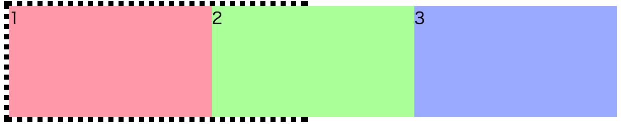
はみ出ます
はみ出ないように子要素を縮小する
span{
  flex: 0 1 200px;
}
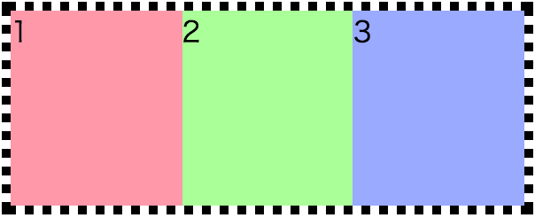
綺麗に収まります。
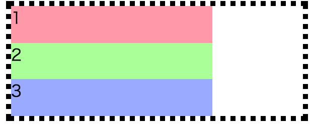
要素がはみ出ない場合は flex-shrinkは機能しない
.flex-container{
  flex-flow: row wrap;
  width: 300px;
}

span{
  flex: 0 1 200px;
}
複数行が可能で子要素のサイズが親要素以下の場合、はみ出ないので縮小されません。
※ 子要素のサイズが親要素以上の場合、はみ出るので縮小されます。
transitionを使ったデモ