perspectiveとは
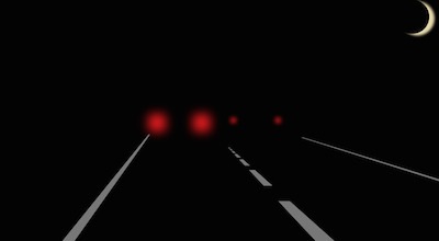
perspectiveは奥行き(遠近感)の表現ができる
.view{
  -webkit-perspective: 300px;
}
html
html
<body>
<div class="view">
  <div class="road-line-left"></div>
  <div class="road-line-center"></div>
  <div class="road-line-right"></div>
  <div class="moon"></div>
  <div class="taillight1"></div>
  <div class="taillight2"></div>
</div>
</body>
CSS
css
html,body{
  width: 100%;
  height: 100%;
  margin: 0;
}

.view{
  position: relative;
  width: 100%;
  height: 100%;
  background: #000;
  -webkit-perspective: 300px;
  overflow: hidden;
}

.road-line-left{
  position: absolute;
  top: 90%;
  left: 0%;
  width: 50px;
  height: 600px;
  background: #777;
  box-shadow:
    0  600px 0 0 #777,
    0 1200px 0 0 #777,
    0 1800px 0 0 #777,
    0 2400px 0 0 #777,
    0 3000px 0 0 #777,
    0 3600px 0 0 #777,
    0 4200px 0 0 #777;
  transform: rotateY(30deg) rotateX(-90deg);
}

.road-line-center{
  position: absolute;
  top: 75%;
  left: 70%;
  width: 50px;
  height: 300px;
  background: #777;
  box-shadow:
    0  -450px    0 0 #777,
    0  -900px    0 0 #777,
    0 -1350px    0 0 #777,
    0 -1800px 10px 0 #777,
    0 -2250px 30px 0 #777,
    0 -2700px 50px 0 #777;
  transform: rotateX(100deg);
}

.road-line-right{
  position: absolute;
  top: 90%;
  left: 200%;
  width: 50px;
  height: 600px;
  background: #777;
  box-shadow:
    0  600px 0 0 #777,
    0 1200px 0 0 #777,
    0 1800px 0 0 #777,
    0 2400px 0 0 #777,
    0 3000px 0 0 #777;
  transform: rotateY(-15deg) rotateX(270deg);
}

.moon{
  position: absolute;
  left: 90%;
  width: 100px;
  height: 100px;
  border-radius: 100%;
  box-shadow: 15px 5px 10px 0 #E4D7AB;
}

.taillight1{
  position: absolute;
  top: 78%;
  left: 53%;
  width: 5px;
  height: 5px;
  box-shadow:
        0 -200px 20px 5px #F11E22,
    130px -200px 20px 5px #F11E22;
}

.taillight2{
  position: absolute;
  top: 78%;
  left: 35%;
  width: 20px;
  height: 20px;
  box-shadow:
        0 -200px 50px 15px #F11E22,
    130px -200px 50px 15px #F11E22;
}