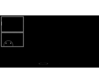
実際の動作を確認したい人向け
https://jsfiddle.net/junya_5102/b9u2u6op/
html
<div class="window mainframe-color subframe-color glass-color">
  <div class="char"></div>
</div>
<!-- 雨 -->
<div class="rain">|</div>
<!-- 波紋 -->
<div class="ripples">
  <div class="ripple"></div>
  <div class="ripple"></div>
  <div class="ripple"></div>
</div>
CSS
body{
  background-color: black;
}

/* 雨 */
.rain{
  position: fixed;
  top: -5%;

  /* 雨の大きさ */
  font-size: 25px;

  /* 雨の色 */
  color: white;

  /* 雨 */
  text-shadow:
      5vw -200px 0,
     10vw -400px 0,
     20vw -500px 0,
     30vw -580px 0,
     39vw -250px 0,
     42vw -340px 0,
     56vw -150px 0,
     63vw -180px 0,
     78vw -220px 0,
     86vw -320px 0,
     94vw -170px 0;
  z-index: 1;

  animation: rain_anim 2.8s linear infinite;
}

.window{
  position: relative;

  width: 150px;
  height: 200px;
  border: 5px solid;
  box-sizing: border-box;
  overflow: hidden;
}

.window:before,
.window:after{
  position: absolute;
  content: "";

  width: 100%;
  height: 50%;

  border: 1px solid;
  box-sizing: border-box;
}

.window:before{
  z-index: -1;
}

.window:after{
  bottom: 0;
  border-top: 10px solid;
  z-index: 1;
}

/* 窓・枠の色 */
.mainframe-color{
   border-color: gray;
}

.subframe-color:before,
.subframe-color:after{
  border-color: gray;
}

.glass-color{
  background-color: rgba(0,0,0,.025);
}

/* キャラクター */
.char{
  position: absolute;
  bottom: -12%;
  left: 10%;

  width: 60px;
  height: 60px;
  border: 1px solid #fff;
  border-radius: 100%;

  box-sizing: border-box;
}

/* 目 */
.char:before,
.char:after{
  position: absolute;
  top: 20%;
  content: "";

  width: 3px;
  height: 10px;
  border-radius: 100%;

  background-color: white;

  animation: wink_anim 5s linear infinite;
}

.char:before{
  left: 20%;
}

.char:after{
  right: 20%;
}

/* 波紋 */
.ripple{
  position: fixed;
  bottom: 0;

  width: 0;
  height: 0;
  border-radius: 100%;

  box-shadow: 0 0 3px 1px white;
  transform: perspective(500px) rotateX(80deg);
}

.ripples .ripple:nth-child(1){
  left: 10vw;

  animation: ripple_anim 2s 4s linear infinite;
}

.ripples .ripple:nth-child(2){
  left: 40vw;

  animation: ripple_anim 3s 4.8s linear infinite;
}

.ripples .ripple:nth-child(3){
  left: 70vw;

  animation: ripple_anim 4s 6.5s linear infinite;
}

/* アニメーション */
@keyframes wink_anim{
  5%,7%{
    box-shadow: 0 10px 0 1px black inset;
  }

  8%,100%{
    box-shadow: 0 0 0 0 black inset;
  }
}

@keyframes rain_anim{
  60%{
    top: 80%;
  }

  100%{
    top: 150%;
    color: transparent;
  }
}

@keyframes ripple_anim{
  0%{
    width: 50px;
    height: 50px;
  }

  100%{
    width: 50px;
    height: 50px;
    transform: perspective(500px) scale(4) rotateX(80deg);
    box-shadow: none;
  }
}