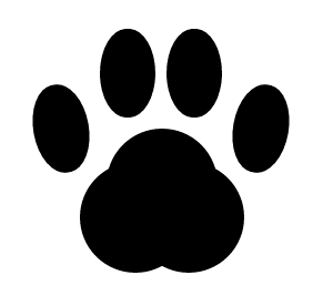
猫の肉球を作りました。
(こんなふうな形だった気がする)
html
<div class="pad">
<!-- 指球 -->
<div class="digitals">
  <div class="digital"></div>
  <div class="digital"></div>
  <div class="digital"></div>
  <div class="digital"></div>
</div>
<!-- 掌球 -->
<div class="metacarpal"></div>
</div>
CSS
css
/* 肉球全体 */
.pad{
  position: absolute;
}

/* 指球全体 */
.digitals{
  position: absolute;
}

/* 指球単体 */
.digital{
  position: absolute;
  top: 0;
  right: 0;
  width: 25px;
  height: 40px;
  border: 1px solid #000;
  border-radius: 100%;
  box-sizing: border-box;
  background: #000;
}

.digital:nth-child(1){
  top: 30px;
  left: 0;
  transform: rotate(-10deg);
}

.digital:nth-child(2){
  top: 5px;
  left: 30px;
}

.digital:nth-child(3){
  top: 5px;
  left: 60px;
}

.digital:nth-child(4){
  top: 30px;
  left: 90px;
  transform: rotate(10deg);
}

/* 掌球 */
.metacarpal{
  position: absolute;
  top: 50px;
  left: 33px;
  width: 50px;
  height: 50px;
  border-radius: 100%;
  background: #000;
  box-shadow:
     12px 15px 0 0 #000,
    -12px 15px 0 0 #000;
}
作り方
指球
幅 < 高さ の boxをborder-radiusで丸めて配置していく
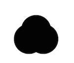
掌球
幅 == 高さ のboxをborder-radiusで丸めて円を作る。
box-shadowを使って円の複製(影)を配置してこのような形をつくります
それぞれのパーツ配置して完成。