読み込み時の演出やオブジェクトとして使えそうな?ものを作りました。
ぐるぐる1
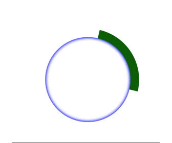
コード
<div class="box"></div>
.box{
  border: 20px solid transparent;
  border-top: 20px solid green;
  border-radius: 100%;
  width: 200px;
  height: 200px;
  box-shadow: inset 0 0 10px 1px blue;
  animation: turn 5s linear infinite;
}

@keyframes turn{
  from{
    transform: rotate(0deg);
  }
  to{
    transform: rotate(360deg);
  }
}
ぐるぐる2
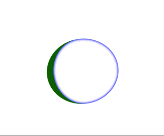
コード
<div class="box"></div>
.box{
  border-top: 20px solid green;
  border-radius: 100%;
  width: 200px;
  height: 200px;
  box-shadow: inset 0 0 10px 1px blue;
  animation: turn 5s linear infinite;
}

@keyframes turn{
  from{
    transform: rotate(0deg);
  }
  to{
    transform: rotate(360deg);
  }
}
ぐるぐる1と2のコードの違いはborder: 20px solid transparent;と指定しているかの違いです。