HTML
<div class="donut">
  <a href="#blueLink">
    <span data-text="ド"></span>
    <span data-text="ー"></span>
    <span data-text="ナ"></span>
    <span data-text="ツ"></span>
  </a>
  <a href="#redLink">
    <span data-text="C"></span>
    <span data-text="S"></span>
    <span data-text="S"></span>
    <span data-text="で"></span>
  </a>
  <a href="#greenLink">
    <span data-text="つ"></span>
    <span data-text="く"></span>
    <span data-text="っ"></span>
    <span data-text="て"></span>
  </a>
  <a href="#orangeLink">
    <span data-text="み"></span>
    <span data-text="た"></span>
    <span data-text="よ"></span>
    <span data-text="。"></span>
  </a>
</div>
CSS
.donut{
  position: relative;

  width: 300px; height: 300px;
  border-radius: 100%;
  overflow: hidden;
}

/* 内側の穴 */
.donut:before{
  content: '';
  position: absolute;
  top: 50%; left: 50%;

  width: 70%; height: 70%;
  border-radius: 100%;
  box-sizing: border-box;

  transform: translate(-50%,-50%);
  z-index: 999;
}

.donut a{
  position: absolute;
  top: 0; left: 0;

  width: 50%; height: 50%;
  border-radius: 100% 0 0 0;

  overflow: hidden;
  transform-origin: right bottom;
}

.donut a:nth-of-type(1){
  /* 背景色 リンク幅に応じて調整が必要 */
  background:
    radial-gradient(circle at 100% 100%, transparent 50%, dodgerblue 50%);

  transform:  rotate(45deg);
}
.donut a:nth-of-type(2){
 background:
    radial-gradient(circle at 100% 100%, transparent 50%, crimson 50%);

  transform: rotate(135deg);
}
.donut a:nth-of-type(3){
  background:
    radial-gradient(circle at 100% 100%, transparent 50%, yellowgreen 50%);

  transform: rotate(225deg);
}
.donut a:nth-of-type(4){
  background:
    radial-gradient(circle at 100% 100%, transparent 50%, orange 50%);

  transform: rotate(315deg);
}

/* リンク区切り線 */
.donut a:before{
  content: '';
  position: absolute;
  bottom: 0; left: 0;

  /* リンク幅に応じて調整が必要 */
  width: 29%; height: 29%;
  border-bottom: 2px solid;
  box-sizing: border-box;
}

/* リンクテキストコンテナ */
.donut a span{
  position: absolute;
  top: 50%; left: 50%;

  display: inline-block;
  font-size: 1.25em;
  width: 1em; height: 1em;
  color: #FFF;

  transform: translate(-50%,-50%) rotate(-45deg);
}

/* リンクテキスト */
.donut a span:before{
  content: attr(data-text);
  position: absolute;
  left: 50%;

  display: inline-block;
  height: 100px;

  font-size: 1em;
  line-height: 1;

  transform-origin: center bottom;
}

/* 文字を円に沿って配置 */
.donut a span:nth-of-type(1):before{ transform: translate(-50%,-20%) rotate(-20deg); }
.donut a span:nth-of-type(2):before{ transform: translate(-50%,-20%) rotate(-5deg); }
.donut a span:nth-of-type(3):before{ transform: translate(-50%,-20%) rotate(+10deg); }
.donut a span:nth-of-type(4):before{ transform: translate(-50%,-20%) rotate(+25deg); }

.donut a:hover span{
  text-shadow: 0 0 2px #000;
}
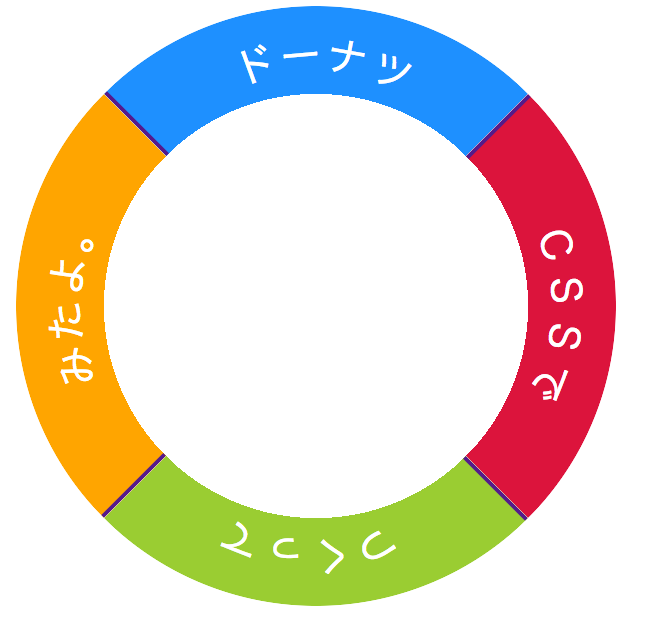
補足
ドーナツをつくる
扇形を組み合わせて円を作ります。
まずは扇形を作りましょう
.donut{
  position: relative;

  width: 300px; height: 300px;
  border-radius: 100%;
}

.donut a{
  position: absolute;
  top: 0; left: 0;

  /* 親要素の半分の大きさ */
  width: 50%; height: 50%;
  /* 左上のみ丸める */
  border-radius: 100% 0 0 0;
}
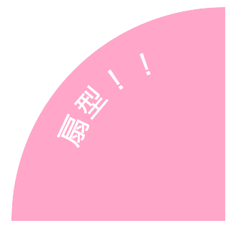
扇形の完成です。
次は扇形を使って円を作っていきます。
扇形4つ用意し、扇の右下を軸にして90度づつ回転させます。
.donut a{
  /* 右下を軸に  */
  transform-origin: right bottom;
}

.donut a:nth-of-type(2){ transform: rotate(90deg); }
.donut a:nth-of-type(3){ transform: rotate(180deg); }
.donut a:nth-of-type(4){ transform: rotate(270deg); }
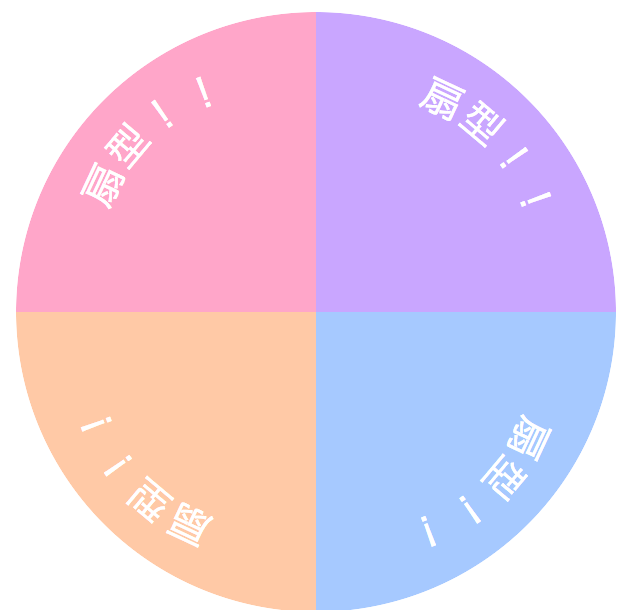
円が完成。
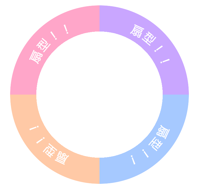
次はドーナツ穴を作ります。
.donut:before{
  content: '';

  /* 親要素の中央に配置 */
  position: absolute;
  top: 50%; left: 50%;
  transform: translate(-50%,-50%);

  /* ドーナツの外側の円より小さい円をつくる */
  width: 70%; height: 70%;
  border-radius: 100%;

  /* リンクよりも手前に描画する */
  z-index: 9999;
}
リンクの前に描画することで、リンク範囲を縮小できます。
穴が空いてないので開けます。
radial-gradient()を使って穴の部分を透明にします。
.donut a:nth-of-type(1){
  /* 背景色 リンク幅に応じて調整が必要 */
  background:
    radial-gradient(circle at 100% 100%, transparent 50%, rgba(255,0,100,.35) 50%);
}

/* 色が異なるだけなので省略します */
これでドーナツ型リンク完成!
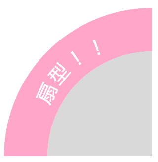
ピンク色の部分がリンク範囲, 灰色が透明にする部分
ブラウザ
Chrome, Firefox, Safari で確認