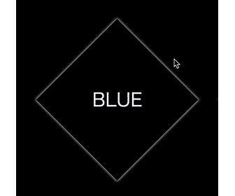
正方形を45度回転させて菱型を表現しています。
簡単なアニメーションも作りました。
<div class="box anim blue">
  <p class="text">BLUE</p>
</div>
body{
  background: #000;
}

.box{
  position: relative;
  /* 大きさに合わせて調整が必要 */
  margin-top: 60px;
  margin-left: 60px;
  width: 200px;
  height: 200px;
  background: #000;
  transform: rotate(45deg);
}

/* 色 */
.blue{
  color: blue;
}

/* テキスト */
.text{
  position: absolute;
  top: 50%;
  left: 50%;
  margin: 0;
  font-size: 2em;
  color: white;
  white-space: nowrap;
  transform: translate(-50%,-50%) rotate(-45deg);
  transition: 3s ease-in-out;
}

/* アニメーション */
.anim{
  box-shadow: 0 0 5px 1px white;
  transition: 2s;
}

.anim:hover{
  box-shadow: 0 0 80px 20px currentColor;
  /* 回転: 45(開始時角度) + 360 = 405 */
  transform: rotate(405deg);
}

.anim:hover > .text{
  color: currentColor;
}
アニメーション