レスポンシブ対応
※Firefoxは inheritを利用したアニメーションが動きません。
※Safariなどで アニメーションがおかしい場合はブラウザを更新(リロード)で治ると思います。
実際に見たい方はこちら
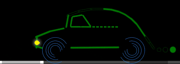
https://junya0215.github.io/cacao_ame/design_art/car/
HTML
<div class="vehicle">
  <div class="body frame">
    <div class="curve1">
      <div>
        <div>
          <div>
            <div class="curve2">
              <div>
                <div>
                  <div>
                    <div class="straightLine1">
                      <div>
                        <div class="curve2">
                          <div class="curve3">
                            <div>
                              <div>
                                <div class="curve4">
                                  <div class="curve5 light">
                                    <div class="straightLine2">
                                      <div></div>
                                    </div>
                                  </div>
                                </div>
                              </div>
                            </div>
                          </div>
                        </div>
                      </div>
                    </div>
                  </div>
                </div>
              </div>
            </div>
          </div>
        </div>
      </div>
    </div>
    <div class="smoke">
      <div>
        <div></div>
      </div>
    </div>
  </div>
  <div class="tire left">
    <div>
      <div>
        <div></div>
      </div>
    </div>
  </div>
  <div class="tire right">
    <div>
      <div>
        <div></div>
      </div>
    </div>
  </div>
  <div class="window">
    <div>
      <div></div>
    </div>
  </div>
</div>
<div class="way"></div>
<div class="shadow"></div>
CSS
:root{
  background: black;
}

.vehicle{
  position: fixed;
  bottom: 20vh;

  width: 100%; height: 100%;
  transform-origin: center bottom;
  transform: scale(.5);

  z-index: 3;
}

.body{
  position: absolute;
  bottom: 10vw; right: 0%;

  width: 6vw; height: 1vw;
  background-color: green;
  color: green;

  transform: translate(-50%,-50%);
}

.body.frame div{
  box-shadow: 0 0 1vw 0;
}

.body > .smoke{
  position: absolute;
  left: 150%;

  width: 2.5vw; height: 2.5vw;
  border-radius: 100%;

  background-color: inherit;
}

.body > .smoke div{
  position: absolute;
  top: 50%; left: 100%;

  width: 135%; height: 135%;
  border-radius: inherit;
  background-color: inherit;

  transform: translate(2vw,-50%);
}

.body div{
  position: absolute;
  top: 50%; left: 100%;

  width: 100%; height: 100%;
  background-color: inherit;

  transform: translate(0,-50%);
}

.body div.curve1{
  transform-origin: left top;
  transform: translate(0,-50%) rotate(-125deg);
}

.body div.curve2,
.body div.curve2 div{
  transform-origin: left bottom;
  transform: translate(0,-50%) rotate(-10deg);
}

.body div.straightLine1 > div{
  width: 166.7%;
  transform: translate(0,-50%) rotate(-5deg);
}

.body div.curve3 > div{
  transform-origin: left bottom;
  transform: translate(0,-50%) rotate(-60deg);
}

.body div.curve3 > div > div{
  width: 120%;
  transform: translate(0,-50%) rotate(+68deg);
}

.body div.curve4 > div{
  width: 80%;
  transform-origin: left bottom;
  transform: translate(0,-50%) rotate(-65deg);
}

.body div.curve5 > div{
  width: 60%;
  transform-origin: left bottom;
  transform: translate(0,-50%) rotate(-75deg)
}

.body div.straightLine2 > div{
  width: 38vw;
  transform-origin: left bottom;
  transform: translate(0,-50%) rotate(-18.5deg) translateX(22.5vw);
}

.body div.light:before{
  content: '';
  position: absolute;
  left: 50%;

  width: 3.5vw; height: 3.5vw;
  border-radius: 0 100% 100% 100%;
  background-color: yellow;
  box-shadow: 0 0 5vw 0 lightyellow;

  transform: translate(-50%,-2vw) rotate(45deg);
}

.tire{
  position: absolute;
  bottom: -10vw;

  width: 20vw; height: 20vw;
  border: .3vw double;
  border-radius: 100%;

  transform: translate(-50%,-50%);
}

.tire.left{
  left: 20%;
  color: dodgerblue;
  border-right-color: transparent;
}

.tire.right{
  left: 80%;
  color: dodgerblue;
  border-left-color: transparent;
}

.tire div{
  position: absolute;
  top: 50%; left: 50%;

  width: 75%; height: 75%;
  border: inherit;
  border-radius: inherit;
  box-sizing: border-box;

  transform: translate(-50%,-50%) rotate(0);
}

.window{
  position: absolute;
  bottom: 28vw; left: 32vw;

  width: 8vw; height: 1vw;
  background-color: green;
  border-radius: 10px;

  transform: translate(0,-50%);
}

.window:before,
.window:after{
  content: '';
  position: absolute;
  left: 100%;

  height: inherit;
  border-radius: inherit;
}

.window:before{
  width: 30vw;
  background:
    linear-gradient(to right, green 25%, transparent 25%),
    repeating-linear-gradient(to right, green, green 2vw, transparent 2vw, transparent 3vw);
}

.window:after{
  left: 200%;
  width: 140%;
  background-color: inherit;
  transform-origin: left center;
  transform: rotate(-125deg);
}

.window div{
  position: absolute;
  right: 100%;

  width: inherit; height: inherit;
  border-radius: inherit;
  background-color: inherit;
}

.window > div{
  transform-origin: right center;
  transform: rotate(100deg);
}

.window > div > div{
  transform-origin: right center;
  transform: rotate(70deg);
}

.way{
  position: fixed;
  bottom: 18.5vh; left: 0;

  width: 100vw; height: 1.2vw;
  background:
    repeating-linear-gradient(to right, snow, snow 35vw, darkgray 35vw, darkgray 50vw);

  transform: translate(0,-50%) translateZ(1px);
  z-index: 2;
}


/* 影フィルター */
.shadow{
  position: fixed;
  bottom: 0; right: 0;
  width: 68vw; height: 100%;

  background-color: rgba(0,0,0,.85);

  transform: translateZ(2px);
  z-index: 2;
}

/* animation  */
.vehicle{
  animation: vehicleBehavior .5s linear infinite alternate;
}

.body{
  animation: inheritColor 1s linear infinite;
}

.body div{
  transition: .1s;
}

.tire, .tire div{
  animation: spin .8s linear infinite;
}

.way{
  animation: way 1.2s linear infinite;
}

@keyframes vehicleBehavior{
  from{
    transform: translateY(-.15px) translateZ(3px) rotate(+.17deg) scale(.5);
  }
  to{
    transform: translateY(+.15px) translateZ(3px) rotate(-.17deg) scale(.5);
  }
}

@keyframes inheritColor{
  00%,25%{
    background-color: transparent;
  }
  26%,100%{
    background-color: green;
  }
}

@keyframes spin{
  from{
    transform: translate(-50%,-50%) rotate(00deg);
  }
  to{
    transform: translate(-50%,-50%) rotate(-360deg);
  }
}

@keyframes way{
  to{
    background-position: 100vw 50%;
  }
}
補足
車体はdivの階層構造で要素別にクラスを切り替えて作ります。
この構造の利点はinheritを利用したアニメーションを作れること、
擬似曲線を簡単に表現できることです。(階層構造じゃないと微調整が大変)
レスポンシブは vw, vh で位置大きさを調整しています。
1vwは、viewportの幅の1/100を表す
1vhは、viewportの高さの1/100を表す
道路の影(暗い部分)は黒色のフィルターを重ねて表現しています。
真っ黒ではなく半透明にするといい感じになります。
このテクニックはホームページ作成でも使えます。