実際の動作はhttp://jsfiddle.net/junya_5102/t2hh9foq/1/ で確認できます
html
<div class="dice anime">
  <div class="pip blue">1</div>
  <div class="pip blue">2</div>
  <div class="pip blue">3</div>
  <div class="pip blue">4</div>
  <div class="pip blue">5</div>
  <div class="pip blue">6</div>
</div>
CSS
.dice{
  position: relative;
  top: 200px;
  left: 50%;
  width: 100px;
  height: 100px;

  /* 要素を立体的に描画 */
     -moz-transform-style: preserve-3d;
  -webkit-transform-style: preserve-3d;
          transform-style: preserve-3d;
}

.dice .pip{
  position: absolute;
  width: inherit;
  height: inherit;
  border: 5px solid red;
  color: #fff;
  line-height: 100px;
  font-size: 3em;
  text-align: center;
  box-sizing: border-box;

  /* 裏面不可視 */
     -moz-backface-visibility: hidden;
  -webkit-backface-visibility: hidden;
          backface-visibility: hidden;
}

.dice .pip:nth-child(1){
  transform: translate(0);
}

.dice .pip:nth-child(2){
  right: 100%;
  transform-origin: right center;
  transform: rotateY(-90deg);
}

.dice .pip:nth-child(3){
  bottom: 100%;
  transform-origin: bottom center;
  transform: rotateX(90deg);
}

.dice .pip:nth-child(4){
  top: 100%;
  transform-origin: top center;
  transform: rotateX(-90deg);
}

.dice .pip:nth-child(5){
  left: 100%;
  transform-origin: left center;
  transform: rotateY(90deg);
}

.dice .pip:nth-child(6){
  left: 200%;
  transform-origin: left center;
  transform: translateZ(-100px) translateX(-100%) rotateY(180deg);
}

.blue{
  background: rgba(0,0,255,0.5);
}

.anime{
  animation: Turn 3s linear infinite;
}

@keyframes Turn{
  from{
       -moz-transform: rotate3d(1,1,0,0);
    -webkit-transform: rotate3d(1,1,0,0);
            transform: rotate3d(1,1,0,0);
  }

  to{
       -moz-transform: rotate3d(1,1,0,1turn);
    -webkit-transform: rotate3d(1,1,0,1turn);
            transform: rotate3d(1,1,0,1turn);
  }
}
解説
backface-visibilityは要素の裏面を可視にするかどうかを指定できるプロパティ
値によってサイコロの見え方が大きく変わります。
backface-visibility: visible(初期値)の見え方
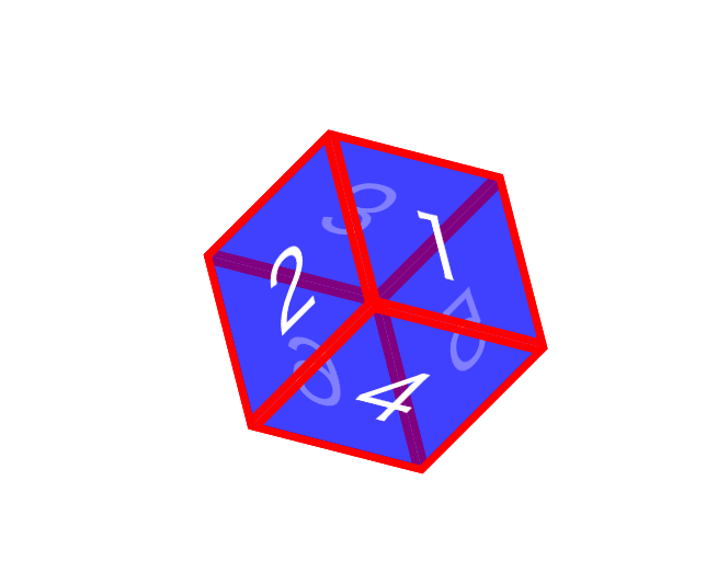
裏面が透けて見えます。
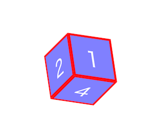
backface-visibility: hiddenの見え方

裏面は透けません。
詳しくはbackface-visibility - CSS | MDN
対応ブラウザ
- Chrome
- Firefox