背景
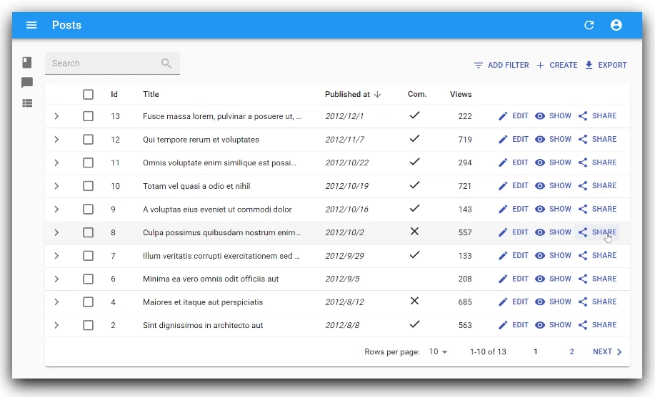
ReactのフロントエンドフレームワークであるReact-adminを使って、アプリケーションを開発中。
何らかのアクションを実行するときに本当に実行してもよろしいですか?と確認画面を出すことは多い。
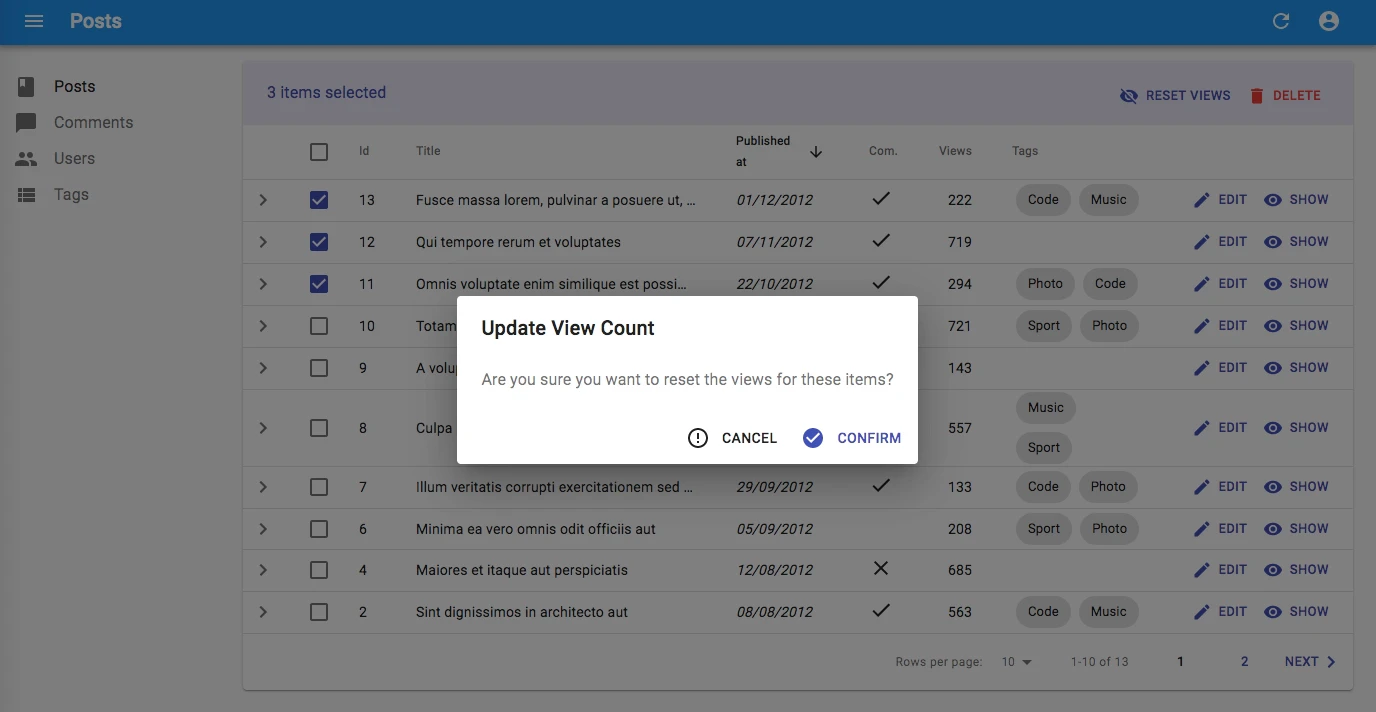
React-adminの標準コンポーネント<Confirm>を使用すると、下の図のように
- タイトル文字列
- 本文(確認メッセージ文字列)
- [実行]ボタン
- [キャンセル]ボタン
を表示することができる。
しかし、実際にはこの実行確認画面に、実行対象の詳細情報などを表示した上で、実行確認するのがより親切。
ということで、本文の部分に文字列ではなく、任意のReactコンポーネント(エレメント)を表示できるような実行確認画面を実装してみた。
つくったもの
- ra-custom-confirm
表示できるのは、
- 任意のタイトル文字列
- 任意のReactコンポーネント(エレメント)
- [実行]ボタン
- [キャンセル]ボタン
また、[実行]ボタンや[キャンセル]ボタンの、アイコンやラベルも自由に設定可能にしてある。
使い方
インストール
# npmの場合
npm install --save ra-custom-confirm

# yarnの場合
yarn add ra-custom-confirm
デモ
下記のコマンドを実行することで、デモを確認できる。
コマンド実行後、ブラウザで http://localhost:8080/ にアクセス。
ログインを求められた場合は login/password を使う。
git clone https://github.com/itTkm/ra-custom-confirm.git
cd ra-custom-confirm/example/
yarn install
yarn start
実装例
import React, { Fragment, useState } from 'react';
import Share from '@material-ui/icons/Share';
import ErrorOutline from '@material-ui/icons/ErrorOutline';
import CustomConfirm from 'ra-custom-confirm';

// Define your custom title of confirm dialog
const CustomConfirmTitle = 'Are you sure you want to share?';

// Define your custom contents of confirm dialog
const CustomConfirmContent = props => {
  return (
    <SimpleShowLayout {...props} >
      <TextField source='title' label='title' />
      <TextField source='user' label='user' />
      <TextField source='date' label='date' />
      <RichTextField source='description' label='description' />
    </SimpleShowLayout>
  );
};

const ShareButton = props => {
  const [open, setOpen] = useState(false);

  const handleClick = (event) => {
    event.stopPropagation();            // support with rowClick on Datagrid
    setOpen(true);
  };

  const handleDialogClose = () => setOpen(false);

  const handleConfirm = () => {
    // do something here
    setOpen(false);
  };

  return (
    <Fragment>
      <Button label="Share" onClick={handleClick}><Share /></Button>
      <CustomConfirm {...props}
        isOpen={open}
        title={CustomConfirmTitle}      // your custom title of confirm dialog
        content={CustomConfirmContent}  // your custom contents of confirm dialog
        confirm='Share'                 // label of confirm button (default: 'Confirm')
        confirmColor='primary'          // color of confirm button ('primary' or 'warning', default: 'primary')
        ConfirmIcon={Share}             // icon of confirm button from @material-ui/icons (default: 'CheckCircle')
        cancel='Cancel'                 // label of cancel button (default: 'Cancel')
        CancelIcon={ErrorOutline}       // icon of cancel button from @material-ui/icons (default: 'ErrorOutline')
        onConfirm={handleConfirm}
        onClose={handleDialogClose}
      />
    </Fragment>
  );
}

const PostList = props => {
  const translate = useTranslate();
  return (
    <List {...props} >
      <Datagrid>
        <TextField source='title' label='title' />
        <TextField source='date' label='date' />
        <TextField source='user' label='user' />
        <ShareButton />
      </Datagrid>
    </List>
  );
};

export default PostList;
props
| Name | Type | Description | Default |
|---|---|---|---|
| title | string | your custom title of confirm dialog | |
| content | element | your custom contents of confirm | |
| isOpen | bool | dialog open or not | false |
| onClose | func | function on close | |
| onConfirm | func | function on confirm | |
| confirm | string | label of confirm button | 'ra.action.confirm' (Confirm in English) |
| confirmColor | string | color of confirm button ('primary' or 'warning') | 'primary' |
| ConfirmIcon | element | icon of confirm button from @material-ui/icons |  |
| cancel | string | label of cancel button | 'ra.action.cancel' (Cancel in English) |
| CancelIcon | element | icon of cancel button from @material-ui/icons |  |