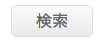
画像を使わずにこんなボタンがつくれます。
.btn {
  box-shadow:inset 0px 1px 0px 0px #ffffff;
  background:color-stop(0.05, #f9f9f9), color-stop(1, #e9e9e9));
  background:linear-gradient(to bottom, #f9f9f9 5%, #e9e9e9 100%);
  filter:progid:DXImageTransform.Microsoft.gradient(startColorstr='#f9f9f9', endColorstr='#e9e9e9',GradientType=0);
  background-color:#f9f9f9;
  border-radius:6px;
  border:1px solid #dcdcdc;
  display:inline-block;
  cursor:pointer;
  color:#666666;
  font-family:Arial;
  font-size:1em;
  padding:3px 24px; /* ボタンの上下と左右の中の余白 */
  text-decoration:none;
}

.btn:hover {
  background:color-stop(0.05, #e9e9e9), color-stop(1, #f9f9f9));
  background:linear-gradient(to bottom, #e9e9e9 5%, #f9f9f9 100%);
  filter:progid:DXImageTransform.Microsoft.gradient(startColorstr='#e9e9e9', endColorstr='#f9f9f9',GradientType=0);
  background-color:#e9e9e9;
}

.btn:active {
  position:relative;
  top:1px;
}

.btn {
  margin-top: 1em;
}