やりたいこと
こういう感じのグラフを書きたい.
環境
Python 3.6.5
plotly 3.3.0
前提
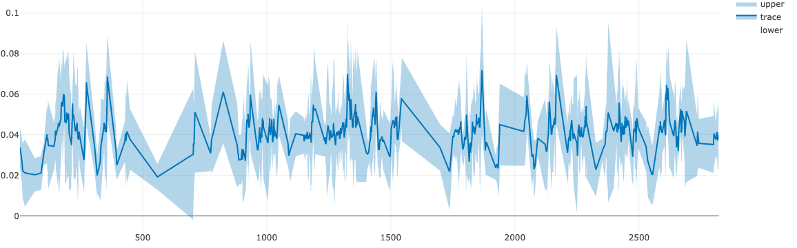
平均値の時間変化をプロットする.
各時点におけるデータのばらつきとして標準偏差もみたい.
コード
エラーバー
trace = go.Scatter(
    x = time,
    y = mean,
    error_y = dict(
        type="data",
        # エラーバーとして,各時系列における標準偏差を使用する
        array=std_dev,
        visible=True
    ),
    name = "trace",
)
data = [trace]
py.iplot(data, filename="basic-line")
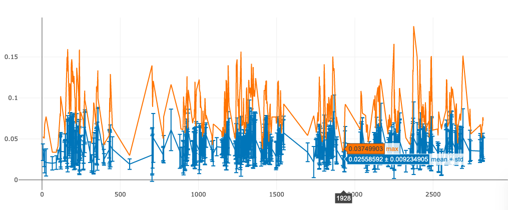
ごちゃごちゃしてる
連続的に表示
これを実現するにはFillオプションで塗りつぶしの設定をする必要がある.
https://plot.ly/python/filled-area-plots/ に詳細あり.
trace_upper = go.Scatter(
    name = "upper",
    x = time,
    y = mean + std_dev,
    line=dict(width=0),
    fillcolor = 'rgba(31, 119, 180, 0.3)',
    fill = "tonexty"
)

trace_mean = go.Scatter(
    name = "trace",
    x = time,
    y = mean,

    line=dict(color='rgb(31, 119, 180)'),
    fillcolor = 'rgba(31, 119, 180, 0.3)',
    fill = "tonexty"
)


trace_lower = go.Scatter(
    name = "lower",
    x = time,
    y = mean - std_dev,

    line=dict(width=0)
)
# データに収納する順番が重要(下から?)
data = [trace_lower, trace_mean, trace_upper]
py.iplot(data, filename="basic-line")