はじめに
データをより良く理解したい/伝えたいということで可視化を頑張ってたんですが、時系列のx軸の操作でハマりました。これまでもpandasやseabornを使ってましたが、matplotlibの理解度が低く、かゆいところに手が届かない事が多々ありました
。そこで、体系的に理解した上でハマりを解消することにしました
元々のハマりどころ紹介
・データ概要:時刻(ex. 9:13)に関する時系列データ。時間間隔は一定でない。
・ハマりどころ:
下図はPandas.Series.barで可視化したものです。
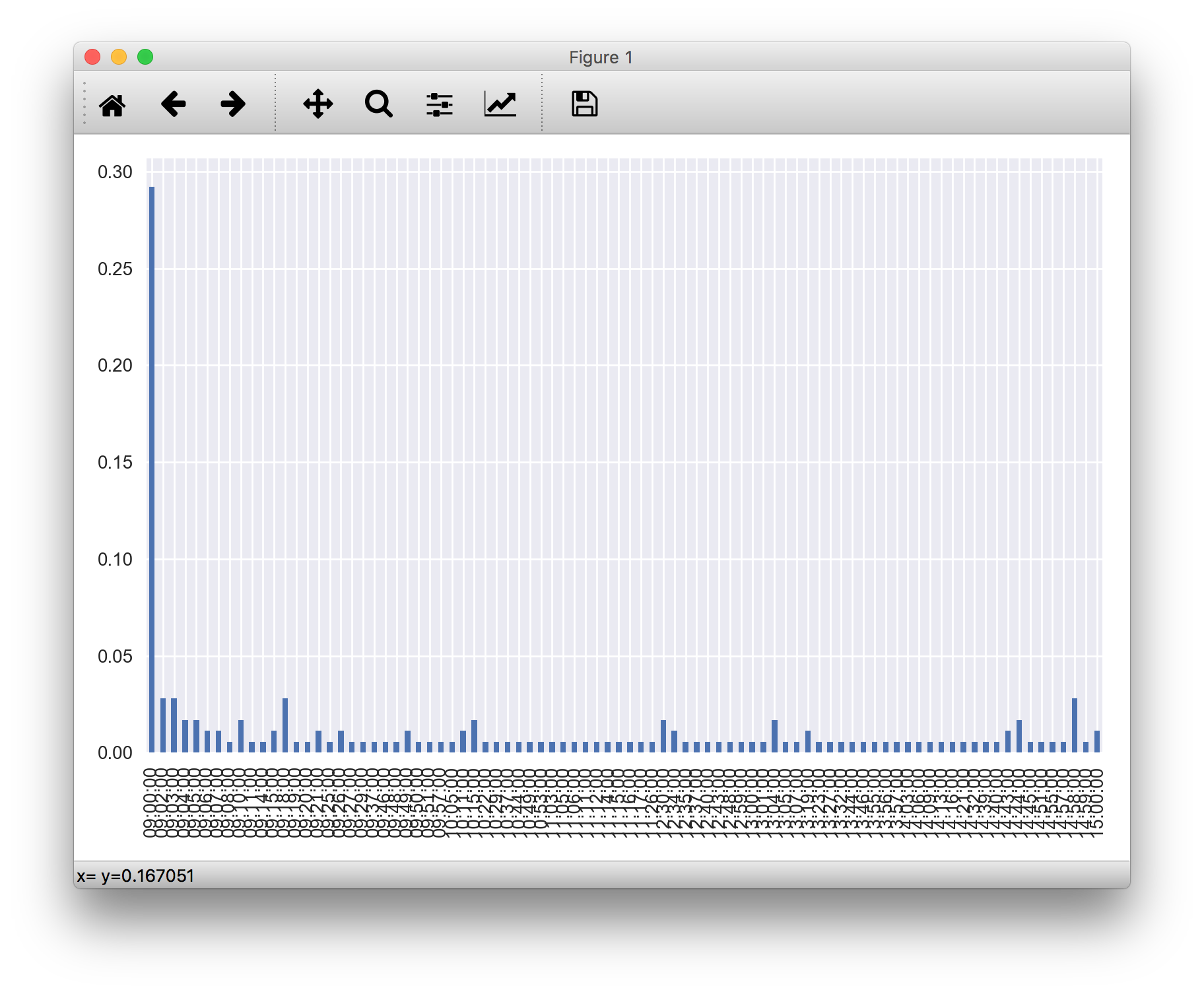
- 「x軸目盛りのラベル多すぎ」 -> 好みの間隔で表示数を間引きしたい
- 「09:02:00じゃなくて09:02までで良い」-> 表示フォーマット操作したい
など、大したことじゃないんですが、自由に設定するのは案外難しく、イライラするレベルのハマりに陥ったのです・・・
matplotlibの基礎(ちょっとだけ)
そもそも「axesとかaxisとか良く分からん」ってことで、まずこちらを拝見しました。
早く知っておきたかったmatplotlibの基礎知識、あるいは見た目の調整が捗るArtistの話
他記事ではあまり触れられない基礎的なエッセンスが説明されており、大変参考になりました。
下図は公式ページで使われていた説明図です。
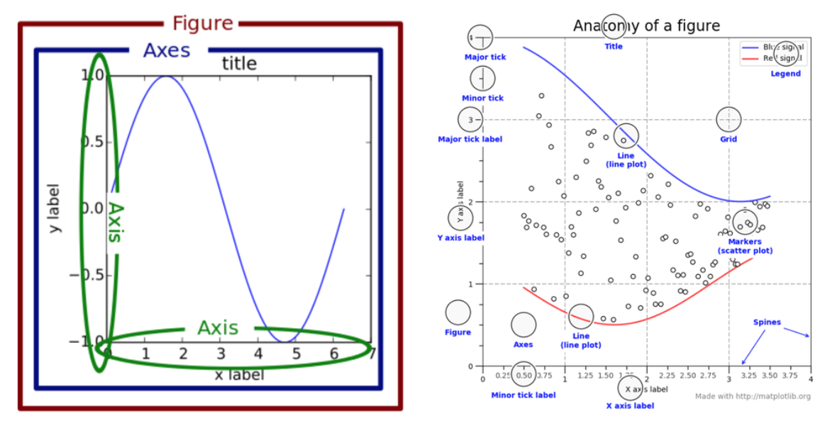
左側の図はFigure, Axes, Axisがどの部分かを示しています。
コードだと、このようにそれぞれのインスタンスを生成・取得できます。
import matplotlib.pyplot as plt
figure_ = plt.figure(1)  # Figure作成
axes_ = figure_.add_subplot(111)  # Axes作成
xaxis_ = axes_.xaxis  # XAxis取得
xaxis_.get_label()  # X axis label取得
dir(xaxis_)  #  使用可能な関数など確認(おまけ)
plt.○○の形式では楽に書けますが(構造を理解してなくても)、細かい操作をするとなると、構造が把握しづらいです。
matplotlibの大枠についてはこのくらいにして、本題のx軸操作へと進みます。
int型のx軸操作
いきなりdatetime型でやると分かりづらかったので、int型のx軸操作から始めました。まず、元となる図を適当に作ります。
# sample data
import numpy as np
x = np.arange(0, 10 ,1)
y = np.power(x, 2)

# Figure and Axes
import matplotlib.pyplot as plt
plt.close(1)  # 既にFigure1が開かれていれば閉じる
figure_ = plt.figure(1, figsize=(8,4))
axes_ = figure_.add_subplot(111)
axes_.plot(x, y, 'o-')

x軸のLocatorを操作します。
xaxis_ = axes_.xaxis
new_xticks = [1.3, 3.0, 8.5]  # 点がない場所でも良い
import matplotlib.ticker as ticker
xaxis_.set_major_locator(ticker.FixedLocator(new_xticks))

Locatorというのは「目盛りの場所」(?)ですかね。
ここの理解はまだ甘いです。公式ページのコード例を見てもらうと良いかもしれません。
何はともあれ、Locatorで場所を自由に決めることが出来ました。
ここからさらに、文字列をListで渡して設定することも出来ます。
xaxis_.set_ticklabels(['ccc','aaa','bbb'])

これで軸の操作のやり方が大体分かりました。
datetime型のx軸操作
さて、datetime型でも同じように出来るかやってみましたが、上手くはいきませんでした。
詳細は略しますが、下記のようにx軸をdatetime型にして同様の処理をしました。
import datetime
x = [datetime.datetime(2018,1,1,0,0)+datetime.timedelta(days=14*x) for x in range(5)]
# ・・・略・・・
new_xticks = [datetime.datetime(2018,1,1,0,0),
              datetime.datetime(2018,3,1,0,0),
              datetime.datetime(2018,5,1,0,0),]
xaxis_.set_major_locator(ticker.FixedLocator(new_xticks))
結果としては点が表示されなくなってしまいました(図は割愛します)。
datetime型で渡されても、同じメソッドでは対応していないということでしょうね。
datetime型でのやり方は公式のコード例があります。
これで大体は分かりますが、「drangeって何ぞや?」など確認しつつ、自分用にカスタマイズしながら動かしました。
まずは公式から抜粋・微修正し、元となる図を作ってみます。
# サンプルデータ作成
import datetime
from matplotlib.dates import drange
date1 = datetime.datetime(2000, 3, 2)
date2 = datetime.datetime(2000, 3, 6)
delta = datetime.timedelta(days=1)
x = drange(date1, date2, delta)
y = np.arange(len(x))

# 普通にAxes.plot()
import matplotlib.pyplot as plt
plt.close(1)
figure_ = plt.figure(1, figsize=(8,4))
axes_ = figure_.add_subplot(111)
axes_.plot(x, y, 'o-')

matplotlib.dates.drangeというのは初めて見ました。
これで作られたxの中身は何かというと・・・
x
Out[189]: array([ 730181.,  730182.,  730183.,  730184.])
type(x[0])
Out[190]: numpy.float64
floatのarrayでした。この数値はどうやら、0001年1月1日を1としたときの日数のようです。(参考:matplotlib.dates)
datetime型を扱っているようで、結局はfloatで処理して、見た目の方を変えるというところですかね。
日付として表示するにはmatplotlib.dates.DateFormatterを使います。
from matplotlib.dates import DateFormatter
xaxis_ = axes_.xaxis
xaxis_.set_major_formatter(DateFormatter('%Y-%m-%d'))

では、int型の場合と同様にx軸のLocatorを操作してみます。
datetime型を数値に変換するにはmatplotlib.dates.date2numを使います
from matplotlib.dates import date2num
new_xticks = date2num([
        datetime.datetime(2000, 3, 2 ,12, 0),
        datetime.datetime(2000, 3, 4, 22, 30)])

import matplotlib.ticker as ticker
xaxis_.set_major_locator(ticker.FixedLocator(new_xticks))
xaxis_.set_major_formatter(DateFormatter('%m-%d %H:%M'))

datetime型を横軸に使いつつ、ラベルを打つ場所を自由に設定できました。
元々のハマりを解消:作りたかった図を作る
下記のようなPandas.Seriesのデータを使います。
「○時△分のイベント発生確率」のような時系列データだと思ってください。
# series_
2000-01-01 09:00:00    0.292135
2000-01-01 09:02:00    0.028090
2000-01-01 09:03:00    0.028090
2000-01-01 09:04:00    0.016854
2000-01-01 09:05:00    0.016854
2000-01-01 09:06:00    0.011236
2000-01-01 09:07:00    0.011236
2000-01-01 09:08:00    0.005618
2000-01-01 09:10:00    0.016854
2000-01-01 09:11:00    0.005618
2000-01-01 09:14:00    0.005618
2000-01-01 09:15:00    0.011236
2000-01-01 09:18:00    0.028090
2000-01-01 09:19:00    0.005618
2000-01-01 09:20:00    0.005618
2000-01-01 09:21:00    0.011236
2000-01-01 09:25:00    0.005618
2000-01-01 09:26:00    0.011236
2000-01-01 09:27:00    0.005618
2000-01-01 09:29:00    0.005618
# 以下略。15時頃まで続く
冒頭のハマりの際は、Pandas.Seriesのplotを使っていましたが、これまでの学習を活かして地道にやります。
# Figure and Axes
import matplotlib.pyplot as plt
from matplotlib.dates import date2num
from matplotlib.dates import DateFormatter
plt.close(1)
figure_ = plt.figure(1, figsize=(8,4))
axes_ = figure_.add_subplot(111)

# plot
axes_.bar(date2num(series_.index),
          height=series_.values, width=1/(24*60))
axes_.set_xlim(
        date2num([series_.index.min(),
                  series_.index.max()]))
axes_.xaxis.set_major_formatter(DateFormatter('%H:%M'))

あとは15分間隔にして、ラベルを回転させます。
# arange x axis
from datetime import datetime as dtdt
import datetime as dt
from matplotlib import ticker
new_xticks = date2num(
        [dtdt(2000,1,1,9,0) + dt.timedelta(minutes=15*x)
        for x in range((15-9)*4+1)]
        )
axes_.xaxis.set_major_locator(ticker.FixedLocator(new_xticks))
axes_.tick_params(axis='x', rotation=270)

ハマりを無事に解消することが出来ました!
matplotlibについてもそれなりに理解できたので、ここまでで一旦終わりにします。疲れたし。