前書き
ReactでTodoを作るにあたってstyled-componentsでいろいろ試行錯誤しながら試してみたので、まとめてみます。
使ってみた感想
まず、スタイルを当てたい要素一つ一つに別々のクラス名を考えなくてもよくなったため、名前を考える負担がとても減りました。また、JavaScriptであるので、色などを定数として管理しておくことができ、とても便利でした。SCSSのようにネスト構造でスタイルを書くことができるのも、個人的には好きでした。
では、Todoを作るにあたって、自分がstyled-componentsを使って便利だなぁと思ったものを紹介していきたいと思います。
目次
- ネスト構造を上手に使い、少ないコンポーネントで表現する!
- cssで表現できることはstyled-componentsで表現できる!
- propsを用いて、それぞれに別のスタイルを当てる!
- 3.より簡単に、カスタムデータ属性を使って表現する!
まず、準備
styled-componentsをインストールします。
npm install --save styled-components
yarn add styled-components
では、みていきます!
1. ネスト構造を上手に使い、少ないコンポーネントで表現する!
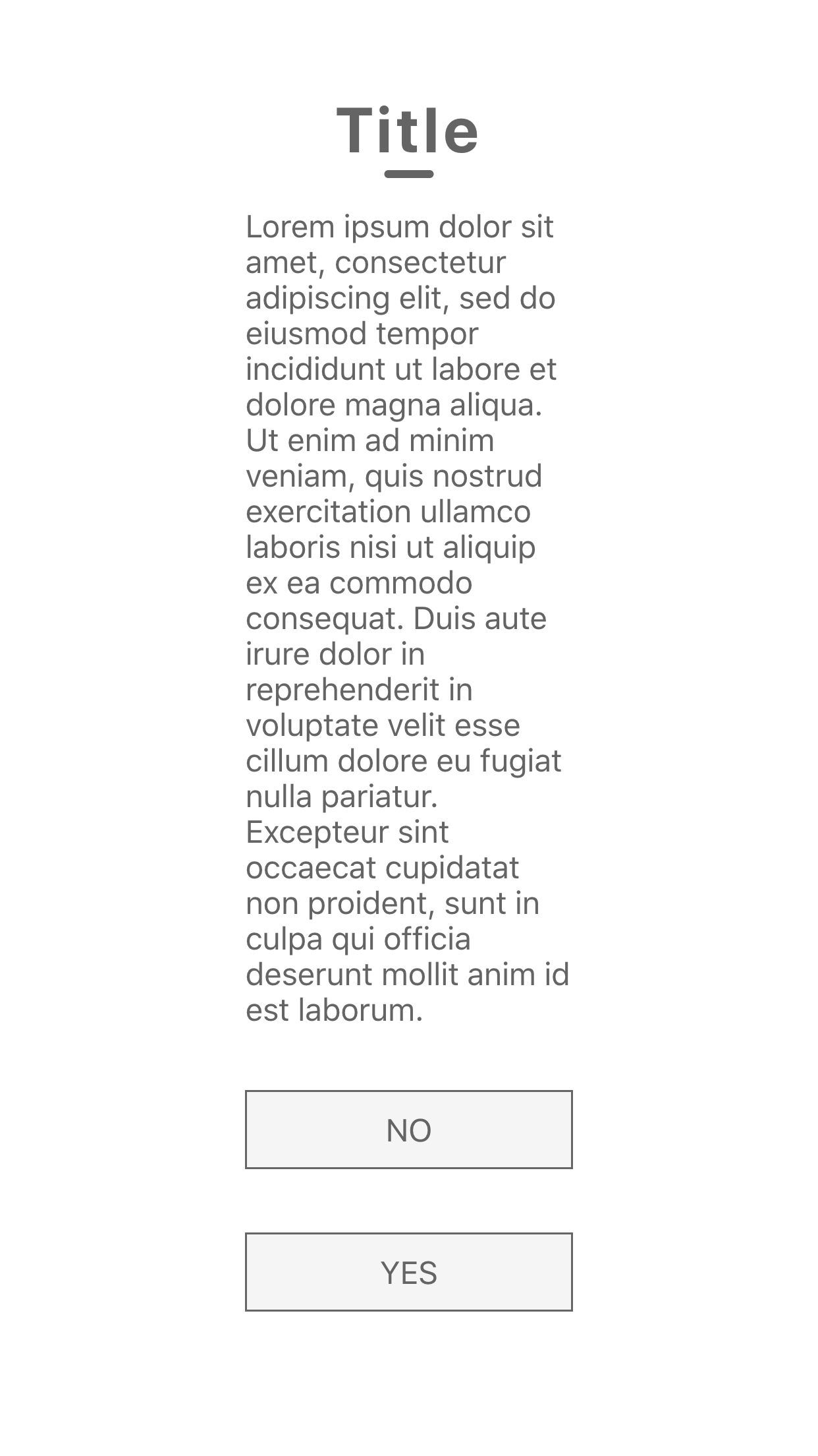
まず、作成したものがこちらです。
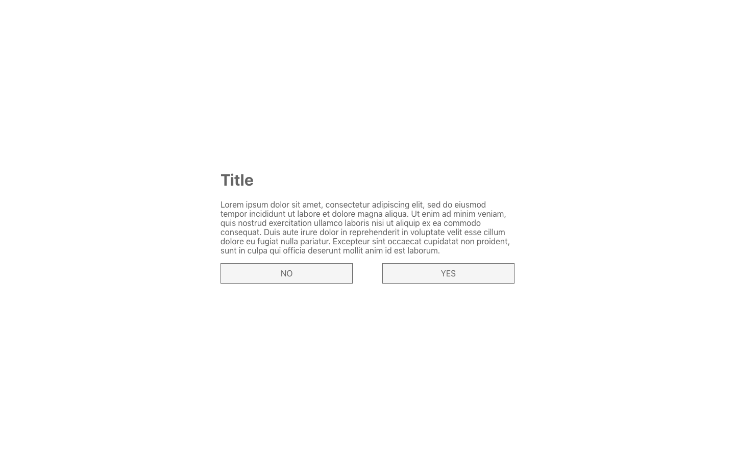
そして、ファイルの中身がこちらです。
import React, { Component } from 'react';
import styled from 'styled-components';

class App extends Component {
  render() {
    return (
      <Container>
        <div>
          <h1>Title</h1>
          <p>Lorem ipsum dolor sit (省略) anim id est laborum.</p>
          <div>
            <button>NO</button>
            <button>YES</button>
          </div>
        </div>
      </Container>
    );
  }
}

const Container = styled.div`
  width: 100vw;
  height: 100vh;
  display: flex;
  align-items: center;
  justify-content: center;
  div{
    width: 40%;
    h1{
      color: #646464;
    }
    p{
      color: #646464;
    }
    div{
      width: 100%;
      display: flex;
      justify-content: space-between;
      margin-bottom: 2rem;
      button{
        font-size: 1rem;
        box-sizing: border-box;
        width: 45%;
        padding: 10px;
        background: #f5f5f5;
        color: #646464;
        border: 1px solid #666;
      }
    }
  }
`;

export default App;
この例では、Containerコンポーネントだけをstyled-componentsで作成し、その子要素をネスト構造でスタイルを当てていっています。より要素が多くなって複雑になった時に、大枠の部分をContainerとして、コンテナごとにコンポーネントを作成しておくと、どのコンテナに入っている要素かがわかりやすくてオススメです。(今回の例ではdivが二つ出てくるので、こういった場合は区別したほうがいいと思います...)
2. cssで表現できることはstyled-componentsで表現できる!
CSSでコーディングをすることに慣れている人が思うことが、「擬似要素とか使えるん??」ってことだと思います。
普通に使えます!!
その例がこちらです。(上の例と同じコードなのでContainerコンポーネントのみ書きます)
const Container = styled.div`
width: 100vw;
height: 100vh;
display: flex;
align-items: center;
justify-content: center;
div{
width: 40%;
h1{
color: #646464;
text-align: center;
position: relative;
letter-spacing: 2px;
//擬似要素
::after{
content: '';
display: inline-block;
height: 4px;
width: 25px;
background: #646464;
border-radius: 4px;
position: absolute;
bottom: -6px;
left: 50%;
transform: translateX(-50%);
}
}
p{
color: #646464;
}
div{
width: 100%;
display: flex;
justify-content: space-between;
margin-bottom: 2rem;
flex-wrap: wrap;
button{
font-size: 1rem;
box-sizing: border-box;
width: 45%;
padding: 10px;
background: #f5f5f5;
color: #646464;
border: 1px solid #666;
//擬似クラス
:hover{
background: #d2d2d2;
cursor: pointer;
}
//メディアクエリ
@media (max-width: 575.98px) {
width: 100%;
margin: 1rem 0;
}
}
}
}
`;
完成したのがこの画像です。
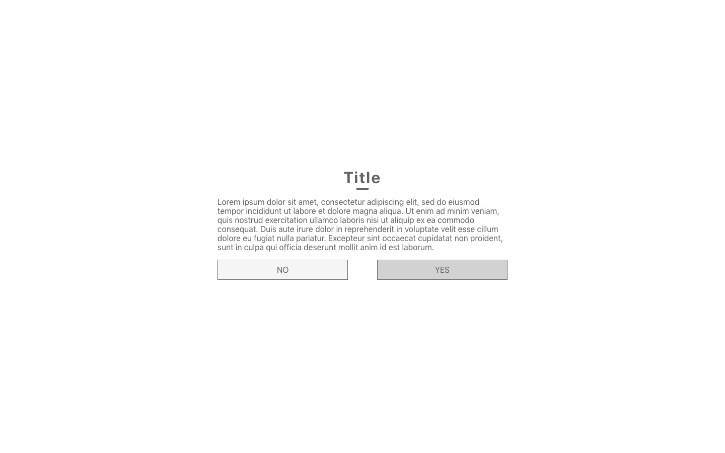
コードをみていただくと、やってること自体はわかると思うので説明は割愛します。1枚目の画像が、PCサイズの時の見た目で、右のボタンにホバーしています。2枚目は、スマホサイズでみたもので、ボタンの配置が調整されています。
次に、もう一つ例を出します。まず、画像を見てください。
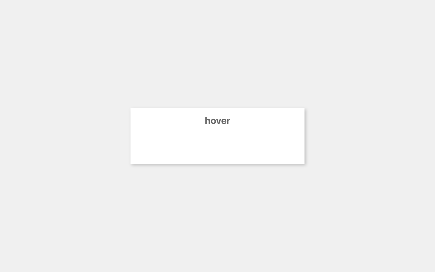
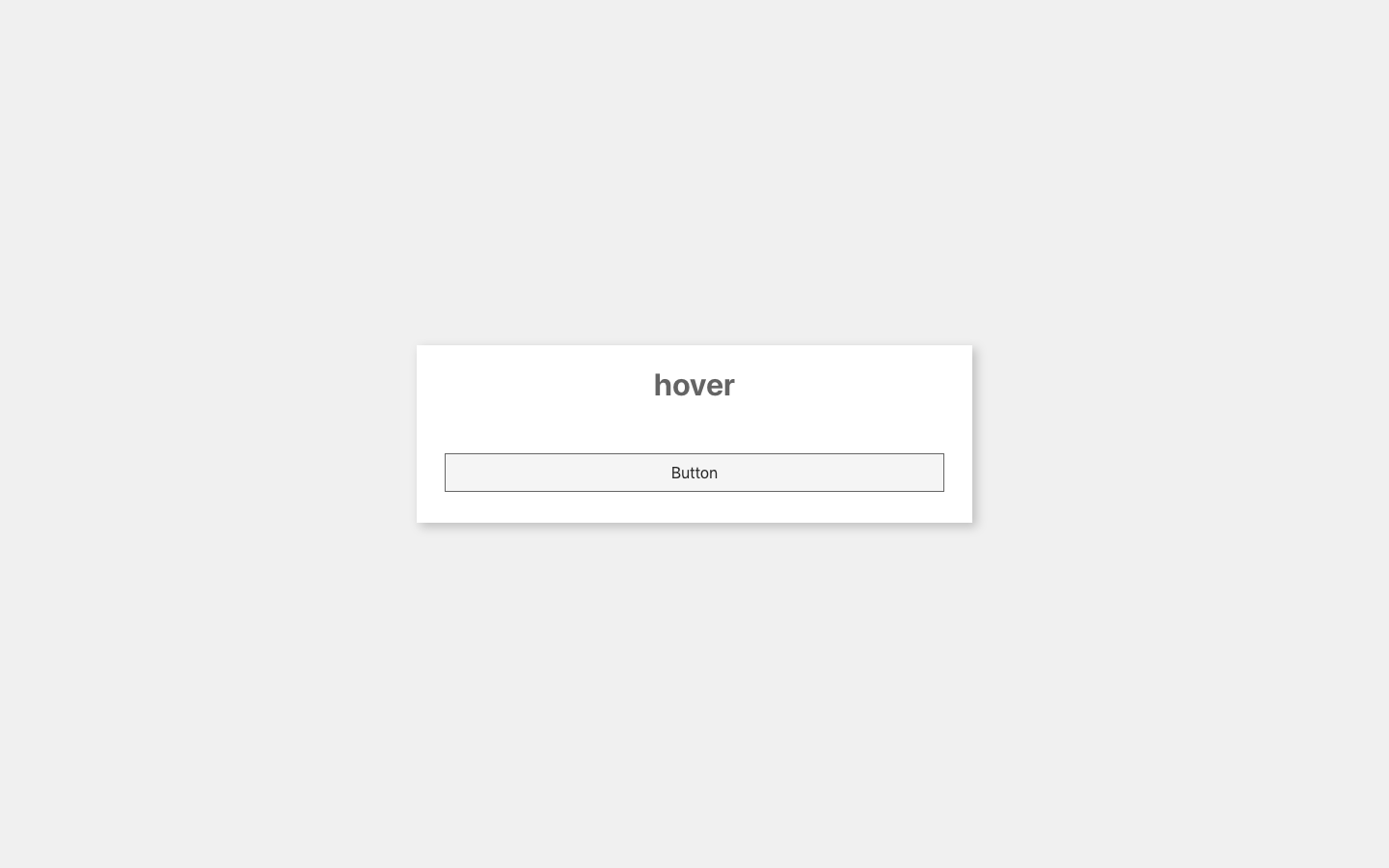
これはカードになっており、カードをホバーすると、ボタンの透明度(opacity)が0から1になります。2枚目がホバーした状態です。今回はコンポーネントをContainerとButtonを作っています。それでは、コードです。
class App extends Component {

  render() {
    return (
      <Container>
        <div className="card">
          <h1>hover</h1>
          <Button>Button</Button>
        </div>
      </Container>
    );
  }
}

const Button = styled.button`
  width: 90%;
  box-sizing: border-box;
  padding: 10px;
  margin: 2rem 0;
  background: #f5f5f5;
  border: solid 1px #666;
  font-size: 1rem;
  opacity: 0;
  transition: opacity .4s ease-in-out;
`;
const Container = styled.div`
  width: 100vw;
  height: 100vh;
  display: flex;
  align-items: center;
  justify-content: center;
  background: #f0f0f0;
  div.card{
      width: 40%;
      background: white;
      text-align: center;
      box-shadow: 4px 4px 10px rgba(0, 0, 0, .2);
      h1{
        color: #646464;
      }
      :hover{
        cursor: pointer;
        ${Button}{
          opacity: 1;
        }
      }
  }
`;
この例では、Buttonコンポーネントを先にまず定義しておくことで、次のContainerコンポーネントの中で、Buttonコンポーネントを利用できるようになっています。
それによって、「div.card」がホバーされたら、「div.cardの子要素のButtonコンポーネント」の透明度が1になる、ということを表現できました。
もちろん、Containerコンポーネントの中に全てまとめることはできますが、今回の例では、ボタンの基本のスタイルと、ホバー前後のボタンのスタイルの、2つを書かないといけないため、わかりやすくするために、ボタン自体のスタイルは、それ単体のコンポーネント(今回では、Buttonコンポーネント)で書きました。
「cssで表現できることはstyled-componentsで表現できる!!」のが伝わったでしょうか。
3. propsを用いて、それぞれに別のスタイルを当てる!
同じ要素が複数あって、全く同じではないけどほぼ似てるデザインだ!っというときに、CSSでは、共通のクラス名とそれぞれにスタイルをあてるためのクラス名を与えていたと思います。
styled-componentsでは、propsで分岐させることでそれぞれにスタイルを指定することができます。
例えば、以下のようなデザインがあったとします。
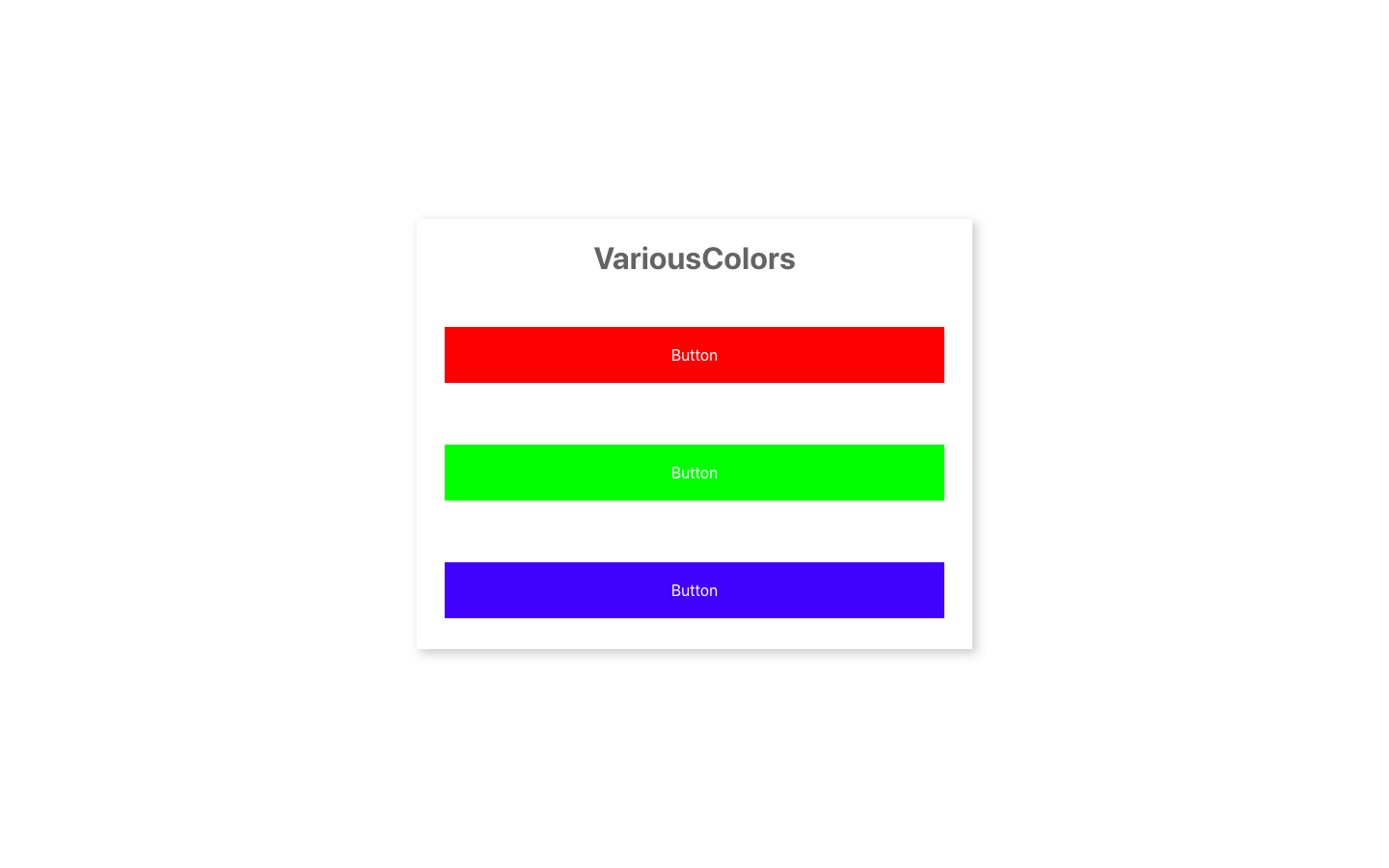
三つのボタンで、違うのは、色だけです。そこで、ボタン自体は、同じコンポーネントを用いて、スタイルをあてて、色のみpropsで条件を分けた先でスタイルを指定します。
import React, { Component } from 'react';
import styled, { css } from 'styled-components';

const Color = {
  red: "#f00",
  green: "#0f0",
  blue: "#00f",
}

class App extends Component {

  render() {
    return (
      <Container>
        <div>
          <h1>VariousColors</h1>
          <Button red>Button</Button>
          <Button green>Button</Button>
          <Button blue>Button</Button>
        </div>
      </Container>
    );
  }
}

const Button = styled.button`
  width: 90%;
  box-sizing: border-box;
  padding: 20px;
  margin: 2rem 0;
  background: #f5f5f5;
  border: none;
  font-size: 1rem;
  color: white;
  ${props =>
    props.red &&
    css`
      background: ${Color.red};
  `};
  ${props =>
    props.green &&
    css`
      background: ${Color.green};
  `};
  ${props =>
    props.blue &&
    css`
      background: ${Color.blue};
  `};

`;
const Container = styled.div`
  width: 100vw;
  height: 100vh;
  display: flex;
  align-items: center;
  justify-content: center;
  background: white;
  div{
      width: 40%;
      background: white;
      text-align: center;
      box-shadow: 4px 4px 10px rgba(0, 0, 0, .2);
      h1{
        color: #646464;
      }
  }
`;

export default App;
先程までの違いとしましては、JSXタグに、などのようにプロパティが追加されています。そして、styled-componentsから{ css }をimportすることでコンポーネントの中で使用できるようにしています。
また、今回はbackground: ${Color.red};のように、色を定数としColorという関数でまとめて管理しています。たくさんファイルが増えていくと、よく使う文字色や背景色などを別ファイルでまとめて管理してそれをimportするだけにしておくと、コードが見やすくなりますし、色の修正も元を変えるだけで済むので楽ですね。
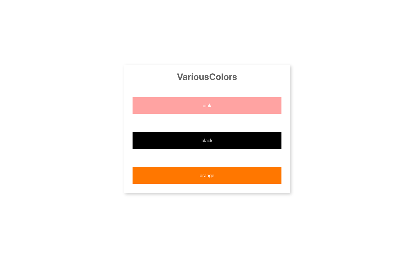
4. 3.より簡単に、カスタムデータ属性を使って表現する!
カスタムデータ属性は、HTML5で導入されたもので、その要素に属性を持たせることができます。マークアップの際も<li data-menu="hot">ホットコーヒー</li>のように、data-で始めることで用います。これを用いて先ほどのコードをより簡単にまとめたのがこちらです。
import React, { Component } from 'react';
import styled from 'styled-components';

const Color = {
  pink: "#f8aba6",
  black: "#000",
  orange: "#f58220",
}

class App extends Component {
  constructor(props) {
    super(props);
    this.state = {
      colors: ["pink", "black", "orange"]
    }
  }

  render() {
    return (
      <Container>
        <div>
          <h1>VariousColors</h1>
          {this.state.colors.map((color, idx) => {
            return <Button data-color={color} key={idx} >{color}</Button>
          })}
        </div>
      </Container>
    );
  }
}

const Button = styled.button`
  width: 90%;
  box-sizing: border-box;
  padding: 20px;
  margin: 2rem 0;
  background: #f5f5f5;
  border: none;
  font-size: 1rem;
  color: white;
  &[data-color='pink']{
    background: ${Color.pink};
  }
  &[data-color='black']{
    background: ${Color.black};
  }
  &[data-color='orange']{
    background: ${Color.orange};
  }

`;
const Container = styled.div`
  width: 100vw;
  height: 100vh;
  display: flex;
  align-items: center;
  justify-content: center;
  background: white;
  div{
      width: 40%;
      background: white;
      text-align: center;
      box-shadow: 4px 4px 10px rgba(0, 0, 0, .2);
      h1{
        color: #646464;
      }
  }
`;

export default App;
色をデータとして分類して、せっかくなのでReactらしくその色の文字をstateに配列として持たせて、それをmapメソッドで回してみました。3.では{ css }をimportしないといけなかったですが、その必要もありません。
完成したものがこちらです。
以上になります。
後書き
補足的になるのですが、構成について少し書きたいと思います。
styled-componentsは、基本、JSXと同じファイルに書くほうが個人的にオススメですが、ファイルが長くなるのが好ましくない人もいるかもしれません。
その場合は、styled-componentsもコンポーネントなので、外部ファイルからexportするといいかもしれません。ファイル構成の一例として、
List
├── index.js
└── style.js
が挙げられます。
以上です。ありがとうございました。