データラベルがデフォで縁取られる
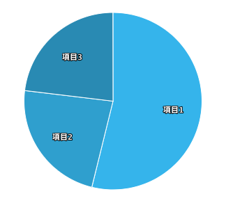
Highchartsの円グラフにデータラベル(グラフ内へ項目名)を配置したら、テキストが縁取られるのがうすらダサいので対処した。
ちなみにこの状態のコードは以下。
Highcharts.chart('pie1', {
    chart: {
        type: 'pie'
    },
    title: {
        text: ''
    },
    tooltip: {
        pointFormat: '<b>{point.percentage:.1f}%</b>'
    },
    plotOptions: {
        pie: {
            cursor: 'pointer',
            dataLabels: {
                enabled: true,
                distance: -40,
            }
        }
    },
    credits: {
        enabled: false
    },
    colors: ['#37BEF0', '#31AAD6', '#2B96BD', '#F09600', '#D68400','#BD7400','#32B400','#2C9C00','#258200','#FF6600','#E65C00','#CC5200'],
    series: [{
        name: 'operator',
        colorByPoint: true,
        data: [{
            name: '項目1',
            y: 7
        }, {
            name: '項目2',
            y: 3
        }, {
            name: '項目3',
            y: 3
        }]
    }]
});
解決方法
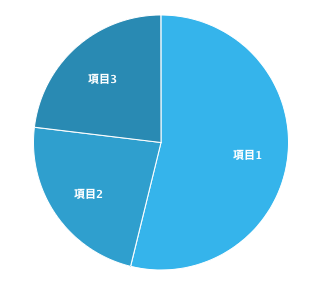
dataLabels: {
    enabled: true,
    distance: -40,
    style: {
        textOutline: 0
    }
}
データラベルのstyleオプションでtextOutline: 0を加えるだけでした。