Matplotlibとは
Matplotlibは、Pythonのグラフ描画ライブラリです。
折れ線グラフや棒グラフなど、様々なプロットを扱うことができます。
インストール
matplotlibのインストール
pip install matplotlib
matplotlibrcの編集
私の環境(macOS Sierra 10.12.6)では、「RuntimeError: Python is not installed as a framework.」と出力されてしまったため、matplotlibrcを修正しています。
matplotlibrcの場所の確認
>>> import matplotlib
>>> matplotlib.matplotlib_fname()
'/Users/UserName/.pyenv/versions/3.6.1/lib/python3.6/site-packages/matplotlib/mpl-data/matplotlibrc'
backendの修正
# The default backend; one of GTK GTKAgg GTKCairo GTK3Agg GTK3Cairo
# MacOSX Qt4Agg Qt5Agg TkAgg WX WXAgg Agg Cairo GDK PS PDF SVG
# Template.
# You can also deploy your own backend outside of matplotlib by
# referring to the module name (which must be in the PYTHONPATH) as
# 'module://my_backend'.
#
# If you omit this parameter, it will always default to "Agg", which is a
# non-interactive backend.

# 2017/10/08
#backend      : macosx
backend      : TkAgg
Matplotlibでグラフ作成
Matplotlibでは、様々な種類のプロットを扱うことができます。
ここでは私が触れた一部を紹介しますが、公式ページではサンプルが多数公開されています。
折れ線グラフ
# -*- coding: utf-8 -*-
import numpy as np
import pandas as pd
import matplotlib.pyplot as plt

# 現在時刻から200日分のdatetimeインデックスを作成
x = pd.period_range(pd.datetime.now(), periods=200, freq='d')
x = x.to_timestamp().to_pydatetime()
# ランダム値配列を3列200行分作成し、各列毎に累積和を求める
y = np.random.randn(200, 3).cumsum(0)

plots = plt.plot(x, y)
plt.legend(plots, ('data1', 'data2', 'data3'),             # 3つのプロットラベルの設定
           loc='best',                                     # 線が隠れない位置の指定
           framealpha=0.25,                                # 凡例の透明度
           prop={'size': 'small', 'family': 'monospace'})  # 凡例のfontプロパティ

plt.title('Random Data Graph')  # タイトル名
plt.xlabel('Date')              # 横軸のラベル名
plt.ylabel('Cum. sum')          # 縦軸のラベル名
plt.grid(True)                  # 目盛の表示
plt.tight_layout()              # 全てのプロット要素を図ボックスに収める

# 描画実行
plt.show()
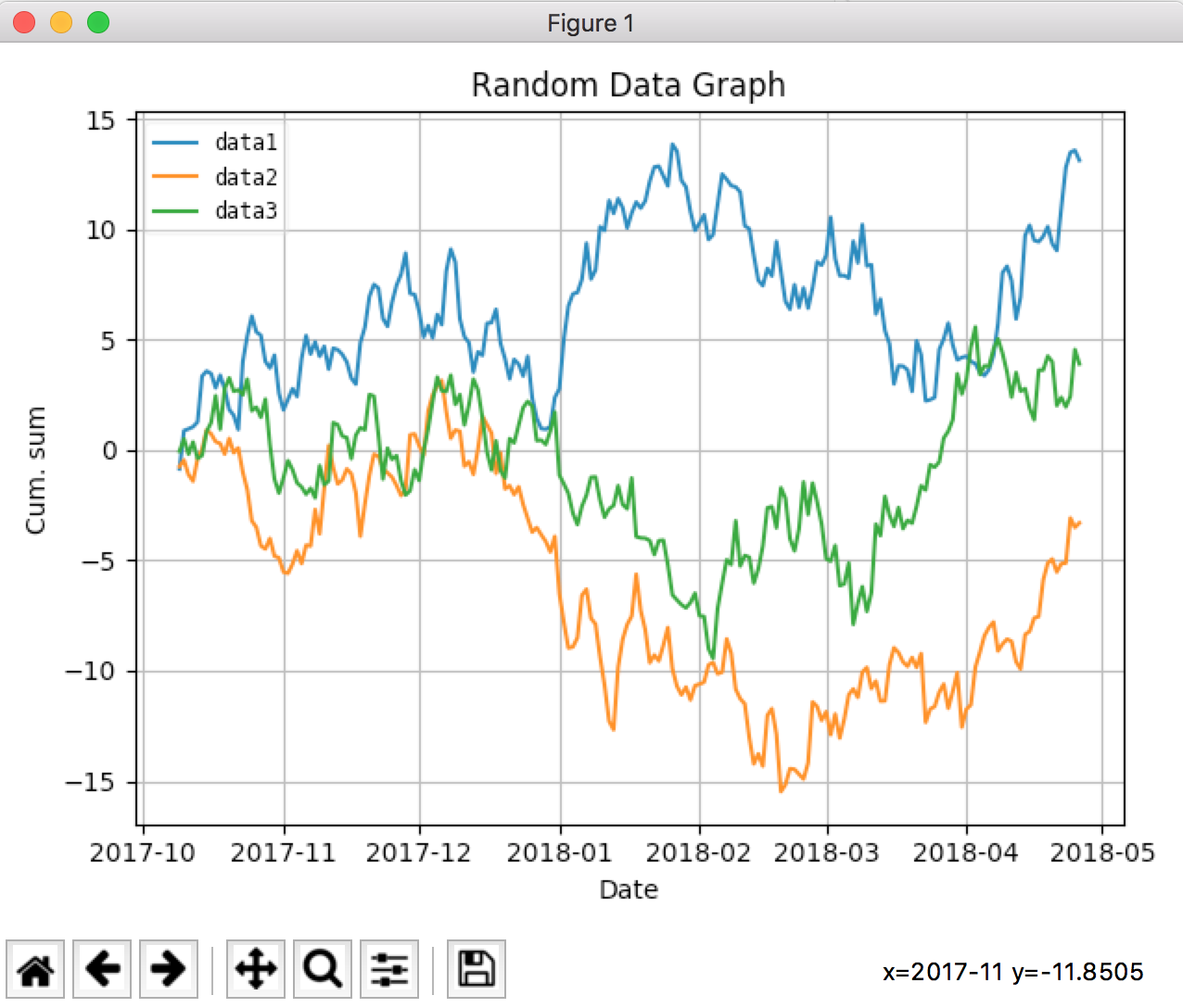
キャプチャにマウスポインタが残っていませんが、マウスオーバーで座標の情報が右下に出力されます。
また、下部のアイコンから描画に関するパラメータの変更や、ファイル保存ができます。
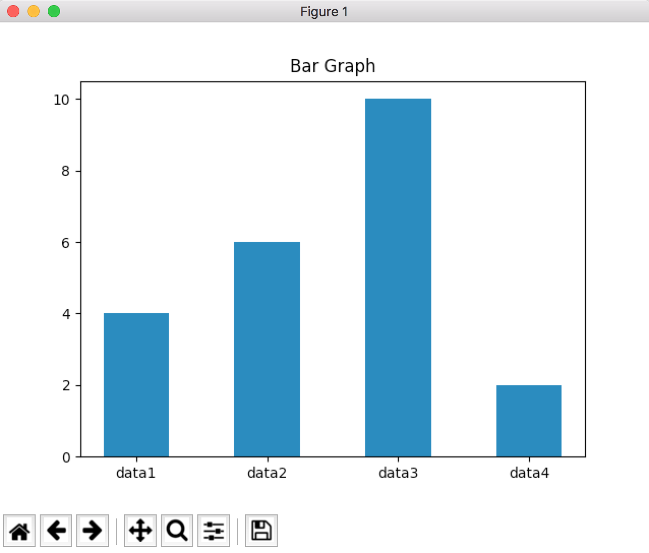
棒グラフ
# -*- coding: utf-8 -*-
import numpy as np
import matplotlib.pyplot as plt

labels = ["data1", "data2", "data3", "data4"]
data = [4, 6, 10, 2]

# 表示位置設定
x_width = 0.5
x_loc = np.array(range(len(data))) + x_width

plt.title("Bar Graph")
plt.bar(x_loc, data, width=x_width)     # 棒グラフの設定
plt.xticks(x_loc, labels)               # x軸にラベル設定

# 描画実行
plt.show()
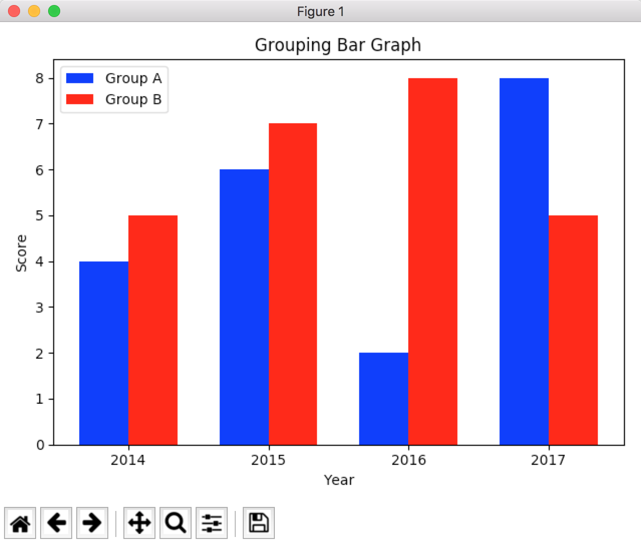
棒グラフ(複数グループ)
# -*- coding: utf-8 -*-
import numpy as np
import matplotlib.pyplot as plt

n_groups = 4

data_a = (4, 6, 2, 8)
data_b = (5, 7, 8, 5)
labels = [2014, 2015, 2016, 2017]

fig, ax = plt.subplots()

index = np.arange(n_groups)
bar_width = 0.35

rects1 = ax.bar(index, data_a, bar_width,
                color='b',
                label='Group A')

rects2 = ax.bar(index + bar_width, data_b, bar_width,
                color='r',
                label='Group B')

ax.set_xlabel('Year')
ax.set_ylabel('Score')
ax.set_title('Grouping Bar Graph')
ax.set_xticks(index + bar_width / 2)
ax.set_xticklabels(labels)
ax.legend()

fig.tight_layout()
plt.show()
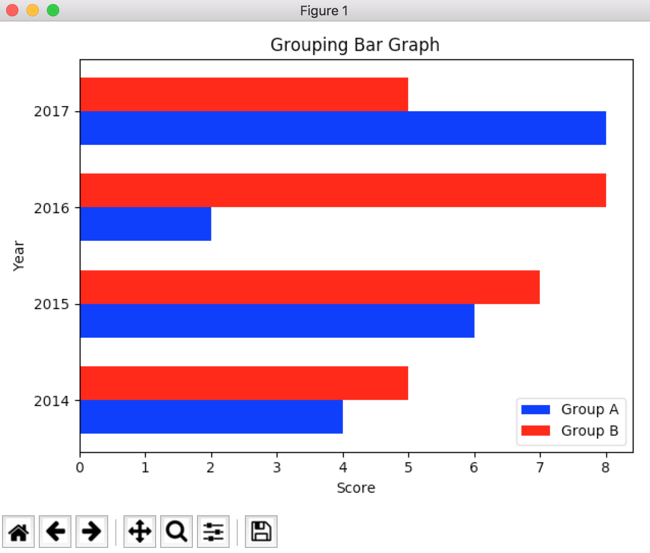
水平棒グラフ
縦方向のグラフを横方向にする場合、barメソッドをbarhに置き換えて、横軸と縦軸を交換すれば描画が可能です。「棒グラフ(複数グループ)」のコードで試してみると、期待通りのグラフになりました。
# -*- coding: utf-8 -*-
import numpy as np
import matplotlib.pyplot as plt

n_groups = 4

data_a = (4, 6, 2, 8)
data_b = (5, 7, 8, 5)
labels = [2014, 2015, 2016, 2017]

fig, ax = plt.subplots()

index = np.arange(n_groups)
bar_width = 0.35

rects1 = ax.barh(index, data_a, bar_width,
                 color='b',
                 label='Group A')

rects2 = ax.barh(index + bar_width, data_b, bar_width,
                 color='r',
                 label='Group B')

ax.set_ylabel('Year')
ax.set_xlabel('Score')
ax.set_title('Grouping Bar Graph')
ax.set_yticks(index + bar_width / 2)
ax.set_yticklabels(labels)
ax.legend()

fig.tight_layout()
plt.show()
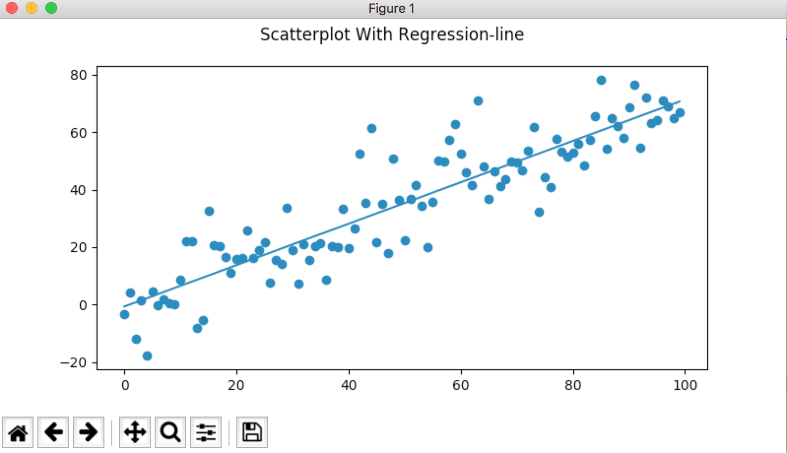
散布図(回帰曲線付き)
# -*- coding: utf-8 -*-
import numpy as np
import matplotlib.pyplot as plt


num_points = 100
gradient = 0.7
x = np.array(range(num_points))                     # x: 0 ~ 100
y = np.random.randn(num_points) * 10 + x*gradient   # y: 正規分布の乱数を0~10の間に拡大して、xに依存する値を加算

fig, ax = plt.subplots(figsize=(8, 4))
ax.scatter(x, y)            # 散布図のプロット

m, c = np.polyfit(x, y ,1)  # 直線の傾き、定数項の取得
ax.plot(x, m * x + c)        # 回帰直線のプロット
fig.suptitle('Scatterplot With Regression-line')

plt.show()
グラフの保存
Matplotlibでは、作成したプロットを保存することができます。
公式ドキュメントによると、利用できる出力フォーマットはバックエンドにより異なるとのことですが、大半ののバックエンドではPNG、PDF、PS、EPS、SVGがサポートされているとのことです。
import matplotlib.pyplot as plt
plt.savefig("image.png")
format="png"とすることでフォーマットを明示的に設定できますが、未設定でも拡張子によりフォーマットが判断されます。
参考
Matplotlib: Python plotting — Matplotlib 2.0.2 documentation
https://matplotlib.org/
Sample plots in Matplotlib
https://matplotlib.org/tutorials/introductory/sample_plots.html#sphx-glr-tutorials-introductory-sample-plots-py