相関係数の一覧を表示する
kaggleのタイタニックの犠牲者データを使って、相関係数の一覧をheatmapを使って表示してみる
数値の値でしか確認できないので注意
corr.py
# lib install
import pandas as pd
import matplotlib.pyplot as plt
import seaborn as sns
%matplotlib inline
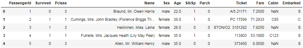
train = pd.read_csv('./train.csv')
train.head()
corr.py
plt.figure(figsize=(8, 6)) #heatmap size
sns.heatmap(train.corr(), annot=True, cmap='plasma', linewidths=.5) # annot:値を表示するかどうか linewidths: しきり線
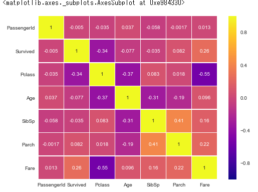
この例の場合、生き残ったかどうかが重要なので、Survivedの列を確認すると相関がある変数を見つけ出せますね