@extendのアンチパターン
Sassを導入しはじめた2013年頃の自分は、Sassがもたらしてくれるコード再利用の為の機能に心酔していた。共通しているコードは全部@extendしないと気が済まない病気にかかっていたし、SMACSSやBEMといった構造化CSSのことも知らなかった。
当時の自分にとっての「ぼくがかんがえたさいきょうのSCSS」の出力結果は次のような内容だった。
.cf:before, .floatedList:before, .navGlobal ul:before, .book.horizontal .inner > ul:before, .book.horizontal .ulWrap > ul:before, .articleList > .head > .options > ul:before, .bodyPage .pageHeader .bodyHead .articleInfos:before, .archiveModeBtns ul:before, .contentWrapper:before, .breadCrumb > ul:before, .siteHeader:before, .mainNavi:before, .mobileSearchPane:before, .toolHeader:before, .btnsUi:before, .btnsUi dl:before, .mainNavi > .inner:before, .navGlobal:before, .searchBox:before, .searchBox > .inner:before, .mobileMenuPane:before,
.mobileGlobal:before, .mobileMenuPane ul:before,
.mobileGlobal ul:before, .book.horizontal:before, .book.horizontal .inner:before, .book.horizontal .ulWrap:before, .book.horizontal ul:before, .articleList .summary:before, .dir4thList .inner:before, .dir4thList dl:before, .dir2ndList > ul:before, .footerWrapper .row1 .inner:before,
.footerWrapper .mobileFoot:before,
.footerWrapper .col1:before,
.footerWrapper .row2 .inner:before,
.footerWrapper .siteFooter:before, .bodyPage .pageHeader .bodyHead:before, .bodyPage .pageHeader .bodyHead .shareBtns:before, .bodyPage .pageHeader .bodyHead .shareBtns ul:before, .bodyPage .files .hideOnMobile:before,
.cf:after,
.floatedList:after,
.navGlobal ul:after,
.book.horizontal .inner > ul:after,
.book.horizontal .ulWrap > ul:after,
.articleList > .head > .options > ul:after,
.bodyPage .pageHeader .bodyHead .articleInfos:after,
.archiveModeBtns ul:after,
.contentWrapper:after,
.breadCrumb > ul:after,
.siteHeader:after,
.mainNavi:after,
.mobileSearchPane:after,
.toolHeader:after,
.btnsUi:after,
.btnsUi dl:after,
.mainNavi > .inner:after,
.navGlobal:after,
.searchBox:after,
.searchBox > .inner:after,
.mobileMenuPane:after,
.mobileGlobal:after,
.mobileMenuPane ul:after,
.mobileGlobal ul:after,
.book.horizontal:after,
.book.horizontal .inner:after,
.book.horizontal .ulWrap:after,
.book.horizontal ul:after,
.articleList .summary:after,
.dir4thList .inner:after,
.dir4thList dl:after,
.dir2ndList > ul:after,
.footerWrapper .row1 .inner:after,
.footerWrapper .mobileFoot:after,
.footerWrapper .col1:after,
.footerWrapper .row2 .inner:after,
.footerWrapper .siteFooter:after,
.bodyPage .pageHeader .bodyHead:after,
.bodyPage .pageHeader .bodyHead .shareBtns:after,
.bodyPage .pageHeader .bodyHead .shareBtns ul:after,
.bodyPage .files .hideOnMobile:after {
  /* micro clearfix */
  content: "";
  display: table;
}

.cf:after, .floatedList:after, .navGlobal ul:after, .book.horizontal .inner > ul:after, .book.horizontal .ulWrap > ul:after, .articleList > .head > .options > ul:after, .bodyPage .pageHeader .bodyHead .articleInfos:after, .archiveModeBtns ul:after, .contentWrapper:after, .breadCrumb > ul:after, .siteHeader:after, .mainNavi:after, .mobileSearchPane:after, .toolHeader:after, .btnsUi:after, .btnsUi dl:after, .mainNavi > .inner:after, .navGlobal:after, .searchBox:after, .searchBox > .inner:after, .mobileMenuPane:after,
.mobileGlobal:after, .mobileMenuPane ul:after,
.mobileGlobal ul:after, .book.horizontal:after, .book.horizontal .inner:after, .book.horizontal .ulWrap:after, .book.horizontal ul:after, .articleList .summary:after, .dir4thList .inner:after, .dir4thList dl:after, .dir2ndList > ul:after, .footerWrapper .row1 .inner:after,
.footerWrapper .mobileFoot:after,
.footerWrapper .col1:after,
.footerWrapper .row2 .inner:after,
.footerWrapper .siteFooter:after, .bodyPage .pageHeader .bodyHead:after, .bodyPage .pageHeader .bodyHead .shareBtns:after, .bodyPage .pageHeader .bodyHead .shareBtns ul:after, .bodyPage .files .hideOnMobile:after {
  /* micro clearfix */
  clear: both;
}

.cf, .floatedList, .navGlobal ul, .book.horizontal .inner > ul, .book.horizontal .ulWrap > ul, .book.horizontal ul > ul, .articleList > .head > .options > ul, .bodyPage .pageHeader .bodyHead .articleInfos, .archiveModeBtns ul, .contentWrapper, .breadCrumb > ul, .siteHeader, .mainNavi, .mobileSearchPane, .toolHeader, .btnsUi, .btnsUi dl, .mainNavi > .inner, .navGlobal, .searchBox, .searchBox > .inner, .mobileMenuPane,
.mobileGlobal, .mobileMenuPane ul,
.mobileGlobal ul, .book.horizontal, .book.horizontal .inner, .book.horizontal .ulWrap, .book.horizontal ul, .articleList .summary, .dir4thList .inner, .dir4thList dl, .dir2ndList > ul, .footerWrapper .row1 .inner,
.footerWrapper .mobileFoot,
.footerWrapper .col1,
.footerWrapper .row2 .inner,
.footerWrapper .siteFooter, .bodyPage .pageHeader .bodyHead, .bodyPage .pageHeader .bodyHead .shareBtns, .bodyPage .pageHeader .bodyHead .shareBtns ul, .bodyPage .files .hideOnMobile {
  /* micro clearfix */
  zoom: 1;
}

/* この調子であと7000行くらい */
- clearfixが必要な度に@extend
- 深いインデントを持ったクラスの@extendにより、大量のセレクタが生成された
- HTML要素への依存性が非常に高い
- 先方に「こんなものは今まで見たことがない」という驚きの声をいただく
- IE9でセレクタ数制限にひっかかり、blessで分割する破目になった
- コンパイル前のソース無しでは、内容の理解も改修もほぼ不可能
自分自身は**「SCSSの中は綺麗だし、HTML側のクラス名はクリーンでセマンティックだし、手元にSCSSがあるんだから、出力後のCSSがどうなろうと知ったことじゃないよ」**という気持ちだった。1
HTMLが綺麗なら、CSSはカオスでもいいのか?
マークアップをシンプルに保ち、かつスタイルを変更する際になるべく影響を受けないよいうに、あらかじめマークアップの各要素というかモジュールごとにスタイルとは切り離した適切な名前をつけておいて、スタイルはスタイルでオブジェクトとして体系化してマークアップから分離する、みたいな理想にオブジェクト指向な Sass で少し近づけるのかも… とか考えるんですが、どうでしょう。
@extendが魅力的に思えるのは、上記引用のように、HTMLをクリーンに保ちつつCSS内では継承ができるという点であった。しかし、いざ使いまくってみると以下のような問題があった。
- CSSの容量増大
- CSSの複雑さが大幅に増し、元ソースなしでは管理不可能になる
- セレクタ数を常に気にしないとIE9で壊れる
明らかに得たものよりも失ったものの方が多い。
「HTMLとCSSのどちらに複雑さを持たせるべきか」という二元論はそれほど重要ではなく、できるだけHTMLもCSSも複雑にすることなく、管理と修正のしやすいコーディングをすることの方が大事なことだったのだと思う。
綺麗に出力できる継承の書き方
最近ではBEMとSMACSSの考え方を導入しつつ、HTMLとCSSのどちらでも継承に対応でき、Sassのメリットを活かせるような書き方を考えている。
例として、BEMっぽく書かれた共通のmy-componentスタイルへ、継承するyourスタイルと、my・yourの両方を多重継承するourスタイルを新たに定義したいとして、異なる2つアプローチを紹介する。
.my-component {
  &__head {
    // ...
  }
  &__body {
    // ...
  }
}
<div class="my-component clearfix">
  <div class="my-component__head">...</div>
  <div class="my-component__body">...</div>
</div>
なお、両方に共通するルールとして以下も前提とする。
- HTML要素に依存しない
-
clearfixなど、コンポーネントと関係ない汎用的なルールは、OOCSSで書く - 子孫セレクタはできるだけ使わない
.my-componentを継承する.your-componentと、その2つを継承する.our-componentを定義する場合
継承がCSS内で行われるケース。
BEMスタイルのコンポーネントは@extendできないので、セレクタを繋げて継承を行う。必然的にコードも近い場所にまとめざるを得ないし、継承のし過ぎも回避できる。
HTML側のクラス名をセマンティックに保てるというメリットがあるが、生成されるCSSに無駄な行ができてしまう欠点もある。(Sass側で対応してくれないものか…)
ソース:
// myスタイル
.my-component,
.your-component,
.our-component {
  &__head {
    /* #{&} */
  }
  &__body {
    /* #{&} */
  }
}
// myスタイルを継承するyourスタイル
.your-component,
.our-component {
  &__head {
    /* #{&} */
  }
}
// myスタイルとyourスタイルを多重継承するourスタイル
.our-component {
  &__body {
  /* #{&} */
  }
  &__foot {
  /* #{&} */
  }
}
コンパイル結果:
.my-component__head,
.your-component__head,
.our-component__head {
  /* .my-component__head, .your-component__head, .our-component__head */
}
.my-component__body,
.your-component__body,
.our-component__body {
  /* .my-component__body, .your-component__body, .our-component__body */
}
.your-component__head,
.our-component__head {
  /* .your-component__head, .our-component__head */
}
.our-component__body {
  /* .our-component__body */
}
.our-component__foot {
  /* .our-component__foot */
}
使い方:
<!-- myスタイルを継承するyourスタイル -->
<div class="your-component clearfix">
  <div class="your-component__head">...</div>
  <div class="your-component__body">...</div>
</div>

<!-- myスタイルとyourスタイルを継承するourスタイル -->
<div class="our-component clearfix">
  <div class="our-component__head">...</div>
  <div class="our-component__body">...</div>
  <div class="our-component__foot">...</div>
</div>
.my-componentにサブクラス.my-component--yours、.my-component--oursを定義する場合
継承がHTML内で行われるケース。
1つのインデントにサブクラスを定義し、HTML側で複数のクラスを挿入する。SMACSSではこの考え方を推奨している。
継承する項目が増えるとHTMLのクラスが複雑になっていく可能性があるが、継承の数が少ない場合はCSSもHTMLも簡潔にまとまるメリットがある。
ソース:
.my-component {
  $self: &;

  &__head {
    /* #{&} */
  }
  &__body {
    /* #{&} */
  }
  // サブクラスを定義
  &--yours {
    #{$self}__head {
      /* #{&} */
    }
  }
  // サブクラスを定義
  &--ours {
    #{$self}__body {
      /* #{&} */
    }
    #{$self}__foot {
      /* #{&} */
    }
  }
}
コンパイル結果:
.my-component__head {
  /* .my-component__head */
}
.my-component__body {
  /* .my-component__body */
}
.my-component--yours .my-component__head {
  /* .my-component--yours .my-component__head */
}
.my-component--ours .my-component__body {
  /* .my-component--ours .my-component__body */
}
.my-component--ours .my-component__foot {
  /* .my-component--ours .my-component__foot */
}
使い方:
<!-- yourスタイル -->
<div class="my-component my-component--yours clearfix">
  <div class="my-component__head">...</div>
  <div class="my-component__body">...</div>
</div>

<!-- ourスタイル -->
<div class="my-component my-component--yours my-component--ours clearfix">
  <div class="my-component__head">...</div>
  <div class="my-component__body">...</div>
  <div class="my-component__foot">...</div>
</div>
こちらもどうぞ!
IE8互換のレスポンシブデザインを、ワンソース、モバイルファーストで作れるSassミックスイン - Qiita
-
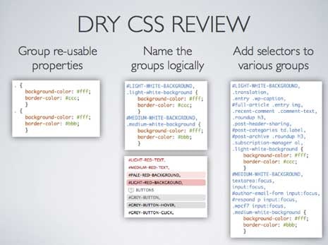
このようなセレクタのまとめ方を積極的に行う「DRY CSS」という手法を検索していて見つけたが、国内で紹介されているのは聞いたことがない。DRY CSS: Don't Repeat Your CSS - Vanseo Design
 ↩
↩