サンプルデータ
線形データ
n=20
a = np.arange(n).reshape(4, -1); a # 5列の行列
array([[ 0,  1,  2,  3,  4,  5,  6,  7,  8,  9, 10, 11, 12, 13, 14, 15, 16,
        17, 18, 19, 20, 21, 22, 23, 24],
       [25, 26, 27, 28, 29, 30, 31, 32, 33, 34, 35, 36, 37, 38, 39, 40, 41,
        42, 43, 44, 45, 46, 47, 48, 49],
       [50, 51, 52, 53, 54, 55, 56, 57, 58, 59, 60, 61, 62, 63, 64, 65, 66,
        67, 68, 69, 70, 71, 72, 73, 74],
       [75, 76, 77, 78, 79, 80, 81, 82, 83, 84, 85, 86, 87, 88, 89, 90, 91,
        92, 93, 94, 95, 96, 97, 98, 99]])
df = pd.DataFrame(a, columns=list('abcde')); df
| a | b | c | d | e | |
|---|---|---|---|---|---|
| 0 | 0 | 1 | 2 | 3 | 4 |
| 1 | 5 | 6 | 7 | 8 | 9 |
| 2 | 10 | 11 | 12 | 13 | 14 |
| 3 | 15 | 16 | 17 | 18 | 19 |
ランダムデータ
r = np.random.randn(4, 5); r
array([[-0.37840346, -0.84591793,  0.50590263,  0.0544243 ,  0.59361247],
       [-0.2726931 , -1.74415635,  0.0199559 , -0.20695113, -1.19559455],
       [-0.59799566, -0.26810224, -0.18738038,  1.05843686,  0.72317579],
       [ 1.23389386,  1.91293041, -1.33322818,  0.78255026,  2.04737357]])
df = pd.DataFrame(r, columns=list('abcde')); df
| a | b | c | d | e | |
|---|---|---|---|---|---|
| 0 | -0.378403 | -0.845918 | 0.505903 | 0.054424 | 0.593612 |
| 1 | -0.272693 | -1.744156 | 0.019956 | -0.206951 | -1.195595 |
| 2 | -0.597996 | -0.268102 | -0.187380 | 1.058437 | 0.723176 |
| 3 | 1.233894 | 1.912930 | -1.333228 | 0.782550 | 2.047374 |
df.plot()
<matplotlib.axes._subplots.AxesSubplot at 0x17699af2a58>

df = pd.DataFrame(np.random.randn(n,n))
plt.contourf(df, cmap='jet')
<matplotlib.contour.QuadContourSet at 0x1769a1a12b0>

等高線表示
plt.pcolor(df, cmap='jet')
<matplotlib.collections.PolyCollection at 0x1769b1e2208>

カラーマップ表示
sin波
n=100
x = np.linspace(0, 2*np.pi, n)
s = pd.Series(np.sin(x), index=x)
s.plot()
<matplotlib.axes._subplots.AxesSubplot at 0x1769e695780>
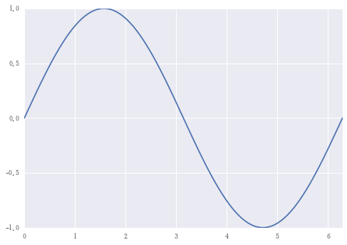
sin波
snoise = s + 0.1 * np.random.randn(n)
sdf = pd.DataFrame({'sin wave':s, 'noise wave': snoise})
sdf.plot(color=('r', 'b'))
<matplotlib.axes._subplots.AxesSubplot at 0x1769e8586d8>

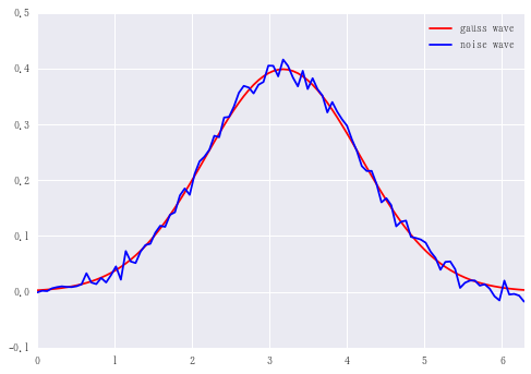
ノイズをのせた
正規分布
from scipy import stats as ss
median = x[int(n/2)]  # xの中央値
g = pd.Series(ss.norm.pdf(x, loc=median), x)
g.plot()
<matplotlib.axes._subplots.AxesSubplot at 0x1769ffba128>

gnoise = g + 0.01 * np.random.randn(n)
df = pd.DataFrame({'gauss wave':g, 'noise wave': gnoise})
df.plot(color=('r', 'b'))
<matplotlib.axes._subplots.AxesSubplot at 0x1769e970828>
log関数
median = x[int(n/2)]  # xの中央値
x1 = x + 10e-3
l = pd.Series(np.log(x1), x1)
l.plot()
<matplotlib.axes._subplots.AxesSubplot at 0x1769ffba5f8>

lnoise = l + 0.1 * np.random.randn(n)
df = pd.DataFrame({'log wave':l, 'noise wave': lnoise})
df.plot(color=('r', 'b'))
<matplotlib.axes._subplots.AxesSubplot at 0x176a00ec358>

ランダムウォーク
n = 1000
se = pd.Series(np.random.randint(-1, 2, n)).cumsum()
se.plot()
<matplotlib.axes._subplots.AxesSubplot at 0x284f3c62c18>

np.random.randint(-1, 2, n)で(-1, 0, 1)のどれかをランダムにn個生成し、cumsum()で積み上げ合計していくことでランダムウォークを描く。
sma100 = se.rolling(100).mean()
ema100 = se.ewm(span=100).mean()

df = pd.DataFrame({'Chart': se,  'SMA100': sma100, 'EMA100': ema100})
df.plot(style = ['--','-','-'])
<matplotlib.axes._subplots.AxesSubplot at 0x284f3cadcc0>

単純移動平均線(Simple Moving Average)と指数移動平均線(Exponential Moving Average)を同時に描画した。
EMAの方がSMAと比べて一般的に直近の動きを反映しやすく、トレンドに追随しやすいといわれている。
記事の内容とは関係ないけど、今さらながらjupyter notebookで書いてmd形式で落とすと、qiitaにはっつけるだけでいいからすごい楽。