聖杯レイアウト
聖杯を手に入れた者は望みのレイアウトが何でも叶うという。
日本で聖杯となったのはExcelである。
display: grid; にはこの摩訶不思議なExcel方眼紙に通じる万能感がある。
display: grid; ならExcel方眼紙も簡単に再現できるんじゃないの?
なら、やってみよう!
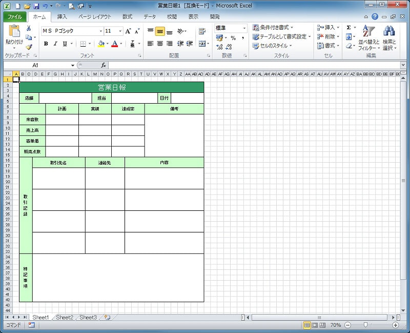
今回再現するのはこのシート。
初稿
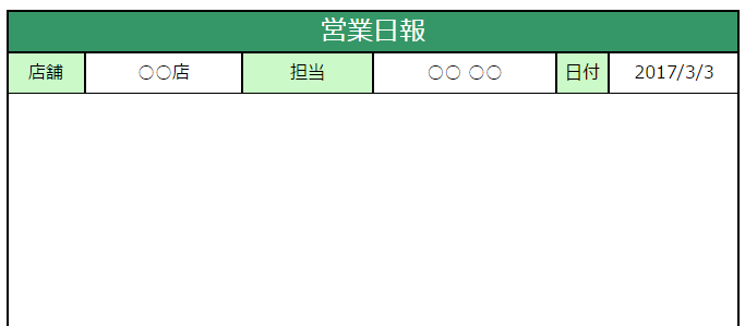
途中まで作ってみた。
index.htm
<!DOCTYPE html>
<html>
<head>
<title>Japanese聖杯レイアウト</title>
<meta charset="utf-8">
<link rel="stylesheet" type="text/css" href="index.css">
</head>
<body>
<div class="excel">
    <div class="header flex border">
        <span>営業日報</span>
    </div>
    <div class="first_contents_item1_title title flex border">
        <span>店舗</span>
    </div>
    <div class="first_contents_item1 flex border">
        <span>○○店</span>
    </div>
    <div class="first_contents_item2_title title flex border">
        <span>担当</span>
    </div>
    <div class="first_contents_item2 flex border">
        <span>○○ ○○</span>
    </div>
    <div class="first_contents_item3_title title flex border">
        <span>日付</span>
    </div>
    <div class="first_contents_item3 flex border">
        <span>2017/3/3</span>
    </div>
    <div class="sheet border2" />
</div>
</body>
</html>
index.css
@charset "utf-8";
/* CSS Document */

/* グリッドの親要素の設定 */
.excel {
    font: 18px;
    line-height: 1.0;
    margin: 0;
    display: grid;
    grid-template-columns: 1.5rem [left] repeat(2, 1.5rem) [third_contents_title_end] 1.5rem
    [first_contents_title_end] 1.5rem [second_contents_title_end] repeat(5, 1.5rem)
    [first_contents_item1_end] 1.5rem [third_contents_item1_end] 1.5rem [first_contents_item1_end]
    repeat(3, 1.5rem) [first_contents_item2_start] repeat(2, 1.5rem) [third_contents_item2_end]
    repeat(3, 1.5rem) [second_contents_item3_end] repeat(2, 1.5rem) [first_contents_item2_end]
    repeat(2, 1.5rem) [first_contents_item3_start] repeat(5, 1.5rem) [right] 1.5rem;
    grid-template-rows: 1.2rem [top] repeat(2, 1.2rem) [header_end] repeat(2, 1.2rem) [first_contents_end]
    repeat(2, 1.2rem) [second_contents_header_end] repeat(2, 1.2rem) [second_contents_item1_end]
    repeat(2, 1.2rem) [second_contents_item2_end] repeat(2, 1.2rem) [second_contents_item3_end]
    repeat(2, 1.2rem) [second_contents_item4_end] repeat(2, 1.2rem) [third_contents_header_end]
    repeat(4, 1.2rem) [third_contents_item1_end] repeat(4, 1.2rem) [third_contents_item2_end]
    repeat(4, 1.2rem) [third_contents_item3_end] repeat(4, 1.2rem) [third_contents_item4_end]
    repeat(9, 1.2rem) [bottom] 1.2rem;
    background: #ffffff;
}
/* グリッドの子要素の設定 */
.flex {
    display: flex;
    justify-content: center;
    align-items: center;
}
.border {
    border: solid #000000;
    border-width: 1px;
}
.border2 {
    border: solid #000000;
    border-width: 2px;
}
.header {
    grid-column: left / right;
    grid-row: top / header_end;
    background: #359767;
}
.header > span {
    font-size: 1.5rem;
    color: #ffffff;
    margin-top: 4px;
}
.title {
    background: #cbfac8;
}
.first_contents_item1_title {
    grid-column: left / first_contents_title_end;
    grid-row: header_end / first_contents_end;
}
.first_contents_item1 {
    grid-column: first_contents_title_end / first_contents_item1_end;
    grid-row: header_end / first_contents_end;
}
.first_contents_item2_title {
    grid-column: first_contents_item1_end / first_contents_item2_start;
    grid-row: header_end / first_contents_end;
}
.first_contents_item2 {
    grid-column: first_contents_item2_start / first_contents_item2_end;
    grid-row: header_end / first_contents_end;
}
.first_contents_item3_title {
    grid-column: first_contents_item2_end / first_contents_item3_start;
    grid-row: header_end / first_contents_end;
}
.first_contents_item3 {
    grid-column: first_contents_item3_start / right;
    grid-row: header_end / first_contents_end;
}
.sheet {
    grid-column: left / right;
    grid-row: top / bottom;
}
なんか違う
grid-template-columns: 1.5rem [left] repeat(2, 1.5rem) [third_contents_title_end] 1.5rem
    [first_contents_title_end] 1.5rem [second_contents_title_end] repeat(5, 1.5rem)
    [first_contents_item1_end] 1.5rem [third_contents_item1_end] 1.5rem [first_contents_item1_end]
    repeat(3, 1.5rem) [first_contents_item2_start] repeat(2, 1.5rem) [third_contents_item2_end]
    repeat(3, 1.5rem) [second_contents_item3_end] repeat(2, 1.5rem) [first_contents_item2_end]
    repeat(2, 1.5rem) [first_contents_item3_start] repeat(5, 1.5rem) [right] 1.5rem;
確かに縦の線を順番に記述するとこの通りなんだけど、全然エレガントじゃないよね。
display: grid; はこんな複雑なレイアウトも一発だぜっていう技術デモにしかなってない。
HTMLらしく
index.htm
<!DOCTYPE html>
<html>
<head>
<title>Japanese聖杯レイアウト</title>
<meta charset="utf-8">
<link rel="stylesheet" type="text/css" href="http://yui.yahooapis.com/3.18.1/build/cssreset/cssreset-min.css">
<link rel="stylesheet" type="text/css" href="index.css">
</head>
<body>
    <article>
        <header>
            <h1>営業日報</h1>
        </header>
        <section>
            <h2>店舗</h2>
            <p>○○店</p>
            <h2>担当</h2>
            <p>○○ ○○</p>
            <h2>日付</h2>
            <p>2017/3/3</p>
        </section>
        <section>
            <h2>計画</h2>
            <h2>実績</h2>
            <h2>達成率</h2>
            <h3>来客数</h3>
            <p>計画1</p>
            <p>実績1</p>
            <p>達成率1</p>
            <h3>売上高</h3>
            <p>計画2</p>
            <p>実績2</p>
            <p>達成率2</p>
            <h3>客単価</h3>
            <p>計画3</p>
            <p>実績3</p>
            <p>達成率3</p>
            <h3>販売点数</h3>
            <p>計画4</p>
            <p>実績4</p>
            <p>達成率4</p>
            <h2>備考</h2>
            <p>備考を記入します。</p>
            <div />
        </section>
        <section>
            <h2>取引記録</h2>
            <h3>取引社名</h3>
            <h3>連絡先</h3>
            <h3>内容</h3>
            <p>○○ ○○</p>
            <p>○○ ○○</p>
            <p>○○ ○○</p>
            <p>○○ ○○</p>
            <p>○○ ○○</p>
            <p>○○ ○○</p>
            <p>○○ ○○</p>
            <p>○○ ○○</p>
            <p>○○ ○○</p>
            <p>○○ ○○</p>
            <p>○○ ○○</p>
            <p>○○ ○○</p>
        </section>
        <section>
            <h2>特記事項</h2>
            <p>特記事項を記入します。</p>
        </section>
    </article>
</body>
</html>
うん、これだ。
これこそHTMLって感じの構造になった。
index.css
@charset "utf-8";
/* CSS Document */
article {
    width: min-content;
    margin: 1.5rem;

    display: grid;
    grid-template-columns: [left] repeat(28, 1.5rem) [right];
    grid-template-rows: [top] repeat(2, 1.2rem) [header_end]
    repeat(2, 1.2rem) [section1_end] repeat(10, 1.2rem) [section2_end]
    repeat(18, 1.2rem) [section3_end] repeat(9, 1.2rem) [bottom];
    grid-auto-flow: row;

    font: 18px;
    color: #000000;
    background: #ffffff;
}
/* 罫線 */
article, header, h2, h3, p, div {
    border: solid #000000;
    border-width: 1px;
}
/* 色付き&センタリングさせる要素 */
header, h2, h3, div {
    display: flex;
    justify-content: center;
    align-items: center;
    background: #cbfac8;
}
/* p要素は左寄せにする */
p {
    padding: 0.25rem;
    display: flex;
    justify-content: flex-start;
    align-items: center;
}

article header {
    grid-column: left / right;
    grid-row: top / header_end;
    background: #359767;
}

article header > h1 {
    font-size: 1.5rem;
    line-height: 1.0;
    color: #ffffff;
    margin-top: 4px;
}
/* セクション1の設定 */
article section:nth-of-type(1) {
    grid-column: left / right;
    grid-row: header_end / section1_end;

    display: grid;
    grid-template-columns: 3fr 8fr 3fr 7fr 2fr 5fr;
    grid-auto-flow: column;
}
/* セルを右寄せにする設定 */
article section:nth-of-type(1) h2:nth-of-type(3) + p {
    justify-content: flex-end;
}
/* セクション2の設定 */
article section:nth-of-type(2) {
    grid-column: left / right;
    grid-row: section1_end / section2_end;

    display: grid;
    grid-template-columns: 4fr repeat(3, 5fr) 9fr;
    grid-template-rows: repeat(5, 2fr);
    grid-auto-flow: row;
}
/* divを左上に*/
article section:nth-of-type(2) div {
    grid-column: 1 / 2;
    grid-row: 1 / 2;
}
/* h2を1行目に */
article section:nth-of-type(2) h2 {
    grid-row: 1 / 2;
}
/* h3を1列目に */
article section:nth-of-type(2) h3 {
    grid-column: 1 / 2;
}
/* 備考欄の設定 */
article section:nth-of-type(2) h2:nth-of-type(4) + p {
    grid-column: span 1 / -1;
    grid-row: 2 / -1;
}
/* セクション3の設定 */
article section:nth-of-type(3) {
    grid-column: left / right;
    grid-row: section2_end / section3_end;

    display: grid;
    grid-template-columns: 2fr 8fr 6fr 12fr;
    grid-template-rows: 2fr repeat(4, 4fr);
    grid-auto-flow: row;
}
/* h2を左端に */
article section:nth-of-type(3) h2 {
    grid-column: 1 / 2;
    grid-row: 1 / -1;
    writing-mode: vertical-rl;
}
/* セクション4の設定 */
article section:nth-of-type(4) {
    grid-column: left / right;
    grid-row: section3_end / bottom;

    display: grid;
    grid-template-columns: 2fr 26fr;
    grid-template-rows: 1fr;
    grid-auto-flow: row;
}
/* h2を左端に */
article section:nth-of-type(4) h2 {
    grid-column: 1 / 2;
    writing-mode: vertical-rl;
}
レンダリング例
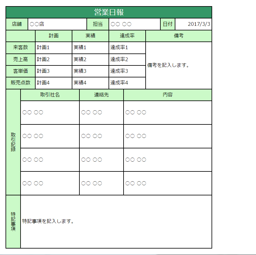
今回は<input />とかは考慮してないけど、
誰かExcelからHTML出力するマクロ作らないかな…。