某所で昨日そんな感じとしか表現しようのないもののマークアップ方法を相談されたので、簡単にサンプル引いてみたものの、ちょっと使い勝手が悪かったのでナイスな方法を考えてみた。
要件
- ul>li要素でマークアップ出来る。
- クラスの付け外しでステートを指定出来る。
- 要素数は可変である必要がある。
- 親要素の幅に対してフィットする必要がある。
- 両端は可能な限り余白を詰める。
さて、これ地味に面倒なわけです。とくに5項目とか。幅を確定する間の線は数-1になるわけで。
結果
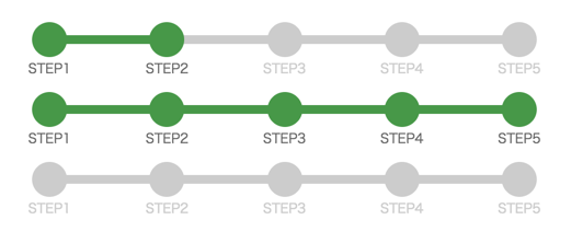
サクッとできたよ。ちなみにHTML側のマークアップはこんな感じ。
<ul class="ui-step-bar">
    <li class="done">
        <span>STEP1</span>
    </li>
    <li class="done">
        <span>STEP2</span>
    </li>
    <li>
        <span>STEP3</span>
    </li>
    <li>
        <span>STEP4</span>
    </li>
    <li>
        <span>STEP5</span>
    </li>
</ul>
やったことの概要
CSSはやや複雑なのでsassで書いてみました。
.ui-step-bar {
    $barMargin: 8px 0;
    $ballSize: 32px; // ボールの大きさ
    $labelWidth: 80px; // ラベル領域の幅。枝の両端の空白もここで決まる
    $labelFontSize: 12px; // ラベルのフォントサイズ
    $labelFontColor: #ccc; // ラベルのフォントカラー
    $labelFontColorActive: #666; // ラベルのフォントカラー
    $labelPadding: 2px; // ラベルのpadding
    $labelGap: 4px; // ボールとラベルのギャップ(px指定)
    $branchWidth: 8px; //枝の太さ
    $pendingColor: #ccc; // 待受中の色
    $doneColor: #494; // 完了時の色
    $unitHeight: $ballSize + ($labelGap + $labelPadding*2 + $labelGap)*2; //プログレスバーの高さ
    &,
    &>li {
        margin: 0;
        padding: 0;
        list-style-type: none;
    }
    & {
        display: flex;
        width: 100%;
        box-sizing: border-box;
        padding: 0 $labelWidth/2;
        position: relative;
        height: $unitHeight;
        margin: $barMargin;
    }
    >li {
        width: 100%;
        position: relative;
        >span {
            position: absolute;
            display: block;
            box-sizing: border-box;
            width: $labelWidth;
            margin: 0 $labelWidth*-0.5;
            padding: $labelPadding;
            top: ($unitHeight + $ballSize) * 0.5 + $labelPadding;
            color: $labelFontColor;
            right: 0;
            font-size: $labelFontSize;
            text-align: center;
            line-height: 1em;
        }
        &:before,
        &:after {
            content: "";
            position: absolute;
            display: block;
            top: 50%;
        }
        // ボールの間の枝
        &:before {
            width: 100%;
            height: $branchWidth;
            margin: $branchWidth*-0.5 0;
            background-color: $pendingColor;
            z-index: 1;
            left: 0;
        }
        &:after {
            width: $ballSize;
            height: $ballSize;
            margin: $ballSize*-0.5;
            border-radius: 100%;
            background-color: $pendingColor;
            z-index: 2;
            right: 0;
        }
        // ここがみそ。最初のLI要素のwidthは0にし、疑似要素の枝を非表示にする。
        &:first-child {
            width: 0;
            &:before {
                display: none;
            }
        }
        &.done {
            >span {
                color: $labelFontColorActive;
            }
            &:before,
            &:after {
                background-color: $doneColor;
            }
        }
    }
}
まずulはdisplay:flexにしています。この状態だと小要素が幅に追従しないので、liは100%を設定。(これは小要素の数が可変なため。固定幅ならちゃんとcalc(100%/5)とかしたほうがいいでしょう)
ここでポイントなのは、最初のli要素の幅を0にしていることです。従って内包している要素は全てposition:absoluteで配置しています。
枝は2番目要素以降に擬似要素で配置。そもそも1番目のステップは枝にハイライトが掛かる必要が無いわけなので、これで良い。
つまり、左側に枝の生えているボールが各要素に並んでいて右揃えになっているイメージですね。
細かい説明はめどいので省きます。適当に読んでくだちぃ。
だれかの助けになれば。特に社内。