2014/10/22 に公開された AppCompat v21 — Material Design for Pre-Lollipop Devices! | Android Developers Blog を翻訳(多少の意訳を含む)してみました。
ちなみに原文の草稿は 10/17 に https://chris.banes.me/2014/10/17/appcompat-v21/ にて公開されており、そのコメント欄でも著者との活発な議論(Q&A)が繰り広げられていたので貴重な情報源です。
あと、この記事で話題にしている appcompat-v7/21 を組み込んだTwitterアプリを公開していますので興味がありましたらどうぞ(宣伝)。
(11/10 追記) http://googledevjp.blogspot.jp/2014/11/appcompat-v21-lollipop.html にてGoogle公式の日本語訳が公開されています。
AppCompat v21 — Material Design for Pre-Lollipop Devices!
By Chris Banes, Android Developer Relations
Android 5.0 SDK は、新しいUIウィジェットとMaterial Design(デザインに特化した視覚的な言語[visual language])をフィーチャーし、先週の金曜日(訳注:2014/10/17)にリリースしました。
古いAndroidプラットフォームに最新のデザインを届けるため、私たちはサポートライブラリ(AppCompatへのメジャーアップデートを含む)を拡張しただけでなく、新たに RecyclerView、CardViewおよびPaletteライブラリを追加しました。
この記事では、AppCompatの新機能と、あなたのアプリがmaterial designをサポートするためにAppCompatを使用する方法について説明します。
AppCompatの新機能は?
AppCompat (別名ActionBarCompat) は、バックポート実装とフレームワーク実装の上に共通のAPI層を提供する、Gingerbread 端末用の Android 4.0 の ActionBar API バックポートとして始まりました。AppCompat v21 は Android 5.0 の最新の API と機能セットを提供します。
このリリースでは、Android は新たに Toolbar ウィジェットを導入します。これはActionBarパターンを一般化したもので、より多くの制御と柔軟性を提供します。
Toolbar は他のviewと同様にレイアウト階層に組み込まれる view であり、他の view に挟み込んだり、アニメーションさせたり、スクロールイベントに反応させたりといったことを簡単にします。また、あなたはToolbarをActivityのAction Barとして設定することができます。つまり標準的なオプションメニューのアクションがその中に表示されることを意味します。
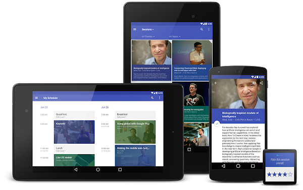
あなたはおそらくすでにAppCompatの最新版を使用してきているでしょう。それは過去数週間にわたり、様々な(PlayストアやPlayNewsstandを含む)Googleアプリのアップデートに含まれていましたので。またそれは上の写真の Google I/O Android アプリにも含まれており、ソースを公開しています。
セットアップ
あなたが Gradle を利用しているのであれば、appcompat を dependency として build.gradle ファイルに追加してください:
dependencies {
    compile "com.android.support:appcompat-v7:21.0.+"
}
新たに組み込む場合
もしあなたが現在 AppCompat を使用していないか、または新規に作成するのであれば、下記がその設定方法になります:
- 全ての Activity は ActionBarActivity を継承してください。
ActionBarActivityは v4 support library の FragmentActivity を継承しているので、引き続き fragment を利用できます。
- (Action Bar/Toolbarが必要な)全てのテーマは、
Theme.AppCompatを継承してください。LightやNoActionBarといったいくつかのバリエーションがあります。
- inflate したものをアクションバー上に表示する場合(例えばリストナビゲーション用の SpinnerAdapter のように)、アクションバーのテーマコンテキスト(
getSupportActionBar().getThemedContext()で取得できます)を利用していることを確認してください。
- MenuItemの操作関連では MenuItemCompat の static メソッドを利用する必要があります。
従来環境からの移行
多くのアプリでは、values/に1つのテーマ宣言が必要です:
<style name="Theme.MyTheme" parent="Theme.AppCompat.Light">
    <!-- Set AppCompat’s actionBarStyle -->
    <item name="actionBarStyle">@style/MyActionBarStyle</item>

    <!-- Set AppCompat’s color theming attrs -->
    <item name=”colorPrimary”>@color/my_awesome_red</item>
    <item name=”colorPrimaryDark”>@color/my_awesome_darker_red</item>

    <!-- The rest of your attributes -->
</style>
全ての values-v14+ ActionBar スタイルは削除できます。
(訳注)従来は下記のようにして targetApi を指定した版も記述していましたが不要になったようです。
values/styles.xml<style name="MyAppTheme.Light" parent="Theme.AppCompat.Light"> <item name="android:actionBarStyle" tools:targetApi="11">@style/MyActionBarStyle</item> <!-- Support library compatibility --> <item name="actionBarStyle">@style/MyActionBarStyle</item> </style>
テーマ設定
AppCompat は新たな color palette theme 属性をサポートします。これはあなたのブランドを primary and accent colors にあうように、テーマを簡単にカスタマイズできます。例:
<style name="Theme.MyTheme" parent="Theme.AppCompat.Light">
    <!-- colorPrimary is used for the default action bar background -->
    <item name=”colorPrimary”>@color/my_awesome_color</item>

    <!-- colorPrimaryDark is used for the status bar -->
    <item name=”colorPrimaryDark”>@color/my_awesome_darker_color</item>

    <!-- colorAccent is used as the default value for colorControlActivated,
         which is used to tint widgets -->
    <item name=”colorAccent”>@color/accent</item>

    <!-- You can also set colorControlNormal, colorControlActivated
         colorControlHighlight, and colorSwitchThumbNormal. -->

</style>
これらの属性を設定すると、AppCompat は自動的にこれらの値をAPI 21以上のフレームワークの値に変換(propagate)します。これにより自動的にステータスバーやOverview(Recents)のタスクエントリーを色づけします。
古いプラットフォームでは、AppCompat はそのカラーテーマを可能であればエミュレートします。今のところ、これはActionBarといくつかのウィジェットに限られます。
ウィジェットティンティン(色付け) [Widget tinting]
Android 5.0 端末で動作させた場合、全てのウィジェットは(私たちが話題にしている)カラーテーマ属性を用いて色付けされます。Lollipopではこれを可能にする2つのメインフィーチャがあります:drawable tinting, and referencing theme attributes (of the form ?attr/foo) in drawables.
AppCompat はこれに近い振る舞いを、以前のバージョンのAndroidにおける一部のUIウィジェットに提供します:
- Everything provided by AppCompat’s toolbar (action modes, etc)
- EditText
- Spinner
- CheckBox
- RadioButton
- Switch (use the new android.support.v7.widget.SwitchCompat)
- CheckedTextView
これらの作業のために他の特別なことは必要ありません。いつも通り、これらのコントロールをレイアウト内で利用するだけで、AppCompat は残りの作業を行います。(いくつかの警告があります; 下記のFAQ参照)
Toolbar ウィジェット
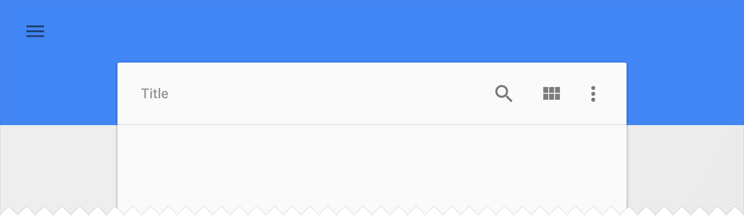
Toolbar は AppCompat でフルサポートされ、フレームワークウィジェットと同等の機能とAPIを持ちます。AppCompat では Toolbar は android.support.v7.widget.Toolbar class で実装されます。Toolbarの利用方法は2種類あります:
-
Toolbarを Action Bar として利用する:従来のAction Bar機構(例えばメニューのinflate、選択、ActionBarDrawerToggleなど)を使いたい場合。その見た目上で、もっとコントロールできます。
- 単独の
Toolbarとして利用する:Action Barが提供しないシチュエーションで、そのパターンを利用したい場合。例えば、複数のツールバーを画面上に表示したり、一部の幅で配置したり、など。
Action Bar
Toolbar をAction Barとして利用する場合、まず標準のAction Barを無効化します。最も簡単な方法は、あなたのテーマをTheme.AppCompat.NoActionBar (またはそのlight版) から継承させます。
次に、Toolbarインスタンスを作ります。通常は layout XML を用いて:
<android.support.v7.widget.Toolbar
    android:id=”@+id/my_awesome_toolbar”
    android:layout_height=”wrap_content”
    android:layout_width=”match_parent”
    android:minHeight=”?attr/actionBarSize”
    android:background=”?attr/colorPrimary” />
高さ、幅、背景などは完全にあなた次第で、それらはただの良い例です。Toolbar はただの ViewGroup であり、スタイルや位置をどんな風にでも設定できます。
そして、Activity や Fragment において、Toolbar を ActionBar として動作するように設定します:
@Override
public void onCreate(Bundle savedInstanceState) {
    super.onCreate(savedInstanceState);
    setContentView(R.layout.blah);

    Toolbar toolbar = (Toolbar) findViewById(R.id.my_awesome_toolbar);
    setSupportActionBar(toolbar);
}
これ以降、全てのメニュー項目はToolbarで表示され、標準のオプションメニューコールバック経由で追加されます。
Standalone
スタンドアローンモードの違いは、ToolbarをAction Barとして設定しないことです。これにより、様々な AppCompat テーマを利用でき、また、標準提供の Action Bar を無効化する必要がありません。
スタンドアローンモードでは、Toolbarにコンテンツとアクションを手動で追加する必要があります。例えば、アクションを表示したい場合、メニューをそこにinflateする必要があります:
@Override
public void onCreate(Bundle savedInstanceState) {
    super.onCreate(savedInstanceState);
    setContentView(R.layout.blah);

    Toolbar toolbar = (Toolbar) findViewById(R.id.my_awesome_toolbar);

    // Set an OnMenuItemClickListener to handle menu item clicks
    toolbar.setOnMenuItemClickListener(new Toolbar.OnMenuItemClickListener() {
        @Override
        public boolean onMenuItemClick(MenuItem item) {
            // Handle the menu item
            return true;
        }
    });

    // Inflate a menu to be displayed in the toolbar
    toolbar.inflateMenu(R.menu.your_toolbar_menu);
}
他にも多くのことを Toolbar で実行できます。詳しくはToolbar API reference を参照してください。
Styling
Toolbar のスタイルは標準Action Barとは異なります。そして直接そのViewに設定します。
下記はAction BarとしてToolbarを利用するときに設定する基本的なスタイルです:
<android.support.v7.widget.Toolbar
    android:layout_height="wrap_content"
    android:layout_width="match_parent"
    android:minHeight="?attr/actionBarSize"
    app:theme="@style/ThemeOverlay.AppCompat.ActionBar" />
この app:theme 宣言はテキストや項目が固定色(すなわち 100% 不透明な白)で利用されることを確認してください。
DarkActionBar
Toolbar インスタンスのスタイルをレイアウト属性で直接設定できます。'DarkActionBar' (暗めのコンテンツ, 明るいoverflowメニュー) のような Toolbar を得るには、theme と popupTheme 属性を与えてください。
<android.support.v7.widget.Toolbar
    android:layout_height=”wrap_content”
    android:layout_width=”match_parent”
    android:minHeight=”@dimen/triple_height_toolbar”
    app:theme="@style/ThemeOverlay.AppCompat.Dark.ActionBar"
    app:popupTheme="@style/ThemeOverlay.AppCompat.Light" />
SearchView ウィジェット
AppCompat は Lollipop 版の SearchView API を提供します。それははるかに多くカスタマイズ可能で、スタイル可能です(queue the applause)。旧来のsearchView*テーマ属性の代わりに Lollipop スタイル構造を利用します。
下記はSearchViewのスタイル設定方法です:
<style name=”Theme.MyTheme” parent=”Theme.AppCompat”>
    <item name=”searchViewStyle”>@style/MySearchViewStyle</item>
</style>
<style name=”MySearchViewStyle” parent=”Widget.AppCompat.SearchView”>
    <!-- Background for the search query section (e.g. EditText) -->
    <item name="queryBackground">...</item>
    <!-- Background for the actions section (e.g. voice, submit) -->
    <item name="submitBackground">...</item>
    <!-- Close button icon -->
    <item name="closeIcon">...</item>
    <!-- Search button icon -->
    <item name="searchIcon">...</item>
    <!-- Go/commit button icon -->
    <item name="goIcon">...</item>
    <!-- Voice search button icon -->
    <item name="voiceIcon">...</item>
    <!-- Commit icon shown in the query suggestion row -->
    <item name="commitIcon">...</item>
    <!-- Layout for query suggestion rows -->
    <item name="suggestionRowLayout">...</item>
</style>
これらの全て(または一部)を設定する必要はありません。初期値は多くのアプリ用に動作します。
Toolbar is coming...
この記事があなたがAppCompatを始める手助けになること、そして素晴らしいMaterialアプリを作成することを望みます。
AppCompatやsupport libraryのいずれかについての質問があれば、(同記事の)コメント/G+/Twitter で教えてください。そうすれば私たちはより多くの資料を提供できますので。
FAQ
Why is my EditText (or other widget listed above) not being tinted correctly on my pre-Lollipop device?
The widget tinting in AppCompat works by intercepting any layout inflation and inserting a special tint-aware version of the widget in its place. For most people this will work fine, but I can think of a few scenarios where this won’t work, including:
- You have your own custom version of the widget (i.e. you’ve extended EditText)
- You are creating the EditText without a LayoutInflater (i.e., calling new EditText()).
The special tint-aware widgets are currently hidden as they’re an unfinished implementation detail. This may change in the future.
Why has X widget not been material-styled when running on pre-Lollipop?
Only some of the most common widgets have been updated so far. There are more coming in future releases of AppCompat.
Why does my Action Bar have a shadow on Android Lollipop? I’ve set android:windowContentOverlay to null.
On Lollipop, the action bar shadow is provided using the new elevation API. To remove it, either call getSupportActionBar().setElevation(0), or set the elevation attribute in your Action Bar style.
Why are there no ripples on pre-Lollipop?
A lot of what allows RippleDrawable to run smoothly is Android 5.0’s new RenderThread. To optimize for performance on previous versions of Android, we've left RippleDrawable out for now.
How do I use AppCompat with Preferences?
You can continue to use PreferenceFragment in your ActionBarActivity when running on an API v11+ device. For devices before that, you will need to provide a normal PreferenceActivity which is not material-styled.