概要
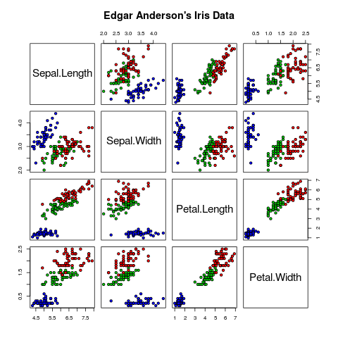
Rで散布図行列を描くときはpairs関数を使います.
pairs(iris[1:4], main = "Edgar Anderson's Iris Data", pch = 21, bg = c("red", "green3", "blue")[unclass(iris$Species)])
これをpythonで描こうとしたのですが,お馴染みのmatplotlibには散布図行列を描く関数が実装されていないようです.
自分でsubplotを駆使して実装しても良いのですが,ここではseabornというグラフ描画ライブラリを使って散布図行列を描く方法を紹介します.
Dependency
matplotlib (>=1.4)
seaborn (>=0.5)
どちらもpipでインストールできるはずです.
ソースコード
import matplotlib.pyplot as plt
import seaborn as sns
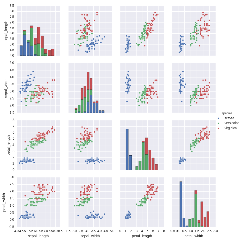
df = sns.load_dataset("iris")
sns.pairplot(df, hue="species", size=2.5)
plt.show()
実行結果
その他
seabornには他にも様々なカッコいいグラフを描くためのツールがあります.
matplotlibのグラフに飽きた方はぜひ使ってみてください.